So let’s talk about one of these important “mind tricks,” “the golden rule of thirds.” As we shall see in a subsequent blog the “the golden rule of thirds.” is actually an approximation of the “golden proportion,” which is where our true aesthetic hard-wiring (whatever that means) lies. But the “the golden rule of thirds.” is a very useful and practical compositional tool to use when taking and creating photographs.
The basic concept is that a photograph will be aesthetically pleasing if its elements are laid out on a basic grid that equally divides the image in thirds. According to Wikipedia, “the golden rule of thirds” was first articulated and by John Thomas Smith in his book Remarks on Rural Scenery (1797).

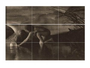
Figure 1 – Ann Brigman’s “The Bubble, 1909,” overlaid with a three by three grid to demonstrate the “Golden Rule of Thirds.” Original photograph from Wikicommons and in the public domain.
Let’s consider an image, that we’ve seen before, Anne Brigman’s “The Bubble, 1909” to see how it’s done. I’ve divided the horizontal and vertical axes in thirds and overlaid the grid on the image. Vertically, you can see that the image is divided into: the ceiling, the middle ground where the figure is, and the pool. Horizontally, the division is: the lit area to the left, the middle ground, and the dark background area to the right. Indeed, the body of the figure is

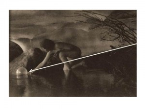
Figure 2 – Ann Brigman’s “The Bubble, 1909,” overlaid with the arrow of directionality. Original photograph from Wikicommons and in the public domain.almost completely confined to the middle zone.
As an aside there are some additional “mind tricks” or suppositions going on in “The Bubble, 1909” as shown in Figure 2. An additional, and very well defined, diagonal line divides the subject again into roughly 1/3 and a 2/3 portions. I’ve drawn it as an arrow to indicate the direction of the motion. Why do I assume that the woman is launching rather than retrieving the bubble? Why does my mind tell me that? Well first of all the arrow goes from darkness to light. Second, the woman expresses an outward gesture with palm up as if she were releasing the orb, not palm down as if she were stretching her fingertips out to retrieve it. The final cue is most interesting of all. In countries where one reads left to right, the eye/mind interprets the left-right motion as inwards. If, in so moving our eye, we encounter an animate object, here the woman, we interpret that she is passing us in the opposite direction, that is moving outward.*
Returning to the issue of the “golden rule of thirds, let’s consider another old friend, Edward Weston’s, ” Nude in the Dunes, 1930.” The picture is vertically divided into thirds and the nude is in the lower third. As I’ve said, this placement and the sand dune above it gives the image a dynamic sense of motion. You feel that the nude is slowly slipping out of the picture. A very different and much more stable effect would be accomplished if the nude were at the center of the image. In fact the effect can be seen in Weston’s, “Nude in the Sand, 1936”
Finally, let’s consider again Ansel Adams, “Moonrise, Hernandez, NM, 1941” Adams made a very conscious decision here to emphasize sky over Earth. The pictures is very neatly divided vertically in thirds (top to bottom): darkness, bright sky, and Earth. The moon in the center region and very near the dead center of the image is clearly a very important focal point, and we need to move our eye outward from there to encounter the town going down or the dark sky going up..
It has to be said, that “rules are made to be broken,” and violating the “golden rule of thirds” can have dramatic effect. It remains, however, a very easy compositional tool that can be readily implemented on the fly while taking pictures and then fine tuned in the light room.
*For a further discussion of this directionality issue see Lootens on Photographic Enlarging and Print Quality, The Camera, Baltimore, MD 1945.

Pingback: Weather-vane | Hati and Skoll Gallery