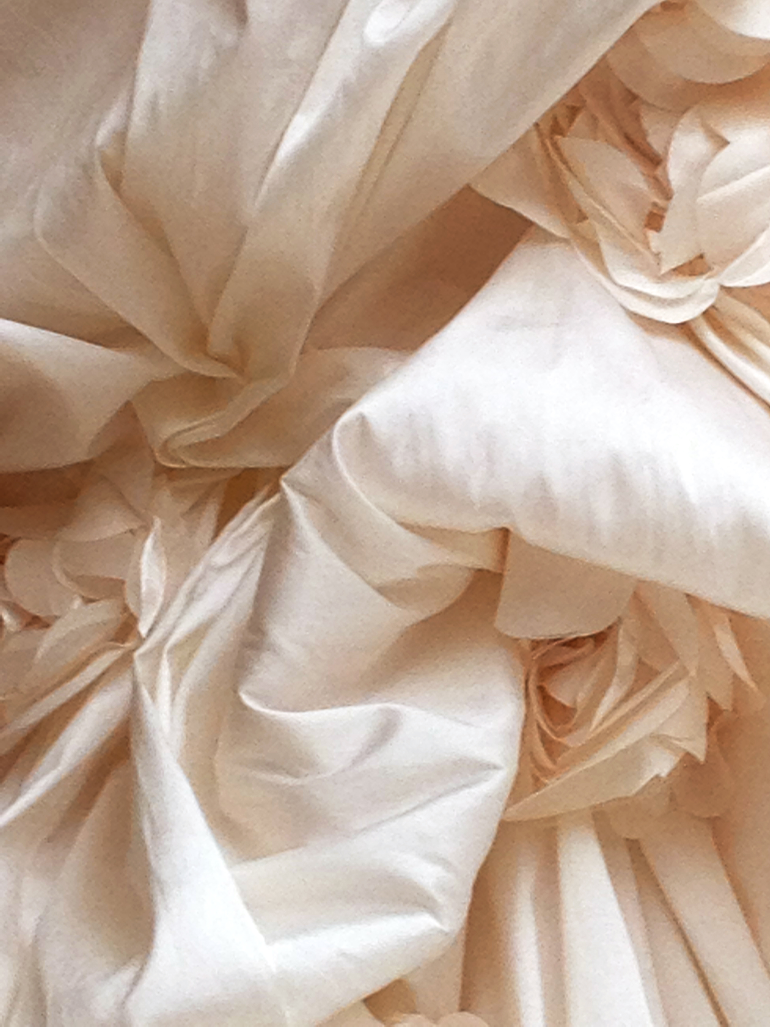
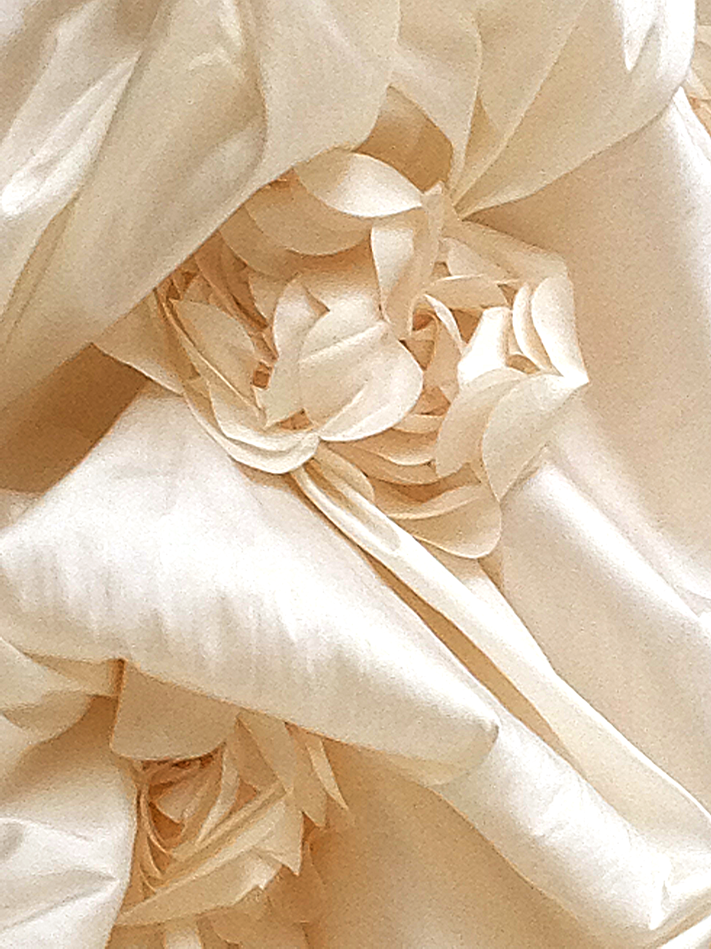
Mall walking again on a Sunday morning. Our local mall has a spring fashion show where they feature the dress designs of local students. This morning I was struck by two fantastically stunning bridal dresses by Lasell College student, Amelia LoBrutto. So while I’m talking about photography here and tone-on-tone photography in particular, while I’m talking about what is commonly called “derivative art,” I think that it is important to give credit to this very talented young artist.
Tone-on-tone intrigues me. It intrigues me because it violates the first rule of my photographic work flow, which is to adjust the levels so as to set the lowest level black and the highest level white. If you do that with tone-on-tone you wind up with something way too contrasty. And in the case with whites, in particular, you wind up with something totally the opposite of the beautifully soft gradations that attracted you to the subject in the first place.
So I think that there is a lot to be learned from doing and experiencing tone-on-tone photography. As a result, I’ve labelled today’s blog “Tone-on-tone 1,” since it is my intent to revisit the subject. And it is my intent also to study it a bit in terms of what dynamic range creates a pleasing tone-on-tone.
This morning however, all I had with me was my IPhone 4S. I have this running dialog in my head that the IPhone is the modern “view camera,” and that I am carrying it high into the Sierras or into the steamier sections of New Orleans Of course, it is the antithesis of that. I find it very difficult to hold the camera steady and I have to concentrate really hard to successfully frame the subject. Still I got two pictures this morning that I found acceptable examples of the tone-on-tone genre.
The signal is all in the upper half of the camera’s dynamic range. I debated a long time, trying out various approaches, and finally settled on the original color, adjusting both the color balance and the gamma subtlety to create what I hope is a beautiful ivory color. The camera will intrinsically set the whole image to a washed out neutral grey. I also did just a bit of dodging to enhance some of the highlights. The results are shown in Figures 1 & 2.


