The very dark side of image as shorthand

Figure 1 Abraham Lincoln's first Inauguration, May 4, 1861.  From the Wikimediacommons and in the public domain.

Figure 1 Abraham Lincoln’s first Inauguration, May 4, 1861. From the Wikimediacommons and in the public domain.

In my post on Friday we discussed the Turkish woman in red and how to a disturbing degree image memes represent stereotypes.  In a sense image memes are a form of shorthand.  And in regard to this shorthand the situation can get darker still. In effect the whole effect can spiral out of control in the mad rush to communicate faster and faster.

In another recent post we discussed our the development of the telegraph by Samuel F. B. Morse (1791-1872) and the laying of the transatlantic cable really represented the world’s first communications internet.  The speed of information transfer from the United States to Europe overnight went from three weeks to three minutes.  In her book “Team of Rivals,” Doris Kearns Goodwin describes the transmission of Abraham Lincoln’s first inaugural address throughout the nation.  This occurred in 1860 just before the laying of Transcontinental Telegraph.  The speech was delivered just before noon, but the text printed in newspapers did not reach the anxious Frances and Fanny Seward in Auburn NY until late at night.  Because of the Pony Express the speech could be read in Sacramento a mere seven days and seventeen hours after its delivery in Washington.

We tend to focus on the snail’s pace time that it took to receive the address.  However, what we should be focusing on is that people read, analyzed, and discussed the text of the address.  People greedily processed information in those days.  The Lincoln-Douglas debates followed a fixed format.  The first speech was an hour long.  This was followed by and hour and a half response.  Finally, the first speaker got a half hour to rebut the response.  So all this totaled three hours of intense reasoning and rhetoric.  Contrast this with today’s debates.  The speakers are lucky to get three minutes to answer a question and rebut.  Most people don’t watch the whole debate, content to watch the sound bites selected by the commentators that agree with their point of view.  The same is true of the inaugural speeches.

The meme of the image, the meme of a picture is all that remains.  Most people are not critical.  If Obama speaks, there’s a whole group that’s going to agree and a whole group that’s going to disagree, based solely on the fact that Obama said it.  Show his picture, the Obama meme, and we immediately like or dislike, hate or love. The effect is just as reflexive.

We really need to ask ourselves how in a society as educated as ours we have let our politics become so very superficial.  A large part of the blame lies in our need to communicate so fast that rational thought becomes a quite impossible luxury.  But, we are dealing with very real, very pressing, and very life or death issues.  This is the very dark side of allowing images and memes to become a shorthand that enables us to avoid thinking.

The Moore, OK Tornado – science, abstract geometric art, and human disaster

“Science, abstract geometric art, and human disaster;” those are strange words to string together.  On May 20th an EF5 tornado touched down and slashed across Moore, OK, killing 24 people and injuring 387.  It is now estimated that 1,150 homes were destroyed with total damage estimated to be $2 billion. But really how do you measure the scars on human life that such a killer storm causes?  Each one of those lives and each one of those homes holds a story of deep personal tragedy.

Among its “Pictures of the Week” this past week,  NBC News features an eery satellite image of the tornado’s path.  It was taken with the ASTER instrument on NASA’s Terra satellite.  The image is so-called false-colored.  It emphasizes the infrared, shown in red, where redness indicates vegetation.  Gray areas indicate buildings and pavement.  The twister’s path of destruction is the sharp brown streaks slashing across the image where all vegetation has been totally destroyed.

The picture is very strange and surreal.  It appears like some kind of geometric abstraction.  But really it’s the scientific abstraction that truly grabs us.  Our minds connect this distant quantitative image with the hundreds of images that we have already seen from ground-based cameras of the human tragedy that unfolded on the ground.  It’s very impersonal from space and very real on the ground.

The Turkish woman in red in memetic context

Figure 1 - Raphael's Madonna of the Chair, 1515 - the ultimate meme.  From Wikipaintings and in the public domain.

Figure 1 – Raphael’s Madonna of the Chair, 1515 – the ultimate meme. From Wikipaintings and in the public domain.

I have received some very interesting comments from readers Megan and Andrew regarding my post about the Turkish woman in red.  The discussion really returns us to the view that an image is a meme.  We see it and we draw connotation from it, and the connotation is culturally-based.  In a western context, the dress on the woman is not the uniform of a protestor.  She is an innocent caught up in a violent and violating act.  And yes, the connotation would be different, although not necessarily unsympathetic if the victim was a young man in blue jeans.  In other cultures, perhaps more religiously conservative ones, she might be viewed quite differently.  She might be viewed as getting what she deserves.  The point is that images are powerful memes and that attaching connotation to them is not only what happens but is so ingrained in our psyches as to be what must happen. The process is intrinsic to our circuitry.  We are organizing our thoughts and reactions, connecting with others of our culture in defining how we will react.

And yes again, regardless of our culture, we are stereotyping.  I would suggest that if memes are such an important innate aspect of human thought and culture, then stereotyping becomes innate as well.  We are taught in western culture that stereotyping is bad.  You learn it in preschool – “respect diversity.”  In railing against stereotyping we are seeking to overpower the innate with our intellects.  This is a good thing, but we always have to recognize that our initial reaction will be the innate and overcoming that first impression will be a task.  In fact, I would argue that the only way to truly overcome stereotyping is to replace one meme with another.

Our concern here is about the power of image.  So I hesitate to go further down this path of arguing about right and wrong and stereotyping.  However, it has to be recognized that saying that stereotyping is wrong, which I believe to be true, because my mother taught me so, is paradoxical to the concept of all inclusiveness and respecting diversity.  This was pointed out by Allan Bloom in his book “The Closing of the American Mind.”  Traditionally, all cultures believe that they have “the truth” and as a result are superior to all other cultures.  To say that we have obtained a new truth, that all cultures and their practices must be respected, so called cultural relativism, is to say that our culture has a greater truth than all others – that we are superior because of attaining this greater truth.

Also in the face of cultural relativism is that we firmly believe that certain practices are fundamentally wrong. Slavery, suppression of women or any group, child abuse are examples.  We condemn those cultures that practice these.  Well, so be it!  What we wish for the world is a more inclusive and freer society – which calls for an evolution of culture.  Whether the human race will ever achieve such utopia is under question.  Will such a culture evolve out of what Joseph Campbell referred to as the mythic ruins of our modern day world or whether culture conflict will remain the norm, really remains to be seen.  What we may be certain of is that we will always hold powerful images in our minds that connect us all.

D. James Dee, the Soho Photographer

Some months ago I discussed Herb and Dorothy Vogel and their amassing, over the course of decades, what is arguably the greatest collection of minimalist art – and this on a budget.  The Vogels donated their collection to the National Gallery in Washington and fifty works to each of the fifty states.  Well, if you’re feeling that the Vogels beat you to it, or if you’re feeling that you should have started collecting some thirty or forty years ago, this may be your golden opportunity to make up for lost time.

The “Soho Photographer,” D. James Dee, who spent his career of thirty-nine years documenting work for artists, galleries, exhibitions, books and portfolios is retiring.  He is closing his Manhatan Wooster Street studios and moving with his wife to Florida.  All of his work, sixty-five file board boxes filled with approximately 250,000 photographs is not coming with him.  Dee explains that if someone asked for four images he would make five and save the extra one.  And Dee is ready to give all his extras away, ideally to a nonprofit archive.

There is one caveat.  To listen to all accounts, Dee has done a rather primitive job of documenting and labeling what’s what.  So this is going to require massive amounts of sleuthing by experts in Soho art history to piece it all back together.  All of the major likely candidate institutions: The National Gallery of Art, Getty Images, and the Fales Library and Special Collections of New York University have declined to take on the collection, discouraged by the lack of captions and the required of storage space.

This is certainly a very valuable archive, and its imminent demise touches on many of the issues at the heart of historic preservation.  Hopefully, a way will be found to preserve it intact, and hopefully too, a way will be found to archive it.  I will keep you informed of what happens.  The moving vans are coming on July 24 and it will be a tragedy if these photographs wind up in the dumpster.

The woman in red

The latest image to go viral on social media is that of the “Turkish woman in red”  It’s actually a short sequence that you can find as a video showing a young Turkish woman being sprayed in the face by police wielding teargas guns.   The image is hauntingly symbolic.  The woman is stylishly dressed in western clothing.  She seems out of place, as if she has suddenly stumbled upon the riot,  As Alexandra Hudson of Reuters points out ” in her red cotton summer dress, necklace and white bag slung over her shoulder she might have been floating across the lawn at a garden party; but before her crouches a masked policeman firing teargas spray that sends her long hair billowing upwards.”  Coupled with the stop action nature of the photos the sequence and individual images take on a dream like quality.  That is until you realize how vicious and nasty spraying teargas directly into someone’s face is. In that context the woman in red stands defiant against the conservative government of Prime Minister Tayyip Erdogan.  She is demanding her right to sexual equality and independence.

The appeal of the photograph, of course, lies both in its incongruity and in the “girl next door” quality of the young woman.  I cannot help but be reminded of “Les Misérables.”  This story has been played out before.  That was the June Rebellion of 1832.No king now sits on the throne of France.The ultimate power of this sequence of images is that the answer is inevitable.  The future belongs to the world’s youth.  Equality and liberty are not just slogans.  The world ultimately belongs to Éponine, Marius, and Cosette.  All of that is in four little frames, demonstrating once again the power of image.

Kyle McBurnie, “Harbor seal in kelp bed, 2013”

I came upon a truly stunning picture today by underwater photographer and scuba instructor, Kyle McBurnie which shows a harbor seal looking out from a kelp forest at Cortes Bank, near San Diego, CA.  This image is this year’s University of Miami’s Rosenstiel Center of Marine and Atmospheric Science annual Underwater Photography contest.  The composition of this image is gorgeous.  I love the vertical elements, which give the seal the sense of carefully balanced buoyancy.  Of course we’ve got “picture perfect” use of the “golden rule of thirds.” Finally I just love the wonderful tones of inky blues as well as the way that the surface light enters and diffuses from the right.  You can feel this image.  Bravo and congratulations to scuba instructor Kyle McBurnie.

Susan Harlin – Large Format Panoramas

I am forever looking for wonderful photographs and photographers.  There are a lot of both out there.  It’s just a matter of sorting through all the noise.  As I’ve indicated before, there are only two photography publications that I read religiously, “LensWork” and “View Camera.”  Both of these periodicals take photography seriously.  The focus is art, not equipment or the latest manipulations to be made using Adobe Photoshop.  So they are both great places to be introduced to great photographers.

Recently, as a result of my reading “View Camera,” I decided to subscribe to the Facebook Special Interest Group (SIG) called “Large Format Photography.”  For those of you who are Facebook members I highly recommend this group.  Everyday now I am seeing great pictures.  And the reason is that large format photographers tend to be obsessed with the art of photography and the creation of fine images. So while I am not a practitioner of large format, I highly admire those who are willing to put in the time and effort to do this type of photography.  It’s a laborious process but the results can be quite amazing.

This past weekend I discovered the work of large format artist Susan Harlin.  Of course, I immediately visited her website, where I discovered some very extraordinary photographs.  What Susan creates defines the best of large format, studied composition, tremendous sharpness,  equally tremendous dynamic range that pulls out both subtle tones of black and of white, and just a wonderful velvety sense of tone.

I would start with “Grandad’s Barn, 2012.”  I have to say that this image is simply stunning.  the tonal range is just perfect, the gestalt creates a perfect mellow mood of serenity and mystery.  There’s something about the composition, right?  The subject is the barn; but the lead-in fence takes up most of the picture, creating a kind of background/foreground flip.  Other than genius, the reason is that Susan is using an 8″ x 20″ Korona Banquet panoramic camera.  The dramatic power of such a camera is spectacularly illustrated by her 2007 photograph, “John Ford Country.” In many of her photographs Susan takes the novel and unusual step of turning this camera on its side to create spectacular long and narrow images such as “Icicles, 2010.”

I highly recommend that you visit Susan Harlins website when you have time to study her work.  You can learn a lot from her about creating great images.

John Delaney’s intimate faces

I spoke on Wednesday about Johsel Namkung’s “Intimate landscapes.”  That seems almost a contradiction in terms.  You expect to find intimacy in portraits, and today I’d like to talk about the very compelling portraits of John Delaney.  But first we should consider what brilliant portraiture is all about.  If you look at someone, if you converse with them, your eyes meet, and it is through eye contact that intimacy is exchanged and achieved.  So when we speak about great portrait photography, we are speaking about the camera becoming the photographer’s intimate eye.  The camera becomes joined with the photographer, it is now, to the subject, an essential element of the person with whom that (s)he is interacting.

John Delaney offers us a wonderful series of images of the “Golden Eagle Nomads of  Kazakhistan.”  In a sense this is travel photography.  However, what Delaney has done is to set up a mobile studio tent on remote location in which he captures remarkable images of the Kazakhs. Nobody knows exactly when the Kazakhs tamed the Golden Eagle of Central Asia.   Herodotus (484 B.C.E – 430 B.C.E) refers to nomadic eagle hunters in 5th Century B.C. Marco Polo (1254-1324) wrote about them in the 13th century. Genghis Khan is said to have had 5000 mounted Eagle Riders in his personal guard. In these pictures there is a mutual nobility to both the Kazakhs and their eagles, and there is an unpoken intimacy between them as well.  These majestic eagles can attain seven foot wingspans. I want to particularly draw your attention to the marvelous gentlemen of Image #9.  I don’t think that more perfect lighting in a portrait could be achieved.  And the portrait of the adolescent girl Image #14 is just wonderful.  You cannot help but wonder what her dreams are.

Delaney who was a master printer for Richard Avedon, before striking out on his own offers the desire to preserve the image of these noble people before they and their way of life (at least 2500 years old) vanishes forever as his reason for traveling to Kazakhistan to photograph these people.  But if you continue to explore Delaney’s website you learn that you do not have to travel half way around the world to document vanishing ways of life.  In his series “Hoboken Passing” Delaney documents the vanishing store owners of Hoboken, New Jersey a neighborhood “in transition.”  These too are noble and proud faces.

Finally, I would like to point you towards Delaney’s gallery “Himalayan Portraits.”  Once more we find that quintessential humanity that lies within all of us.  I am especially bewitched by the portrait of (presumably) a mother and her two daughters in Image # 10.

John Delaney is a master of portraiture.  His black and white (sepia toned) images of distant people seem quite intentionally to come from the nineteenth century.  In this way they emphasize the distance, creating the sense that we are separated from them in both space and time.  Of course, the essential paradox is that through their eyes we become intimate with Delaney’s subjects.  They are of us.

Are full frame DSLRs superior to APS-C cameras?

Figure 1 - DSLR camera sensor formats compared.  Image from the Wikimediacommons and in the public domain.

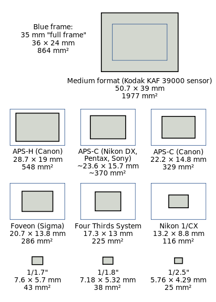
Figure 1 – DSLR camera sensor formats compared. Image from the Wikimediacommons and in the public domain.

I have been dealing with a lens problem over the last few weeks, and as a result, I have been sorting out in my mind the relative advantages between the APS-C and full frame sensor cameras.  At the risk of becoming soporific, the story begins with where does that pesky multiplication factor come from.  But a first question: what am I talking about?  If your DSLR  camera (refer to Figure 1)has a full frame sensor it is a 26 mm X 36 mm or 864 mm2, which means that it is the same size as 35 mm film.  However, if your DSLR has an APS-C sensor it is smaller, 15.7mm x 23.6 mm or 370 mm2 for Nikon and 14.8mm x 22.2mm for Canon or 329 mm2.  Now suppose you put a standard lens (one designed for the full frame format) on the camera.  Your APS-C sensor will only image the center of the field.  Your image will appear magnified relative to the full frame format by a factor of 36/23.6 = 1.53 for Nikon and 36/22.2 = 1.62 for Canon.  There is your magic multiplication factor.

Image magnification is determined by focal length.  For example, a 100 mm lens magnifies two-fold compared to a 50 mm lens.  As a result whatever the true focal length of the lens is, you need to multiply by this multiplication factor to get the equivalent focal length for an APS-C camera.  For instance, if you are using a Canon 18mm to 55 mm zoom lens, it is equivalent on a APS-C camera, such as the Canon T2i, to a 29 mm to 89 mm zoom.

It is logical to ask which is better?  And if you are a regular reader of this blog then you know that I am going to obsess about two factors: image sharpness and image dynamic range.  Given that, and before we can discuss relative advantages, we have to consider one more technical point.  Suppose that you start with the APS-C sensor and you want to make it bigger, indeed you want to make it full frame, then you can do this in one of two ways: you can make the pixels bigger and keep the same number of pixels or you can keep the size of the pixels the same and just add more of them.  This is not a minor point, as we shall see.

Canon’s full frame cameras, for example the EOS 5D and the EOS 6D have approximately 22 Mp “resolution.”  Compare this to their APS-C cameras at 18 Mp “resolution.”  This means that there are about 22 % more pixels or about  10 % more on a side.  Basically, this means that the pixels are bigger, but that the number doesn’t change by much. Nikon kind of goes both ways.  Their APS-C cameras have around 24.1 Mp.  Their full frame cameras come in two flavors.  The D800 has 36.3 Mp, meaning 50 % more pixels or 23 % more on a side,  while their D600 series has a full frame sensor with 24.3 Mp, meaning no change in the number of pixels.

Advantage APS-C – Price

The big advantage of the APS-C sensor is that it is cheaper to manufacture.  The reason for this is that the larger a sensor you try to manufacture there more likely you are to have a flaw.  Flaws were acceptable back in the Jurassic, when I was a lad, and we were first using cooled-CCD cameras for scientific measurements.  In the consumer market, this is totally unacceptable.  There can be as much as a 20 fold increased cost associated with making a full frame, as opposed to APS-C, sensor.  This is reflected in the increased cost of full frame DSLR cameras, approximately five to six fold.

Advantage full frame dynamic range and signal to noise

If you have a larger sensor then its well depth, the number of photoelectrons that it can hold increases as the area.  So roughly speaking, if you hold the number of pixels constant and increase the area of the pixel by (1.5)2 or 2.25, you gain over a two-fold increase in your camera’s dynamic range.  Also the  more electrons the better the signal to noise.  This is going to help you out in low light images, but only by about a factor of about two or one f-stop.

What about image sharpness

The story with sharpness is a tricky one.  First, of all most lenses perform best, from a sharpness or modulation transfer function point (MTF) of view, at or near their centers.  It is the edges that are hard to get sharp.  I am in love with my Canon  EF 70-200mm f/4L USM LensThis lens has an outstanding MTF.  Couple that with my APS-C sensor and the performance is just amazing!  In addition, it is easier for lens manufacturers to design high quality lenses for a smaller sensors, and again easier translates to price.

Last October we spoke extensively about photographic image resolution and I showed you that the resolution of a camera lens is 1.22 x wavelength of the light x f-number.  For green light this is about four microns.  We also showed that for good DSLRs this is about equal to the interpixel distance (for a 18 Mp APS-C sensor).   Recognize that the focal length of the lens comes in because the f-number is the focal length divided by the aperture and that this refers to the true focal length.  So if you keep the number of pixels the same going to full frame you will lose a bit in resolution or sharpness.  But say that you increase the number of pixels enough to keep the interpixel distance the same (that was 2.25 fold in the previous example), then your resolution or sharpness will be the same.  However, if the resolution is the same then when you print or project your image on a computer screen you will have more pixels.

Last fall we discussed in detail how many pixels you need as a function of print size.  What we found there is that 300 pixels per inch is more than sufficient and this means that today’s APS-C sensors certainly provide sufficient sharpness for a crisp 12” x 18” image.

My bottom line

When I started writing today’s blog I was afraid of being boring (I have no doubt succeeded in that), but at least I thought the subject pretty straight-forward – 1100 words later, no so much!  You can see that there are advantages both ways, which makes the choice ambiguous.  My bottom line is that for the kinds of photography that I do and the print sizes that I am aiming for there is no real value to going full frame.  Affordability is very key, since everyone has limits on how much they can spend on equipment.  The ability to add another lens to my photographic arsenal, outweighs the minor disadvantages of the APS-C.