Semiconductor light detectors

Figure 1 - schematic of the p-n junction of an LED.  Top shows distribution of electrons and holes in the two regions. Bottom shows the conductance and valence bands. From the Wikicommons by S-kei and in the public domain under creative common license.

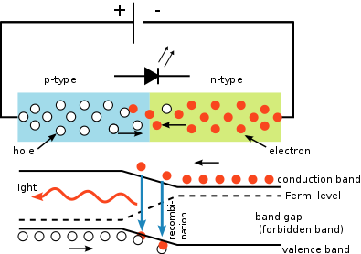
Figure 1 – schematic of the p-n junction of an LED. Top shows distribution of electrons and holes in the two regions. Bottom shows the conductance and valence bands. From the Wikicommons by S-kei and in the public domain under creative common license.

We have previously discussed how a p-n junction can be used to produce a light emitting diode (LED) and how an array of LEDs can be used to create a digital display.  I redisplay Figure 1 from that blog to remind you.  So lets recall a few critical points.  First, the n-type semiconductor is rich in electrons.  Second, the p-type semiconductor is deficient in electrons, that is is rich in holes.  Second the application of a voltage across the diode (p side positive, n side negative) causes a current to flow and drives electrons from the n-type semiconductor to the junction, where they combine with holes; thus falling out of the conduction band into the valence band.  When they do this, they emit light.  Hence, we have a light emitting diode.

Now the whole process can, in fact, be reversed.  Physicists have a really cool expression.  They say that “the system is invariant under reversal of time.”  Whoa! Time reversal. Shades of H. G. Wells.  Actually this whole question of time reversal in physics is rather fun.  In our everyday world time is an arrow.  It moves from the past to the present and then on to the future – in inexorably.   But the equations of physics they don’t care they can go either way.

Figure 2 - Examples of discrete photodiode light detectors.  From the Wikicommons and in the public domain under GNU licsense

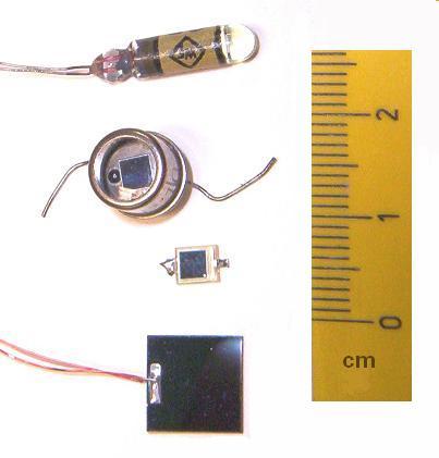
Figure 2 – Examples of discrete photodiode light detectors. From the Wikicommons and in the public domain under GNU licsense

And for our little p-n junction this means that if we can apply a current (aka electricity) and create light we can apply light and get electricity.  So if you have a p-n junction and shine light on it (at the correct wavelength), electrons get lifted from the valence band to the conductance band.  What happens next depends on whether you have a battery hooked up to it.  If you don’t then the electrons build up at the junction creating an electric field or a voltage.  The size of the voltage depends upon the amount of light.  This is the so-called photovoltaic mode.  On the other hand if you attach a battery in the opposite to that shown in Figure 1 (meaning that the plus side is attached to the n-type material and the minus side to the p-type material, referred to as reverse bias) then the as electrons rise to the conductance band they are swept to the positive battery terminal, a current is created.

The reason that the battery needs to be set up reverse bias or backwards to that shown in Figure 1 has to do with our desire to run the system in reverse time.  If running electrons one way causes light, we expect that light will cause the electrons to run the other way.

So we can use a p-n junction to create light, a light emitting diode.  And we can use a p-n junction to create either a voltage or a current.  The latter means that we can use a p-n junction to measure light.  Some example of discrete (stand alone) photodiodes are shown in Figure 2. These devices are at the heart (eyes?) of how many light meters on cameras work.  And we are one step further to understanding how a digital camera’s detector array works.


Cal Whipple, George Strock, and the Buna Beach Photograph

The issue of photographs of horrific stories is not a new one. Addison Beecher Colvin Whipple (1918-2013) has passed away. During World War II, Mr. Whipple worked for Time-Life Publishing at the Pentagon. His job was to get photographs cleared by the military for assignments and then to get the images that they returned passed the military censors. In 1943, Whipple, then 25, found himself embroiled in a major controversy. Life magazine wanted to publish a photograph by George Strock of three dead American marines after the amphibious assault on Buna Beach in New Guinea.

Military censors refused Life’s request to publish the photo. Their policy was that no pictures of American soldiers killed in combat were allowed. And this view was amplified when it was realized on close examination that one of the marines lying face down in the sand was being consumed by maggots.  Whipple appealed the decision through the Pentagon. Whipple and Life believed that American’s needed a healthy dose of understanding of what the war was about, what the grim realities of it were.

Finally in September 1943 the decision went to the White House. President Roosevelt, the War Department, and the Director of the Office of War Information, Elmer Davis, decided “that the American people ought to be able to see their own boys as they fall in battle; to come directly and without words into the presence of their own dead.”

It is a controversy that we have seen again during the Iraq and Afghanistan wars.  Sadly seeing the horrible meaning of war appears to offer no deterrent. Like Strock’s photograph the words of Wilfred Owen (1893-1918), killed in “The War to End All Wars” forever go unheeded.

“My friend, you would not tell with such high zest 
To children ardent for some desperate glory, 
The old Lie; Dulce et Decorum est 
Pro patria mori.”

Color abuse or don’t show me anymore of your damn flower pictures

On the subject of hackneyed and over wrought, I’d like to express my opinion about the over use of color.  In my view color is too often used in a vain attempt to compensate for mediocre subject and composition.  I have seen far too many flower pictures.  Isn’t this beautiful?  Not really, please wake me up when it’s over.  Nature’s done a wonderful job of creating a beautiful flower, your photography, not so much.

And it’s an important point that color is so dominant to our sight that nature has used it in creating flowers.  So it’s a pretty easy way to go if all you want to do is create the illusion of dramatic photographs.  Sit back please, analyze what is your subject?  What is the composition of your image?

To me, photography is first and foremost about form and composition.  Then if you want to throw in a bit of color that works for me.  Don’t over power me.  Certainly some pictures work best in color.  Sometimes one of the coolest things that you can do is take a color picture, which is just so subtle, just a touch of hue beyond black and white.

I am definitely a black and white kind of guy.  I choose my subjects, usually for form and composition.  The first thing that I do in my workflow is discard the color information.  I then create the image and finally, a bit resentful of the added megabytes in the color plane, I often then return to RGB color; so that I can digitally tone the photograph.  Almost always I tone sepia, trying to catch the pleasure of the selenium toning that I used to do in my analogue days. I find that sometimes this toning adds just the right amount of ump to the image.  Maybe that’s a cop out. I worry about that  Maybe I tone too much.  Maybe my sepias cross the line to the muddy.

And do I need to emphasize again that this is my personal view of photography?  I can share it with you.  But you have to set your own rules, and if all you want to do is run around the garden taking snap shots – well wake me up when it’s over.

Sad, horrific, and hackneyed subject matter in photography

A couple of weeks back, I was admiring Italian photographer, Marina Rosso‘s  touching photoessay about her grandparents “Licia and Ryan,” who have been married for fifty-seven years.  Nice work, I thought (and still think), but then I made the mistake of reading some reader comments on PetaPixel.  Photographing one’s grandparents  “a little suspect.” And I gues, in a sense, that it is.  I mean you pretty much know how this story is going to play out.  And this got me thinking about choosing what might be termed “easy topics.”  By easy topics I mean, topics or subjects, where you pretty much know the story is going to turn out and where the emotions that you are likely to elicit in your audience are pretty much predictable and guaranteed.

Then I came upon “The Scar Project,” which I discussed yesterday.  I mean who is not going to feel for these people?  Right?  And yes indeed, I have seen other pictures like these before.  So is there anything wrong with photographing such “easy topics?”  There are two obvious answers.  First, these are not “easy topic.” The photographer, if (s)he is a living breathing human being, as interpreter has to be even more devastated by the subject matter than the viewer.  Second, commonality of theme does not make a theme off limits.  It just makes it harder to succeed, because your audience expects not only excellent images, but also something more – a new twist or perspective.  The ante is up.  And besides who has the right to tell an artist what (s)he can photograph?

We have to consider war and devastation images in this context.  The photojournalist needs to communicate.  The images of American Civil War dead rotting in a field have retained their significance and ability to move despite the reams of subsequent images from every war and genocide in the intervening years.  The fundamental statement about humanity, it resilience and endurance, remains.  And I keep coming back to two images that we have discussed before: Eddie Adams’ “Brigadier General Nguyen Ngoc Loan Executing the Viet Cong Guerilla, Bay Lop, 1968;” and Nick Ut’s “Children Fleeing South Vietnamese Air Force Napalm Attack on the Village of Trang Bang, 1972,”   Both of these images played significant roles in reversing American public opinion about the Vietnam War.  Such is the power of image.

Sterling B. Jensen, empathy, and “The Scar Project”

Figure 1 - "With my mother, 1951" (c) copyright DEWolf 2013.

Figure 1 – “With my mother, 1951” (c) copyright DEWolf 2013.

From 1964-68, I had the privilege of attending Stuyvesant High School.  I say privilege first because it was a very special place with very special teachers and second because at the time I probably didn’t fully recognize what a privilege it was.  I may have seen it as a necessary rite of passage for a “geek in training.”

As I write this my mind recalls some really great teachers: Jack Irgang (history), Ralph Ferrara (Biology), Ann Moehle (Biology), and Sterling B. Jensen (creative writing and drama).  We were truly blessed.  I’d like to write a bit today about Sterling Jensen.

Mr. Jensen was an actor and mime.  Notably he was a founder of the now legendary Roundabout Theatre in Manhattan.  I saw him as King Lear, and it was truly unforgettable.  Mr. Jensen taught me two interesting things.  First, never use the words “interesting” or “things,” oops!  If you truly have something worth saying, you can find better words.     Second, that the highest of human emotions is empathy.

To be clear about it, say there is a terrible accident, where a bicyclist is hit and killed by a car.  If you hear about it second hand, and say “OMG that’s terrible, that poor guy,” you are experiencing sympathy.  You feel sorry for the bicyclist and, perhaps, the driver who now has to live with the pain of having killed someone.  But if you see the accident and at the moment of horrendous impact wince painfully, you are empathizing, you are feeling or sharing that person’s pain.

Back in the land of geekdom, people with fine tuned empathic powers have been featured in several Star Trek episodes.  First, there is Gem from the Minarian system, who in 2268 is tested by the Vians to see if her people are worthy of being rescued from a supernova.  Kirk, spock, and McCoy are subject to torture and Gem must take on their pain to save them – pretty grim stuff.  And then, of course, there was Deanna Troi, extrasensory empath,who was a half-Betazoid, half-Human who served under Captain Jean-Luc Picard, as ship’s counselor aboard the USS Enterprise-D and the USS Enterprise-E. I am doubtful that most therapists would want to have extrasensory empathic powers, but there you are.

My point in all of this is that if empathy is the highest form of human emotion, and if the purpose of art and photography is to create emotion in the viewer, then art that evokes empathy has achieved this higher plane.  It is in that context that we may consider the very remarkable and truly moving portfolio by fashion photographer David Jay, “The Scar Project.”  And I think that we do need to include the rest of the project’s title “Breast Cancer is not a Pink Ribbon.”  When you view these images you do not feel sympathy, you do not feel “there but for the grace of God go I,” you feel empathy.  For a brief instant, it is ever fleeting, you feel the pain, and grace, and endurance of these women.

Jay’s project was born when a frequent model of his was diagnosed with breast cancer at age 32.  The project is documented in a film, “Baring it All,” which you can see at the projects website.  It is hard to say anymore without seeming trite or cliché.  Perhaps all is said by one of the young women in the documentary who declares, “The scar represents everything I’ve been through. I’m proud of what I’ve been through.”

Finally, and to go full circle, I remember very vividly that when I was taking Sterling Jensen’s class in creative writing in 1968, my mother Sylvia Wolf (1917-1988) was diagnosed with breast cancer and underwent her first radical mastectomy.  It was very hard to concentrate on Shakespeare.  My mother succumbed to the disease twenty-years later, but only after fighting it with tremendous strength and grace.  Having witnessed all of this, I can bear testimony, that it truly is not a pink ribbon.


Spring finally comes to New England

Figure 1 - "Old New England Barn in Spring, Stow, MA," (c) copyright DEWolf 2013/

Figure 1 – “Old New England Barn in Spring, Stow, MA,” (c) copyright DEWolf 2013

Snow came late to New England this year.  But then it came with a vengeance and stayed around for a very long time.  I will have to add that the snow was truly beautiful, and blissfully for the most part occurred on weekends, when it could be enjoyed and photographed – and you didn’t have to drive to work in it.  People who don’t have garages are a lot less charitable about it.  There’s nothing worse than chipping you car out of an iceberg. Anyway it now appears to be over.  Hopefully there will be no more snow pictures for another year.

We had lunch at the Nancy’s Stow Airport Cafe, and everyone was abuzz about the single blooming crocus in Nancy’s garden and the daffodils and hyacinth just cracking the ground.  We marveled for a while as we watched the little planes land and take off on a perfect Sarurday.  The sun has crossed the celestial equator on the ascendant and definitely taken on a spring brightness and cast.  And we approach all things with renewed expectation.

So it is time for new photographic studies, and with my little Panasonic Lumix I took the cliché, yet hopeful, “Old New England Barn in Spring.”  It’s nothing special but does warm up my shutter finger,

The immediacy of photography and the view from the bottom of the world

Please have a look at this link.  It is a live feed from the Amundsen-Scott International Research Station at the South Pole.  The image is dull and, frankly, kind of boring from a fine art photographic perspective.  Still it gives one, or me at least, a little thrill, raising the hairs on the back of my neck with some sense of interhuman pride.  It’s like we are standing there, and I cannot quite get the image of Roald Amundsen standing at the South Pole with his men on Dec. 14, 1911, just over a century ago out of my mind.  What does it all mean?

Does it mean that photography, in a mad quest for immediacy and “take me there” bravado, has trivialized everything?  I don’t think so.  If we look at the development of photography as a continuum, as an evolution, we start with the nineteenth century.  In the nineteenth century photography enabled us to capture precise and accurate images of places and people in a matter of minutes.  The daguerreotypist would disappear into his magic world of iodine and mercury fumes (OSHA would not have been happy) only to reappear with something truly marvelous.  And we could then retain a certain intimacy with loved one’s across oceans, time, and even death.  That’s pretty remarkable.  Operatively, it brought us closer to one another.

As that century progressed people demanded “be there” images of wars and historic events.  The world shrunk further, we became closer, and it became no longer possible to hide the atrocities of war and other evils, like slavery and genocide, from us.

As the world entered a new century, the twentieth, there was more and more of a demand to “be there”, at the front in wars, at the site of discovery at the poles, and even with our robots and ourselves as we began to leave the bounds of Earth.  The significant fact continued that the world was ever shrinking, we were getter closer.

And now in our own century, the twenty-first, there are cameras everywhere: in our cameras, in the cell phones of hundreds of millions of us, and in robot eyes.  They are truly everywhere and nothing goes unrecorded.  We are in constant communication with everyone else.  Nothing remains hidden for long.  So therein, I believe, lies the point of the South Polar webcam.  It increases, rather than diminishes, the significance of the photograph of Amundsen’s party, because both are symbols of the human quest to shrink and bring the world closer together.

Alfred, Lord Tennyson (1809-1892) may have said it best in his poem “Ulysses.”

“I am a part of all that I have met; Yet all experience is an arch wherethrough Gleams that untravelled world, whose margin fades For ever and for ever when I move.”

Vortices on the Charles River

Vortex

Figure 1 – Vortices on the Charles River Beneath the Watertown Bridge (c) DE Wolf 2013.

Two physicists were crossing a bridge…  Yes it sounds like the start of one of those physicist jokes that end with the punchline:  “Well first you have to assume that the chicken is spherical.”  Anyway my colleague and I were taking a walk at lunch and on passing over the Watertown Bridge we noticed that there was an excess of sudsy pollution on the river.

This is very foul for the waterfowl (sorry).  But it does highlight the flow patterns of the river.  And what we noticed was that as the water goes under the bridge where it narrows and then releases into the wider river below (right hand side in Figure 1), there is a back-flow (left hand side in Figure 1), resulting from Bernouilli’s principle that causes little whirlpools or vortices to form (center in Figure 1).

I took a couple of pictures and we went on to discuss the Coriolis force and whether water truly goes clockwise down a bathtub drain in the northern hemisphere and counter-clockwise in the southern hemisphere.  Life is good!

Frederick Cook – sometimes a fraud is simply a fraud

Figure 1 - Frederick Cook's fraudulant photography of his attainment of the summit of Mount McKinley in 1906.This location is now known as "Fake Peak."  From the Wikicommons and in the public domain.

Figure 1 – Frederick Cook’s fraudulant photograph of his attainment of the summit of Mount McKinley in 1906.This location is now known as “Fake Peak.” From the Wikicommons and in the public domain.

We’ve spoken about both sophisticated and unsophisticated photographic fakes.  But it’s important to remember that sometimes there’s no photographic slight of hand to it.  Sometimes a fraud is just a fraud.  Case in point is Frederick Cook’s (1865-1940) photograph of his “successful”  ascent of Mount McKinley, the highest peak in North America.  Besides claiming the first successful climb of Mount McKinley, Cook also claimed, to have reached the North Pole on April 21, 1908, a full year before Peary.  As discussed in yesterday’s blog, both claims are now disputed.

Cook was a physician and explorer.  He was a founding member of two New York both the Arctic Club (1894–1913) and the Explorers Club (1904–present). Dr. Cook was, in fact, the second President of the prestigious Explorers Club.

Cook claimed to have reached the summit of Mount McKinley on  September 1906, which would have made him the first person to do so.  After his claim to the North Pole came into question in 1909, his climb of Mount McKinley also came under scrutiny. Ed Barrill, Cook’s sole companion during the ascent signed an affidavit saying that they never reached the top.

Two modern climbers, Bradford Washburn and Brian Okonek, made it their mission to discredit Cook’s claim.  Between 1956 and 1995 they were able to identify the locations from which most of Cook’s photographs of the ascent were taken.  In 1997 Robert M. Bryce Bryce identified  the locations of the additional photographs, including his “summit” photograph, shown here as Figure 1.  This location, now known as “False Peak,” is approximately twelve miles from the summit and three miles below it.

The point of all of this is that you don’t necessarily need to manipulate images to create a fake.  You just need the imagination to do so and a lot of wishful thinking on the part of your viewer.  And if what I read on the social media is correct, as one false image after another is circulated, wishful thinking is bountiful.