Meteor over Chelyabinsk

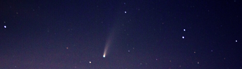
My colleague and I were oohing and ahing over the videos of a meteor crashing to Earth in the Chelyabinsk region of the Russian Urals last Friday.  We are told that this is a once in a century event; so certainly worthy of being the “iconic image of the week.”  People will likely still be watching it a hundred years from now..

It got me thinking of meteors and photographs of meteors and meteorites.  Of course, my first thought was a blog on “The first photograph of a meteor.”   I was able to learn that the first meteor photograph was taken on a glass plate negative by Ladislaus Weinek director of the Klementinum observatory in Prague on Nov. 27, 1885However, I was unable to find a copy of this image on the web.

Figure 1 - Tunkuska tree fall, 1908, from the Wikicommons and in the public domain.

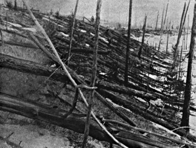
Figure 1 – Tunkuska tree fall, 1908, from the Wikicommons and in the public domain.

So I combed the cobwebs of my memory for thoughts and visions of meteors.  The first is obvious.  On June 30, 1908 near the  Podkamennaya Tunguska River in what is now Krasnoyarsk Krai, Russia there was a great meteor fall and blast generally referred to as the “Tunguska event.”  It is now believed that the meteoroid actually exploded in the air rather than striking the ground.  It probably had the force of a ten to fifteen megatons of TNT and  knocked down an estimated 80 million trees over an area covering 2,150 square kilometers (830 sq mi).  That is a circular diameter of 52km.  While there were no “robotic eyes” or surveillance cameras to photograph the event, there are many amazing post blast photographs of the tree fall made by subsequent expeditions.

Figure 2 - Robert Peary and tthe Ahnighito Meteorite, 1897, from the Wikicommons and in the public domain.

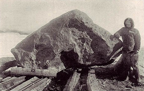
Figure 2 – Robert Peary and tthe Ahnighito Meteorite, 1897, from the Wikicommons and in the public domain.

My strongest memory association with meteorites is as a child being taken by my father to see the great meteorite collection at the Hayden Planetarium in New York City.  In 1818, British arctic explorer Sir John Ross was astonished to find that a tribe of Eskimos along Greenland’s western coast possessed spear heads of iron.  The Eskimos smartly refused to reveal the source saying only that they came from a mountain of iron, in their language saviksoah.  A number of subsequent explorers tried, but failed to find the saviksoah.

By the the turn of the twentieth century Eskimos were actively trading for iron and no longer had the same need for their magic source.  An Eskimo named Tallakoteah told explorer Robert Peary that there were three irons: “the woman,” “the dog,” and “the tent. The legend was that there once had been a sewing woman and her dog, who lived together in a tent in the sky.  An evil spirit hurled them to the Earth and they landed as great lumps of iron.  Tallakoteah led Peary to these stones and, true to imperialist form, he decided to cart them away to New York. This was a Herculean task which ultimately took him several attempts and years.  As a child I remember looking with amazement at the tent, or Ahnighito, (also referred to as the Cape York meteorite) where Peary brought it for permanent exhibit at the Hayden Planetarium at the American Museum of Natural History in New York City.

There are many classic images of Peary collecting this colossal stone in Greenland, transporting it to New York, and then carting it up from the peer to the American Museum.  Figure 2 is a example of these images.  For a complete telling of the saga of meteorite collection and Peary’s efforts see Douglas Preston’s book, “Dinosaurs in the Attic.”

The blizzard of 2013 – Part 2 Old Burial Ground Sudbury, Massachusetts

Figure 1 - The Old Burial Ground, Sudbury, MA (c) DEWolf 2013

Figure 1 – The Old Burial Ground, Sudbury, MA (c) DEWolf 2013

Sudbury, Massachusetts is one of the great historic Revolutionary War villages in Middlesex County, Massachusetts.  It’s Town Center is marked by the Old Burial Ground and the Congregational and Unitarian Churches.  The blizzard of 2013 dropped over two feet of snow in Sudbury and left the historic town center “picture perfect.

On the 19th of April in 1775 the church bells rang to summon the Sudbury Minutemen to march to neighboring Concord, Massachusetts to defend the gunpowder stores.  This commemorated evry year on the anniversary, when the church bells still ring out to summon the Sudbury Minutemen reenactors.   It is an eight mile march to Concord and on that day in 1775 Sudbury’s militia arrived too late for the initial engagement with British troops on the Old North Bridge.

Figure 2 - Grave markers in the snow, Old Burial Ground, Sudbury, MA (c) DEWolf 2013

Figure 2 – Grave markers in the snow, Old Burial Ground, Sudbury, MA
(c) DEWolf 2013

The old graveyards of New England seem to accentuate our connection with the past.  They remind us of the building of America and our obligation to the ideals of these early Americans.  The denizens of Sudbury’s Old Burial Ground are mostly from the eighteenth and early nineteenth centuries.  Across Concord road from the Old Burial Ground is a newer cemetery and the side of the road is marked by crypts containing the remains of prominent Sudbury citizens of the nineteenth century.  A second nineteenth century graveyard is to be found about a mile South of the town center.

GraveMarkerinSnowSm

Figure 3 – Gravemarker in the Snow, Old Burial Ground, Sudbury, MA (c) DEWolf 2013

A problem in the early days, and up until the nineteenth century, was that the ground became too hard in winter for burials.  The deceased were stored in undertakers’ sheds until spring when the ground softened. In many Massachusetts towns, such as Concord, here The  Burial Ground overlooks Monument Street, may be found built on glacial drumlins because this was the ground first caught the sun and melted first in spring.  Such drumlins are a key geological feature of eastern Massachusetts, Sudbury has recently moved the old undertaker’s storage shed to the burial ground and restored it.

Figure 4 - Undertaker's Shed, Old Burial Ground, Sudbury, MA (c) DEWolf 2013

Figure 4 – Undertaker’s Shed, Old Burial Ground, Sudbury, MA (c) DEWolf 2013

Next to Sudbury’s Old Burial Ground may be found the stonework town pound, where escaped domestic animals were placed until they could be reclaimed by their owners.  The town has rebuilt the gate to this pen, and its authentic coloration provided a marvelous contrast to the stark, pristine whiteness of the snow.

Figure 5 - The gate to the Old Town Pound, Sudbury, Massachusetts, (c) DEWolf 2013.

Figure 5 – The gate to the Old Town Pound, Sudbury, Massachusetts, (c) DEWolf 2013.

When one thinks of New England one thinks of snow.  So there was something right about the blizzard of 2013 in the way that it set off the countryside.  Still there was something quite reassuring to retreating from the cold to a warm cup of coffee.


The blizzard of 2013 – Part 1 Geometrics

Figure 1 - Slats and Snow, 2013 (c) DEWolf

Figure 1 – Slats and Snow, 2013 (c) DEWolf

The great blizzard of 2013 is fading into memory now.  Within 48 hrs the pristine snow, in Boston at least, had acquired that yucky, sloppy, urban blackness.  Fortunately, I got out early on the first two days and did some photography.  Hopefully, you will find some of it interesting.

Snow is curious and nontrivial to photograph.  I still have a lot to learn and have yet to truly achieve tone on tone.  Rather I wind up defaulting to high contrast in the image, that is letting it range from black to white.  I experimented with plus and minus on the exposure.  In general you wind up with double peaked histograms.  If you photograph the snow alone the dynamic range is tight and the images can become very high contrasty and abstract, if you equalize the histogram.

Today I’d like to focus on what I call geometrics.  The first (Figure 1) is an image of hand-railing slats projecting deep shadows on a pristine alabaster and flat snow bed, whicj is the deck of a front porch.  You tend to think of snow as cold, which would suggest blue/green toning as preferred, but here I chose a deep sepia tone and like the effect.

Figure 2 - Windblown peak on a field of snow, 2013 (c) DEWolf

Figure 2 – Windblown peaks on a field of snow, 2013 (c) DEWolf

The second (Figure 2) is an image of wind blown peaks on a field of snow.  Strong wind defines a blizzard and the effects can be abstract and very pleasing.  I’m really drawn to this kind of subject matter – nature’s abstractions.  Here a subtle and colder blue/green toning seemed best.

Figure 3 - Windblown ripples in the snow, 2013 (c) DEWolf

Figure 3 – Windblown ripples in the snow, 2013 (c) DEWolf

Another, wind effect are the beautiful undulating waves seen in Figure 3.  Again a cold blue/green tone seemed most appropriate.  The image required a lot of cropping.  The effect seems to me very abstract and mysterious.  Snow would not be what first comes to my mind if asked what I am looking at.  It might as easily be sand or even the surface of a quart of iced cream.

A serious case of Ansel Adams envy

Our discussion of large format analogue photography vs. digital photography had led me to muse about the clinical pathology that may be referred to as “Ansel Adams envy.”  All photographers suffer from this to some extent.  And I suspect that this includes practitioners of large format photography.

When I first encountered the photographs of Adams, I was amazed, envied, their wonderful sharpness – the fineness of the detail.  This, of course, was the unobtainable ideal, unless I was prepared to purchase and lug an 8″ x 10″ or larger view camera around the Sierras.  The Sierras part is required and, as I was a New Yorker then and didn’t drive, seriously outside my reach.  What to do about that?

Well the answer is not much.  The sharpness of film is on the order of 50 to 10 lp/mm and the best lenses 100 to 200 lp/mm.  But an 8″ x 10″ contact print is going to be five or six times sharper than an enlargement from a 35 mm camera.  It’s simple physics and geometry.

Then I started to realize that while sharpness was one factor, the other was dynamic range as well as the artistry that Adams used as a master print maker.  So I studied all of Adams’ books on photography, learning as much as I could about the zone system  The problem then was two fold.  First, 35 mm photography does not easily lend itself to the kind of one off negative development that the zone system requires.  Second, it was all very costly.  Photographic chemicals and paper were quite expensive and the arduous, albeit quite worthwhile, experimenting that is required of fine analogue printing burned through a lot of photographic paper and chemicals.  Some of my best work in this analogue world still hang on my walls, and I continue to love them.

Being environmentally aware, and who isn’t who secretively believes that he should be wandering around the Sierra’s in quest of natures beauty, I was starting to get concerned about the ill effects of my darkroom materials.  I was toning with selenium, leaving me with both that and nasty silver waste to deal with and I was using massive amounts of water to achieve the ideal “archival quality.”

It is in this regard that digital photography has been liberating for me.  Using raw 14 to 16 bit file format and good metering the zone system can be applied frame by frame.   ISO can also be changed frame by frame.  You can even switch between color and black and white frame by frame.  You start off with a linear look up table and then can mimic the response of any film, real or imagined that you like.  You can dodge and burn at a level of detail that would be maddening in analogue photography.

So I am free at last to be Ansel Adams.  One problem remains.  Only Ansel Adams was Ansel Adams and he was a photographic genius!


All forms of photography are equal

I am an avid reader of “View Camera, The Journal of Large Format Photography.”  Practitioners of this form of photography are the keepers of many of the wonderful time-tested forms – from wet colloidon to large format Polaroid –  of the art that might otherwise be lost.  Indeed, they keep these forms new and vibrant, since their goal is not merely to copy but to create.  I was despaired, however, to read in one article recently, the comment that digital printing was merely poster printing, not truly a photographic process.  That is not true and misses a very fundamental point.

I used to believe that if you painted squares or lines and dots on a canvas, but couldn’t paint like Rembrandt, if required to do so, then you weren’t really an artist.  Somehow I believed that being an artist required achieving technical prowess beyond that required for your own art.  It seems silly now and rather convoluted.  It is not true and misses a very fundamental point.

Art is vision and the ability to express that vision.  It encompasses everything from a detail fifteenth century tempura or fresco that might have taken years to complete to minimalist art – a string glued to paper or a paint-laden sponged dabbed selectively on a white board.  You can like it or not, but it expresses vision and is art.

And the marvel in all of this is the individuality of vision.  I have a coworker who showed me marvelous pastel photographs that she had taken in Greece.  They were wonderful, and I remember thinking that if I had been standing right beside her and taken the same pictures they would look completely different.  It’s all about vision.  And it’s all art.

Modern digital cameras, even cell phone cameras, have become progressively easier to use.  They have made the technical part easy and allowed us to concentrate on vision.  Or said differently, they have opened up for us previously unheard of technical capability.   One may argue that the endless droning litany of drunken partiers posted on Facebook, represents a new low in photography.  But I would argue that the real mediocritization of photography came with a vengeance with the introduction of the Kodak Brownie.  Dull meaningless black and whites, or was it gray and grays, and colors automatically set by processing machines to muddy indifference.   They have given more artists a voice.

Let’s embrace photography in all of its forms from the most ancient to the most modern.  They all contribute an important vision or voice to the diversity of the art.


The number of photographs ever taken

I found myself wondering recently how many photographs have ever been taken.  I recognize that this is a little weird.  However, it is what geeks do.  I knew that there would be an answer on the web, that someone besides me had wondered about it before.  So with a little searching I found that everything that I could find written about the subject dates back to a 2011 blog posting by 1000memories.com,  which estimated the number in 2011 to be about 3.4 trillion (3.5 x 10 ^12 for us geeks).  I’ve come up with a slightly different number, but close enough for government work and it’s interesting in that it really demonstrates Kurweil’s concept of the “Singularity.”  The Singularity is the view that technology is growing so rapidly that it’s becoming essentially infinite and  going off the scale.  So let’s have some fun and look at this.

To begin with 100memories.com uses as the number of cameras in the world an estimate by media expert Tomi Ahonen at 2.2 billion in 2011.  In 2012 Ahonen revised this estimate to be 4.2 billion cell-phone base cameras and about a quarter of that, say 1.0 billion non cell-phone based cameras.  So let’s take this number to be a total of 5.2 billion cameras.  The next thing that we have to ask is how many pictures are taken each year per camera.  1000memories.com estimated this in 2011 to be 150 photographs per camera.  As I’ll show you in a bit there is reason to believe that the rate of growth is on the order of 16% a year; so lets go with 175.  So we have something like 910 billion photographs being taken each year at the start of 2013.  Wow!

Alright, so where do we go from here?  So let’s remember that the first photograph was taken by Joseph Nicéphore Niépce in 1827.  That’s 186 years ago.

Figure 1 - The growth of photography 1827-2013

Figure 1 – The growth of photography 1827-2013

The problem is a lot like compound interest.  Suppose that your great-great grandfather had gone into a bank in 1827 and offered to deposit a dollar with the proviso that the money would not be taken out of the account until January 1, 2013 but that he wanted 16% interest.  How much would you have today?  Yes, you guessed it $910 billion. The growth is shown in Figure 1, years 1827 to 2013.  I’ve taken it back to photographs per year.

The Figure doesn’t show the early years very well.  I’d have to expand the scale or make it logarithmic.  But notice how it explodes as we get close to 2013.  That explosion in math is known as a singularity.  Hence “The Singularity.”  Kurzweil generally places the singularity at around 2025, for various reasons.  All sorts of technologies follow this pattern towards blinding almost  inconceivable growth.  Take our calculation out to 2025 and we’ll be talking 5.4 trillion photographs per year!

Getting back to our original question of how many photographs have ever been taken, to calculate this you need to add up the number for each year since 1827.  That is you have to calculate the area under the curve in Figure 1.  This number is 6.62 trillion.* Pretty impressive!


*Last year Facebook estimated that people were uploading 250 million photographs a day.  This is about 91 billion photographs a year or about 10 % of the photographs taken in the world last year.  Facebook current has 220 billion images stored.  That’s 3.5 % of all the pictures ever taken.


Subtractive color films

Today I want to talk about subtractive color films.  Take a deep breath.  For those who want the details I am going to get a bit technical.  Two good sites, consulted here, where you can find additional information are the Wikipedia site on Kodachrome and an excellent site from the Physics Department at the University of Colorado.

I think that after our discussion of Technicolor you can see the appeal of a film where everything is built in – no registration, no bonding, no fuss.  So basically we are talking about a film with three emulsion layers each dyed with one of the primary colors.

HSV-color-Circle

Figure 1 – The RYB or HSV color circle showing color complements. From the Wikicommons by Jacoblus under creative commons license.

Let’s begin with something that I haven’t yet shown you, namely a color wheel.  So-called color spaces are very complicated.  In addition to the mix of the colors you need to worry about hue, saturation, and lightness.  If you work with Adobe Photoshop, you will be familiar with this.  But let’s leave these issues for another day and consider Figure 1, which shows the simple color wheel that describes the Red, Yellow, Blue color system.  The point here is that the complement of yellow is blue, of red is aqua (aka cyan), and of (lime) green is magenta, etc.  Each of these colors will remove its complement, when light is passed through or reflected off it.  So to get yellow remove blue and vice versa.OK so again, in a subtractive film like Kodachrome we have three layers of emulsion one for each of the primary colors.  Each emulsion layer consists of a silver halide with a chemical called a “coupler.”  The coupler will undergo a reaction during the development and form a dye wherever there is free silver. Coupler can be added either during manufacture (eg. Ektachrome, where little oil droplets in the emulsion contained the coupler) or during development (eg. Kodachrome).  The first is called a substantive film and the latter is called a non-substantive film – because the coupler is or is not a substantive part of the emulsion.  Non-substantive films tend to be sharper, or finer grained, because the emulsion is thinner

Needless-to-say development was complicated, and as I’ve said before required very precise temperature control.  For Kodachrome this was out of the reach of amateurs.  Ektachrome could be developed at home by the brave of heart.

Obviously, there’s a lot more to it and the Devil is in the details.  For instance, silver halides are intrinsically blue sensitive.  By chemical modification red or yellow sensitivity could be added.  However, these red and yellow sensitive layers were still blue sensitive.  So to complicate matters the blue layer was placed on top of the stack and it was separated from the other layers with a blue absorbing that is a yellow filter layer.  However, the basic concept and fundamental point to remember is that of three separate emulsions each with a coupler that enabled them to be dyed for a particular set of complementary colors.

Kodachrome was introduced in 1935.  It served as a very fine and special color movie and still film.  There is a film clip circulating on the web and claiming to be a 1922 Kodachrome film test.  It is worth watching for its wonderful soft and beautiful color.  It was taken by Eastman Kodak as it tried to develop viable color processe.  However, the film was taken by an early Kodachrome process similar to the two color Technicolor process and not the commercial Kodachrome process ultimately released.

Richard III revealed

I am a great lover of Shakespeare.  So I was delighted last Monday to learn that University of Leicester archaeologists had announced definitive DNA evidence that a skeleton found under a parking lot several months ago was  that of the last Plantagenet King of England Richard III. This was a wonderful tour de force based on DNA analysis of the skeleton’s mitochrondial DNA with that of both Michael Ibsen and an anonymous individual, modern-day maternal descendents of Richard III. Richard IIII is, of course,  Mitochronial DNA is inherited solely from one’s mother and passed on unchanged through the maternal line

Richard III is Shakepeare’s great villain in a play by that name.  He was evil incarnate, according to Shakespeare.  Some revisionist thinkers however, question this and point out that the Tudor claim to the throne depended upon the legitimacy of the reign of King Henry VII, who defeated Richard at the Battle of Bosworth Field in 1485.  So it was, perhaps, a spin job.

But there I was studying a photograph of Richard’s skeleton, complete with scoliosis of the spine and lethal hole in his skull.  Who would ever expect to see such a photograph?  And if that wasn’t enough, on Tuesday I was greeted by a facial reconstruction, which truly brought the five hundred year old king to life.

These two photographs have returned us for a brief instance to the fifteenth century.  So, as I contemplated Richard’s face and the painful deformity of his back, the words of Shakespeare came back to me:

But I, that am not shaped for sportive tricks,
Nor made to court an amorous looking-glass;
I, that am rudely stamp’d, and want love’s majesty
To strut before a wanton ambling nymph;
I, that am curtail’d of this fair proportion,
Cheated of feature by dissembling nature,
Deformed, unfinish’d, sent before my time
Into this breathing world, scarce half made up,
And that so lamely and unfashionable
That dogs bark at me as I halt by them*;

 * to hear Sir Laurence Olivier perform (in 1955) this marvelous soliloquy click on this link.


.

Early color movies – and the story of Technicolor

Figure 1 - Lon Chaney, Sr. from The Phantom of the Opera, 1925. Image from the Wikicommons and in the public domain.

Figure 1 – Lon Chaney, Sr. from The Phantom of the Opera, 1925. Image from the Wikicommons and in the public domain.

Some time around 1925, my mother who was a young girl then, went with her friend Becky to the Loew’s Delancy in New York City to see Lon Chaney, Sr. (1883-1930), Mary Philbin (1902-1993), and Norman Kerry (1894-1956) in the silent film classic, “The Phantom of the Opera.”  They screamed so loudly that they were almost thrown out of the theater.  Watch the famous unmasking scene or even the entire movie and judge the terror for yourself.  It is, of course, pretty thin by modern standards.  Also take a look at Figure 1, a still shot from this movie, showing the horrific phantom.  So the question I have to ask is this the movie that terrified my mother and her friend?

But first, let’s talk about the history of color in movies.  In 2012 the National Media Museum in the UK announced an exciting discovery.  The first color film was created by british inventor Edward Raymond Turner in 1902.  Figure 2 is a still from the movie.  This film was made with a special camera that took three successive black and white images through a red, green, and blue filters and then projected them back through the same filters.  So fifty years after Maxwell’s tartan ribbon, we have the same technique applied to moving pictures.  It is plain and simple pure additive color.

Turner Still 1902

Figure 2 – A still from Edward R. Turner’s first color movie, 1902. From the British Media Museum and graciously in the public domain.

The first feature film taken and shown with an additive red green additive two color process called Kinemacolor was “A Visit to the Seaside,1908.”  Of course, the use of just two colors was a bit limiting.  In 1917 an additive technique that used four filters on a rotating filter wheel (red, yellow, green, and blue) was used to produce a film called “Our Navy.”

The dominant early color process was Technicolor.  And it is with Technicolor that the subjects gets complicated and interesting.  Technicolor came in three chronological stages.

Process 1 (1917) – the first Technicolor Process was additive and involved first taking the red an green images simultaneously onto sequential film frames using a beam splitter arrangement.  The projector had two projection lenses.  As anyone familiar with optics will recognize, this kind of projection will lead to a subtle parallax shift and the colors will not be in perfect registration.  To overcome this, a wedgeprism was added to enable registration of the two color planes.  There is an excellent photograph of one of these early Technicolor cameras and schematics of both the beam splitter camera system and the two lens projection system at the Wide Screen website.   The first film produced by this process was “The Gulf Between, 1917.”  Additive color was effective, but, as noted, required special cameras and projectors.  The process  also necessitated projection at double speed.

.

Phantomtechnicolor

Figure 3 – A still from the masqued ball scene from the Technicolor Process 2 film, “The Phantom of the Opera, 1925.” From Wikicommons and in the public domain.

Process 2 (1922) –  As a result, it soon became clear, necessity being the mother of invention, that subtractive color was the way to go.  This led to adoption of the second Technicolor process.  Again, as in Technicolor Process 1, images were taken red and green simultaneously on film.  The red and green sets were then photographed onto two separate strips and dyed in the complementary color.  They were then cemented together.  The first film produced by this method was “The Toll of the Sea, 1922.”  “Phantom of the Opera was made by the Technicolor Process 2 in 1925.  Wait a minute!  Phantom of the Opera was a color movie.  Yes indeed it was.  Only a small segment of this remains of the masqued ball scene (see Figure 3) .  So why is it now only seen in black and white?  We’ll get to that part of the story later.

Some of you are old enough to remember films melting from the heat of the projector, or even worse, for nitrocellulose based films, exploding or bursting into flames.  Projector heat was a real problem for films produced by the Technicolor 2 process.  They warped and buckled and the two layers would separate.

Process 3 (1928) – To overcome this heat problem the third Technicolor process was developed.  Once again red and green planes were recorded simultaneously but sequentially on the film.  However, in the developing laboratory the reds were copied to one strip of film and the greens to another, just like in the Technicolor 2.  However, the film contained a special gelatin.  The gelatin required exposure to UV light to copy the films.  The UV hardened the emulsions.  Unhardened emulsion, that is unexposed emulsion, was removed chemically.  This is very reminiscent of Nicéphore Niépce’s (1765 – 1833) method of creating the world’s first photograph, which we have discussed previously.  The emulsions were then dyed with complementary colors and chemically transferred to a “blank” strip of film.  A so-called “mordant” was then applied to prevent further migration of the emulsion.  The first film produced by the Technicolor 3 process was “The Viking, 1928” (video of the entire film).”  This was also the first feature-length Technicolor film to also feature a soundtrack.

Wikipedia has a list of early color movies and the processes used to make them.  The list covers the period from 1903 to 1935.  Take a look at this list.  It is astounding how many there were and how strong audience demand for the latest technology must have been.  We have Autochromes and Three Color stills.  We have brilliant and magnificent color movies by a variety of additive and subtractive processes, most dominantly Technicolor.  These all are a tribute to the inventiveness and color of the age.   I for one can never think of this period as being a black and white one.

OK.  So why do most of these films now exist only in black and white?  First, of all in the 1940’s the company Technicolor destroyed many film originals, when they were unclaimed by the studios during a space clearing act.  Most of those that survived were made into black and white for television copies in the 1950’s and the colored masters were subsequently destroyed.  So the real black and white era was not the 1900’s to 1920’s but the 1950’s to 1960’s – the era of black and white television.

For further reading on Technicolor see the Wikipedia and the Wide Screen website.  Both of these were consulted extensive in researching this blog.