Why can we see movies?

Zoetrope

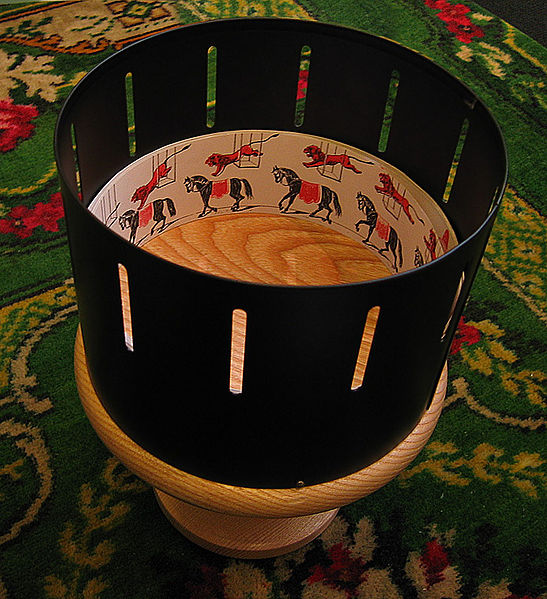
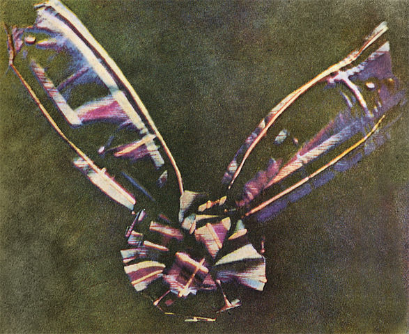
Figure 1 – a modern replica of a Victorian Zoetrope
Photograph © Andrew Dunn, 5 November 2004.
Website: http://www.andrewdunnphoto.com/ published under Creative Commons attribution license.

The question for today is: “why can we see movies,” or more accurately put: “why can we perceive movies?” You will often see this answered by the phrase “persistence of vision.”  Persistence of vision refers to the fact that an afterimage of what you see persists for approximately 1/25th of a second after you see it.  This is a purely physical answer akin to saying that every instrument has a measureable response time.  It’s been clear, however, for a century, from neurophysiological and neuropsychological studies that persistence of vision is not the cause of motion perception.  The bottom line, before we go any further is that the human eye, for many many reasons, some of which we have previously discussed, is not a camera. Perception of image and perception of motion are brain phenomena.

In a sense, this is really all that we need to know. But it is fun to explore this a bit further.  The perception of motion appears to be more closely related to what is called the “phi phenomenon” first defined in 1912 by Max Werthheimer (1880-1943), one of the founders of Gestalt psychology.

Figure 2 - The Lilac Chaser an example of the phi phenomenon.  From the Wikicommons and in the public domain.

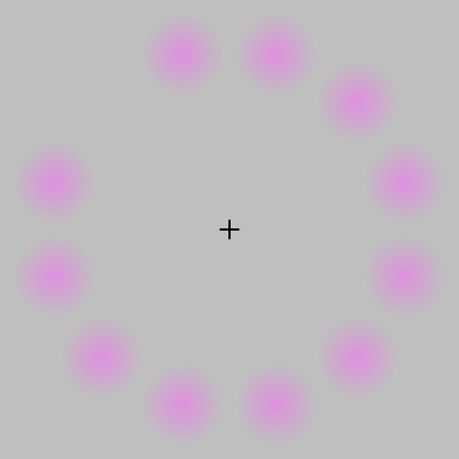
Figure 2 – The Lilac Chaser an example of the phi phenomenon. From the Wikicommons and in the public domain.

The phi phenomenon is often demonstrated to a viewer by projecting two images in succession. The first image might be a ball on the left hand side of the screen.  The second image may be a ball on the right hand side of the screen.  If you project the two images with sufficient time in between and hold the images for sufficient duration, the viewer sees first a ball on the left and then a ball on the right.  However, with certain times in between and certain durations of holding the images steady, the viewer perceives a sensation of motion of the ball between the two sides.The same is true of music.  If you play the notes too closely they will blur into a squeal.  If you play them too far apart, they become separate and disembodied from the music.  I mention this because the music that we launched into space on Voyager may or not be interpretable by some alien civilization that discovers it.  That will depend on the way that the alien’s brain operates.

Of course, a great example of this phenomen is that of the zoetrope (see Figure 1), where a rotating drum with a set of images, of for instance a horse running and a lion jumping,  is viewed through a slit.  Actually, the slits are also rotating.  The brain interprets the set of images as the horse running and the lion jumping.  This is, needless-to-say just like the successive frames in a movie.

A  cool example of the phi phenomenon is shown in Figure 2.  It is an optical illusion called the “lilac chaser” and really illustrates the dominance of brain function in image interpretation.  In the lilac chaser we observe twelve blurred lilac (aka magenta) disks forming a ring.  One of the disks is made to disappear for about 0.1 seconds, then the next about 0.125 seconds later, and so on in a clockwise direction.   Now the trick is to stare at the cross in the center, and you may want to click on the image so as to maximize its size..  Don’t cheat keep starring at the cross. When one stares at the cross for about 20 seconds or so, one sees successively three different phenomena.  First, a gap appears to run around the ring of magenta disks.  This is the so-called beta movement.  Second, the gap becomes replaced with a green disk.  This is  an adaptation of the rods and cones of the retina.  The brain is working and interpreting.  There is no green disk.  Finally, again the brain interpreting, the magenta disks disappear and you have a green disk running around against the grey background.

So the bottom line, or lines, is that:

  • the eye is not a camera but part of the eye-brain system
  • once the between image timing and the duration of images become fast enough the brain no longer interprets the images as separate
  • because of the phi phenomenon there is a sweet spot of image duration and between image timing that the brain will interpret as motion

It is the second of these points that, we will next consider as a further mode of creating additive color from multipile images.  And, as I promised yesterday our view of the early twentieth century will no longer be one of subdued black and white, but rather of vivid Technicolor.  That will be discussed in tomorrow’s blog.


The Blizzard of 2013

WatchinSnowflakes

Blizzard of 2013 – Watchin’ the snowflakes
(c) DEWolf 2013

As you may have heard, the Boston area has been hit by an official blizzard.  We’ve had 24 inches of snow and it is continuing to pile up.  Driving is banned throughout the state and Boston’s MBTA, made famous by “Will he Ever Return, Charlie,” is shut down.  Basically there’s nothing to do but watch the snowflakes – which for some is very exciting!

Methods of additive color photography

Edward_Steichen-Three Color Experiment

Figure 1 – Edward Steichen, “Experiment in Three Color Photography, 1906<” originally published in Camera Work #15, 1906, from the Wikicommons and in the public domain.

We began our exploration of early color photography from a discussion of Edward Steichen’s (1879-1973) “false color” image of the Flat Iron building in NYC.  So it is fitting to include Figure 1 an image from Camera Work # 15, 1906, which shows an early experiment by Edward Steichen in color photography by the three-color method.  I just cannot resist also including two more of Prodkudin-Gorsky’s three color images from the Library of Congress.  These are “Peasant Girls, 1909” and “Nilova Monastery, 1910.”

Prokudin-Gorsky's "Peasant Girls, 1909," from the Library of Congress and in the public domain.

Prokudin-Gorsky’s “Peasant Girls, 1909,” from the Library of Congress and in the public domain.

It is surprising to discover that with these additive methods coupled with photo-lithographic techniques not only was color photography possible in the first decade of the twentieth century, but it was magnificent.  Both the Autochrome and the three color techniques were appealing in that they did not require any more, from a chemical standpoint, than standard silver halide development.  This meant that any amateur could develop them.

Figure 3 - Prokudin-Gorsky, Nilova Monastery, 1910," from the Library of Congress and in the public domain.

Figure 3 – Prokudin-Gorsky, Nilova Monastery, 1910,” from the Library of Congress and in the public domain.

Such was not the case with ultimate subtractive processes such as: Kodachrome, Kodacolor, and Ektachrome.  These required not only a complex slew of nasty chemicals to develop, not to mention complex tweaking of color filters on your enlarger, but also very precise temperature control.  This made these processes largely inaccessible to most home darkrooms.

Autochrome and three-color are interesting variants in methodology.  They both involve geometric separation of the different primaries.  In the Autochrome process this is microscope and local, much like the modern computer LED or LCD monitor.  In three-color three separate images are projected separately into registration.

You can see the fundamental problem with this additive color approach, at least to analogue photography.  Both methods are awkward and require special equipment and methods to visualize.  They were stunning, but inventors, at the time, soon realized that subtractive color was the way to go.

However, before we go on to discuss subtractive color, we need to realize that there is one more approach to additive color that we have not considered.  We’ve spoken about local separation and projection (Autochrome) and global separation and projection (Three-color).  But we have yet to consider the very significant method of temporal separation, the rapid project of serial images.  However, first we need to consider the phenomenon of visual persistence, or what it really is.  We need to consider why we can see movies.  And by the time we are done with that, we will have to abandon our misconception that the first two decades of the twentieth century were black and white.  In the immortal words of Jacques Brel

“It was the time when Brussels could sing 
It was the time of the silent movies 
It was the time when Brussels was king 
It was the time when Brussels brustled 
Pick out a hat so dashing and gay 
Go take a walk, it’s a beautiful day 
Put on your spats and your high-buttoned shoes 
Get on the tram, get the gossip and news”

Updates and Changes to Hati and Skoll Gallery Website

Over the last week I have been updating the Hati and Skoll website for 2013.  You will find many new photographs in the galleries.  I have also added a New Gallery of photographs taken with my IPhone.

I’d also like to take a moment and thank all of you for your continued interest in the gallery, the blog, and photography.  Readership is growing rapidly via subscription, Facebook, RSS feed and people who just regularly stop by.  I love everyone’s comments and value your thoughts; so please keep commenting.

I hope that you enjoy the new pictures and continue to read and like the blog.

David

Sergey Mikhaylovich Prokudin-Gorsky and the Zenith of Three Color Photography

Alim-Kahn

Figure 1 – Color composite of Alim Khan, the emir of Bukhara, 1911 taken by  Prokudin-Gorsky.  The individual images taken through red, green, and blue filters are shown in the side triad.  This example is unretouched, from the wikicommons, and in the public domain.

Yesterday we  discussed the role played by James Clerk Maxwell in the invention of additive three color photography.  The first example produced by Thomas Sutton in 1861 of a tartan ribbon left much to be desired and, in a sense, left tangibility to the imagination.  As mentioned, this work lay largely dormant for three decades.  It was resurrected and taken to wonderful and beautiful heights by the Russian photographer Sergey Mikhaylovich Prokudin-Gorsky (1863-1944).

L_N_Tolstoy_Prokudin-Gorsky

Figure 2 – Count Leon Tolstoy,  1908,three color image by Prokudin-Gorsky from Wikimedia andin the public domain.

From 1909-1915 Produkudin-Gorsky set out, as photographer to the Tsar, to document the Russian Empire through photography, using the three color method.  This work has been brought back to life through digital scanning of the 1,902 original colr images  by the Library of Congress.  As exemplified  by Figure 1, which shows the Emir of Bukhara, Alim Khan these images are simply stunning.  The side panel illustrates the three color positives taken with red, blur, and green filters and then reconstructed by additive  projection to create the composite color image. Note again how the three color planes can be distibnguished at the borders.

Figure 1 is a simple addition of the color planes.  The Library of Congress contracted with digital imaging specialist, Blaise Agüera y Arcas, to scan and digitally render these images.  It is truly worth some time to explore the website at the Library of Congress dedicated to exhibiting these images – or should I say e-exhibiting?

The most famous of Produkin-Gorsky’s work today is his portrait of Count Lev NikolayevichTolstoy (1828-1910) taken in 1908.   While producing actual color photographic prints at the time was challenging, Produdin-Gorsky’s studio did use photomechanical –  photoengravature methods to reproduce his color images.  Most famous of these was this image of Tolstoy issued both as post cards and prints.

Photographic Firsts # 7 – the first color photograph

Figure 1 - The world's first color image, a picture of a tartan ribbon, produced by the three color method by Thomas Sutton for Sir James Clerk Maxwell

Figure 1 – The world’s first color image, a picture of a tartan ribbon, produced by the three color method by Thomas Sutton for Sir James Clerk Maxwell (from Wikimedia and in the public domain)

As described in yesterday’s blog, additive color theory says that one can create any color by mixing the primaries from three projectors.  This fact was described by the great Victorian physicist, James Clerk Maxwell.  The critical point made by Maxwell was that the cells of the retina did not perceive color, rather color perception involved the relative stimulation of the red, green, and blue cone cells.  He predicted that  if three transparent (what we now call slides) black and white photographs of the same scene were taken through red, green and blue filters, and then projected in register onto a screen all of the colors of the original scene would be reproduced.

In 1861 such  a set of images, referred to as color separations, were taken by Thomas Sutton, who used them to illustrate a lecture by Maxwell on color.  The image was of a tartan ribbon and is shown in Figure 1, the worlds first color photograph. Maxwell commented on the inadequacy of the result, pointing out the need  for a photographic material more sensitive to red and green light.

Today photographic historians are puzzled by this image because the emulsion used by Sutton was insensitive to red light.  It is now believed that the red in the image actually results from ultraviolet sensitivity of the process.

Of course, these experiments soon faded into obscurity.  They were reinvented in the late nineteenth century.  We have already discussed the Lumiere brothers Autochrome invention – the first commercially practical color photography process

Additive and Subtractive Color

Color Receptors Human Eye

Figure 1 – The spectral response of the S, M, and L photoreceptors in the human eye, from Wikimedia and in the public domain

I’d like to discuss further the nature and development of color photography.  Always key to understanding color is the nature of the human eye.  Figure 1 is one that we have have seen before.  It shows the response of the human eye to color.  The human eye has three types of color receptors, S, M, and L cone types, each with its own spectral sensitivity.  Color vision, in its essence, comes from the relative excitation of the these three types of photoreceptor cells.

AdditiveColor.svg

Figure 2 – Additive color primaries from Wikimedia Commons and in the public domain

There are two ways to create color: additive and subtractive.  Additive color starts with black and builds up from there with pure primaries, usually red, green, and blue.  Take a look at Figure 2.   You might imagine, for instance, that the image of Figure 2 was created with three slide projectors, projecting a red, a green, and a blue circle respectively.  Where they all mix equally you get white.  Essentially, any color can be achieved by varying the proportions of these three primary colors.

Subtractive Color System

Figure 3 -Subtractive color primaries, from Wikicommons and in the public domain

Alternatively, see Figure 3, you can start with white and progressively subtract colors.  This is what happens when you mix paints.  Blue paint absorbs all colors except blue, which it reflects back at you.  Yellow paint reflects yellow light.  When the two colors are mixed you get green – as we all learned in kindergarten.  The usual primaries for subtractive color are yellow, magenta, and cyan.  You can think of the circles in Figure 3 as being filters of each of these three colors.  Where they all overlap, you get black, and every color in between black and white can be achieved by some mixture of the three.

DuHaurron1877

Figure 4 – Early subtractive color process by DuHaurron 1877, from Wikicommons and in the public domain

In future blogs I’m going to talk about various color processes.  Indeed, we have already spoken about the additive Autochrome process and looked at some examples.  So for fun, consider Figure 4 a photograph taken by Louis Arthur Ducos du Hauron (1837-1920) and created by the helichrome multilayer dichromated pigment process.  This is an early subtractive color process and if you examine the edges of the image you can quite clearly see the different pigment layers.


David gets on his high horse about the fashion photography

As promised, today I want to discuss the darker side of fashion photography.  And also as promised, I’m going to get up on my high horse.

The fashion industry, and by default much of fashion photography, is selling sex.  Ok, there’s nothing wrong with sex.  Often this kind of fashion photography is designed to provoke.  We are bombarded with women’s breasts, women’s falsies, men in women’s dresses, and both men and women’s genitalia.  This world is a crotch fest.

Ok, at most levels even that doesn’t bother me, and it is certainly an improvement over the fashion magazines of the seventies and eighties when there were invariably women about to be dismembered by doberman pinschers.  I’m not quite sure what they were selling then – certainly not the much maligned doberman.  Now we only have Tom Brady being attacked by a doberman or wearing its collar.

There is taste and there is bad taste.  Yes, it’s a relative thing, and yes I’m even ready to forgive bad taste. I’m ready to accept the fact that bad taste can sell and that’s ultimately and unfortunately what it’s all about.

But the relativity and commerciality doesn’t alter the fact that you know when the limit’s been crossed.  It’s been crossed when things get degrading and therein lies the fundamental problem.

I’m a child of the sixties and the seventies.  Those were very turbulent times, and in the safety of retrospection, exciting times.  A great off-shoot of those times was the women’s movement.  We’ve seen women make great strides since then, and we’ve watched them take it all for granted and slip perilously backwards in the intervening years.

Frankly, there is nothing more beautiful than a beautiful woman in beautiful clothes.  But the darker side of that industry, and the photographs that promote Darth Vader’s view, objectivize and exploit women.  Worse many of the women involved are really young girls, essentially children.  And young girls seek to emulate this view of themselves, thus perpetuating the worst of this mindset.

It is perhaps the ultimate irony to see a young business woman in the airport studiously reading one of the glamor and fashion magazines.  In so doing she has become complicit  in the world that she claims to hate.  That, one man’s opinion, is what troubles me about this darker side of photography.


Mario Testino – In your face

I guess that I need to begin today’s blog with an apology.  A week ago I visited the Museum of Fine Arts in Boston to see the exhibit of fashion photographer Mario Testino.  Actually, this was two exhibits “British Royal Photographs,” and “In Your Face,” which highlights his work for fashion magazines.  My apology is that these splendid exhibits of this Boston born photographer are scheduled to close today.

These exhibits are the handiwork of museum curator Malcom Rogers.  Rogers has swollen the ranks of museum visitors by expanding audience appeal with such exhibits as “Speed Style and Beauty“, which exhibited vintage cars from the Ralph Lauren collection and “Fashion Show: Paris Collection 2006“.  What these exhibits do is legitimize what we already viscerally recognize as art.

As for Testino, there can be no question, that this is art and that this artist is a master.  The art-form is the heavily staged world of the fashion shoot.  The artist is assisted by a large crew of aids and assistants.  The set and the image are finely constructed.

Perhaps the best way to say this is to explore some of my favorite images from the collection. First and foremost “Sienna Miller, American Vogue, 2007.” This is a photographer’s photograph.  Almost the entire scene is in a pale blueish white except the figure, who explodes from her dress in color.  The statues all reach outward creating a sense of motion, while the model bends forward just slightly in contrast.  Do I have to mention the rule of thirds organization?

Then we have “Gweneth Paltrow, Paris 2005.”  The trick of having your subject jump is famous.  A lot of portrait artists use it to take away inhibition.  The subject suddenly concentrates on the jump and reveals themselves.   Actually, one of the interesting observations I had as I walked about the exhibit was that among all the celebrities photographed Paltrow invariably seemed spontaneous and herself.

Next, I was amazed by “Aston Kutcher Gets Real, 2008” for the cover of VMan.  We find Kutcher in a white suit his hands clasped together.  But wait!  His right arm is not connected to his right hand, and his torn jacket reveals,  not sinew and muscle, but a mechanical mechanism.  This is simple, genius, and compelling!  Well, maybe not so simple to execute.

And then there’s this, simply beautiful black and white portrait of  “Emma Watson Wearing White Gloves, 2010,”  It is just wonderful and perfect.

Just think, I made it all the way through this blog without showing you Tom Brady with a growling doberman or anybody’s genitalia.  Mario Testino is a talented artist and has contributed some magnificent and iconic images to our culture.    There is however, a world of saprophytic mutual exploitation in fashion, which also comes out in this exhibit.  Indeed, Testino played a major role in designing the exhibit and one of his stated intents, or so the entry text to the exhibit states, was to provoke. So tomorrow I’d like to climb up on my highest horse and discuss  this darker side.