The Panama Canal Centenary

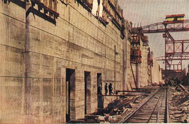
Figure 1 - The Pedro Miguel Locks of the Panama Canal photographed by Earle Harrison in color using the Autochrome Process.  From the Wikimedia Commons uploaded by Mschlindwein and in the public domain because its was photographed before 1923.

Figure 1 – The Pedro Miguel Locks of the Panama Canal photographed by Earle Harrison in color using the Autochrome Process. From the Wikimedia Commons uploaded by Mschlindwein and in the public domain because its was photographed before 1923.

In addition to the centenary of the start of the First World War, this August, August 15th to be precise, marked the opening of the Panama Canal, that great dream of a “Path Between the Seas.” I have been looking at a lot of photographs of the construction of the canal, including, of course, many pictures of that larger than life and somewhat controversial figure, President Theodore Roosevelt.

Most interesting among them are the color autochromes of Earle Harrison.  Figure 1 is an example of these and you might also what to check out the link above for some more dramatic examples. The whole collection of these images was recently reissued.

I have spoken at length about the autochrome process and will, in fact, admit to be really intrigued by it. The Autochrome process works as follows.  An adhesive layer was coated onto a glass plate. Potato starch grains graded to 5 to 10 um where attached to this layer.  The starch grains were dyed with either red orange, green, or blue violet dye (an unusual color wheel). Gaps between the grains were filled with lamp black (essentially soot).  This fragile layer was coated with a shellac and then overlain with a conventional silver halide gelatin emulsion.  Because of the high sensitivity of these emulsion to UV light from the sun, a yellow orange filter needed to be placed in front of the camera lens when taking a photograph to block-out these rays.

When a photograph was taken the colored potato starch grains acted as minute filters.  The silver halide emulsion was developed by conventional means and then reversed to a positive by what is effectively a bleaching process.  Since the colored starch matrix remains intact, when the positive image (say illuminated from behind) will become colored as light passes back through the filter matrix.

Like our own time, the early twentieth century was a period of huge technological advancement, posing a series of complex moral an ethical issues.  Indeed, it is all really an accelerating continuum.   And again like our own time, it was a period of great ethical hypocrisy.  World War I represented the worst that technology had to offer, highly efficient mechanized killing.  The Panama Canal represented the middle ground. There was the dream, powered by visions of huge profit, that drove men to build the canal, which was the ultimate Herculean project.  It took over thirty years to complete, and was a triumph (?) over nature both in terms of the actual digging and reinforcement and in terms of overcoming yellow fever.  The autochrome, I would argue, ever subtle, was the best.

Humans see in color, and as long as photography was confined to black and white there was something important missing. Color represents a significant dimension of reality.  Actually, as we have seen it really adds three dimensions.  And thanks to the Lumiere brothers we can look back and marvel, as if we were there for the events.  Shackleton set sail for his destiny in the Antarctic.  The Panama Canal opened. And Europe leaped head first into disaster.  All caught on camera.

A hideous cocoon

Hmm!  It was another hideous week, and there are lots of very dark thoughts.  I came upon an unattributed picture yesterday from Reuters on the BBC that pretty much sums it all up.  It shows two men intertwined and sleeping on a kind of disgusting bridge over a railroad station in Yangon (Rangoon) Myanmar.  They are covered in mosquito netting.  The disconcerting element for me, other than the desperateness of their lives, which is a little made up story in your mind, is the red floral pattern in the netting, which make the sheet look bloodied.

A year ago I posted about E. E. McCollum’s incredible “Cocoon Series.”  They are such gorgeous images, woven to tell a tale of rebirth, emergence, and resurrection.  In the Myanmar image we have the opposite effect where netting tells a tale of desperation, crucifixion, and death.  It is a very powerful image to my eye.

Of the Charleston Chew, the Charleston, and Josephine Baker

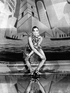
Figure 1 - Josephine Baker dancing the Charleston in 1926. From the Wikimediacommons and in the public domain because of expired copyright.

Figure 1 – Josephine Baker dancing the Charleston in 1926. From the Wikimediacommons and in the public domain because of expired copyright.

As a follow-up to yesterday’s post about “The Charleston Chew,” the question may be asked why a Boston manufactured candy would be named after Charleston, SC and not Charlestown, MA, where the USS Constitution resides.  Well the answer, perhaps obvious, is that the Charleston Chew is named after the the dance the Charleston, which was so popular at the time it was invented, if candies are invented, or introduced.

The Charleston was indeed. named for the beautiful city of Charleston, South Carolina. It was popularized by a 1923 tune called “The Charleston” by composer/pianist James P. Johnson from the Broadway show “Runnin’ Wild.” The rest, as they say, was history.  The dance electrified and defined the decade and its generation.

There is some wonderful vintage images to share regarding the Charleston.  The first is the photograph of Figure 1 showing the incomprable Josephine Baker dancing the Charleston at the Folies Bergère, Paris, in 1926.

Figure 2 - Josephine Baker in her world famous banana costume.  Photograph by Walery, French, 1863-1935, from the Wikimedia Commons (uploaded by http://www.sheldonconcerthall.org/bakerpress.asp) and in the public domain because of copyright expiration.

Figure 2 – Josephine Baker in her world famous banana costume. Photograph by Walery, French, 1863-1935, from the Wikimedia Commons (uploaded by http://www.sheldonconcerthall.org/bakerpress.asp) and in the public domain because of copyright expiration.

Wonderful image!  Baker, of course, was a the first African American superstar and a heroine of civil rights. After Martin Luther King’s assassination in 1968, Correta Scott King asked Baker to take on the role as symbolic leader of the movement. I am also including another picture of Miss Baker in her world famous “Banana Costume.” Carmen Miranda eat your heart out!  This is not directly related to the Charleston but is really cool just the same.

I want also to include a vintage video clip with the classic Charleston Music.  But before you click on it, be careful.  It is contagious and you may start dancing.  I offer it as a tribute and remembrance of my mother, who was of that generation, and could still in the late sixties and early seventies dance a mean Charleston without losing her breath.

The Charleston Chew

Figure 1 - Sign of the Kendall Confectionery Co, Cambridge, MA, August 19, 2014. (c) DE Wolf 2014.

Figure 1 – Sign of the Kendall Confectionery Co, Cambridge, MA, August 19, 2014. (c) DE Wolf 2014.

Charleston Chew, now there’s a name from my childhood, and it wasn’t my favorite by a long shot. NECCO wafers are a totally different story – little chalky disks, of well, of chalky flavor.  And what they both have in common is that they were manufactured in Cambridge, Massachusetts.

Cambridge has a long history of candy making going back to 1765 when John Hannon established America’s first chocolate mill on the banks of the Neponset River in Dorchester.  A half century ago candy makers stood tall, exactly where BioTechs now dominate.  Cambridge’s Main Street was sweetly referred to as Confectioner’s Row and the tooth decay of our youth was produced: Junior Mints (my grandfather Louis always had a little box of Junior Mints waiting for me when I visited), Charleston Chews, Sugar Daddies, and NECCO wafers.

So today my photographic goal was more one of archaeology and recording.  Near my office is the faded and chipped historic sign on the façade of the Kendall Confectionery Company, which still produces and distributes candies.  I noticed yesterday that there were painters doing something to the sign.  It doesn’t look ominous, actually, maybe just cleaning it. But just to be sure I took the image of Figure 1.  There is an antique flavor to the sign, accentuated by the fonts and the almost lost art of punctuation.  I might just challenge my pancreas with a Charleston Chew tomorrow.

The sacred and the profane

I was attracted this morning to an intriguing photograph by Arno Burgi for the EPA showing a workman in Dresden where the “Semper Gallery” is undergoing restoration.  The construction worker in hard hat enters a door that seems to lead him through a poster of Raphael’s (1463-1520) painting “The Sistine Madonna.”

Really wonderful, and the painting works on several levels.  First, there is the sense of incongruity, of “the sacred and the profane.”  But really it is more than that.  The

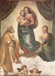
Figure 1 - Ra[hael's "Sistine Madonna," from the Wikimedia Commons, The Yorck Project: 10.000 Meisterwerke der Malerei. DVD-ROM, 2002. ISBN 3936122202. Distributed by DIRECTMEDIA Publishing GmbH.

Figure 1 – Raphael’s “Sistine Madonna,” from the Wikimedia Commons, uploaded by the  Yorck Project and distributed by DIRECTMEDIA Publishing GmbH and in the public domain because the painting is more than 100 yrs old..

man walks through a door.  It is symbolic of liminal passage, the entrance to the cathedral, the ascent from the profane to the sacred.  The man seems just a bit hesitant, the virgin just a bit worried (as has often been said of this work by Raphael), and finally you find yourself wondering exactly what is behind the door.  And never once do you, or, at least, do I think that the man is exiting rather than entering. Hmm!  That’s a lot.  That’s pretty subliminal.

If you know the painting you will recognize that there is a wonderful; element not shown in the poster or the photograph.  This is the two cherubs at the bottom of the painting.    It is said that they are looking up at the Virgin and child, and at Saint Sixtus and Saint Barbara, also not shown, or perhaps the cherubs are rolling their eyes at my over interpretation. One point ‘though, it has been said that Raphael’s painting is such a masterpiece that upon first seeing it the artist Antonio Da Correggio (1489-1534) was driven to tears and exclaimed, “And I also, I am a painter!”

Sausage and ‘rooms

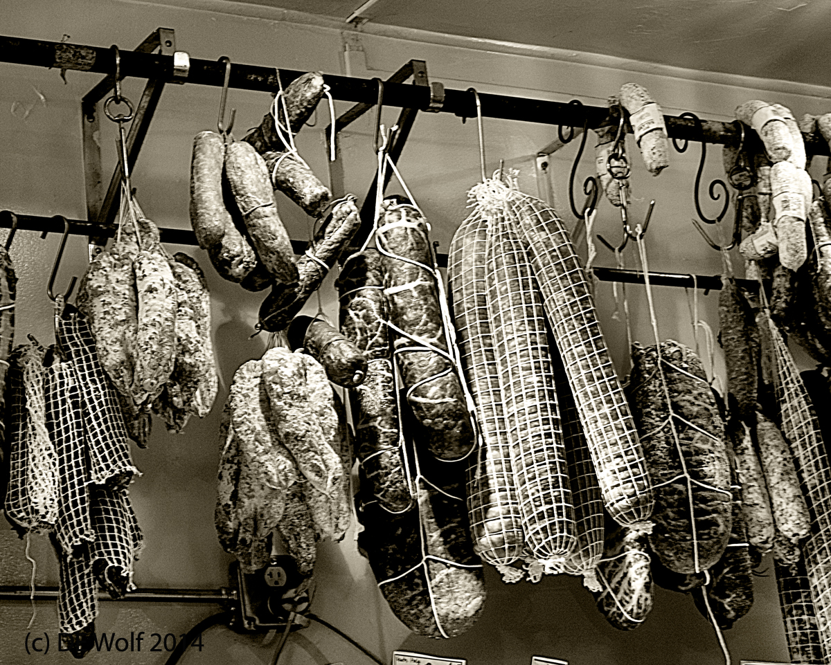
Figure 1 - Sausage at Formaggio Kitchen, Cambridge, MA. (c) DE Wolf 2014.

Figure 1 – Sausage at Formaggio Kitchen, Cambridge, MA. (c) DE Wolf 2014.

When I fail to get a photograph right, I take it as a failure of technique and a learning lesson.  But it sticks with me, sticks in my craw, if you wish. Last October I posted about a trip to the Brooklyn Farmers’ Market in the Grand Army Plaza, where I photographed hydrangeas. What I did not discuss at the time was my absolute failure to successfully photograph some delicious looking mushrooms at the market – dull, boring, fuzzy image.  My son cooked them up that evening for our dinner, and they were truly delicious.  It was a failure noted and to be rectified.

I mentioned my Saturday trip to Formaggio Kitchen in Huron Village.  Food is an art form at Formaggio.  If you can get by the very tempting fare served outside in the summer you enter the cheese and sausage room. I was attracted to the sausages that were hanging out to dry on the wall.  Unfortunately, for the most part my sausage eating days are over. Next to them were some pretty good looking prosciutto.  Memories of the Prosciutto Room at the North Beach Restaurant in San Francisco came flooding back.  Now that was an experience!  But I digress.  While ordering cheese a took a few pictures of the sausage (Figure 1), attracted by the spot lights that illuminated them.  It required a bit more sharpening than I like and wasn’t quite successful in that respect. But the room was dark, and I was hand holding.

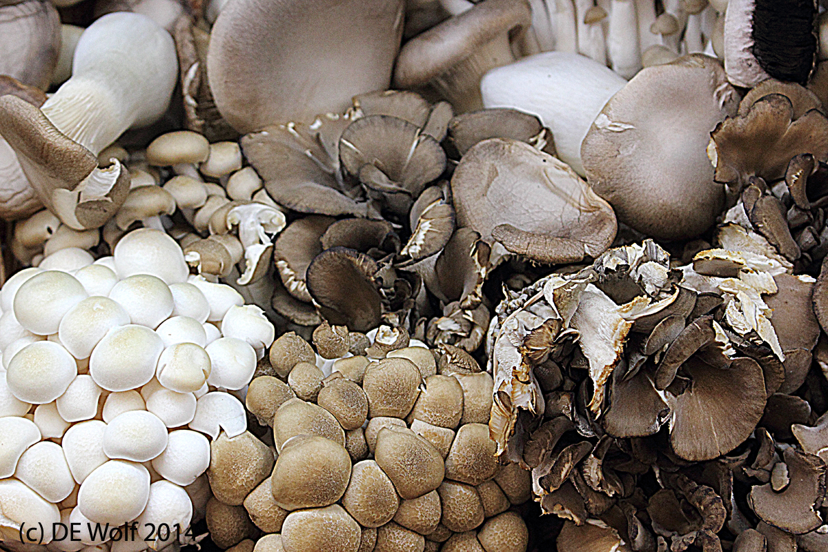
You leave the cheese room and enter the vegetable and fruits room, where as my wife shopped, I photographed.  You do not get strange looks.  They know that there food is beautiful!  I found the mushrooms of Figure 2, loved the earth tones, the variety of shapes, and the well, yes, the scrumptious appearance. Food photography, both amateur and profession, I believe, has one of two purposes: either to offer abstract geometry or to make you hungry.  So I count this photograph a success because it makes me hungry.

You finally, enter the flower section, which is a whole different photographic paradise.  Right now, I am dreaming once more of mushrooms sautéed in butter with just a bit of salt and pepper.  I truly hope that someone enjoyed that last night.

Figure 2 - Mushrooms at Formaggio Kitchen, Cambridge, MA. (c) DE Wolf 2014.

Figure 2 – Mushrooms at Formaggio Kitchen, Cambridge, MA. (c) DE Wolf 2014.

Figure 1 – Canon EF-S18-55mm f/3.5-5.6 IS STM Lens at 50 mm, IS, ISO 800, 1/15th sec. AE Aperture Priority Mode f/7.1, Exposure compensation 0.

Figure 2 – Canon EF-S18-55mm f/3.5-5.6 IS STM Lens at 52 mm, IS, ISO 800, 1/60th sec. AE Aperture Priority Mode f/7.1, Exposure compensation -1.

A little bit of California in Cambridge, Massachusetts

Huron Village, Cambridge, MA, Summer 2014. (c) DE Wolf 2014.

Huron Village, Cambridge, MA, Summer 2014. (c) DE Wolf 2014.

We have been basking in the glory of a beautiful New England summer and privately acknowledging that we deserve it after the cold and severe winter of 2013/2014.  Well, bad news people!  I heard on the news this morning that this mild summer with only four 90 + days, so far, is really only a continuation of last winter’s cold trend.  Thank you, Mr Weatherman.  Thank you for raining on my parade.

Still it has been spectacular, and so on a particularly mild, sunny, and gorgeous day my wife and I set out to explore a little bit of Belmont and Cambridge.  As if by magnetic attraction we ultimately found ourselves drawn to what is known as “Huron Village in Cambridge,” one of the “neat and desirable neighborhoods” and home to one of the best cheese shops in the state, “Formaggio Kitchen.” I know what I’m having for breakfast tomorrow morning.

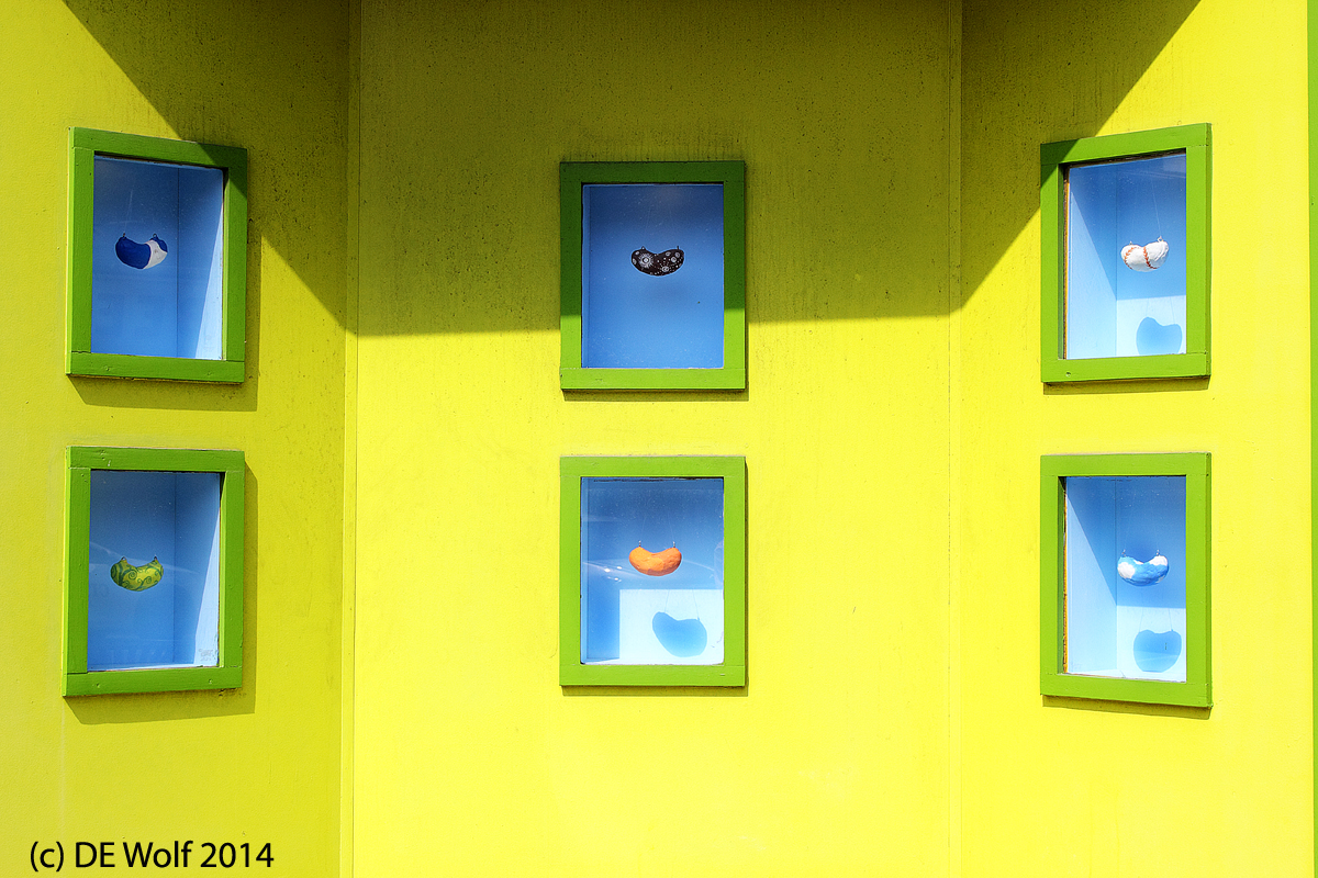
As I wandered around with my camera enjoying the soft sunshine, I came across the facade of the Magic Beans Toy Store, Figure 1 In these dog days of summer it did not seem so incongruous.  Neither did the beans hanging in the window boxes.  They could, indeed, be magic beans. But when snow is about, these vivid, even blinding, California (or are they Miami?), colors will seem transported in space from an alien world.

Stalking the green heron

Figure 1 - Green Heron at Black's Nook, Fresh Pond Reserve, Cambridge, MA. (c) DE Wolf 2014.

Figure 1 – Green Heron at Black’s Nook, Fresh Pond Reserve, Cambridge, MA. (c) DE Wolf 2014.

For the last couple of weeks, I have had my eyes on a group of green herons (Butorides virescens) that are summering at a place called Black’s Nook in Cambridge, MA’s Fresh Pond Reserve.  While smaller than the great blue heron (Ardea herodias ), the green heron is beautiful for its iridescent green and blue coloration.

So finally, on Friday I schlepped my big lens and monopod to Black’s Nook and sought out my avian friends.  While they are not totally fond of visitors, they tolerate them, and I was not disappointed.  I learned once more that I have a lot to learn about shooting at 400 mm (really 640 mm with the sensor factor).  Even with the monopod it is hard to hold the camera still enough to get the spot autofocus right.  I set the ISO at 1600 so that I could use a 1/200th sec exposure, that to hopefully stabilize things.  Indeed, if you compare Figure 1 shoot at 1/2000th sec and Figure 2 shot at 1/500th sec, you’ll see that the sharpness award goes to the shorter exposure despite the image stabilization.  And then the trick is shoot, shoot, shoot – just keeping shooting.  I am starting to think that the tripod without image stabilization is the better way to go.  That’s how I got my “Supre Moon” picture. I recently bought myself a set of Manfrotto quick releases, enough to cover all my lenses, my monopod, and my tripod.

When I got home I sorted through the images for sharpest and best pose.  I am pretty happy with Figure 1, which I hope shows Butorides virescens to best advantage and in all its glory. Sharpness is always a big deal for me, but also, of course, the composition and lighting are important.

The proverbial “they” always tell you that you should photograph a bird doing something interesting, something that speaks of its behavior.  So I also include Figure 2. When this fellow landed on this particular log, he found it was already occupied by a turtle sunning itself.  The heron approached the turtle and the two contemplated each other for a moment.  The turtle quickly retreated into its shell.  Finally, the emboldened heron charged the turtle chasing him off of the log.  It is this moment of avian assault and reptilian retreat that Figure 2 captures.

Figure 1 – Canon EF100-400mm f/4.5-5.6L IS USM lens using IS 1 at 400 mm. ISO 1600 with 1/2000th sec with Aperture Priority AE f/7.0 and spot AF.

Figure 2 – Canon EF100-400mm f/4.5-5.6L IS USM lens using IS 1 at 800 mm. ISO 400 with 1/500th sec with Aperture Priority AE f/8.0 and spot AF.

Figure 2 - Green heron charging turtle, Black's Nook, Fresh Pond Reserve, Cambridge, MA. (c) DE Wolf 2014.

Figure 2 – Green heron charging turtle, Black’s Nook, Fresh Pond Reserve, Cambridge, MA. (c) DE Wolf 2014.

Sharpness isn’t everything

I was doing some bird photography yesterday and obsessing, I do a lot of that, over image sharpness.  I need to remind myself that sharpness isn’t everything, witness the image of the chamber maid by Emile Joachim Constant Puyo, Montmartre, ca. 1906, which we have previously discussed. And in looking through the usual candidates for great pictures of the week, I came across this amazing shot by Fully Handoko for EPA showing Indonesian villagers atop the crater of Mount Bromo in Probolinggo, Indonesia on August 12th.  These Tengger Hindus were celebrating the Kasodo ceremony, an expression of gratitude to the gods for a good harvest.

Fogginess, absolute fogginess! The people are reduced to mere silhouettes in the darkness.  For some reason, I am particularly drawn to the man on the horse.  You could crop him out and make a wonderful picture of that alone. The image seems to speak of the confusion of life on Earth and the clarity of heaven, as the pictures moves our eyes from dark murkiness to brilliant clarity, bottom to top.  Here the lack of sharpness seems to bespeak a mystic sacredness.  Remarkably, despite the fogginess and its flatness, we get an wonderful sense of the enormity of the scene. And, we seem to be in an impressionist world, where the vision isn’t quite clear until there is an explosion of light..

Usually in contemplating such a religious scene, we would comment on its timelessness – the fact that it could have been taken at any point in, perhaps, the last five hundred years.  But alas, that is not the case.  Two of the participants are taking pictures with their cell phones.