John Henry, build me a railroad

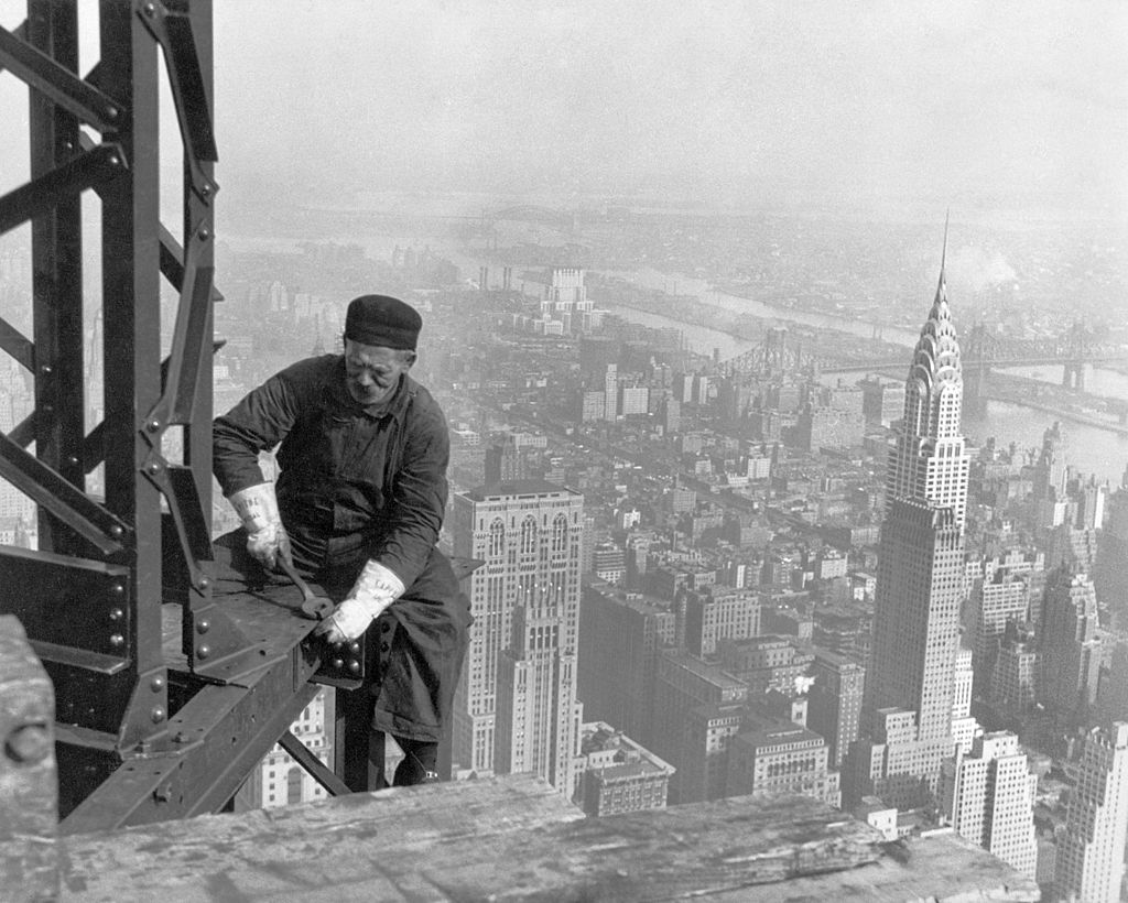
Figure 1 - Lewis Hine, 1932, Worker on the Empire State Building. Created for the US Government WPA and in the public domain.

Figure 1 – Lewis Hine, 1932, Worker on the Empire State Building. Created for the US Government WPA and in the public domain.

About a year ago, I posted about what I called “Morphin’ memes.”  This is the concept that the meaning or connotation of a photograph or the subject of a photograph can change with time. I took a set of photographs a triptych in 1968 of the Consolidated Edison Steam Power Plant on the Lower East Side of Manhattan and commented how it signified pollution but that five to twenty years earlier the same photographs would have symbolized power, strength, and national growth.  I started my last three blogs talking about the Empire State Building.  What could be more symbolic than that?  But in doing my research for those blogs, I noted something that struck me as pretty peculiar.

Consider Figure 1.  It was taken by Lewis Hines for the WPA.  It shows a construction worker building the Empire State Building.  It was after all built by men, tightening one bolt at a time, welding one joint at a time. It is pretty typical of the images of great construction projects at the time. Take a look at this set of images of the Empire State Building construction.  And you have, of course, also to look at this very iconic image by Charles C. Ebbets from 1932 showing workers having lunch on a beam during construction of the RCA Building.  The theme is men building and men creating.  Usually, this is set against the background of great height, but often enough the background is cloudy and overcast.  The men are the central theme.

Now consider images of today’s great construction projects.  They are typified by images such as those that I discussed in a previous blog about the construction of NYC’s Second Avenue Subway.  If you do a Google image search of the terms “Construction, World Trade Center,” you’ll see what I am talking about.  And so as not to belabor(sic) the point there are notable exceptions, one of my favorites being an image of a welder building the original twin towers in 1970.  The emphasis is structure, the emphasis is the power of machines.  It is a city without inhabitants.  You want brave and noble construction workers.  Take a look at Joel Meyerowitz images of the “deconstruction of the World Trade Center.”

I am probably overstating the point.  There are as many photographic views as there are photographic eyes and cameras.  But I do believe that in this context photography gives us a glimpse of ourselves and our deeper attitudes.  It’s meant to do that.  In the 1930’s we valued labor and our goal was to put men back to work during the depression.  The depression/recession of 2009-2013 what about that.  We spent a lot of time pointing fingers.  We no longer value work. Unions were to blame, everyone was to blame, except me. We glorified machines and monuments set against hollow cities.  After all, the really important question had become who could build the tallest building, the ultimate pinnacle of humanless success.

The hyperphotograph

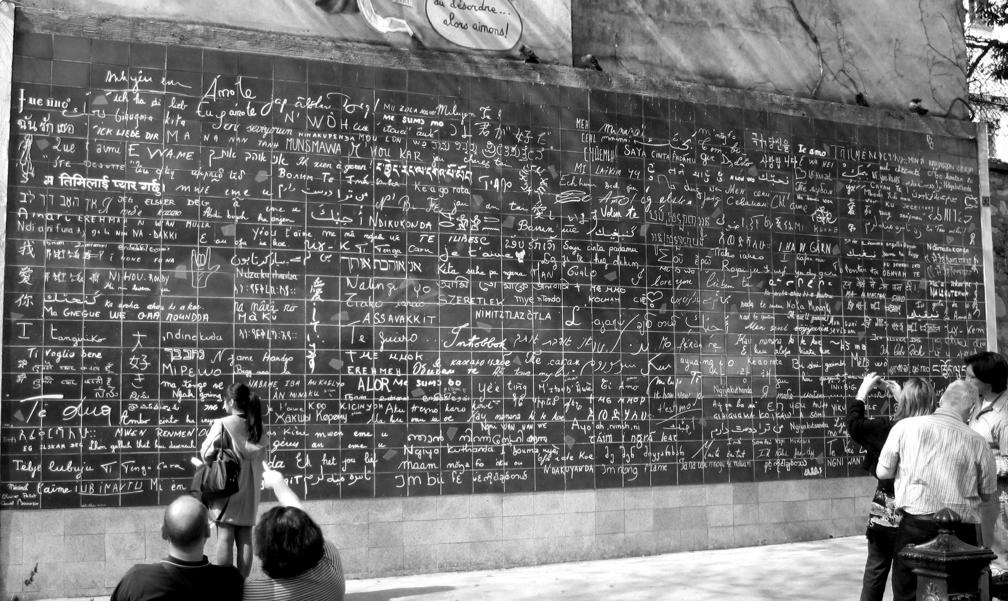
Figure 1 - The I Love You Wall in Paris, February 11, 2011. From the Wikimediacommons and uploaded by Oh Paris to Flickr under Creative Commons Attribution License.

Figure 1 – The I Love You Wall, Le Mur Des Je TiAime with “I Love You” written in hundreds of languages, brainchild of Frederic Baron,  in Paris, March 28, 2011. From the Wikimediacommons and uploaded by Oh Paris to Flickr under Creative Commons Attribution License.


In the last two blogs we’ve gone from the Empire State Building to the concept that a photograph is a five dimensional object.  This merely states the obvious point that a photograph is a set pixels, which are laid out in a two-dimensional grid.  Each position requires two numbers to define it, and three numbers to define brightness and color, the amounts of red, green, and blue. So we define each pixel in the image as a vector (x,y,r,g,b). And here is where the fun begins.

Let’s imagine that we add the physicist’s favorite fourth dimension, time, to the mix.  So we wind up with a string of images, each taken at a different time.  Wait a minute that’s a movie, and each pixel in the movie as (x,y,r,g,b,t), where t can be expressed either as a true time, say in ms, or as a frame number.  A movie, which is really a type of photograph, is a 6-dimensional vector.

Well that’s a silent movie isn’t it?  What about sound.  We can certainly add sound to a movie.  We had to add time first, because human perception of sound requires time.  So do we just add sound as one more number to the mix.  Well obviously not.  Sound is not just intensity and more than light is, it’s also got frequency, which is a sound’s color.  Do we need three numbers or coordinates to describe sound? That is are there three primary sound frequencies?  Well like visual color, sound color is complicated and a mish-mash of psychology, physiology, and physics and way beyond what I want to discuss today.  But, at a minimum, we know that the concept of primary sounds cannot be completely devoid of validity, because an A is an A regardless of the octave, and all (western) music can be written as a sequence of the notes of the chromatic scale. So let’s just say that we have to add n more dimensions or numbers to define the sound in a movie.  So a sound movie is a form of photograph, which is 6+n dimensional.

For good measure, we can even make the movie 3D.  A simple way to do that is to make it stereoscopic, taken from two slightly shifted positions.  OMG this gives us a 7 + n dimensional photograph.

I know that all of this seems just a silly numbers game that restates in pretty terms the obvious.  But there’s one more piece to the puzzle that we have to speak about before we can understand the why.  This has to do with neuroplasticity, which is pretty much the ability of our brains, especially those of children to learn, adapt, and if necessary, to find new pathways.  I read an article once by someone who had lost his hearing over the course of a few short weeks.  To restore his hearing he had a cochlear implant,a device where the damaged parts of the ear are replaced by a microphone and electrodes that stimulate the neurons of the inner ear.  When he woke up from surgery there was a cacophany of sound.  He had to relearn how to hear because the new neuronal pathways, the circuits within his brain, were completely different than the ones that he previously used.  But his brain was plastic, aka moldable, enough to relearn.  A very similar things is going on with what are known as subretinal implants.   Like a cochlear implant, a subretinal implant consists of a silicon wafer containing light sensitive microphotodiodes.  These, generate electrical signals directly in response to light that directly stimulate the retinal cells.  Humans have tremendous neural plastic abilities.

There is a fascinating article in July’s Scientific American by Gershon Dublon and Joseph Paradiso of the MIT Media Lab, called Extra Sensory Perception. and I recommend it highly to you, as it gives us a glimpse of where we are going.

The computer and the crude network of computers that we call the internet has profoundly altered our lives.  Our children interact with a cadre of new devices with ease.  And I would argue that as a result of when they were exposed to it, that they are programmed differently than we of an older generation are.  Yet, we are all still pounding away at a key board, a single node in cyber space.  Our children just pound more efficiently. You’ve all heard about the new Google Glasses.  But just like our computer monitors whatever information we receive from these devices is reduced by our computer processor to some understandable two dimensional form – or as we have seen maybe five dimensional.  As I sit here and pound away, robotic eyes of the Mars Rover are beaming back data to me.  Well not really to me directly, because I do not have the right interface to receive these particular devices.  But at the same time I am surrounded by other signals.  I am bathed in them, in fact. Radios transmission, television transmissions, cell phone signals, motion detectors from my alarm system, WiFi signals from my computer and back from my internet service provider, GPS signals, etc., etc., etc.  It’s almost frightening.  Yet for every one of these signals, we need a dedicated device to interpret the signals.  What if we could assimilate all of this information directly, what if we could in essence see it?

Such a direct assimilation would profoundly alter our definition of the phrase and concept of “being there.”  How was it possible that we watched Neil Armstrong step onto the lunar surface in July of 1969.  I remember thinking at the time how strange it was.  It was as if I were actually there ahead of him.  Today we watch live pictures stream back from Mars and from the giant planets.  I had the same bizarre disconnect when I watched the very first images come back from the planet Jupiter.  My original understanding of being there was changed forever.  It became something so much profounder. In contrast to what will is, what will be is astounding – not even truly understandable yet.  We cannot yet really make sense of the ways in which we will assimilate all of this information into a greater extrasensory perception.

The photograph in its broadest sense, defines what we mean by being there.  First, we had still black and white photographs that capture an instant in time for ever.  Then we made pictures 3D.  Then we added color.  then we added time.  then we added sound.  You can visualize a little dimension counter adding new dimensions with each of the last five sentences.  We assimilated new information at each step and added new dimensions of perception. So when we ask what perception will mean in the hyperspace of the future, we have to at the same time ask what a photograph will be with these new dimensions added to it.

I like to think of the man sitting across the dinner table from a you woman with whom he is enamoured.  He struggles with the question of whether to say “I love you.” It poses such a risk, such an act of no return.  It occurs to him that perhaps he should say “Je t’aime” instead.  As an English speaker he believes that there might be less risk in saying it in French.  His five sense limit him.  With his eyes he looks across the table and studies the moistness and sparkle in her eyes, the flush in her cheeks (maybe just the wine) and the way that she looks back at him.  With his nose he sniffs for ambiguous pheromones hidden amidst the sweet smell of her perfume.  He listens for cues, a subtle change in her voice perhaps a or a quickening in her breathing.  He reaches across the table to touch her hand.  Does he feel the hairs rise?  He is not sure.  Whatever, the futrure holds, the magic will still be there and someone, he or she, must always take the risk and leap across the emotional abyss.
The real Empire State Building or the five-dimensional photograph

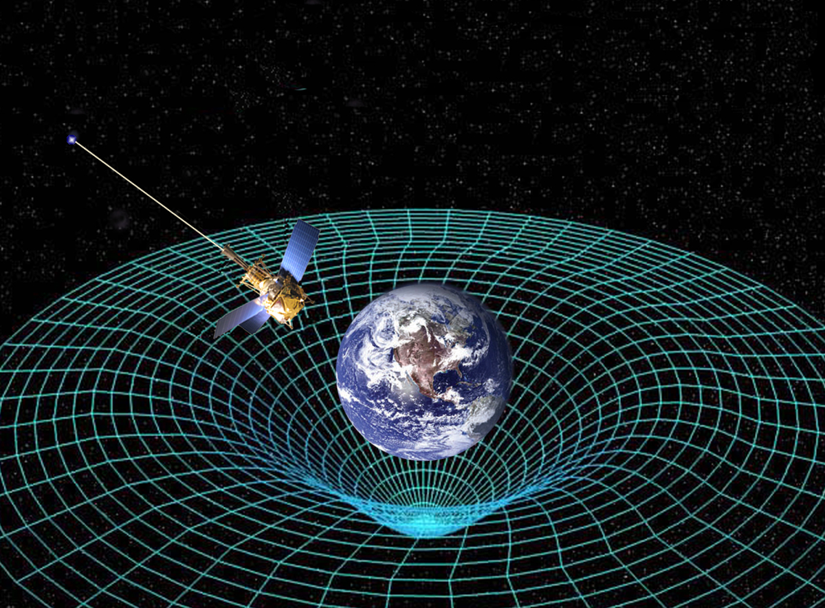
Figure 1 - NASA's Gravity Probe Mission shown in a NASA graphic depicting the warp in spacetime caused by the planet Earth.  From NASA and in the public domain.

Figure 1 – NASA’s Gravity Probe Mission shown in a NASA graphic depicting the warp in spacetime caused by the planet Earth. From NASA and in the public domain.

We seem to have ended yesterday’s discussion with the conclusion that the Empire State Building is an object in a three dimensional world (space) rendered by the lens into a flat two dimensional object, called the photograph. But not so fast.  There is a bit more to a photograph.

What distinguishes the points in the photograph?  If it is a black and white photograph each pointy has to have an intensity associated with it. If you are happy to divide the range of intensities into 256 grey levels from 0 to 255, each point has an intensity associated with it.  So what we are really saying is that each point (x,y) on the photograph has an intensity and really needs to be denoted as (x,y,i), where i is the intensity.  So a black and white photograph really needs to be thought of not as a two-dimensional but three-dimensional object.

BTW – 256 grey levels is referred to as one computer byte of information.  If you are shooting in uncompressed raw black and white mode, there is a one-to-one correspondence between your number of pixels in your sensor and the number of byes required to store that image on your computer.  So I megapixels = 1 megabyte.

But what about a color image?  Every color imaginable (actually not quite) can be created or stored as a combination of the three colors: red, green, and blue.  So if you are shooting a color image you really have neither a two-dimensional photograph or a three-dimensional photograph, but really a five dimensional photograph.  Each point is described in a five dimensional space by five coordinates (x,y,r,g,b).  Where r, g, and b are the amounts of red, green, and blue respectively.  This is a hard thing to picture in your mind, or even on a graph.  But it is understandable, and really we have slipped seamlessly into what physicists and mathematicians refer to as a five-dimensional hyperspace. It’s almost Star Trekian! But, as Mr. Spock would say: “This all seems quite logical.”

Mr. Spock, of course, would have focused on a different form of hyperspace.  The four-dimensional space of space time, that Einstein used to describe gravity.  It is the stuff that warp-drives, worm holes, and time travel are made of.  I won’t go into all of that here.  But I will include as Figure 1 the wonderful graphic from NASA for its gravity probe mission.  You know, “to boldly go where no man has gone before.” 8<}

The point being that three dimensions is only sufficient to describe our world if it were merely everywhere either black or white, like a pencil drawing on white paper.  We need intensity and color to describe what we see.  Rather than shooting over our heads, the concept of hyperspace is really in our heads all along.  Our three dimensional vision- world is really six dimensional and photographs of it five dimensional.+


+And I guess, I should point out that to store a megapixels worth of color information I need not one megabyte, but a megabyte per color; so three megabytes in total.

The dimensions of photography

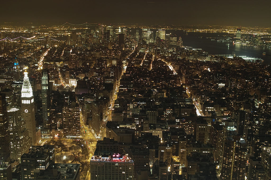
Night view from the deck of the Empire State Building, January 11, 2011, from the Wikimediavommons uploaded as original work by Yorumac under creative commons license.

Night view from the deck of the Empire State Building, January 11, 2011, from the Wikimediavommons uploaded as original work by Yorumac under creative commons license.

The word dimension, in a physical sense, really strikes at the heart of what a digital photograph is.  You might start off by saying that a photograph is a two-dimensional representation of the three-dimensional world.  That’s OK as far as it goes.  However, believe it or not, the subject deserves further examination not only to help us understand what a digital photograph really is, but also to understand what it is becoming. And “becoming” is ultimately where our interest lies!

So first of all some physics “mumbo jumbo.” Actually, it’s mathematical “mumbo jumbo,” but if I said that, it would cause many of you to shut down perception – always a bad thing.  Don’t want to lose you; so please bear with me.

The Empire State Building is located in New York City at the intersection of E33rd Street and 5th Avenue.  New York is laid out in some kind of a grid, well kinda, just like a sheet of graph paper, and we can abbreviate the coordinates of the Empire State Building as (+33, 5). Note that I’ve replaced the E with a plus.  Imagine that you were standing at the intersection of Houston and Fifth Avenue in lower Manhattan.  I know for New Yorkers this takes a lot of imagination, because Fifth Avenue doesn’t go down that far and sorta becomes LaGuardia Place – but not really.  The grid system was added later and really only applies to Midtown Manhattan.  But I’m assuming a perfect city, and New Yorkers never claim the Big Apple to be perfect.  So anyway, Houston and Fifth would be the origin of your graph – the magical point with coordinates (0,0). But if you were standing at that intersection and looked toward the Empire State Building (It’s big and tall, which is why I chose it) you could imagine an arrow running from your feet to the Empire State.  Physicist call this kind of arrow, as opposed to the ones used in archery, as a vector.  And for that reason the point (+33,5) is referred to as a vector.

Of course, there are other ways to describe the address of the Empire State Building.  One way is to give its latitude and longitude; so (-73.9857, +40.7484).  This too is a vector; only its origin is at the intersection of the prime meridian and the equator.  It is in the Gulf of Guinea in the Atlantic Ocean, about 380 miles (611 kilometers) south of Ghana and 670 miles (1078 km) west of Gabon.  Hmm, hard to stand there for sure.  This address is, of course, the one that your phone’s GPS system uses.

You will, needless-to-say, realize that these coordinates do not fully describe the situation.  Standing on the top floor (373.2 m above the ground) of the Empire State Building is quite a different story from standing at street level. So we tend to add a third dimension and give the coordinates as (+33,5,373.2).

All well and good.  We seem to be saying that the world, our world, is described as a three dimensional space, that one of those fancy-pants physicists would call a 3D vector space.  Well, not so fast!

But before we move on I want to point out that there are other ways to represent the location of the Empire State Building.  The United States Postal Service is happy with 350 5th Avenue.  But that is really a different way of saying the same thing.  We’ve still got a 2D vector with coordinates (350, 5) instead of (+33, 5).  But more importantly, all the address that you really need for a letter to the Empire State Building is the zip code 10118.  Most zip codes to really define a location are 8 digits long, but the Empire State Building only needs five because it is cool and special. There are also IP internet addresses that specifically designate the Empire State Building’s location as a single number.  Zip codes and IP addresses are examples of compressive addresses.  We don’t need two numbers only one.

Wait compression.  You mean like TIF to JPG.  Yes, Virginia, that is what I mean.  I’m not just dragging you along here for no reason.

OK, well probably I have exhausted everyone’s patience by now.  So I thought that I would stop for today. But I do owe you some historic and/or beautiful photographs.  Hence, Figure 1 which is a view from the observation deck at night looking downtown and portraying New York as the beautiful constellation that it is.  More on this dimensionality story to come.

Meanwhile, back on Mars…

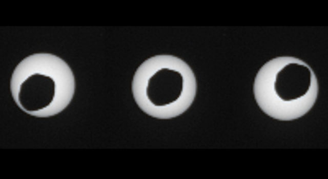
Figure 1 - Images of the moon Phobos eclipsing the sun from Mars Rover Curiosity. From NASA and in the public domain.

Figure 1 – Images of the moon Phobos eclipsing the sun on August 20, 2013 from Mars Rover Curiosity. From NASA and in the public domain.


Here go those gorgeous robot eyes again!  Thank you to reader Howard for alerting me. During last summers imaging session,  Mars Rover Curiosity shot a stunning set of images of Mars moon Phobos eclipsing the sun.  Three of those photographs can be seen in Figure 1. And you can also watch a video of the eclipse.

So a couple of points.  Earth’s moon, aka “The Moon” and sometimes “Selene.” by rare happenstance is exactly 110 X it’s diameter from the Earth as is the sun.  This results in the remarkable eclipses, where the moon’s shadow perfectlu occludes the sun’s light and we see solar flares and the suns outer atmosphere or corona.  All very beautiful.  Phobos is irregular shaped and has a diameter of ~ 11 km, It orbits around 6000 km above Mars surface. Compare that to our moon, which orbits at 384,400 km.  As a result even though the sun is much farther away from Mars, Phobos does not manage to complete occlude the sun.  We have instead an irregular shaped rock beautifully outlined against the sun’s disk.

Before you think of Phobos as a diminutive little thing, I would remind you of the origin of the name Phobos and that of his twin brother the other moon of Mars, Deimos. These were the sons of Ares or Mars. Deimos was the god of terror.  Phobos was the god of fear. (Hence phobia).  They accompanied Mars, the god of war, into battle driving his chariot relentlessly forward.

Avoiding old fuddy-duddidom

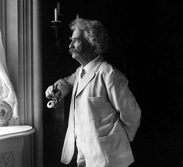
Figure 1 - Mark Twain by Underwood and Underwood, 1907, from the US Library of Congress via the Wikimediacommons and in the public domain.

Figure 1 – Mark Twain by Underwood and Underwood, 1907, from the US Library of Congress via the Wikimediacommons and in the public domain.

Last night I was watching a rerun of Ken Burns’ documentary on the life of Mark Twain.  Long-term readers will know that I love Mark Twain and will take any opportunity to post a picture of him.  Hence Figure 1. This is a wonderful, Vermeer side lit image from 1907 by Underwood and Underwood, who were once the premier distributors of stereographic photographs in the world.

As I was watching this documentary, I kept pointing out to my wife all of the classic historic photographs that Burns was using.  I must be rather annoying.  Still, it is profound to watch Twain evolve before us from daguerreotype to albumin print – as technology itself evolved.  Twain was certainly an adapter of technology.  People in Twain’s “Gilded Age,” saw the promise of technology – and that’s what I really want to talk about today.  He/they would have really loved our digital cameras and world, for sure.

There is no surer way to achieve true fuddy-duddidom than to be a Miniver Cheevy (Yes, I’ve spoken about this before) and deny, fear, and loathe new technology. I have friends who tell me that they cannot deal with these new-fangled computer gadgets and that these young whipper-snappers, with their noses in their cell phones, are going to be the ruination of the world.  Really?  You mean like the bicycle, the motor car, the radio, the telephone, the television?  Give me a break! That, friends, is a fuddy-duddyism, and I am an anti fuddy-duddialist.  Adapt, people! Truly, adopt and adapt, or perish.

Does perish seem a strong word?  Well, it’s not, and that’s because I can pretty much guarantee that you are going to eventually perish like a techno-dinosaur.  The world belongs to the young, for the time being at least.  So their technology is ultimately the world’s technology.  By virtue of their longevity (compared to you), they are right!

I have a particular disaffection for people that deny digital photograph.  Be a proponent of silver gelatin if you want, but don’t give me this story about how vastly inferior digital images are.  They are not.

I love digital.  But years ago I also fell in love with the  brilliant subtlety of platinum-palladium printing. Never done it myself.  Would love to try it.  The same is true of the daguerreotype.  In fact, I have progressed so far that I can now type that word without relying on spell check to keep me literate.  What a pain it would be to have to revert to looking it up in a dictionary, especially since it is one of those words were you might not know where to begin.  And on my recent trip to the MFA I have become totally enamoured of bromoil printing.  That I really want to try.  The painterly effects are amazing and spectacular for all the reasons that, and here’s the real point, I love photography.

Photography is the point.  I can see the virtue of all forms, except possibly wet silver collodion, which just strikes me as a major pain in the ass.  Actually I’m just being cute.  There’s a special beauty in collodion as well.  Here we are talking about photographic art.  Digital photography has done a spectacular job of making the art of great print making widely available.  Don’t be a fuddy-duddy, learn, love embrace all manner of technology.  It is the future!  As far as your photography is concerned, finding your ideal medium is like a singer finding his or her voice.  And remember that your voice matures with time, but never ceases to delight.


The first Nikon One Touch

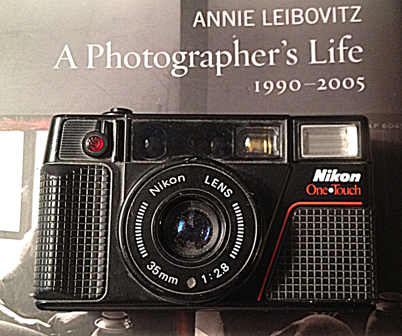
Figure 1 - Nikon "One Touch" autofocus consumer camera, 1985. (c) DE Wolf 2014.

Figure 1 – Nikon “One Touch” autofocus consumer camera, 1985. (c) DE Wolf 2014.

This past weekend I was depositing my trash at the town dump.  It sounds like a simple task.  But among Yankees (I am a Yankee come lately, and BTW this has nothing to do with a certain baseball team that has appropriated the name) this is more of a rite thank a task.  Trash is sorted and recycled, and most importantly treasures are recycled, or passed on to new owners.  I usually focus on the book swap, but this Saturday I wandered into what is fondly referred to as “the put and take.” The name explains it all. And there waiting for me was the little black beauty of Figure 1- a Nikon One Touch.

Now I do not collect old cameras, although I do have a few old consumer cameras of note.  That was a minor collection started for me by my son, who one Christmas gave me a nice little Kodak Brownie. Incongruously, it too is made of black plastic.  Go figure!

Of course, I went home to explore this little Nikon more thoroughly.  As it turns out the “One Touch” is part of the L-Series.  The L-Series began in 1983 with the L35 AF/AD.  This was Nikon’s entrance into the autofocus market for consumer cameras – really a moment in photgraphic technological history.  I use the term “consumer cameras” to distinguish them from SLRs.  That explains the AF.  What the AD stands for is “auto-date” the camera marked each frame with the date. This was pretty high tech for 1983.  In 1985 Nikon introduced the first of the “One-Touch Series,” the  L35AF2/L35AD2/One•Touch. This has a elegant automatic window that covers the lens when it is not in use.

So what’s the point?  The point is that these cameras are elements of a transitional technology that took us from 35mm SLRs with their autofocus and autoexposure features to today’s DSLRs and more importantly today’s pretty sophisticated digital point and shoots.  Today you’ve got to try pretty hard to take bad pictures.  It can be done, however.  But the significant fact is that today’s cameras, which are really little photographic robots complete with their own little microprocessor brains, make it a lot easier to take technically good pictures – freeing the Sunday photographer to fulfill his/her artist destiny.

So my heading into the little “put and take” shed was a sort of trip down memory lane back into into the early eighties.  Those were the days of big hair styles.  Who can forget Meg Ryan in “When Harry met Sally,” which was 1989?  The other part of the nightmare were shoulder pads, which often came in several layers making the women look like football players.

The birth of a moon

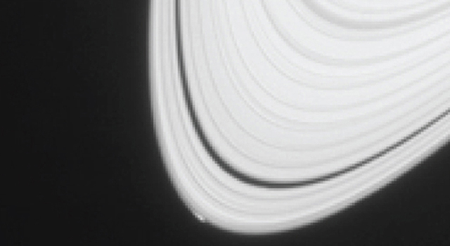
Figure 1 - NASA's Cassini satellite in orbit around Saturn documents the formation of a new moon on April 15, 2013. From NASA and in the public domain.

Figure 1 – NASA’s Cassini satellite in orbit around Saturn documents the formation of a new moon on April 15, 2013. From NASA and in the public domain.

Figure 1 is an example of something that I never thought that I would see.  It is a moment of thought-provoking grandeur, brought to us by tireless robotic eyes that extend our vision and our horizons, like those of Ulysses’ mariners ever outward.

According to a paper published in the planetary astronomy journal Icarus, NASA’s Cassini spacecraft has documented the formation of a small icy object within the rings of Saturn that may be a new moon.  These images were taken by Cassini’s narrow angle camera on April 15, 2013.  They show disturbances, a perturbation merely, at the very edge of Saturn’s A or outermost ring.

NASA scientists also found other unusual protuberances at the ring’s, which they believe to be gravitational disturbances caused by nearby massive objects.  This may significantly increase our understanding of the process of formation of Saturn’s ice moons like the cloud enshrouded moon Titan and the ocean moon Enceladus. Scientists believe that the ring system of Saturn once supported the outgrowth of giant ice moons, but that the process is now largely complete.

We tend today to take this kind of imagery for granted, rather than marvel at it with the awestruck devotion that it deserves.  It all began with Draper’s first daguerreotype of Earth’s moon in 1839.

The ultimate folly

Figure 1 - "No man's land in Flanders field, France, during World War I," from the wikimediacommons, original in the US Library of Congress and in the public domain.

Figure 1 – “No man’s land in Flanders field, France, during World War I,” from the wikimediacommons, original in the US Library of Congress and in the public domain.

One hundred years ago today, July 28, 1914 Austro-Hungarian guns began firing in preparation for the invasion of Serbia.  It was the ultimate folly, the opening shots of World War I or the “Great War,” and by the time it was over four and a half years later 10 million had died to be followed soon by 50 million succumbing to the Spanish Flu pandemic the the war’s end engendered. I say the ultimate folly, but watch the news tonight and wonder if we have learned anything.

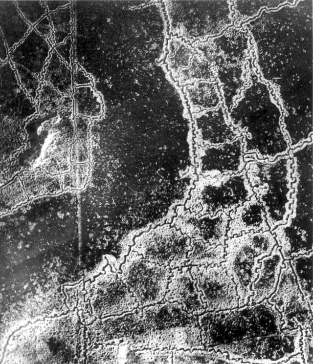
The First World War was well photographed.  There are gruesome stills and even video footage of the misery and carnage.  I thought that I would post a couple of images in tribute or remembrance. Figure 1 shows the “no man’s land” in Flanders, France a desolate, alien, and gruesome place. And Figure 2 is a different view of this nether world.  It shows an aerial reconnaissance photograph of the opposing trenches and no-man’s land between Loos and Hulluch in Artois, France, taken at 7.15 pm, 22 July 1917. German trenches are at the right and bottom, British trenches are at the top left. The vertical line to the left of centre indicates the course of a pre-war road or track.

“Zonder liefde, warme liefde
        Sterft de zomer, de droeve zomer
        En schuurt het zand over mijn land
        Mijn platte land, mijn Vlaanderland.”+

+”Without love, warm love
The summer dies, the sad summer
And the sand scours my country
My flat country, my Flanders”

Jacques Brel, “Marieke
Figure 2 - An aerial reconnaissance photograph of the opposing trenches and no-man's land between Loos and Hulluch in Artois, France, taken at 7.15 pm, 22 July 1917. German trenches are at the right and bottom, British trenches are at the top left. The vertical line to the left of centre indicates the course of a pre-war road or track. From the wikimediacommons, originally from the UK Imperial War Museums and in the public domain.

Figure 2 – An aerial reconnaissance photograph of the opposing trenches and no-man’s land between Loos and Hulluch in Artois, France, taken at 7.15 pm, 22 July 1917. German trenches are at the right and bottom, British trenches are at the top left. The vertical line to the left of centre indicates the course of a pre-war road or track.
From the wikimediacommons, originally from the UK Imperial War Museums and in the public domain.