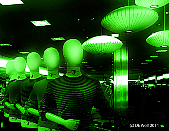
The faceless army

Figure 1 - The faceless army, Natick Massachusetts. (c) DE Wolf, 2014.

Figure 1 – The faceless army, Natick Massachusetts. IPhone photograph. (c) DE Wolf, 2014.

I need to make a confession.  It was a beautiful day here in Massachusetts and despite the glory of the sunshine and a gentle breeze, I went to the Mall for a morning walk.  So I feel that I need to explain why, to explain my strange little foible.  I go in search of espresso.  I end my walk sitting in a chair, observing the shoppers, and sipping on espresso.

Saturday morning is a contemplative time for me.  So in my contemplations I have begun to become aware that there is a silent, faceless, often headless or armless army among us.  These are the manikins or mannequins.  The used to have faces with beautiful painted eyes.  And I have been trying to understand how they have lost their heads and become faceless.  I suspect that it has something to do with the desire to make them neutral so as not to attach a racial or ethic identity to them.  Indeed, where I grew up the eyes were always blue.

But the effect of all this dismemberment and eradication of identity is rather eery.  Today was the most disturbing yet featureless faces covered with canvas, like in a nightmare. They are everywhere and they come across as something very alien – or maybe are all too familiar.  The facelessness or headlessness betrays a social decapitation.

They are not us.  Or worse, they symbolize modern man and modern woman in some disparate existential sort of way.  They are like the homeless, the poor, the slaves – we try to ignore them.

Perhaps less caffeine tomorrow. 8<}


Such stuff as dreams are made on

A fun, or is it a confusing, fact about the internet is that you can be reading something and you think that it was written yesterday only to discover that in reality it was written three or more years ago.  Well, OK, today I was reading the New york Times Lens Blog and I came or the little arrow of my pointer wandered upon this posting by Kerri MacDonald from August 4, 2011. Never mind the date.  It is still interesting!  It is a discussion of a then fresh photography book by  James Mollison entitled “Where Children Sleep.”   The project shows pictures of children, each paired with images of their bedrooms.  In a sense it takes you to the anvil of dreams, the very place where childhood dreams are forged.

Two points come out of this work.  First, that children are meant to dream, and second, that because of exploitation many are robbed of this quintessential element of childhood.  I found the captions in LensBlog a little distracting.  I don’t need to be subliminally told what to think.  I prefer looking at Mr. Mollison’s website and feel the emotion, the sadness and the outrage for myself.  These emotions emanate from the power of the images themselves.  And some of these are very powerful images.

The other side of all of this is that for those children, who can dream, their intensity of dreaming is palpable.  We were all children once and we all can remember dreaming of what would be or what could be.  These, as Ms. MacDonald, points out are the essential unifying elements.

“Everybody sleeps. And eventually, everybody grows up.”


Holy cow, Batman.

Well “Big Bang Theory” enthusiasts Comic-Con 2014 is currently running through this Sunday in San Diego.   It is Friday and, as always, I am looking for something light among “The Week in Pictures” features on the various news services and I found from the EPA this photograph of a pretty young lady named  Emily Reeve who is dressed as a 1950’s pop art housewife.  The image, of course, is meant to pay homage to the many wonderful pop art works by Roy Lichtenstein. And as I was researching this blog, I was not totally surprised to find a plethora of photographs of “pop art women” from Comic-Cons” present and past.

Comic-Con is, needless-to-say the ultimate dress up event, and I wish I were there with my camera. Perhaps the right get-up for me would be “Tintin” with camera.  Oh, BTW the cast of the “Big Bang Theory” usually puts in an appearance.  Pretty girls with dots painted on their faces and Penny, what could be better?

Bromoil printing

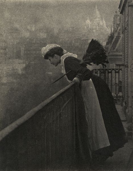
Figure 1 - Emile Joachim Constant Puyo, Montmartre, ca. 1906.  This is one of the images featured in the MFA exhibit on Pictorialism.  This image is from the Wikimediacommons and from the Metropolitan Museum of Art in NYC.  In the public domain in the United States because it is more than 75 yrs. old.

Figure 1 – Emile Joachim Constant Puyo, Montmartre, ca. 1906. This is one of the images featured in the MFA exhibit on Pictorialism. This image is from the Wikimediacommons and from the Metropolitan Museum of Art in NYC. In the public domain in the United States because it is more than 75 yrs. old.  Note the painterly quality of the image.  Is it a painting or is it a photograph.  This is the effect that the pictorialists were after.


Yesterday I discussed photographic Pictorialism and I got interested in what exactly their bromoil process entailed.  There is a lot of information about it to be found on the web, both at the Wikipedia site and, if you want to try it for yourself at the Alternative Photography site. We have previously discussed the world’s first photograph and this is a good place to begin considering the bromoil process.

For his first successful photograph Niépce, in 1826, used a pewter plate as a support medium that he covered with bitumen of Judea (an asphalt derivative of petroleum).  He exposed the plate for approximately eight hours. The exposed regions of the plate became hardened by the light, much like dentists currently cure cements with UV light.  Niépce removed the plate and used a mixture of oil of lavender and white petroleum to dissolved away the the unhardened bitumen.  This produced a direct positive image on the pewter, which has now lasted close to two hundred years.  Pretty cool, I think! And you will note oil-based.

In a more modern “oil print” the paper is covered with a thick gelatin layer photosensitized with dichromate salts. You layer a conventional negative above this sensitized paper and expose to light.  This is referred to as “making a contact print.”  The light exposed regions like in Niépce’s image become hardened. After exposure the paper is washed in water.  The less exposed non-hardened regions absorb more water than the higher exposed hardened regions.  You then remove excess water with a sponge and while the paper is still damp parts, you apply an oil-based lithographers ink.  Oil and water don’t mix, and as a result the ink preferentially sticks to the hardened regions thus creating a positive image.

The “bromoil print” is a variation of the oil print.  Here one starts with a normal silver bromide print on photographic paper.  This is then chemically bleached and hardened. The gelatin which originally had the darkest tones, is hardened the most.  The highlights will absorb more water.  Finally, you ink this print as you did in the “oil print.”

The first point is obvious.  This process requires a lot of skill.  But corollary to that you wind up with an enormous level of artist control over the process, once you have mastered it.  I also find intriguing how akin this process is to the printing process of lithography.  In bromoil printing the photographer essential releases him/herself from the bonds of the silver gelatin process and gains a delicate and moody control of the art, which is precisely the effect that the pictorialists sought.


Truth and beauty at the MFA

Figure 1 - F. Holland Day The Last Seven Words of Christ, 1898, from the Wikimedia Commons and in the public domain in the United States because it is more than 70 years old.

Figure 1 – F. Holland Day, “The Last Seven Words of Christ, 1898,” from the Wikimedia Commons and in the public domain in the United States because it is more than 70 years old.

There is an intimate exhibition of pictorialist photography at Boston’s Museum of Fine Arts that runs through February 22, 2015, entitled “Truth and Beauty.” This exhibition celebrates the museum’s recent acquisition of four major works related to the Boston leader of the movement, F. Holland Day. His The Seven Last Words (1898) (see Figure 1), purchased in 2013 and three portraits of Day by Edward Steichen, James Craig Annan, and Clarence H. White.

For those of you not in the know, like myself, the last seven words of Christ refers not to seven parting words, but to seven parting phrases that bear deep meaning in Christianity. The last of these called “the words of reunion” are “Father, into your hands I commit my spirit!” Holland Day’s work is a small series of self portraits depicting the Christ upon the cross.  The copy at the MFA is much more subtle than the one depicted in the figure from the Metropolitan Museum in NYC. Day’s work has been referred to as “an important touchstone of Modernist photography,” by the New York Time.  Because of its small size and delicate toning it connects you with a very personal spiritual moment, even if you do not share the particular religious connotation.  This, I believe, is because it relates to a universal pattern of human consciousness – that which Joseph Campbell refers to as one of the great monomyths or the “Masks of God.

Pictorialism as a movement in photography that triumphed in the thirty year period from 1885-1915, and like so many intellectual movements owes its demise, in part, to the traumatic events of the First World War.  Its ascendance coincided with the fiftieth anniversary of the invention of photography and to the threat of impending mediocrity to the art posed by George Eastman’s introsuction of the box camera in 1888.  These were fifty years during which the debate in the art world was whether photography was merely a means of recording an image or itself a fine art.  It was highly influenced by both classic traditions and the contemporary concept of fine painting as being  a means of conveying emotion through moody out-of-focus, often misty, imagery.

The first use of the term pictorial, in the context of photography, came in 1869 in English photographer Henry Peach Robinson‘s “Pictorial Effect in Photography: Being Hints On Composition And Chiaroscuro For Photographers.” He defined this style in terms of the then centuries old term from Italian painting “chiaroscuro” referring to the use of dramatic lighting and shading to convey an expressive mood.”  Robinson advocated “combination printing,” mixing elements from multi-negatives and  heavily manipulating the final print or negative.

Pictorialists often advocated and practiced the use of what they referred to as “enobling processes.” They would alter the appearance of their photographs using gum or bromoil printing.  These are materials that stick to the emulsion and enabled the photographers to create highly moody effects and so much altered their images that they were often mistaken for drawings or lithographs. A classic pictorialist image of this type, that we have spoken extensively about before, is Edward Steichen’s “Flat Iron Building at Night, 1904.”  It is probably a tribute to Steichen’s success with this image that today the blue versions are mistaken for early examples of color photography, which they are not.  Another pictorialist photographer whom we have previously discussed is Annie Brigman.  Among the striking images in the MFA exhibit is Alfred Stieglitz’s “The Hand of Man, 1902,” shown as Figure 2. It epitomizes the kind of moody imagery that defines pictorialism.

As noted, photography changed irrevocably with the world in 1914.  However, the pictorialist movement, championed by such masters as Holland Day, Alfred Stieglitz, and Edward Steichen triumphed before photography evolved to its next phase. Their principal advocacy was to see photography accepted as a “fine art.”  In 1910 the Albright Gallery in Buffalo bought 15 photographs from Stieglitz’ 291 Gallery.

As I’m writing this, I am revisiting the many wonderful works of the long career of Edward Steichen.  A retrospective at the Whitney Museum in 2000-2001 in NYC began with his pictorialist images and ended with photographs like his “Matches and Match Boxes, 1926.”  It demonstrates, on the one hand, how much art and photography have changed, and, on the other hand, how wonderful the medium is in its diversity.
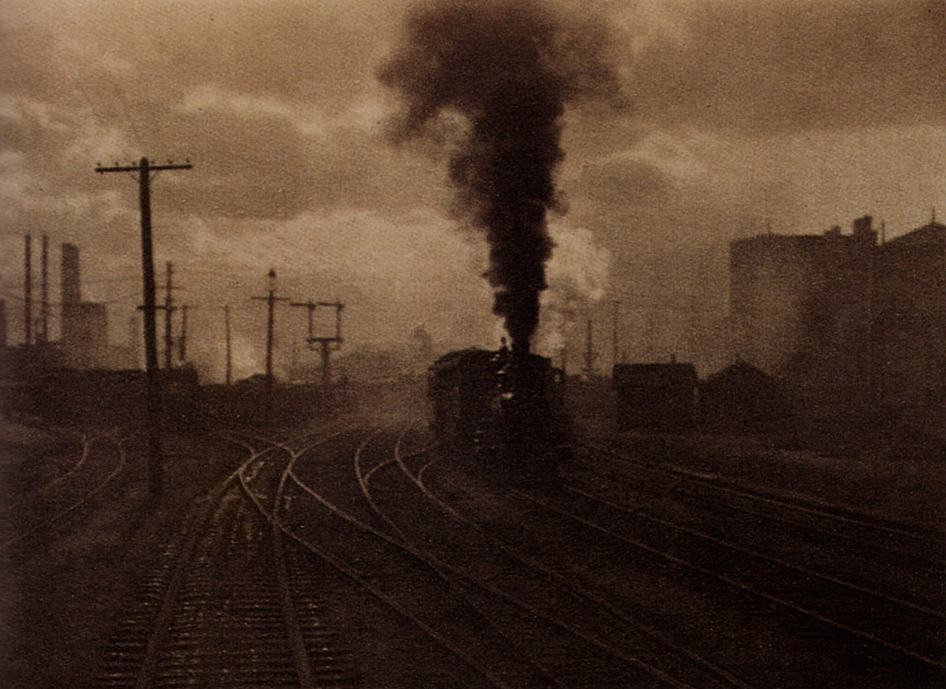
Figure 2 - Alfred Stieglitz, "The Hand of Man, 1902." From the Wikimediaxcommons and in the public domain because it was published before 1923.

Figure 2 – Alfred Stieglitz, “The Hand of Man, 1902.” From the Wikimediaxcommons and in the public domain because it was published before 1923.

 

Happy thoughts

This morning I found myself still enjoying last week’s “Week in Pictures” and still trying to avoid dwelling too long on the gruesome events of the day.  So I’ll stick to happy stuff!  First, I really love Nikita Dudnik of the AP’s photo of the beach goers in Novosibirsk caught in a hailstorm.  You gotta admire the photographer, who was probably also caught out in the storm. I apologize to anyone who calls Novosibirsk home, but about twenty years ago I went to a seminar by scientists from a research institute there about nasty tick-borne illnesses (the ticks are nasty, the illness deadly) and the unbelievably high level of ticks there in summer. I came out with the conclusion that this was a place on Earth only very marginally supportive of human life.  No wonder everyone is on the beach ready to be pelted with golf ball size hail. Stay out of the grass people! Yikes! Guess summer is over. 8<)

Next is Christian Hartmann of Reuters spectacularly picture of an elderly French woman cheering as the Tour de France rides by in fantastic blur before her.  This is a classical and beautiful example of using blur to create an exciting sense of motion.

Finally, take a look at Erik De Castro also of Reuter’s picture of tigers enjoying a cooling swim at a zoo in Malabon in the Phillipines.  You gotta love the big guy licking the glass. Some will try to accuse me, I know, of posting a cute cuddly animal picture. But as all cat lovers are keenly aware: cats are the most human of people.

Photographing bronze

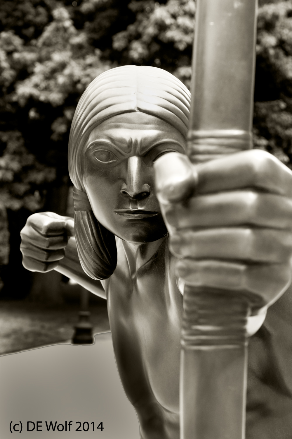
Figure 1 - Paul Manship's Indian Hunter, Boston, MA.  (c) DE Wolf 2014.

Figure 1 – Paul Manship’s Indian Hunter, Boston, MA. (c) DE Wolf 2014.

On Sunday my wife and I headed into the Boston Museum of Fine Arts to catch up on all of the special exhibits that we had been meaning to see.  I was particularly interested in an exhibit on photographic pictoralism and will discuss that in an upcoming blog.

I love museums, and one of the reasons that I love them is that they invariably offer up interesting subjects to photograph.  Among my favorites are bronze and marble sculptures.  I was enraptured on Sunday, as I always am at the MFA.  Unfortunately, I cannot share most of these pictures because one’s not allowed to publish pictures taken in the museum.  That’s part of the agreement when you pay your admission fee.

So, I’d like to share today the photograph of Figure 1, which is of a gorgeous bronze of an Indian (Native American) hunter by Pan Manship (1885-1966), the sculptor who brought us the beautiful statue of Prometheus in Rockefeller Center in NYC. And fortunately this sculpture is in a very public place, right in front of the museum’s historic Fenway entrance.

What I love so much about bronze as a subject matter for photographs is: the subtle yet rich golden color and the dramatic way in which it catches light. I immediately take the image to black and white, suppressing all that beautiful color and then I bring it back by sepia toning as a final step. The amazing part, the true magic of digital photography, is magnifying each region of the image and delicately burning in the highlights with a fine digital brush and similarly darkening the subtle shadows.  It’s a lot of work, but so often worth the effort.

When I first did this I realized how hard it would be to do it on a silver gelatin work.  Although, there were chemical brushwork techniques that the masters used. It is a clear advantage of the digital photographic medium, and best of all you can easily discard your work and start all over again.

The photominimalism project

I have mentioned that I have been working on what I have been calling the Photominimalism Project and today I have put up a Photominimalism Gallery highlighting a first set of photographs from this project.  These are images of strands of seaweed, drenched, wet, or dry taken on the beaches of Kennebunkport, ME in May may also be found at the bottom of this page.

Minimalism as a form in both music and visual art describes work that sets out to strip the subject of non-essential forms, features, and concepts thereby exposing its essential identity. As an artistic movement it evolved in the mid-twentieth century and is strongly associated with prominent artists including: Ad Reinhardt, Tony Smith, Donald Judd, John McCracken, Agnes Martin, Dan Flavin, Robert Morris, Larry Bell, Anne Truitt, and Frank Stella. My son taught me to appreciate this kind of art, given me the gift of his love of this body of work.  And I must say that there is something very exhilarating at encountering  the quintessence of a subject.

A couple of years ago, I walked among the flotsam at tides edge at the beach and I was struck by the minimalist nature of little strands of seaweed perhaps joined perhaps with a shell in the sand.  It reminded me so much of minimalist work.  Of course, I do break the rules here.  Not every image is stripped of detail.  Indeed, some of my subjects revert back to a love of fine detail, like a photograph by Edward Weston.  But I am not going to apologize for that.  Each image stands on its own merit, either is appealing or is not. Such is always the case.

Finally, I should point out that I use the term photominimalism in the concept of minimalist art.  More often the term “photominimalism” refers to a technique in artistic photograph where “more is better. An example would be my recent image of a weathervane.  The subject is essentially enveloped by an expanse of blue sky.  But that was not my purpose here.  My purpose was to delight in very simple things, as if the seaweeds lying in the sand were a form of writing or a graphic in the sand.  They have no more meaning than that, and I hope that you will enjoy them.

Invalid Displayed Gallery


Falkland Islands

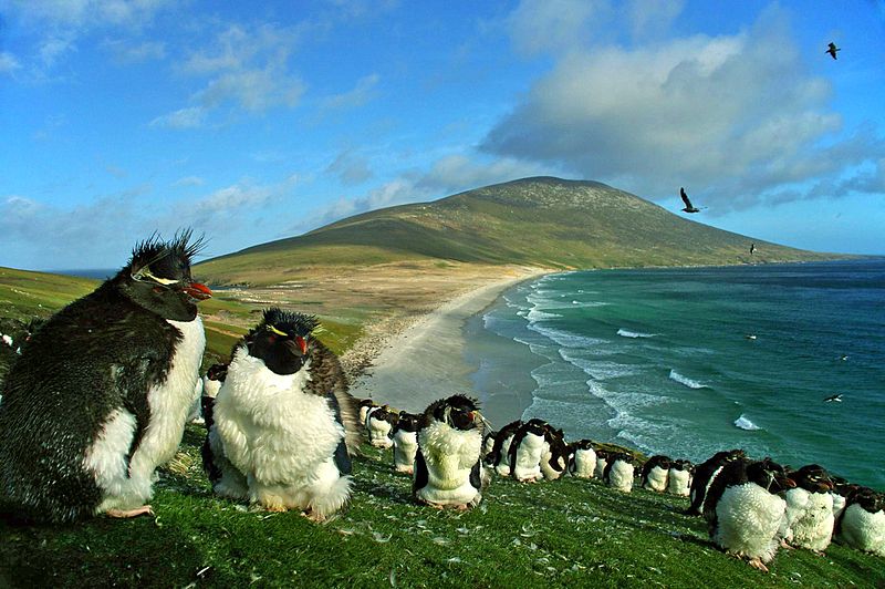
Figure 1 - Southern Rockhopper Penguins on Saunders Island in the Falklands. Image from the Wikimedia Commons and by Ben Tubby under creative commons attribution license.

Figure 1 – Southern Rockhopper Penguins on Saunders Island in the Falklands. Image from the Wikimedia Commons and by Ben Tubby under creative commons attribution license.

It is Saturday morning, and I am eating steel-cut oatmeal and trying for a few moments to ignore the constant news bombardment of this week’s toll of human misery.  You could really spend all of your time crying.  But I have to mention it because it truly cannot be ignored and treated as if it is not there.

So I am looking for some balance – something of quiet beauty. And in my weekly sojourn through “This Week in Photos,” I came  across, on the BBC, a wonderful collection of images now on display in London at the Mall Galleries. It is an exhibition of photographs by residents of the Falkland Islands from a competition run by the  Falkland Islands Government to find the “best photographs” by island photographers.  Judging from this there is a high proportion of the 3000 some inhabitants of the island with great photographic talent.  The two that are giving me the greatest peace this troubling Saturday morning are Aniket Sardana’s dynamic photograph of a smiling (if I am allowed to anthropomorphize) seal swimming upside down underwater.  This is really a beautiful and exciting image.  And then there is a spectacular, I assume HDR, image, also by Aniket Sardana of the Cape Meredith Coast. I have truly found inner peace. And just as a bonus, I include, not from the exhibition but from the Wikimedia Commons a gorgeous photograph of windblown Sothern Rockhopper penguins on Saunders Island in the Falklands.  I think that I am loading up my camera gear and taking the next boat!