Art vs. Science? Creating new visions

Figure 1 - Photomicrographs of the drug AZT were taken at magnifications of 30x and 50x. Used to illuminate the crystals were polarized and darkfield lighting techniques. AZT is thought to help prevent the replication of HIV, the AIDS virus, also known as HTLV-III.

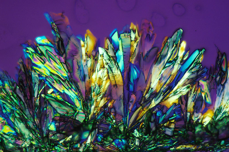
Figure 1 – Photomicrographs of the drug AZT were taken at magnifications of 30x and 50x. Used to illuminate the crystals were polarized and darkfield lighting techniques. AZT is thought to help prevent the replication of HIV, the AIDS virus, also known as HTLV-III. Image from the US NCI by Larry Ostby, 1986. FRom the Wikimedia Commons and in the public domain.

A reader posted on Facebook yesterday this interesting set of images by Andy Ellison, who is an MRI technologist at Boston University Medical School’s Center for Biomedical Engineering.   These are three dimensional scans (a set of slices of produce, yes that’s right vegetables).  As is so often the case with natural structures these a stunningly beautiful. But a couple of critical questions came to mind.  Do they present a new vision? Do they present new botanical information?  And all of this got me thinking again about the relationship between science and art and the transitional spectrum between pure science and pure art.

We recently spoke about X-ray images by Arie van’t Riet, which are clearly more in the realm of art – particularly in the colorization.  You may, in a sense imagine what it would like to have X-ray vision, like Superman. And, of course, that is the very point isn’t it?  We used to see only our red, green, blue world. Now we get to see all over the electromagnetic spectrum and even other spectra like the MRI. All of this extends human vision, revealing new ways of seeing.

It strikes me as curious.  We see science and art as two different viewpoints.  But arguably the purpose of this kind of imagery, when it is scientific is to present a new and different vision of the world.  When it is artistic in nature, the purpose is to present a new and different, often an individualistic, vision of the world.  How can two supposedly diametrically opposed viewpoints share the same purpose?

I have made a big deal about the strictures of scientific art.  Science sets rules about image manipulation.  Fine, but this has nothing to do with whether the image is artistic.  It is just like writing a fugue.  There are rules that you must follow.  But this has nothing to do with the magnificence of the piece.

One is tempted to say something like: science can be art, but art cannot be science – as if it were a corollary to this rule concept.  This is meaningless and discipline chauvinistic. Science, in this context, does not possess a higher purpose than art.

I think that the important point to be made is that when science becomes art, it is typically the artistic expression of an individual artist.  This artist chooses the composition, chooses the colors, chooses the dynamic range.  The fact that it starts as science is only relevant in that the palette chosen, the expressive elements, are scientific in origin.  The creator transcends science and really becomes an artist.  Similarly, the artist may choose to adopt a scientific palette. A clear example of this is the photomicrographs of Roman Vishniac.  What I am saying is that all art is art.  All purpose is to present the artist’s vision.


The secret of the Loch Ness Monster revealed

A few days back I blogged about the Apple Maps image of the Loch Ness Monster.  Well, thanks to reader Champ and some intrepid computer scientists it is indeed a misinterpreted image.  You see that I am not saying a fraud, which would imply deceptive intent.  The deal here is that Apple Map images are typically formed from composites.  Images from multiple days are combined to create a single image.  In this case the image of a ship was washed out by the addition of the non-boat images.  The result is a ghostly, monster-like image of a faded boat and boat wake.     The Loch Ness Monster Fan Club apparently doesn’t buy it.  I guess that the rest of us need to chalk this one up to the experience and the view that you can’t trust every photograph that you see.  I fear, ah well, that we must heed the words of 19th Century biologist Sir Thomas Huxley, who said:

“Sit down before fact as a little child, be prepared to give up every preconceived notion… or you shall learn nothing.”


Implicit symbolism

It is the end of the week and time for my weekly search of the “best of…” images.  I came across this dramatic image by David Cerny of Reuters.  I usually like to describe what exactly we are looking at.  However, it struck me that the sweet and angelic little girl wnd the graveyard crosses are so self explanatory as symbols of death and innocence, birth and resurrection that they seem to defy the need to explain.  They could be equally from anywhere and any time.

With implicit symbolism the risk is always one of being cliche or hackneyed.  I think that for several reason Cerny has avoided these pitfalls.  It is the coloration, the perfect composition, the out of focus cross in the background that so make this image.  And then I look at the little girl’s face partially obscured by the cross and I am struck by  the way that her eyes look up and away from us. This can be seen in classical images and implies her interaction with other or greater worldly purpose.  This is truly a wonderful image.

The intrepid lego photographer

We’ve spoken a lot here about Barbie and even about Legos but never about the Intrepid Lego Photographer. Photographer Andrew Whyte of Caters reveals the fantastic world of the Lego Photographer, also referred to as the “Leg Ographer.”  (Get it?) This is a Lego character who has traveled across the U.K. lego camera in hand taking pictures of the sights. Lego man goes wherever Whyte goes, safely secured in his pocket.

The net result is a collection of pretty clever images.  The Leg Ographer encounters many dangers during his quest for the perfect image.  Not the least of these are killer crabs and dangerous bananas. Whyte carries the Lego man in his pocket wherever he goes, just in case the perfect picture opportunity arises.  The Leg Ographer is diverse in his subject matter.  Need-less-to-say this includes the occasional selfie. Indifferent to personal dangers, for the sake of art the Leg-Ographer ventured onto thin ice to capture the frozen beauty of cracking ice.

Seeing is believing – the photograph as validation

Figure 1 - British climber George Mallory in 1915. Image from the Wikipedia. Put there by МаратД and in the public domain in the United States.

Figure 1 – British climber George Mallory in 1915. Image from the Wikipedia. Put there by МаратД and in the public domain in the United States.

In a world dominated by photomanipulation it is remarkable how the photograph, the image, remains so important as a means of visualization. It is almost as if nothing else matters.

I was troubled this passed week by the World’s tragedies.  It seems as if we have more of these terrible events than usual lately.  Maybe, that is merely another example of a world where instantaneous media is king. Most recently, we have the ferry accident in South Korea, Malaysia Airlines Flight 370’s disappearance, and the avalanche on Mount Everest – all equally horrible. Among them Flight 370 is unique in that there is no photographic validation and as a result we my even cling to the hope that our worst fears are not realized…

Indeed, as I read the news each day, I hope for resolution, and anticipate validation.  Strangely, and in the absence of such validation, we have a preconceived, previsualized concept of what it should or will look like – an airplane shaped sonar echo, a underwater image of the plane like those of the Titanic, or of debris floating on the surface.  It is the lack of the latter that is so perplexing and incredible.

Mount Everest and its recent tragedy holds a statling comparison with Malaysia Airlines Flight 370. On June 8, 1924 two climbers from the 1924 British Mount Everest Expedition, George Mallory and his climbing partner Andrew Irvine both disappeared 800 vertical feet from the summit on the North-East ridge during their attempt to make the first successful ascent of the mountain. Mallory was a dashing roaring twenties kind of hero for that generation, and for seventy five years the mountain held its grim secret.  All that people could do, as all that we can do, was imagine Mallory lying dead somewhere forever frozen in the ice. On May 1, 1999 his mummified remains – validation is now complete- were discovered by an expedition sent by the National Geographic Society to find the remains of the climbers.

Where the story gets interesting is the question whether Mallory and Irvine actually made it to the summit.  Three pieces of evidence suggest that they may have. First there is an odd shaped hole in Mallory’s skull such as might have been caused by his axe, suggesting that he might have been perform what climbers call a “glissade” where you slide down the ice pack slowing himself with his pick axe until it hit a rock, pounced up, and killed him. Second, according to Mallory’s daughter he had planned to leave a photograph of his wife on the summit.  This was not found with his body. And third, his snow goggles were found in his pocket suggesting it was evening and that he and Irvine might well have been descending in the dark.  These questions raise more imagines pictures in our minds.  But these images are ones we will never see. Ultimately, the mountain bears silent witness and hold its secrets.

was wearing were torn off in his fall.

A study in scarlet

Figure 1 - A Study in Scarlet, IPhone Photograph, (c) DE Wolf 2014.

Figure 1 – A Study in Scarlet, IPhone Photograph, (c) DE Wolf 2014.

On Saturday I went to for a walk at the mall again.  I love these walks because, true to Bill Clinton style, they end in my sipping an intense double espresso in contemplation of the rest of the weekend. Early morning is a very peaceful time at the mall, and I had the chance to have one last look for the season at the Easter Bunny photographer with his smiling kids, crying kids, and kids not quite sure how to take the whole process in.  There was a bright sunlight made just a bit diffuse by light clouds filtering in the big skylights and this lit up the fashion exhibit in a beautiful way – not too high a contrast, not too dull.

I paused to photograph a glimmering wave of scarlet satin on one of the dresses to continue my IPhone collection of monotones. I include this as Figure 1. Scarlet is so amazingly intense to our eyes and it bears so many connotations to our collective literary consciousnesses: “The Scarlet Letter,” “The Scarlet Pimpernel,” and then, of course, there is the Arthur Conan Doyle story, “A Study in Scarlet.”

This 1886 novel derives its name from a speech that Sherlock Holmes gave to Dr. Watson in which he uses the metaphor “study in scarlet” to define the nature of his work:

“There’s the scarlet thread of murder running through the colourless skein of life, and our duty is to unravel it, and isolate it, and expose every inch of it.”

A study in art is meant to connote just that artistic notes or sketches preparatory to a greater work.  In the present case it gives me the opportunity to explore what happens when you combine flowing form with intense overwhelming color and there is certainly no color that is more intense to our eyes than a brilliant red.

In the meanwhile, the beautiful light, the budding trees and flowers, which this year seem to be in a race with one another, the pollens assaulting my sinuses all beckon me outside for other photographic studies and explorations.

Is a picture worth a thousand words?

I was chided by a reader on Friday for posting only a link to a picture without enough words.  I had thought that the picture of Dutch tulip fields spoke for itself.  Indeed, is not a picture worth a thousand words?  We are certainly told that it is.  So then I started wondering what the origin of this phrase was.  Internet to the rescue!

First I was delighted to find that the phrase was anticipated by by a character in Ivan S. Turgenev’s novel Fathers and Sons, 1862:

“This drawing shows me at one glance what might be spread over ten pages of a book.”

I say delighted because back in college I vividly remember visiting the great wooden secretary in my parents’ bedroom and pulling down that gem of a story about inter-generational relationships from my own father’s library. It seemed so relevant to the 1960’s/1970’s.

Credit for the actual phrase is usually given to newspaper editor Arthur Brisbane who in a 1911 article describing newspapers and advertising wrote:

“Use a picture. It’s worth a thousand words.”

In a 1913 advertisement for the Piqua Auto Supply we find the phrase:

“One Look Is Worth A Thousand Words”

By 1927 in an article in the trade journal “Printers Ink,” by Frederick R. Barnard an ad by Barnard states: 

“One Picture Worth Ten Thousand Words,”

where it is labeled a Chinese proverb. The phrase had undergone word inflation and appealed to the popular “Confuscius say…,” which he did not.

By this point we are stuck by the question is it worth a thousand or ten thousand words? Computer scientist  John McCarthy has made the inverse point:

“As the Chinese say, 1001 words is worth more than a picture.”

The origins of the phrase in the history of print points to its fundamental meaning.  We have spoken extensively in this blog to the explosion of information over the internet and the sheer volume of meaning that we need to absorb each day.  What the phrase continues, a century after it was first penned and set into type, is the fundamental point that visualization enables us to absorb information far more rapidly and far more voluminously than the written word. This presumed brevity is an apparently contradiction.  It takes so many more bytes of information to create a picture than text.  So if the currency of information is gigabytes then this is a false economy.  However, if you want to get your meaning across, if you want to avoid confusing your audience, put in a picture.

Nessie on Apple Maps?

Figure 1 - Apple Maps image possibly showing the Loch Ness monster.

Figure 1 – Apple Maps image possibly showing the Loch Ness monster.

When I was in the fifth grade, I had a huge argument with my teacher over the existence of the Loch Ness monster.  She declared me to be argumentative – I still have the report card.  I declared her to be close minded.  And I was determined to visit Inverness and its famous Loch – which I did a few years back. For me, a budding scientist then, it really was a lesson in open-mindedness and the importance of evidence.

Well, the years have past, and I will even more vehemently defend the scientific method.  Nessie has gone through a lot in the intervening years: including a serious argument against based on biomass and the publication of a photograph of a “fin” in the scientific journal Nature, which led to its being declared a protected species.  Then there was the sorry news that the clearest and most convincing photograph ever was indeed a fraud.  I had, and pretty much still do, or is it no longer, hold out much hope for the erstwhile plesiosaur.

Now here’s the thing.  Yesterday it was announced that 27 year old  Andrew Dixon claims to have been scanning Apple Maps and on zooming in seeing an image of the Loch Ness Monster.  Now wouldn’t that be lovely!  I am posting that picture as Figure 1.  I have unfortunately become just a bit jaded with age and suspect that it will be shown to be a fraud.  I will keep you “posted.” It is, after all, the age of Photoshop.  However, some people have independently found the image on their IPhones and IPads.  So for now we cannot be exactly sure what this is.  It is the spitting image of the plecostamus cat fish that I had in my  office aquarium.  However, that was not fifty feet long.  I remain hopeful that there are fifth grade teachers out there who will learn a lesson from all of this – probably not!

Cute, cuddly, and incongruous

As we have discussed I love cute cuddly animal pictures as much as the next guy.  However, I try not to fall into the trap of posting them.  Today I’m going to come pretty close. Yesterday, I came across this picture by Sutanta Aditya of AP/Getty Images of a veterinary staff member of the Sumatran Orangutan Conservation Program center examining and treating an orangutan on the island of Sumatra, Indonesia, on April 16.

This big guy had been shot with an air-gun, and pellets were still lodged in his body when he was rescued by local forestry officials from a nearby plantation. The center has cared for over 280 rescued orangutans and has returned more than 200 animals to the wild.

What is so appealing about this image is its incongruity.  One expects a person to be lying on the examination table, not an orangutan.  And the expression on his face is, after all, so very human.  You start to wonder whether this is a scene from “Return to the Planet of the Apes.”  Is this really an orangutan or is it merely a person in an orangutan costume?  It is a great example of how dynamics can be created in a photograph by adding the unexpected or incongruous.  It is a classic example of the genre of incongruity developed by photographers like William Wegman. I suppose that there is a whole greeting card industry based on images of animals dressed as people.

The other question that this image of the orangutan raises is, why he is so calm.  Is it anesthesia?  Is it trust?  Why doesn’t he strike out and kill the woman examining him.  We are left, perhaps, with the famous quote from the movie classic “King Kong,” and certainly this photograph reminds us of that movie.

And lo, the beast looked upon the face of beauty. And it stayed its hand from killing. And from that day, it was as one dead.