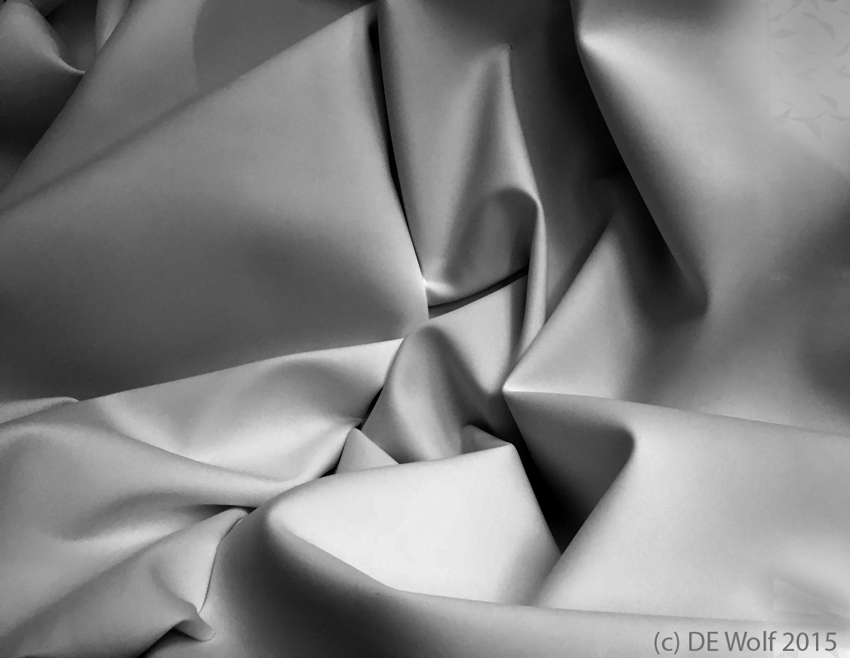
Figure 1 shows one of my absolute favorite black and white subjects a tone-on-tone, and favorite among favorites the tone is white. The image is composed strictly of light and shadows. This is an IPhone image of a huge satiny white paper background to a store window display. Of course, the rotation that I chose, what is vertical, what is horizontal is not the same as the original. The folds seemed to demand something different. As always the trick is not overdoing the contrast, not defeating its tonality and turning into a black and white caricature. Here also there was the problem of reflections in the window glass. I minimized these by shouting at a slight angle and those that remained a treated by bleaching out the midtones until they faded into the highlights and then softened the highlights to match the surrounding greys. Other than that there is very little dodging and burning here. I set the levels to equalize the histograph and gave it a pleasing gamma – nothing else. I am pleased with the final results.
Hati and Skoll Gallery
Home to the photographic works & blog of physicist David E. Wolf.

