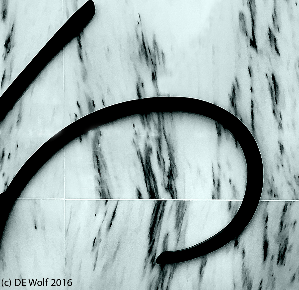
I thought that I would go, or offer up, today an example of photominimalism. The Wikipedia defines “minimalism” in the visual arts and music as style that uses pared-down design elements. This paring down, I think, is key to its appeal. When you look at what might be called a “complex” photograph full of details, it is usually made or broken by fundamental design elements” the golden rule of thirds, sweeping curves, vertical or horizontal lines. But these can be hidden, buried in complexity, to be dug or teased out. Minimalism emphasizes these design elements. We are delighted by its simplicity.
So Figure 1 is an example of photominimalism. I am happiest when I can do it in black and white, which is, in and of itself, a minimalizing element. My eye delights in the curves, the tiles, the glossy texture the marble background contrasted with the matte black of the sweeping lines. For me there is a kind of meditative simplicity to it.

