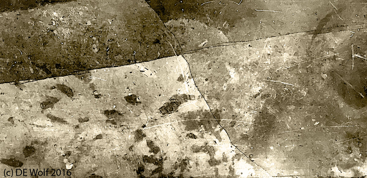
I just wanted to share Figure 1 today, which is my second floor-tile study. It was even more difficult than the one that I posted yesterday, in terms of the narrow contrast of the original; so again a challenging tone-on-tone. I processed it in a very similar fashion and again ended with a fairly deep sepia tone. Here the original was tan and tanner. I do not see anything specific in this tile only the intricate and magic of polished stone and in the image’s interpretive adherence to the “golden rule of thirds.”
Hati and Skoll Gallery
Home to the photographic works & blog of physicist David E. Wolf.

