Here is one for all of you who had to pass the dreaded swim test at summer camp, high school, or college. On Wednesday, November 6, the two new Sumatran tiger cubs at Washington, DC’s National Zoo were subjected to a swim test of their own before they would be allowed to roam the tiger enclosure. The cubs, Bandar and Sukacita were not totally pleased with the outing, which will not be a surprise to anyone with a pet cat. It is totally humiliating! But it is important that should the little(?) felines find themselves accidentally in the drink, as it were, that they be able to both swim and drag themselves out of the enclosure’s moat. Hmm, Bandar was kinda unceremoniously tossed in and in can be seen showing his extreme displeasure, in this perfectly caught photograph by Manuel Balce Ceneta/AP, as in “do that to me again and I’ll eat your face-off!”
Remembering Armistice Day

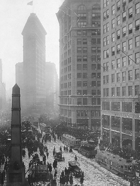
Armistice Day, November 11, 1918 at Madison Square in NYC, from the Wikimedia Commons and in the public domain.
Some thing that we all share with our parents and our grandparents, with all people worldwide is the wish that war will have ended forever. So it seems fitting to share with you this historic photograph of the celebrations on Madison Square in New York City of the end of the “War to End All Wars,” taken on November 11, 1918.
You will note the Flat Iron Building in the background. I was there about a month ago and tried to position myself exactly where Edward Steichen stood to take his wonderful image. And I always look up at the Flat Iron building and smile remember both being there with my father and the wonderful movie “Bell Book and Candle” when Jimmy Stewart throws his hat off the roof. This picture captures the magic of the site and the magic of a New York City tickertape parade. The trolley cars and automobile attest to when the image was taken.
Then there is the obelisk in the lower left. This was erected in 1857 and rises over the tomb of General William Jenkins Worth, who served in both the Seminole Wars and the Mexican War. Fort Worth, Texas was named, after him as was Worth Street in lower Manhattan. These wars were already distant memories by 1918. But perhaps, the presence of this memorial in the picture testifies to the difficulty of establishing terue and long-lasting peace. It is an admirable goal!
I never expected to meet Mozart’s wife

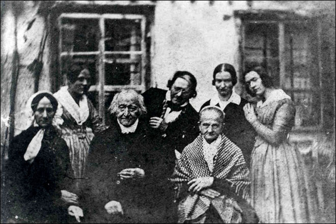
Figure 1 – Image from 1842 showing Mozart’s widow, Constanze Weber, lower left two years before her death. From the Wikimedia Commons and in the public domain.
I was doing some mindless searching of the web today at lunch and I met someone that I never expected to encounter. This person was Constanze nee Weber (1762-1842), the wife of Wolfgang Amadeus Mozart (1756 – 1791). Wait a minute, you say, how is this possible? Well take a look at Figure 1 which shows Constanze Mozart at age 78 years two years before her death. She is in the front left and dressed in black. Bavarian composer Max Keller is seated center front, and to his left is his wife Josefa. From left to right in rear: family cook, Philip Lattner (Keller’s brother in law), and Keller’s daughters Luise and Josefa. The print is a 19th century copy of the original daguerreotype photograph taken October 1840, at Keller’s home. This image was discovered in 2004 in the Altötting state archive in 2004. So amazing, right? You’ve got to love the way Lattner leans forward, the expression on Keller’s face, and the touching way that Josefa leans against Luise.
We have spoken a lot about this, but the words “I met” still ring very true. Somehow seeing someone’s photograph is meeting them, somehow you feel closer to them than with a painted portrait, no matter how finely done. They become kindred in a way – fellow occupants of modern times. You cannot help but stare into their faces in a way that doesn’t work with a painting. It’s not after all, an artists conception, it is a real instant lived. You create a little story in your mind. In this case the story is of the first encounter with some new fangled gadget – maybe the first time you saw a digital camera – or maybe the first time you saw a Polaroid Instamatic (if you ever did). You can relate to the moment captured. The party on the lawn stops and everyone gathers round as the magician photographer does his sorcery. And finally, and in a way that once more contrasts ever so deeply with the experience of a painting, you feel a twinge of remorse that this person or persons passed away. You met them, knew them, and shared a moment with them. Perhaps there is truth to the view that the camera captures your soul.
Modern Fossils
I went out for a walk along the river at lunch today and I was amazed. It’s been six weeks since my first fall foliage posting of the year and the trees are still at. This is very unusual. I went back and visited the site where I photographed “First touches of fall,” and not surprisingly, the lily pads are gone, and the leaves are all gone from the overhanging trees. Still, the reds that I said were missing have now emerged and the oaks are putting on a magnificent display of reddish browns, and orange browns, and burnt oranges.
However, I suspect that you will scream if I post one more image of brilliant autumnal color. Enough is enough, Wolf. Time to get back to black and white! So I’ll have to find expression in other topics.
One significant point is the importance of looking down. He who looks constantly straight ahead is apt to trip and fall on his/her face. So I did just that. I did look down. It is a male habit. As young boys we learn the lesson that treasures are to be found by the perceptive eye on the ground.
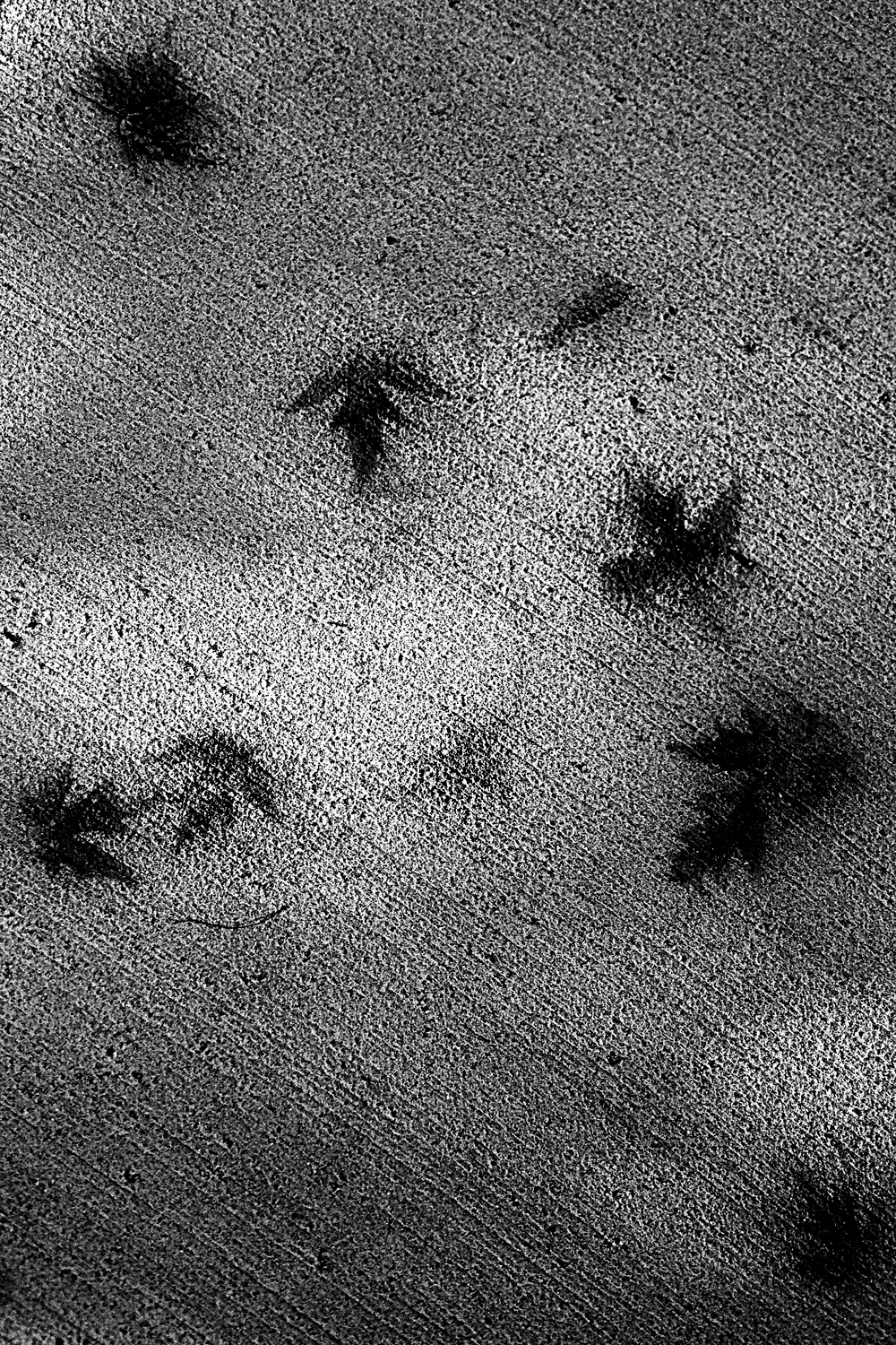
Today I was looking at the pavement, and what I found was kind of interesting. It had rained over the weekend and some maple leaves had stuck to the ground and rotted a while, long enough to leave barely perceivable impressions of themselves. The leaves are now “Gone with the wind.” But the impressions linger – themselves the last ephemeral remembrances of summer. Under different circumstances these impressions might become fossilized and last for millions of years. The duration of these leaf prints is more fleeting. Come the next rain or at best the melting of snow next spring and they will be washed away, except as Figure 1, taken with my IPhone, preserves them.
The destroyer of worlds

Figure 1 – Pacific Typhoon Haiyan approaching the Phillipines on Nov. 6, 2013, Image Credit:
NASA Goddard MODIS Rapid Response Team, in the public domain.
As I am writing Typhoon Haiyan is barreling down on the central and southern Phillipines. Robotic eyes from spacing are watching the whole story unfold, and despite the natural beauty of these space images, we are, unfortunately, certain to see much worse in the days to come as scenes of the human tragedy unfold.
Haiyan has achieved status as a Category 5 hurricane. According to Brian McNoldy, a Senior Research Associate at the University of Miami’s Rosenstiel School of Marine and Atmospheric Science in Miami, Fla.,”Haiyan has achieved tropical cyclone perfection. It is now estimated at 165kts (190mph), with an 8.0 on the Dvorak scale… the highest possible value.” Haiyan is approximately 500 mi in diameter. Some believe it to be the most powerful typhoon ever recorded. The image shown in Figure 1 was taken from the MODIS instrument aboard NASA’s Aqua satellite on Nov. 7, 2013 at 04:25 UTC.
NASA has many robotic eyes trained on Haiyan. These are the ever watchful sentinels of Earth. They study wind, temperature, and pressure. The trouble with robotic eyes, at least for now, is their intrinsic lack of soul. They do not feel or empathize. Still save many lives will be saved by virtue of the warnings that they provide and by the knowledge base that they build. Looking at images like this, simultaneously so beautiful and so terrible, I cannot help but recall the words of J. Robert Oppenheimer (1904-1967) and of all the world’s mythologies that his phrase evokes.
Windy
This may shock you, but today I am going to post a cute, cuddly dog picture. It’s just the mood that I’m in. I am forever going through the various “Best of the Week” photo series and am forever depressed by all of the terrible events going on around us! Today I just cannot deal with it anymore. So…
Last week there were severe and devasting storms in Europe. We have been watching the news footage here in the United States in the context of the pretty recent memory of Hurricane Sandy in New York City and along the New Jersey coast. So I was drawn to these images and delighted to find this wonderful picture by Jens Buettner / Deutsche Presse-Agentur via AP showing a very shaggy dog running during a heavy storm at the harbor of Timmendorf on the German island of Poel in the Baltic Sea on October 28.
What I like about this photograph is that it tells the whole story without words. The dog shuts his eyes against the onslaught of the wind, which fiercely blows back his fur. We wonder if he is in danger of being blown out to sea. Some technical points: love the rule of thirds, love the color similarity of dog and dock, love the out of focus bokeh of the sea. Great stop action. Then there is a certain ambiguity about how the dog feels. Is he upset about being windblown? Would he prefer the warm of hearth and home? Or does he find it all great fun, in the same way that school children enjoy a day off and fun in the snow the day after a blizzard when the rest of us have to clean up.
Some changes at Hati and Skoll Gallery
Hello Everyone,
Thank you so much for your continued interest in Hati and Skoll Gallery and Blog. I’ve made a few changes in keeping with the changing of the seasons and “The Time Change.” You may notice that I have taken down the “Halloween Gallery” – farewell for a year to my favorite holiday. The images on exhibit at the “New” has also changed. There you will find a set of images that I took in late October 2013 at the Mark Twain and Harriet Beecher Stow Houses in West Hartford, CT and at the Hill-Stead Farm Museum. You will also find that new images have been added to some of the other galleries. I hope that you enjoy.
All the best,
David
Collecting “selfies”
I went out to lunch with my wife last Saturday, and we wound up checking out the Eileen Fisher Company Store. This is a pretty husband friendly store. They have a nice array of “husband chairs” and they do not clutter them up with piles of clothing. You can also sit and watch an endless video loop on a big screen TV about eco-friendly fabric dying and the sixteen ways to tie a scarf. So if you want to discuss either of these, I’m quite definitely your man!
But after a while the videos became old, and my wife had yet to emerge from the dressing room; so I took to reading the news on my cell phone. There I came upon a blog by Helen A. S. Popkin for NBC News entitled “Don’t try this at home: all the selfies you’re hopefully never going to take.” It is Popkin’s hypothesis, and I think a rather safe one, that all the hubbub about selfies in 2013 is only going to be eclipsed by the hubbub about them in 2014. Basically this is the age of the selfie craze.
I strain to project my mind forward fifty years. It is a humbling exercise, because we never know all the twists and turns that nature and mankind will take. Still I am pretty sure that just as we today go to major museums, like the Metropolitan in NY, the MFA in Boston, or the Musée d’Orsay in Paris, to see retrospectives about, for instance, the Kodachrome Era or Snapshots of the Sixties, our progeny will head to these, or other, museums to see the great retrospective about The Golden Age of the Selfie. You can pretty much count on it, and it will be fun for them to see and wonder what was going on in the minds of these self-possessed, just as we now look and wonder about those people in the Daguerreotypes.
Hmm! It is easy enough to imagine this. Where things get interesting is when you try to understand how monetary value will become attached to these selfies as collectors’ items. People collect early photographs and great photographs. Today they collect the memorabilia photographs of the mid-twentieth century. The point is that these are on paper, glass, or metal. They are by definition one-of-a-kind and rare. How does this kind of collection translate going forward into this and future centuries?
Years ago you would met someone, say on a bus, and after a while you would pull out your wallet and show snapshots of your family, and yes even your pets. Today you pull out your smart phone. The smart phone has the same size, format, and perspective of the snapshots of old. The are copyable and easily transferable. Still the simple fact of their being merely stored as so many pixels and bytes makes them vulnerable in the long term. You don’t even have to bother throwing them in the trash to send them to ignominious oblivion.
This simplicity of destruction will make them intrinsically rare. So I am thinking that some entrepreneurial sort will find a way to make money selling them. And that’s where it will all begin.
In her blog – you see they’re no longer columns or articles, but blogs – Pokin quotes a user-submitted definition of “Selfie” on the crowd-sourced “Urban Dictionary:”
“The taking of a picture of yourself and posting it on Facebook because you have extremely low self-esteem and you need people to comment to tell you how hot or pretty you look.”
I predict that a some point those of these narcissistic examples of human vanity will become more than so. They will make the transition to art – not just art, but collectable art.
London with an eastern view
For the past four years a blogger known as “The Gentle Author” has been writing about the social history of East London. For those of you who follow “Call the Midwife,” it is that East London. In the process The Gentle Author has amassed a hundred years of London photographs with this easterly viewpoint and he has now published them. Here is a wonderful video with some of these images.
Often, a drawer or box full of old photographs becomes a treasure trove and derives new meaning simply by sorting and cataloging. It becomes a thematic collection, and history has a way of making the mundane and everyday now prized for the nostalgia it evokes. People who collect historical photographs, antiques, or antiquarian books are always told to choose a topic and take it on with undaunted focus. We have time and again seen collections of old pictures evolve into wonderful collections. When I was growing up my father had a friend who went around NYC photographing things that were typical but on the way out – making that wonderful transition from commonplace to quaint. Such collections they teach us where we have been, and by learning that we get a glimmer both of essential humanity and where we are going.


