Autofocus and the intelligent camera I – what is image contrast

Figure 1 - An image illustrating the concept of contrast.  The LHS is at relatively low contrast, the RHS at relatively high contrast.  From the Wikimedia Commons and in the public domain.

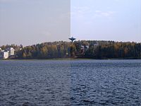
Figure 1 – An image illustrating the concept of contrast. The LHS is at relatively low contrast, the RHS at relatively high contrast. From the Wikimedia Commons and in the public domain.

I’d like to continue our discussion of the artificially intelligent (AI) camera with an exploration of how autofocus is accomplished.  You start with the view that what my brain is doing is pretty complex and requires great intelligence.  Then you break it down in pieces, pieces that can be automated and it seems pretty simple.  This is turn leads to the view that what the camera is doing isn’t very intelligent after all. This is really not the correct way to look at it.  The autofocusing hardware and software in the modern digital camera is truly AI.

Autofocus is accomplished in two ways.  There is the contrast maximization method and the phase method.  So the first question that we have to answer, which is the subject of today’s blog is: what is contrast?  Take a look at Figure 1.  The left hand side is at relatively low

Figure 2 - Histograms of the grey level distributions of the two sides of Figure 1.

Figure 2 – Histograms of the grey level distributions of the two sides of Figure 1.

contrast, while the right hand side is at higher contrast. This conclusion is based on our visual perception or concept of contrast.  It looks to us as if there is a wider distribution of grey scales on the right than the left ,and this is borne out when we look at a histogram of the grey levels in Figure 2.  If you’re not familiar with what a histogram is, it is an analysis of how many of the pixels in this case in each of the sides of the image have a particular intensity (or grey level).  This is a so-called eight bit image; so there are 256 grey levels with values from 0 (or black) to 255 (or white).  We see that there is a much narrower range of grey levels in the low contrast right hand side.

This is what image contrast is conceptually.  If we want to put a number on it, which we do if, for instance, we want to quantify it so that we can use the contrast to create an autofocusing mechanism, there are several definitions that we can go with.  In common parlance, there are three widely used definitions, Weber, Michaelson, and RMS for root mean square. Each has its uses, disuses, and misuses.  But fundamentally, what these definitions do is calculate some representation of the width of the distribution and the average value of the distribution.  Contrast is then calculated as the ratio of width over average. If you are interested in the actual mathematical definitions. a good starting point is the Wikipedia site on contrast.  The important point is that if you have an array of pixel intensities (Psst, that’s your image) all of these can be calculated in a tiny fraction of a second with appropriate hardwired or software-based programs.

By the way, there is a little paradox to consider here.  One of the first things that I do when processing an image is to spread the grey levels of the image over the full range of 0 to 255.  If you do that with the low contrast left hand side the result is a much more contrasty image, than if you do that with the high contrast right hand side.  This is because the right hand side has intrinsically more contrast and therefore more dynamic range of grey levels.  It has more information.


Volleyball and breaking all the rules

Sometimes the best way to take a dramatic photograph is to break all the rules, well maybe not all, the rules.  Take a look at Michael Meisnner of the AP’s wonderful picture showing Russia’s Iuliia Morozova and Ekaterina Pankova jumping to block the ball during the Women’s Volleyball European Championship quarter-final match against Turkey in Germany.  BTW, the Russian women did go on to win the tournament. This is one of those amazing wow pictures.  The subjects are facing away from us. There are no faces and no bodies, just hands and a ponytail.  The ponytail, of course, says it all about this anti-gravity moment.  Then your eyes start to wonder. You are intrigued by the finger nails, the matching hairband, and the bandaged pinky finger.  When you find yourself studying the detail that much in a picture, you just know that the photographer really succeed. I just love it! Bravo!

The invisible skyscraper or the photograph that isn’t and never will be

Here’s a paradox for you.  Can you take a photograph of something that’s invisible?  Sound like a rhetorical question?  Well maybe not.

The government of South Korea has approved a design for a skyscraper which has been described as “invisible”.  No, this is not the latest illusion by magician David Copperfield, who vanished the Statue of Liberty, and the building will not actually be transparent. Rather, the building is designed to reflect its surrounding area with a complex system of glass, LED lights and cameras. ‘Tower Infinity’ will project real-time images of its background onto its own surface. Three sections each with 500 rows of LED screens will – at full power – appear to merge the skyscraper into the horizon.  Designed by U.S.-based GDS Architects, the glass-encased Tower Infinity will top out at 450 meters (1,476 feet) and have the third highest observation deck in the world. Here is an artist’s conception of what the building will look like as the invisibility, aka “Romulan cloaking shield,” is turned on.

Us physics types really love paradoxes, and we have many to choose from, for instance “the twin paradox” from relativity theory, the “grandfather paradox” from (I don’t know time theory(?), and, of course “Schrödinger’s Cat,” from quantum theory.  But finally, we have something that the average everyday photographer will be able to point his lens at, or maybe not.

“A paradox!

A most ingenious paradox!

We’ve quips and quibbles heard in flocks,

But none to beat this paradox!”

Gilbert and Sullivan, “The Pirates of Penzance


Nathan Benn’s Kodachrome memories

I have previously extolled the virtues of Kodak’s “Kodachrome” transparency film.  This is part of the mystique of the “Analogue Days,” of film-based photography.  I personally used three films: Kodachrome, High-speed Ektachrome, and Agfachrome.  There were others, of course,but these were the ones that I used.  The important point was that each of these transparency films provided the photographer with a unique set of aesthetic qualities.  They functioned like an artist’s palette, and you could choose between them depending upon your mood and what you were photographing.  Kodachrome was for warm pastels, Ektachrome for cool wintery scenes, and Agfachrome for vivid color.  The phrase “film’s aesthetic quality” uses “quality” in the same sense that it is used in music to connote the individual voice of an instrument, here a film.

So, now I’m thinking of shoe boxes everywhere in the closets of aged photographers full of Kodachrome slides.  National Geographic photographer Nathan Benn recently went through his closet, chose some of what he believed, were his finest slides and published them in a new book entitled “Kodachrome Memories.”  I found myself going through this series several times trying to figure out whether Mr. Benn had really captured the quality of this wonderful film.  Then I realized something.  I was going through this set of pictures over and over again, and there were several images, in fact more than several images,  that repeatedly made me smile.  Kodachrome was not just a film with certain visual properties.  More significantly, this film defines a period roughly in the center of the twentieth century, and our visual sense and collective memory of that period is inexorably intermingled with the aesthetic properties of Kodachrome – in the same sense that we think of the early twentieth century as black and white.

Let’s start with Benn’s 1973 photograph, “Vermont Barnyard,”  with its cows set against a huge barn with peeling paint, and the laundry hanging out to dry.  This is quintessential Kodachrome – Kodachrome at its best!  Then there is his 1974 “Woman in a New Haven, Vermont Doorway.”  The woman seems to define the back to basics mystique of the seventies.  She isn’t looking at the camera, which creates a need for a story.  She is young and beautiful and her bare dirty feet, charming. Then there is the 1984 image from South Memphis, TN capturing a couple kissing, because what tells a better story than a man and a woman kissing?  Well, maybe it’s the 1983 picture of a little girl in a white dress in New Orleans, LA.  And just as I found myself smiling at the Nanette hairstyle in Benn’s 1973 photograph from Cleveland, Mississippi of a young woman standing in front of a Coke machine,  I found the 1990 picture of a Pittsburgh, PA office worker.  God, were those hairstyles awful!

I wouldn’t say that I want to go back permanently, but I am grateful to Nathan Benn for taking me back for a short visit.  It’s always nice to remember where we have been.   The book is “Kodachrome Memory: American Pictures 1972-1990.”  It was around 1995 when a press photographer came into my lab and talk pictures with a very expensive digital SLR.  I was amazed and now Kodachrome is truly a memory!

The frog that jumped to the moon

Figure 1 - NASA moon rocket launch from Wallops Island, VA, showing startled frog in the upper left.  Picture from NASA and in the public domain.

Figure 1 – NASA moon rocket launch (September 12, 2013) from Wallops Island, VA, showing startled frog in the upper left. Picture from NASA and in the public domain.

I have a friend who told me about a cousin of hers who travels all around the world.  Let’s call the cousin “Robbie,” to protect the innocent.  Robbie carries with her a little Lego figure that she calls Lego Robbie, and Lego Robbie bears a striking resemblance to real Robbie.  Anyway, everywhere Real Robbie photographs Lego Robbie against the sights wherever she goes.  So you have for instance “Lego Robbie in Front of the Eiffel Tower” or “Lego Robbie” in front of the Great Pyramids.”  It’s really kind of delightful and, actually, from a technical viewpoint less than trivial for Real Robbie to achieve the depth of field required to photograph a two inch toy figure against full size grand architecture.  It is very reminiscent of the US television commercials about the guy who travels with a garden gnome figure.

I was thinking about the two Robbies the other day after seeing Figure 1. On September 12, 2013 NASA launched a rocket to the moon from Wallops Island, Virginia, and there captured in one of the launch frames is a startled frog leaping for his life.  The comment was made in one of the articles that I read about this that “we cannot guarantee that no frogs were hurt in the creation of this photograph.”  That would be very unfortunate.  We may also joke about “amphibious assaults.” However, I prefer this little children’s story that runs through my mind about a little frog (OK let’s call him “Robbie.”) who wanted to jump to the moon.  He was always trying, and all his erstwhile friends, his brother and sister frogs, even his parent laughed at him.  That is until one day when …


The artificial intelligence inside your camera

Figure 1 - An example of an artificial inteeligence system.  The top image is the query image.  The program called CIREs, for content based retieval system, then searches the web or other database to retrieve similar images.  From the Wikimedia Commons and in the public domain.

Figure 1 – An example of an artificial inteeligence system. The top image is the query image. The program called CIRES, for content based retieval system, then searches the web or other database to retrieve similar images, which are shown in the bottom.   The program is following a set of rules that define the image and here ultimately lead to magenta flower, butterfly optional. From the Wikimedia Commons and in the public domain.

We have discussed the fact that cameras used to have a persona about them.  It was almost as if they were people.  You know, the person that never takes a good picture of you.  Today, cameras have become so small and so integrated into our lives that they have lost this persona.  They’re just there. And it is really a paradox because just as we have given our cameras artificial intelligence and therefore a real persona, we pretty much take them for granted.

Cameras with artificial intelligence?  It almost seems like a silly statement to make.  Part of the problem is that we take artificial intelligence for granted.  Ray Kurzweil has pointed out in his book, “The Singularity is Near,” that every time we invent or create artificial intelligence, we call it something else.   And this is clearly the case for the modern digital camera.

Photography is a semi-complex process.  However, if you think about it, if you break it down, everything that you do in taking and processing a photography is a series of reasonably well thought out steps.  The process of automating a process, that is translating it from a task performed by a human to a task performed by an automata or machine is first translating the  criterion used  in the process, and then the steps come easily.

Perhaps the earliest element of the “taking a picture” process to be automated was automatic exposure.  We are really talking here about through the lens metering, and early systems worked by the process of taking an average or sometimes a central spot reading and setting that to the exposure and f-stop that would give you the intensity of neutral grey.  Such a system works in some cases but in others is wholly unacceptable.  So more and more exposure points were developed and the camera tried using a microprocessor to anticipate what was important to you.  Or you can give it a hint by setting to close-up, night scene, landscape, back-lit, whatever.  Don’t be so sure if you think that the human is still required.  The systems are getting better and better.

What about autofocus? The first autofocus systems were developed by Leica in the 1960’s and 1970’s.  By the 1980’s autofocus was becoming popular, widespread, and sought-after.  I remember as a proud Leica M3 rangefinder user  thinking at the time.  Who needs that?  Anyone can focus a camera.  Well, let me go on record and say that I was wrong, really way off.  The autofocus systems of today are just amazing.  Truly there a wee little person in my T2i doing all the work for me.  Yes sometimes I can do better with manual focus.  However, since they eliminated the split screen system it’s gotten a bit hard.

Think about the process of focusing.  How do you automate that process?  In the next few technical blogs I’d like to explore that process.  But for now let me just that automating the process was a matter of determining how the human brain measures sharpness of focus and then mimicking it using a microprocessor.

You might be inclined to say all right then but composition that’s untouchable.  As we move towards 2025, when it is predicted that we will have computer’s with the processing power of the human mind and something like forty years after that of the entire human race, I think it a mistake to say never. After all, when we compose we tend to follow, or violate, a set of rules or conventions.  That can be programmed into a machine.  The aesthetics of a beautiful woman, a sweet child, or a handsome man can all be pretty closely defined and will ultimately be translated into a machine language.

Right now I am a bit suspicious of the images coming off of the Hubble Space Telescope.  They are often so beautiful.  Is this because they are intrinsically so; or is someone cropping and choosing the color look up tables to make them appealing to human viewers? However, ultimately, perhaps regrettably, all of our aestheticisms can be measured and coded.

It is also important to remember that all of the processing power need not be on a chip inside your camera.  The infinity of the cloud is available. Siri is not inside your IPhone, but rather somewhere on a big computer in Cupertino, CA.

In the meanwhile we can marvel at the complexity of our cameras and the degree to which artificial intelligence has been incorporated into them.  My suggestion is that you decide on whether your camera’s persona is male or female.  Then give him or her a name.  Start talking to this person.  Pretty soon they will be responding.


A more subtle message

Following up on our discussion of horrific iconic images yesterday.  The kind of images that we have been speaking about are evoke a visceral aka gut-wrenching response.  However, there is a more subtle approach to getting the message across and often this is the more powerful.  Consider, as a poignant example, this story from the San Francisco Chronicle about “Lost Childhood,” by Paul Szoldra, and the associate images by Hamid Khatib for Reuters.  It tells the tale of a ten year old Syrian boy who lives in Aleppo, Syrian.  He and his father fix weapons for the Free Syrian Army.  Issa works ten hours a day and not unlike the children in Jacob Riis’ photograph, “The Children Sleeping on Mulberry Street,”  his story is one of lost childhood.


Social Media: Twitter Embed

This post tests WordPress’ Twitter Embeds feature.

A “Night Gallery” of iconic images

We have discussed recently the powerful and subsequent numbing effect of terrible imaging.  And this brought us to Susan Sontag’s point that each time a terrible, heart-biting image it raises the ante.  The next one must be more terrible to overcome the desensitization.

CNN World has recently posted a series of the “Twenty-five Most Iconic Images.” And I thought that I would share them with you.  Not all of them are terrible.  Some even make you smile – and then you feel guilty for that.  Those that are horrible truly illustrate Sontag’s point.  They are all part of our collective consciousness.  If you remember them from when they first appear they take you back to the original moment of nightmare.  Many are, well, truly gut wrenching.