Dorset Quarry

Figure 1 - View of the Dorset Quarry, Dorset, VT (c) DE Wolf 2013.

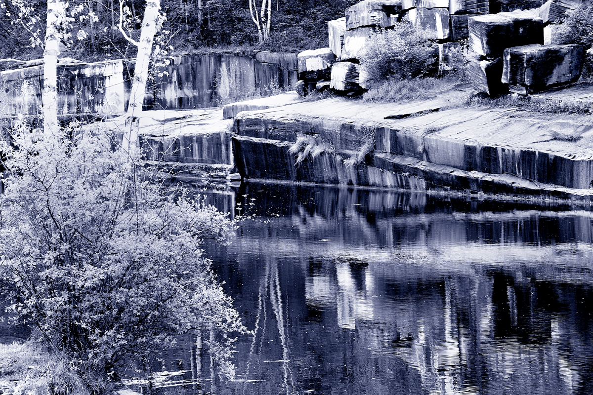
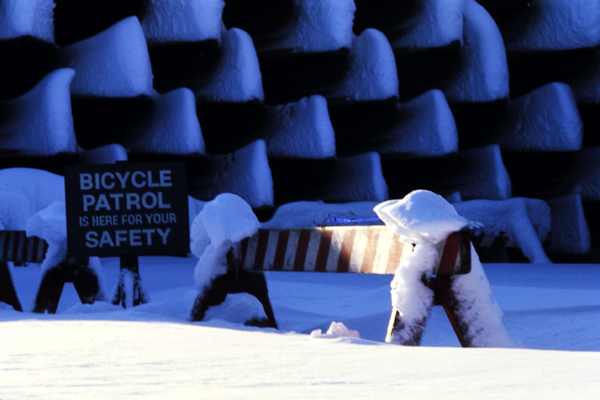
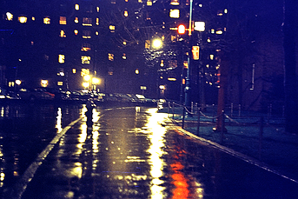
Figure 1 – View of the Dorset Quarry, Dorset, VT (c) DE Wolf 2013.

Vermont is marble!  Indeed the old part of Manchester Village, opposite the Equinox Resort, is actually paved with marble blocks.  So on my recent trip to Vermont, I had one destination in mind, ahead of time, and that was the Dorset Quarry in Dorset, Vermont.  I had been there before and knew that it was an ideal location for the kind of geometric images that I love.

Dorset Quarry was the first commercial marble quarry in the United States.  It was opened in South Dorset by Isaac Underhill in 1785 and continued to produce marble for the next 130 years.  There were ultimately at least  two dozen quarries located on Mts.  Dorset Mountain and Aeolus. Dorset marble was widely used for headstones, hearths, and mantels as well as for sculpture.  This marble was used for several major architectural masterpieces including:the New York Public Library, the library of Brown University, and Memorial Continental Hall of the Daughters of the American Revolution in Washington, D.C. as well several of the stately mansions on Fifth Avenue in New York City.Figure 1 is just a snapshot to give you a sense of the location.

It is the usual black as night water filled town swimming holes.  It conjures up nightmares of accidental drowning deaths.  However, I am assured that the actual safety record of the quarry is much better and that there have not been any fatal incidents at the Dorset Quarry.  Still it seems the perfect setting for a Stephen King novel or M. Night Shyamalan movie.

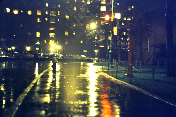
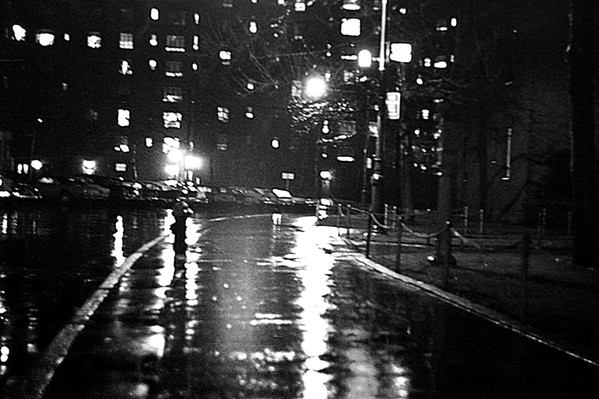
There are huge blocks of graffiti covered quarried marble blocks which decorate the site.  These form abstract designs ideal for photography.  I have several successful photographs from this trip, which I will publish over the next few weeks.  Figure 2 is an example.   I find that the man-made bore holes enhance the majesty of the marble.  Marble is an interesting substance to photograph.  It comes in many varieties.  Dorset marble is know for its blueness.  However, a given image seems to call out fro its own intrinsic toning.  I have chosen a cold blueish tone for Figure 1 but a warmer sepia tone for Figure 2.

Figure 2 - Dorset Quarry #1 Dorsert, VT, (c) DE Wolf 2013.

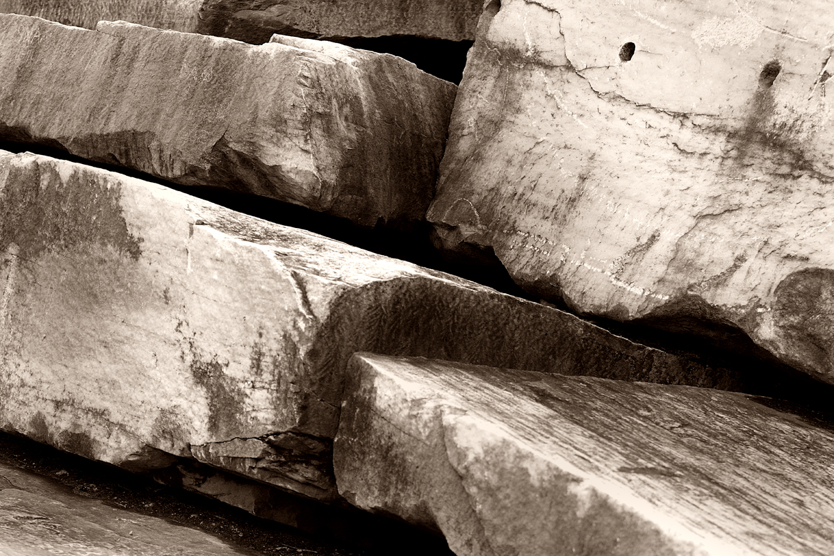
Figure 2 – Dorset Quarry #1, Dorset, VT, (c) DE Wolf 2013.

Vermont Color

Figure 1 - Tree, Norwich, VT, (c) DE Wolf 2013

Figure 1 – Tree, Norwich, VT, (c) DE Wolf 2013

We have been taking a short vacation to Manchester, Vermont – which is a very beautiful valley set in the Green Mountains.  Reminiscent of our vacation last year to Maine, the beautiful weather ended the day we left – but sunshine is where you make it. So once again it was time to be creative with my camera and to continue to learn about the subjects that I like to photograph.

Vermont is, of course famous for its fall colors.  But spring too has its own magnificent shades, starting with the perfect chartreuse  greens of the newly born spring leaves, emergent everywhere.  The flowering trees are magnificent, and even the lilacs are starting to come out in abundance.

On the way up, we stopped first in Norwich at the King Arthur Flour Bakery and Bakery School Campus.  I saw a trail that led into a pine forest and couldn’t resist.  The colors inside were very subtle shades of reddish brown.  A golden retriever greeted me, anxious to be my friend  and play.  The forest went through a wetland, and a little flat board bridge took me across a bog, where I found the remains of an old tree, covered in moss, and still raising what was left of its branches in a mock spooky greeting.  I paused to photograph it using my monopod and experimented a bit to determine whether augmenting the subdued light with flash would improve the scene.  In the end, I settled on the subtlety of the natural light.

Figure 2 - Vermont Flannel, Woodstock, VT, (c) 2013 DE Wolf.

Figure 2 – Vermont Flannel, Woodstock, VT, (c) 2013 DE Wolf.

From Norwich we drove to historic Woodstock, where we discovered, or rediscovered, the brilliant color of Vermont Flannel.  This little narrow shop is  a Vermont mainstay.  It is famous for the three children (manikins) that sit outside, dressed in colorful flannel regardless of the weather, and is stuffed with brightly colored reminders that winter is never far behind in this part of New England. I had trouble framing pictures because the shop was so long and narrow, but did manage a few images that I liked in the end.  Picking up on the same theme, we stopped later in the day at the Vermont Country Store in Weston, VT where I found a pair of women’s rain boots that matched the enthusiasm of all the flannel.  So despite the rain I marked it up as a very colorful day in the end.

Figure 3 - Boots at the Vermont Country Sore. (c) 2013 DE Wolf.

Figure 3 – Boots at the Vermont Country Sore. (c) 2013 DE Wolf.

Blue snow – another color correction problem

Figure 1 - Bicycle Patrol, 1968 digitized image from a Ektachrome transparency, uncorrected for blue show effect. (c) DE Wolf 2013.

Figure 1 – Bicycle Patrol, 1968 digitized image from a Ektachrome transparency, uncorrected for blue snow effect. (c) DE Wolf 2013.

The photograph in Figure 1 was taken at the boat house in Central Park, NYC after a major snow storm in 1968.  The color is as the Ektachrome transparency recorded it.  Blue snow?  Snow isn’t blue; it’s white.  Or is it?

Why is the snow blue?  It’s actually not a problem with the film but rather with the snow itself.  We’re illuminating with daylight, that is beautiful white light.  The color of things comes from three phenomena:  light absorption, light scattering, and interference.  Let’s leave interference, the root cause of color in oil slicks and butterfly wings, for another day and concentrate on absorption and light scattering.  Remember that white light is a mixture of colors or wavelengths that our eye/brain interpret as white.   If you have a surface say a piece of white paper that scatters all wavelengths of light it  appears white.  However, if you have a leaf that reflects or scatters green light but absorbs other colors it will appear green.  So the dominant factor in the color of leaves, and flowers, and other pretty things is what wavelengths it absorbs or removes from white.  Sounds like subtractive color to me!

Now why is the sky blue?  The atmosphere is made of air.  The molecules of the air, the oxygen, nitrogen, etc. scatter the light.  Physicists call this particular flavor of scattering Rayleigh scattering.  Rayleigh scattering goes inversely as the fourth power of the wavelength.  So if you have blue light say 450 nm it will scatter (700/450)^4 or   5.9 times more by air than red light at 700 nm.   Basically the red light shines down on us while the blue light scatters all over the place, making the sky blue.

The same is true of snow.  White light strikes the snow.  The blue light reflects back, while the red light penetrates further, eventually becoming absorbed.  So the snow appears blue. Snow flakes and thin snow don’t absorb much; so they appear white.  Thicker snow and glacial crevices appear blue, as does the snow on my rowboat.

Your eye/brain tends to correct for this and still see white.  In digital photography you can use image processing software, like Adobe Photoshop, to “correct” for the blue snow and make it appear as you expect it to be, namely white.  I’ve done this in Figure 2, using adjust color balance in Photoshop.  Again, you can decide which coloration you prefer.


Figure 2 - Bicycle Patrol, 1968 digitized image from a Ektachrome transparency, corrected for blue show effect. (c) DE Wolf 2013.

Figure 2 – Bicycle Patrol, 1968 digitized image from a Ektachrome transparency, corrected for blue snow effect. (c) DE Wolf 2013.

White balance and color temperature

Figure 1 - Black body spectrum illustrating the concept of color temperature.  From the Wikimediacommons by Dariusz Kowalczyk and in the public domain under creative commons license.

Figure 1 – Black body spectrum illustrating the concept of color temperature. From the Wikimediacommons by Dariusz Kowalczyk and in the public domain under creative commons license.

An obvious question is whether reciprocity failure is related to white balance and color temperature.  the answer is yes and no.  The yes part comes from the common point to both reciprocity failure and white balance that films are designed for a certain mixture of colors in the light.  The no part is that reciprocity failure relates to low and very high light levels, while color balance really applies to the central portion of the sensitivity curve.

Let’s use the terms white balance and color temperature synonymously.  They’re actually kissin’ cousins, but not quite the same thing – but we don’t need to worry about semantic differences here.  When the sun rises in the morning it is reddish, becomes whiter until noon, and then starts to go back to red.  This has to do with atmospheric absorption and scattering of light.  The sun is an incandescent light source, which means that it emits light over a broad region of the electromagnetic spectrum, which our eyes call white because we are programmed to do so.  If you took a piece of iron or tungsten and heated it up to 5900 degrees Kelvin (the Celsius or centigrade temperature plus 273 degrees), it would glow with a spectrum nearly identical to that of the sun.  Hence, the sun is rated as having a color temperature  If you heated it to a lower temperature it would appear red, to a higher temperature blue.  The applet of Figure 1 shows this pretty graphically.  The temperature is given as is the spectrum in red and the rectangle shows you the color that your eye would perceive.

Your eye does a pretty good job of correcting for all of this.  Unless you really concentrate on the tonality, your eye-brain will interpret a sheet of paper to be white regardless of whether you look at it under daylight, indoor color lighting, or fluorescent hotter lighting. Your eye does a wonderful job of adapting.  In contrast films do what they are designed to do.  If you are using daylight film it will give you a warm yellowish tone if you take a picture with incandescent light bulbs or a greenish blue tone if you use fluorescent lighting.  To correct for this you either had to use indoor film or rebalance  the color with color correction filters.

Today’s digital cameras do this correction electronically by adjusting the relative contribution of the red, green, and blue pixels.  They do this very well, in my experience, and even can sense the nature of the lighting.  If you are shooting raw images you can turn off white balance and then manipulate it later with your image processing software.

Changing meaning or morphin’ memes in photography

It is curious how within one’s lifetime, one can witness the connotation of an image or word change by 180 degrees.  For me the classical example of this is contained in a poem by English poet Robert Graves (1895-1985), “The Naked and the Nude.”  I think that to us today, the word naked refers to the lustful, the lascivious, and the sinful – something that you would see on a billboard at an adult movie theater.  In contrast, I think that the word nude describes the artful, the beautiful, the epitome of humanness – something that you would see in an art museum or gallery.  But here’s what Robert Graves said, scarce half a century ago (first published in 1961).

“For me, the naked and the nude
(By lexicographers construed
As synonyms that should express
The same deficiency of dress
Or shelter) stand as wide apart
As love from lies, or truth from art.

Lovers without reproach will gaze
On bodies naked and ablaze;
The Hippocratic eye will see
In nakedness, anatomy;
And naked shines the Goddess when
She mounts her lion among men.

The nude are bold, the nude are sly
To hold each treasonable eye.
While draping by a showman’s trick
Their dishabille in rhetoric,
They grin a mock-religious grin
Of scorn at those of naked skin.

The naked, therefore, who compete
Against the nude may know defeat;
Yet when they both together tread
The briary pastures of the dead,
By Gorgons with long whips pursued,
How naked go the sometimes nude!”

It is as if the two words have totally switched and interchanged their meaning.

Back in 1968, I took a set of three Kodak Transparency images of the Consolidated Edison Steam Power Plant on the lower East Side of Manhattan.  Before that day, in the fifties and early sixties such an image would most certainly have been a meme for industrial power, strength, and national growth.  By 1968 the meme was undergoing metamorphosis.  Such an image was coming to mean industrial pollution, global warming, and national putrification.  These images were taken right on the cusp of the transition – so much so that my friend and I were chased away by overzealous security guards at the power plant.

Figure 1 - Consolidated Edison #1, 1968, digitized from a Kodachrome transparency. (c) DE Wolf

Figure 1 – Consolidated Edison #1, 1968, digitized from a Kodachrome transparency. (c) DE Wolf

Reciprocity failure in color film

While working on my slide collection digitization project, I came across some classic examples of color film reciprocity failure.  This is not a problem with modern digital photography, but something one should be aware about, otherwise it will surprise you when it crops up..

For starters, let’s consider the concept of reciprocity. Reciprocity refers to the simplification that the response of silver halide is a function of the total exposure. As a result, you should be able to achieve the same density of silver grains by exposing to a fixed total amount of light.  This fixed amount  is equal to the exposure time multiplied by the light intensity.  The idea is that the same density is achieved, say, intensity I in one second and with half the intensity or I/2 in two seconds.  Film does not strictly respond in this way.  At extremely low light levels this is not strictly true – hence what is known as reciprocity failure.  At low levels of

Figure 2 - Uncorrected digitized Ektachrome image of a wet street at night in NYC, illustrating reciprocity failure. (c) DE Wolf 2013.

Figure 1 – Uncorrected digitized Ektachrome image of a wet street at night in NYC, illustrating reciprocity failure. (c) DE Wolf 2013.

light the film responds much more slowly so you need a longer exposure to get the same density on your negative.  For color films things become more problematic as each of the three color layers respond differently to low light level.  In general, with slide films green is more responsive than yellow; so the image slips into a greenish tinge.

This can easily be seen in Figure 1, a digitization of an Ektachrome transparency, taken around 1970, of a New York City Street on a rainy night.  The image has clearly, shifted towards the green.  You’ve got to decide whether or not you find this aesthetically pleasing.  Of course, once you’ve got the slide digitized it is a simple matter to adjust the color back to normal, which I have done in Figure 3.  So you can decided which image you like better: uncorrected Figure 1 or corrected Figure 2.

Figure 2 - Color-corrected version of Figure 1.  (c) DE Wolf 2013.

Figure 2 – Color-corrected version of Figure 1. (c) DE Wolf 2013.

I showed this image to several colleagues, and it was unanimously decided that, in fact, the image looked better as a black and white.  This is presented below as Figure 3, and speaks to the power of black and white photography to create mood.

Figure 3 - Night scene of NYC in the rain, c 1970," (c) DE Wolf 2013.

Figure 3 – Night scene of NYC in the rain, c 1970,” (c) DE Wolf 2013.


Why Albert Einstein is wearing his wife’s coat explained

My posting about memes and the fact that Albert Einstein is wearing his wife’s coat – a jacket that buttons right to left has generated some interest.  As a result I decided to delve into the problem a bit and do some photographic forensics.

Figure 1 - Einstein facing the right way and wearing his own coat.  1947 from the Wikimediacommons and in the public domain.

Figure 1 – Einstein facing the right way and wearing his own coat. 1947 from the Wikimediacommons and in the public domain.

I wanted to put Einstein in what was definitely the correct perspective.  I found two images where the orientation is definitive.  The first, shows Einstein writing on the blackboard, where if we can read the equations, it’s not a mirror image.  The second, shows Einstein shaking hands, a right hand activity, upon receiving his certificate of US citizenship from Judge Phillip Forman.  The important point in these images is to notice the distinctive nature of Einstein’s two eyebrows.  The right eyebrow is darker in the center, while the left is more uniform in coloration.

So then if you return to our original image.  You see that it is the left brow that is smaller.  The image is reversed, mirror flipped.  The Wikimedia site is definitive.  It shows the original image from 1947 and facing right and facing left variants.  Somebody along the way decided that Albert would look better facing to your right, despite the fact that it dressed him in borrowed robes, and was just a bit disconcerting to the dress-code meme-sensitive among us.  So allow me to restore Einstein to his full uncropped and unflipped 1947 glory in Figure 1.  I am certainly glad that we got that straightened out!  Columbo and Monk would be proud.


Photography and the sin of pride

Figure 1 - The Roman Pantheon, from the Wikimediacommons, image by Bengt Nyman under creative commons license.

Figure 1 – The Roman Pantheon, from the Wikimediacommons, image by Bengt Nyman under creative commons license.

Among the seven deadly sins the sin of pride is considered not only the worst, but the root cause of all others.  The construction of the Tower of Babel was considered a classic biblical example of the sin of pride. Dante’s definition of pride was “love of self perverted to hatred and contempt for one’s neighbour”.  Whoa!  That’s serious stuff and not really what I want to write about here.  I’m more concerned about your everyday pride – perhaps not reading so high on the Father Guido Sarducci’s “How to Pay for your Sins Scale.”

There’s a lot of things that we as individuals are proud of.  I am proud of some of the scientific work that I have done, proud of some of my scientific writings, proud of the book book that my colleague Kip Sluder and I have edited and nurtured through four editions, and yes, proud of some of my photographs.  There’s not so much wrong with any of this kind of feel good about yourself stuff as long as you remember not to take yourself too seriously.

And as long as you remember to keep it all in proper perspective.  I remember that when my book first came out I would hold it up and think: “Pretty good I made this!”  Well, at about that time I happened to visit Rome on vacation, where I wandered into the Roman Pantheon – The Temple to all the Gods.  This is a remarkable building.  I have included an image of it as Figure 1. The Pantheon is deceptively designed in that its facade is meant to look like the Athenian Parthenon, the Temple of Athena.  But when you enter it you emerge into a giant dome, really a sphere (the ancients realized that the Earth was a sphere and believed that it was surrounded by the concentric spheres of cosmos) with a marvelous window at its center.  This is meant to symbolize everything (a modest endeavor to be sure).  This building is truly wonderful and almost beyond description.  You emerge again breathless and look back from whence you came and there above the portico, inscribed in giant letters for all the world to see are the words: “M·AGRIPPA·L·F·COS·TERTIUM·FECIT,” which basically means: “MARCUS AGRIPPA MADE THIS.”*

Hmm, my little book paled in comparison.  I tell you this story kind of as a parable in relationship to photography.  In photography, indeed in life, one needs to do for the love of doing and seek to do good and beautiful work.  One reads so many biographies of photographers, scientists, artists that say something like: (s)he was unappreciated is her/his lifetime.  The point is that while it is nice to be loved, do it for yourself, the rest: fame, riches, whatever is serendipity.  Indeed, the goal to be great as opposed to the goal to be good is a dangerous one, witness all of the cases of scientific fraud, perpetrated by those who sought fame and somewhere along the way lost the meaning of being a scientist.  This takes us full circle to the sin of pride.

I know so many people that are true amateurs – someone who does something purely for the love of it.  And among these are some of the finest photographers that I know.  And how do I judge that?  The answer is obvious.  It is that their work speaks to me and contains a deeply personal vision.

And what of Marcus Agrippa and the Pantheon that he built?  What of the deadly sin of pride?  The answer, of course  lies in the famous poem “Ozymandias” by Percy Bysshe Shelley (1792-1822).

I met a traveller from an antique land
Who said: “Two vast and trunkless legs of stone
Stand in the desert. Near them on the sand,
Half sunk, a shattered visage lies, whose frown
And wrinkled lip and sneer of cold command
Tell that its sculptor well those passions read
Which yet survive, stamped on these lifeless things,
The hand that mocked them and the heart that fed.
And on the pedestal these words appear:
`My name is Ozymandias, King of Kings:
Look on my works, ye mighty, and despair!’
Nothing beside remains. Round the decay
Of that colossal wreck, boundless and bare,
The lone and level sands stretch far away”.

* Actually the inscription was put there during a later renovation by the Emperor Hadrian and means, in its entirety: “Marcus Agrippa the son of Lucius made this in his third term as consul.”