John Thompson – Street Life in London

Figure 1 - John Thompson, Flower Girls in Front of Concvent Garden.  From the Wikicommons and in the public domain.

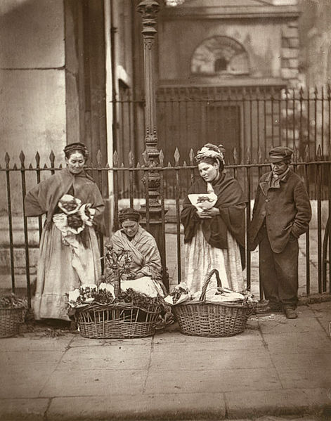
Figure 1 – John Thompson, Flower Girls in Front of Concvent Garden, 1877. From the Wikicommons and in the public domain.

John Thomson (1837 – 1921) was one of the great Scottish photographers of the nineteenth and early twentieth centuries.  In his early career he gained notariety as a travel photographer and was one of the first photographers to document the far east.  In his later career he became a society photographer in Mayfair and was awarded the royal warrant.But what he is most remembered for today is his partnership with radical journalist Adolphe Smith.  The two collaborated in the production of a monthly, Street Life in London, between 1876 – 1877, which was subsequently published in book form in 1878.  The project was to document London street life, the lives of the people who scratched out there living invisible and just beneath the eyes of the middle and upper classes.  These were images of chimney sweeps, and flower girls, and peddlars.

Figure 2 - John Thompson, The Crawlers, 1876-1877, From the Wikipedia posted by catus.man and in the public domain.

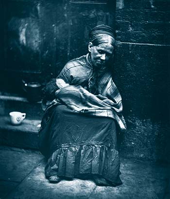
Figure 2 – John Thompson, The Crawlers, 1876-1877, From the Wikipedia posted by catus.man and in the public domain.

These powerful images represent one of the first great social commentary photographic series.  and served to create a visual resonance to the stories of Charles Dickens.  Life was not rosey on the streets of London. Take, for instance, figure 1, which shows flower “girls” in front of Convent Garden.  They are not Eliza Doolittle. In Smith and Thompson’s own words:

When death takes one of the group away, a child has generally been reared to follow in her parents’ footsteps; and the” beat” in front of the church is not merely the property of its present owners, it has been inherited from previous generations of flower-women. Now and then a stranger makes her appearance, probably during the most profitable season, but as a rule the same women may be seen standing on the spot from year’ s end to year’s end, and the personages of the photograph are well known to nearly all who are connected with the market…”

Truly, in creating Street Life in London, John Thompson defined the profession of photojournalism.  The powerful images that chronicle social injustice in the twentieth and twenty-first centuries have their roots, and owe their essence to these photographs by John Thompson.

Marie and Pierre Curie in their laboratory

Figure 1 - Marie and Pierre Curie in their Laboratory.  From the Wikicommons and in the public domain.

Figure 1 – Marie and Pierre Curie in their Laboratory. From the Wikicommons and in the public domain.

As classic examples of the photographic genre “Scientists at work in their laboratories,” I offer up, first a picture of Marie (1867-1934) and Pierre Curie (1859-1906) in their laboratory (Figure 1) and then a later picture of Marie Curie alone (Figure 2).  The second most likely dates after Pierre’s untimely death.

Here the camera serves to chronicle, to capture a moment in time, and to place that moment in its historical context.  These images serve three purposes.  First, they are portraits of the Curies.  Second, they recorded, and now show us, what a physics laboratory was like at the dawn of the twentieth century,  And third, pershaps most significantly, since they were at some level posed, they show us the Curies in the way that they wanted people to see them.  Image for public figures was as important then as it is now.  Pierre looks more than a bit fatherly.  And Marie appears demure, not to mention gorgeous in her younger days.  What we see of her is her dedication to science, to family, and to country.  Despite her taking on a then masculine endeavour, she violates no social norms.

Figure 2 - A later laboratory picture of Marie Curie.  From the Wikicommons and in the public domain.

Figure 2 – A later laboratory picture of Marie Curie. From the Wikicommons and in the public domain.

It is important to mention what remarkable people the Curies were.  They were physical chemists in the late nineteenth and early twentieth centuries.  Chemistry text books began with the essential definition of an element as an immutable substance.  You could change its physical form.  You could melt or vaporize it.  You could react it with other elements.  But you could never turn it into another element.  But then the Curies’ measurements showed something very strange, elements could change into other elements.They were brilliant experimentalists.  Look around at the scientific instruments that they used.  Many of them were homebuilt and were the most accurate in the world.  They checked and rechecked their calculations.  But in the end, they opened up their minds and as scientists they embraced the epiphany before them.  And they opened the door to a true understanding of the physical nature of the universe.  In this regard, they are the architype of “the scientists.”

In ending, I’d like to draw your attention to a website that chronicles the arrival of these two Parisian dandies, or so they must have seemed to American westerners, on their arrival in Telluride, Colorado to buy dirt.

Scientists in the laboratory

Figure 1 - the author in the laboratory of Dr. Watt Webb in the Department of Applied Physics at Cornell University in 1975. (c) DE Wolf, 2013

Figure 1 – the author in the laboratory of Dr. Watt Webb in the Department of Applied Physics at Cornell University in 1975. (c) DE Wolf, 2013

While I was writing and researching my recent blog on Robert G. Edwards, I was struck by the importance of capturing images of people in their places of work and in their places of living.  My father had a friend who in the 1960’s and 1970’s set out to take photographs of everyday things that he was pretty sure would no longer exist in, say twenty-five years.  What images that show the way people live or lived gives us a momentary glimpse into another time.  It is for this quality that we value nineteenth century photographs that aren’t just portraits but images of what it meant to live in the nineteenth century.  And we may even forlonly wish that we had similar images of still earlier times.

So over the next few weeks one of my topics is going to be photographs of that chronicle people at work and street life, images that capture the Zeitgeist, the spirit of the times.  I have a particular liking for images of famous scientists in their laboratories so there will be some of that as well.

And as a start, I’d like to post a picture of myself (Figure 1), in all my youthful geekiness, albeit sans pocket protector.  The picture is from 1975 and shows me in the physics laboratory of my mentor Professor Watt W. Webb.  I am shown standing next to the worlds first microscope-based fluorescence correlation spectroscopy instrument, which had a screaming 128 bit hardware correlator built by Dr. Dennis Koppel.  What’s was it for?  In those days we were establishing the fundamental ways in which biological membranes work, specifically how molecules move in these membranes.

Louis Vuitton – Moiré adventures with my IPhone

Figure 1 - Louis Vittoun Moiré Pattern (c) DE Wolf, 2013.

Figure 1 – Louis Vuitton Moiré Pattern (c) DE Wolf, 2013.

Yes, I will admit it, I have been walking the mall again, IPhone in pocket and ever on the prowl for interesting geometrics.  Today’s IPhone image is a detail from a Louis Vitton window – how much more geometric can you get.  And here I was struck my the wonderful Moiré pattern that I found.

The Moiré pattern is related to the problem of aliasing, where someone makes the mistake of wearing either a striped shirt or striped tie on television, and you see strobing as the stripes cross the pixel pattern on the TV.  Another related phenomenon is when two musical instruments are tuned just slightly off frequency from one another, and you hear  beats with a frequency that is the difference of the two instruments.

Figure 2 - Animation of the Moiré pattern that forms as a set of green lines is rotated in front of a set of red lines.  The spatial frequencies in the horizontal direction change because of the rotation creating the Moiré pattern From the Wikicommons by P. Fraundorf under creative commons license.

Figure 2 – Animation of the Moiré pattern that forms as a set of green lines is rotated in front of a set of red lines. The spatial frequencies in the horizontal direction change because of the rotation creating the Moiré pattern From the Wikicommons by P. Fraundorf under creative commons license.

Basically if you have a set of lines superimposed on one another, where the lines per inch (referred to in optics as the spatial frequency) of the sets are slightly different from one another, you will see a regular beat pattern, at the difference of the two patterns in lines per inch.  You can see the same thing if you rotate two sets of lines even with the same pattern with respect to one another because rotation effectively creates a situation where one set of lines is no separated in the horizontal direction by a shorter distance.  You can see this in the little animation of Figure 2.

I have here introduced the very useful optical concept of the spatial frequency.  Sound is a wave; so two sound waves can interfere with one another.  Light is a wave; so two light ways can interfere with one another.  And equivalently any regular line pattern is geometrically equivalent to a wave, a so-called spatial wave; so two regular line patterns can interfere with one another and create Moiré patterns.

Of course, if the line patterns are two dimensional, say a regular mesh like a window screen or a sheer curtain, the beat or interference pattern is also two dimensional.  Make the lines curved or three dimensional and very wonderful patterns can occur, like in my photograph.

Sometimes also the pattern can be quite unexpected if the lines or meshes at just discernible.  In that case,  the Moiré pattern can suddenly appear seemingly out of no where.  For instance, when the wind blows a sheer curtain in front of a window screen.

Robert G. Edwards and the degrees of image recognition

There are degrees to image recognition.  The meaning of some images is so crystal clear to us that we understand them on first viewing.  An example would be the Madonna and Child.  They appeal instantly to a  collective consciousness, to common mythology, and common  associations.  Arguably, they are culturally read, but as long as you share the cultural context you know what they connote.  I here offer as an example of these some of  of the images of Annie Brigman that we have discussed in previous blogs.  Then there are images that require some level of explanation – footnotes that can be contained within the image so that they become self explanatory.  Consider, for instance, the Barbie Doll image that we spoke about yesterday.  Take an image of an attractive nude woman holding a Barbie Doll and you just about get the point.  Draw lines on her body to show where fantasy ends and reality begins and the whole point comes across.  These lines are your footnotes.  Finally, there are some images that require a historical or otherwise elaborate explanation.  Show me a daguerreotype of a man in a stove pipe hat, and I start to get interested.  Convince me, through facial feature, that it is indeed Abraham Lincoln, and the picture suddenly takes on a greater meaning picture.

A few months ago I discussed an image of Lesley and Louise Brown, a Madonna and Child.  Louise Brown was the world’s first test tube baby and Lesley Brown her mother.  Sadly, the recent publication of the image was to mark the early death of Lesley Brown.  The image appeals to us in the sense of instant recognition, as mother and child.  But, put in its historic context, it takes on a renewed and invigorated meaning.  There is a whole generation of mothers, who could never have been mothers, and children, who could never have been born, without the development by Robert G. Edwards and Patrick Steptoe of in vitro fertilization.

This week there was another image.  It seems to be a family portrait, like a million other family snapshots.  Perhaps, one thinks, it shows a grandfather and grandmother with their daughter and infant granddaughter.  We need the historic context to understand this image fully.  It shows Robert G. Edwards, Lesley Brown, test-tube baby Louise Brown, and  Louise’s own child.  The image was taken to mark the occasion of Edwards being awarded the Nobel Prize in Physiology in 2010.  Sir Robert Geoffrey Edwards, CBE, FRS (1925-2013) died this past Wednesday.

The Barbie Doll body image

As a scientist I’m always interested in the question of how to best present data visually.  That is, how does one most effectively get one’s point across?  So whenever I see an image that says it all, it is bound to get my attention.

Case in point, today I came across an image, which appears to have originated in Australia and has been making the round on Twitter and other social media.  Here it is at the french website “24 Matins.”   The photographs makes the very important point that real women don’t have bodies like Barbie.  The image shows an attractive woman holding a Barbie, and drawn on the woman’s body is Barbie’s figure, illustrating what needs to be removed, which happens to be most of the woman, and what needs to be augmented.  Well you know…  As an example of “a picture is worth a thousand words” this is a gem.  As always it’s all about the power of the image.

Building a digital camera sensor from a charge coupled device

Figure 1 - Schematic of Bayer filter overlain on a CCD (top) also showing how rede, blue, and green light is separated by the filter.  From the Wikicommons and in the public domain.

Figure 1 – Schematic of Bayer filter overlain on a CCD (top) also showing how rede, blue, and green light is separated by the filter. From the Wikicommons and in the public domain.

Now that we understand how a charge coupled device or CCD works and how it reads out, we are in a position to consider how exactly one goes about making a color digital camera sensor out of one.The first question is how does one make an intrinsically black and white sensitive sensor sensitive to color.  If you followed our discussion about autochromes and additive color, the answer is obvious.  You overlay the pixels with some kind of set of red, green, and blue filters.  Because everything needs to be electronically addressable and translatable from imaging device to display, say a computer screen, it’s better not to use a random distribution of filters, like in an autochrome, but rather an ordered one.  Figure 1 shows schematically such a filter system, referred to as a Bayer filter.

Figure 2 - Image acquired with a CCD chip through a Bayer filter.  From the Wikicommons and in the public domain.

Figure 2 – Image acquired with a CCD chip through a Bayer filter. From the Wikicommons and in the public domain.

Notice that we have twice as many green filters as we do red or blue filters.  The reason for this is that the human eye as twice as many green sensitive cells as it does red or blue sensitive ones.  Figure 2 shows an example of an image, where we have focussed in very closely so that we can see the individual filters of the Bayer filter.  You can do the same thing at home with  a digital TV or computer screen and a magnifying glass.  So far so good, but there’s a second very important question to consider – the question of how to make the sensor as sensitive as possible.  Even though the intrinsic quantum efficiency of a CCD can be remarkably high (as high as almost one electron per photon) several factors conspire against us.  There is dead space between pixels and off angle light isn’t going to make it to the photosensitive region.

If you look at Figure 3 you see a schematic of a cross section of a pixel that illustrates several aspects of camera sensor design.  Let’s walk through this.

  1.  is the incoming light.
  2.  is a lenslet that collects light to the pixel.  It can be shaped so that even light over dead zones makes it to the sensor pixel.
  3. is the Bayer filter element.
  4. is the transparent voltage gate.
  5. is the silicon dioxide insulator.
  6. is the n-doped silica layer
  7. is the p/n silica layer
  8. is the p-doped silica layer.
Figure 3 - Cross section of a pixel on a color digital camera CCD sensor.  From the Wikicommons and in the public domain.

Figure 3 – Cross section of a pixel on a color digital camera CCD sensor. From the Wikicommons and in the public domain.

The lenslets are very important elements.  Without them the device can become quite insensitive.  This is especially true as we push greedily for more and more pixels.  If you have a certain amount of light striking a pixel and then cut the pixel size in half, so that you have four pixels, where previously there was one, then each pixel gets only a quarter as much light.  The well depth similarly goes down.  So the bottom line is that you want as much signal as possible.  Signal compared to what?  Yes you guessed it.  Signal compared to noise!

More Secrets of Charge Coupled Devices

CCD_charge_transfer_animation

Figure 1 – Charge transfer in a CCD array. By Michael Schmid from the Wikicommons and under creative commons license.

The real secret of a charge coupled device is how it uses programmed voltages to shift the stored charge between pixels.  This is illustrated schematically in Figure 1.  Once the exposure is complete.  The device systematically shifts the charge from pixel to pixel until it reaches the readout point.  This is accomplished as shown in the animation by taking a pixels voltage to zero which allows it to transfer to the adjacent pixel held at a voltage V. The process, illustrated in Figure 2 is not unlike a “bucket brigade.”

Figure 2 - The march of the electrons in a CCD sensor. (c) DE Wolf 2013

Figure 2 – The march of the electrons in a CCD sensor. (c) DE Wolf 2013

By the way, I think that you can see the advantage of using a shutter on a CCD camera.  It protects the sensor from light while it is in the process of reading out.

At the output the accumulated charge acts as a voltage.  A device known as a analogue to digital converter (A/D) converts this voltage to a digital signal.  Significantly the signal is analogue up until this point, when it becomes digitized.

ChargeCoupled Array

Figure 3 – A CCD sensorarray. From NASA via the Wikicommons and in the public domain.

There’s a lot to talk about regarding CCDs.  However, let’s focus for now on two points, just to give a flavor.

  • As charge is transferred between pixels there’s a little slop over, just like spilling water in a bucket brigade.  As a result the readout process introduces a source of noise in the signal.  This means that the amount of charge transferred per pixel is variable because of the readout, in addition to all the other reasons that it can be variable.
  • The dynamic range of the device, that is the number of grey levels that it can be divided into is defined, not by the number of bits in the digitizer, but rather by the number of electrons.  We discussed many months ago the concept of  photon counting noise.  This is controlled by the number of electrons in the well, by the well depth.

You can also see that I am very focused on sources of noises.  This is what it’s all about.  If you want to know how sensitive of CCD is, or if you want to discuss proper exposure, or dynamic range, or ISO you’ve got to worry about what physicists and engineers call the signal-to-noise ratio.

But for now, we are getting ahead of ourselves.  And I’d like finally to show you a typical CCD sensor array, which is shown in Figure 3.


Secrets of Charge Coupled Devices (CCD)

Figure 1 - Schematic of the structure of a pixel element of a CCD array (c) DE Wolf 2013

Figure 1 – Schematic of the structure of a pixel element of a CCD array (c) DE Wolf 2013

In our last technical blog we discussed how semiconductor junctions can be used to create electrical signal.  This is a good start, and you can certainly imagine that if you made a two dimensional array of such photodiodes you would have an imaging devices.  There is one problem however.  The device that we described pumps out electricity at some rate.  While this rate can be adjusted, it gets hard to integrate signal for large amounts of time like we do with photographic film.  For this purpose the charge coupled device, the CCD, comes to our rescue.

There are a lot of fascinating and important points to consider about CCDs.  The first is how do they store your image until you have achieved sufficient exposure to read it out.  Take a look at Figure 1, which shows schematically the structure of a single pixel element of a CCD array.on.   First of all, notice that we have a gate, basically a metal electrode.  For starters it is held at a positive voltage.  Next we have a layer of silicon dioxide.  Yes sand!  And that’s an insulator that does not carry electrons.  It acts like a barrier that keeps the electrons away from the gate.  Then we have a thin layer (called an epitaxal layer)  of n-type silicon.  This is the photosensitive region, where electrons are easily stripped off by light.  The epitaxal layer sits on a layer of p-type silicon.  A negative voltage is applied to the back side of the p-type silcon layer.

What about the photoelectrons?  They can’t go to the gate.  They won’t go to the negative electrode on the back side.  So they start to fill up the holes in the p-type silcon layer below the gate.  The longer the device is exposed to light the more electrons are created and bound up by holes until there are no more holes available.  You can think of the holes as forming a well that collects electrons, and then the maximum number of electrons that the well can hold is the well capacity.

We seem to have just what the doctor order.  It is a device which stores charge proportionally to the light exposure. as a function of exposure.  It is effectively an electronic film.  You can certainly see how you can build up an array of these pixel.  So really the big question that remains is how to read it out.  That is the subject of our next technical blog.