My second favorite image of last week from Saint Peters, actually Saint Petersburg, is this wonderful pictue by Alexander Demianchuk for Reuters called “Catching the Rays.” It shows a young man preoccupied by the music of his IPod strolling in the snow past the wall of the Peter and Paul Fortress in St. Petersburg, Russia, on March 10. He is modly dressed in boots, jeans, and snow jacket apprpriate to the season and he flaunts a classic Russian fur hat meant to deal with the a serious Saint Petersburg winter. He is oblivious to the sunbathing, bikini-clad beauties gathered against the wall. The image brings a smile and a chuckle, and I really love the boots of the snow maidens!
Images from the Saint Peters I
Well, it’s Sunday and that means that I find myself flipping through the various collections of “Photos of the Week.” There are invariably a number of moving or amusing images. And, of course, I find myself reflecting on how much under image rapid-fire we all are. I found two images to share this week and they are so different, one sacred, one profane, that I feel I have to put them up on separate days.
So first – last week, brought the election of the new Pope amidst a pagent of sacred, yet ancient, ceremony. And we could not help but think how different our cellphone-based world usually is. This wonderful picture by Michael Sohn of the Associated Press seems to unify, if momentarily these two worlds. An expectant crowd gathers to witness the appearence of the new pope in Saint Peters square. We see a constellation of lights, candles(?) symbolic of the human soul. They seem infinite and just out of focus, just beyond reach. But then we realize that they are not candles but cell phones and IPads – all photographing the event. Indeed, the one in focus IPad in the center of the foreground, creates the sense of picture within picture, which like two parallel mirrors heightens our sensation of infinity.
It is a magnificent juxtaposition and excellently executed! The depth of field was perfectly chosen to contrast sharpness and fuzziness in reflief and beyond that to create a true sense of mystery of the infinite.
Victorian spirit photographs
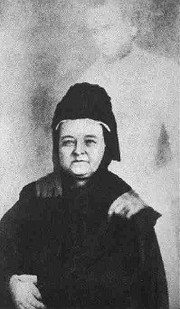
Figure 1 – Photograph of Mary Todd Lincoln in widow’s weeds being consoled by the wraith of her husband, Abraham Lincoln. In the public domain.
I was going to write a detailed discussion about Victorian and Edwardian spirit photographs, but then I found this image of Mary Todd Lincoln in her widow’s weeds being consoled by the ghost of our old fudged friend Abraham Lincoln, which just about says it all. I mean come on people: double exposures, photo-montage, and tricks of light. Combine this with the Cottingly Fairies. It’s all so amateurish that it’s embarrassing that people ever believed this stuff.
I’m saying this despite a long “history” of Lincoln’s ghost sightings in the White House. Including a sighting by no less a luminary than Winston Churchill, who claimed to have seen Abe’s ghost in the Lincoln Bedroom (there’s a surprise) in the buff – (that was the Prime Minister not Lincoln in his birthday suit).
Mary Lincoln was a firm believer in the occult and is even said to have conducted a seance at the White House. According to Lincoln biographer (Team of Rivals: The Political Genius of Abraham Lincoln), Doris Kearns Goodwin, Lincoln was not a believer. She recounts how a neighbor asked Lincoln whether he believed in a future realm. “I’m afraid there isn’t,” he answered. “It isn’t a pleasant thing to think that when we die, that is the last of us.”
Is the lesson that people of the nineteenth and early twentieth centuries were stupider and more gullible? I don’t think so. I don’t think that such is the case. I suspect that it’s just that technology and our exposure to it has led us to be more savvy and sophisticated. We expect our frauds to be better done. That’s all.
My favorite photographic fake
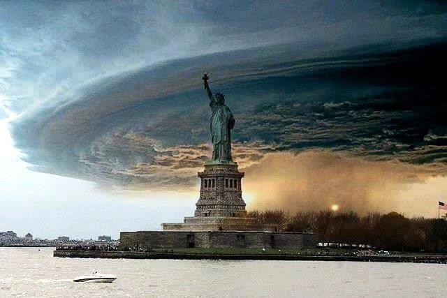
Figure 1 – Fake image of the Statue of Liberty during Hurricane Sandy – “Human sacrifice, dogs and cats living together… mass hysteria! “
I hesitate to admit it, but I do have a favorite photographic fake – or at least a current favorite photographic fake. I say current because I never know when I am going to log onto Facebook and see a new favorite. My current favorite is the image of the Statue of Liberty, symbol of the City that Never Sleeps surrounded by hurricane Sandy in all it apocalyptic grandeur – or at least as much apocalyptic grandeur as one can create from a fairly stock image of the Statue of Liberty mated with an image of a tornado in Nebraska. Actually this is even a recycled image first created when a tornado touched down in Brooklyn two years prior to Hurricane Sandy.
The image is, of course, reminiscent of scenes from the 1984 movie “Ghost Busters.”
Dr. Peter Venkman: “This city is headed for a disaster of biblical proportions.”
Mayor: “What do you mean, “biblical”?”
Dr. Ray Stantz: “What he means is Old Testament, Mr. Mayor, real wrath of God type stuff.”
So a question remains. Where is the divine Ms. Siggy when you need her? No, sorry that’s not it. Who is making all these images and why?
Faked “in death” pictures of Abraham Lincoln
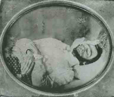
Figure 1 – Posed false image of Abraham Lincoln on his deathbed. See reference in the text for a detailed discussion. Image in the public domain.
In the last blog we talked about how Abraham Lincoln’s head was transposed onto John Calhoun’s body. Ironically this is not the end to the Lincoln head story as it keeps popping up – or maybe not. Lincoln was assassinated on April 14, 1865. People were hungry for photographs of the president on his deathbed. However, Secretary Stanton and the army would not allow it. This small omission, however, did not stop journalists and entrepreneurs eager to capitalize on the nation’s grief. There are numerous false images of Lincoln on his deathbed with either other people posing as Lincoln, drawings made to look like photographs, or doctored photomontages. It is all a well heavily studied subject and still somewhat hotly contestrd subject. An excellent web-based reference on the subject is “Abraham Lincoln, Nine Hours Before Death.”
Abraham Lincoln and the transposed head
Figure 1 – Portrait of Abraham Lincoln, 1860 – or is it. From the Wikicommons and in the public domain.
What Lincoln supporters needed was a dramatic photograph of the president. What was called for was a pose of elegant and powerful grandeur. But no such image existed. The result is shown in Figure 1 – the imperial president ready to slay the foes of abolition and union. Many of you may remember this image from childhood, because it hung for generations in classrooms nationwide.
However, no such image existed at the time – not did it ever really exist. What did exist was a portrait of a very stately John Calhoun, a Southern leader and a Mathew Brady image of Lincoln’s face. So what was done was that the face of Lincoln was cut out of the Brady portrait and pasted onto Calhoun’s body. It was then rephotographed to create the final Lincoln image. But first one more piece of photographic art had to be performed. In the Calhoun’s image, the papers on the table read “strict constitution,” “free trade,” and “the sovereignty of the states.” In the Lincoln image, these have been changed to read, “constitution,” “union,” and “proclamation of freedom.”
Figure 2 – John Calhoun 1860 – from the Wikicommons and in the public domain.
Would we do such a thing today? Of course we would. This kind of transposition of heads and bodies is today a common tool of the fashion and tabloid world, where the goal is to augment chest size of reduce body weight. Visit the Oddee website for some famous examples. But let me offer two choice examples. The is Oprah Winfrey’s head on Ann Margaret‘s body. from the cover of TV Guide in August 1989.According to Oddee, the composite was created without permission
Figure 3 – Mathew Brady, Lincoln Portrait, 1860 from the Wikicommons and in the public domain.
of Winfrey or Ann-Margret, and was detected by Ann-Margret’s fashion designer, who recognized the dress. The second is the famous gun tottin’ Sarah palin in patriotic bikini – not. Sorry to disappoint everyone on that score.
So the real question is: does anyone still believe that a photograph never lies? I have gotten so skeptical of every image that I see on the web that the first thing that I invariably do is a quick search of the web for the subject and the word fake. I believe that I have previously recounted how once when I expressed my doubts on Facebook with the words “If it’s true.” Another friend of a friend almost immediately countered that “it didn’t matter if it were true.” Well to all my friends – of no matter what degree of separation – it kinda’ does matter!
Photographic First #10 – Hippolyte Bayard’s faked suicide
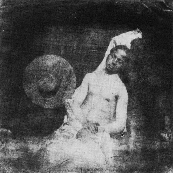
Figure 1 – ,” the world’s first faked photograph from the Wikicommons and in the public domain.
Todays blog fits in both with our series of photographic firsts and with the question of photographic fakes and manipulations. Figure 1, Hippolyte Bayard, “Self-portrait as a drowned man, 1840,” is widely viewed as the first photographic fake. Hippolyte Bayard (1801 – 1887) was a French photographer and direct competitor with Louis Daguerre. He invented his own unique direct positive process, and exhibited his work on 24 June 1839. He claimed to have been the first inventor of photography, predating both Daguerre and Fox Talbot.
However, little credit came Bayard’s way and in reaction to what he perceived to be a great injustice, he created the first staged photograph entitled, “Self Portrait as a Drowned Man, 1840.” In the image, he pretends to have committed suicide. On the back of the photograph Bayard wrote:
- Figure 2 – Hippolyte Bayard Self Portrait, 1863, from the Wikicommons and in the public domain.
“The corpse which you see here is that of M. Bayard, inventor of the process that has just been shown to you. As far as I know this indefatigable experimenter has been occupied for about three years with his discovery. The Government which has been only too generous to Monsieur Daguerre, has said it can do nothing for Monsieur Bayard, and the poor wretch has drowned himself. Oh the vagaries of human life….! … He has been at the morgue for several days, and no-one has recognized or claimed him. Ladies and gentlemen, you’d better pass along for fear of offending your sense of smell, for as you can observe, the face and hands of the gentleman are beginning to decay.”
This announcement of Bayard’s untimely death in 1840 was premature, as illustrated by Figure 2, a second self-portrait taken twenty three years later in 1863. He went on to enjoy a highly successful career in photography and died in 1887 at age 86.
Photoshop as a dirty word
I thought that it would be interesting to explore further this issue of photo-manipulation. Is it art or is it always a bad thing? Recently someone complained to me about the degree of manipulation being put it some digital images It’s always expressed today as “that was Photoshopped” or even merely “shopped.” This means that Photoshop has joined the elite pantheon of brands that have become catch-all verbs, like Xerox and Bing. Indeed, and I love this, the process of so much recognition that a word becomes universal has been referred to as “genericide.”
It is all, obviously a matter of context. In art anything goes (as long as it isn’t hateful, perverse, or exploitative). And I stick with those exceptions. But beyond these, in art image manipulation software is a tool that furthers the artist’s ability to express him- or herself. It is like any new artistic medium.Beyond that, we move into the high fidelity zones of science and press photography. In these two areas, the absolute truth is required – no image manipulation allowed.
In science, this gets really interesting. In the analogue days, films and papers were intrinsically nonlinear. Indeed, they were logarithmic in response. As a result, while dodging and burning were strictly forbidden, the very act of choosing a paper contrast grade was inherently manipulation, even though it was considered acceptable then. Today, you are expected to be linear. You can histogram equalize as long as the settings are maintained for experimental and control images and as long as you do not clip detail into the blacks. It’s a bit complicated and made even more so by imaging systems that automatically set all sorts of experimental parameters.
In press photography the big issue is that what you are photographing is real. That is that you haven’t removed details or added any. Photo-montage is a strictly forbidden. However, aesthetically tweaking the image, as we would an image in fine art photography, is allowed.
The problem with press photography is that it’s a close kissin’ cousin of advertising photography – and those guys will alter everything. The goal of advertising is to sell brand or politics, and they do it with a vengeance. And since the goal of press photography is to sell newspaper or television or other media, things start to get seriously blurred. However, it remains the responsibility of a free press to be truthful and to report. This is more and more forgotten today – still it remains paramount.
I’d like in the next few blogs to consider some of the classic examples of manipulated photography. At a superficial level it may appear that there is considerable grey involved in the deduction of whether a given example is good or bad in an ethical sense. I believe, however, that on careful consideration the absolute criteria remain. You don’t need Bertrand Russell, only your mother. Is it meant to fool or deceive? Is it meant to manipulate? Is it hateful, perverse, or meant to exploit? I think that the ultimate criteria remain. In art almost every manipulation is acceptable. In science and press photography almost no manipulation is acceptable. And as for advertising, I guess that we have to recognize it for what it is. But do remember, especially when politics is involved that the stakes are very high, and by dashing off a supposedly funny or telling political image on the web, however manipulated, we ourselves become manipulated pawns in the process.
P-n junctions and the heart of the LED display
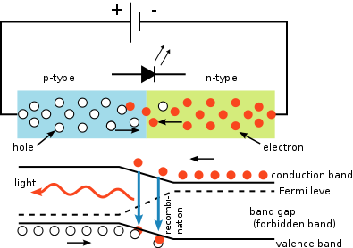
Figure 1 – schematic of the p-n junction of an LED. Top shows distribution of electrons and holes in the two regions. Bottom shows the conductance and valence bands. From the Wikicommons by S-kei and in the public domain under creative common license.
We now have the background information about semiconductors that we need to start to talk about digital photography – about digital array displays and digital sensor arrays. Let’s start with a discussion of LED (light emitting diode) displays. If you sigh at this point and try to escape to elsewhere on the web, chances are that an LED display will still be staring you in the face. If you instead try to escape by watching television, the chances are still very high that an LED display is staring you in the face. So under the assumption that it’s worth knowing as much about your computer as it knows about you, let’s proceed.
In my last technical blog, I discussed p and n type semiconductors. In and of themselves, they’re not too exciting. However, the fun begins when we start to combine them. Suppose we put a p type semiconductor right up against an n type semiconductor. This is what is called a p-n junction. This is also called a diode and is shown graphically in Figure 1, where we’ve even allowed for a small transition region. The p region is shown in blue and the n region in green. You’ll note that we’ve connected this to a battery. The plus terminal to the p side and the negative terminal to the n side, as one might expect. Once the battery is connected, the electrons start to flow towards the plus terminal (remember that opposites attract). Remember also that electrons can flow. Holes really only appear to flow because the electrons are flowing. So there is a current in the semiconductor, with electrons flowing from the n region into the p region and on to the plus terminal of the battery. Of course, electrons exit the negative terminal of the battery and enter the n side of the diode. If you hooked the battery up backwards there would be no current. A diode is unidirectional.
As an aside, in the center we see the symbol for a diode, with its big honking arrow showing the direction that current flows. This is because back in the eighteenth century no less than Benjamin Franklin made the unlucky guess that the charge carrier was not the negative but the positive charge, and this view is perpetrated by convention in circuit theory today, even though everyone knows that it is wrong.
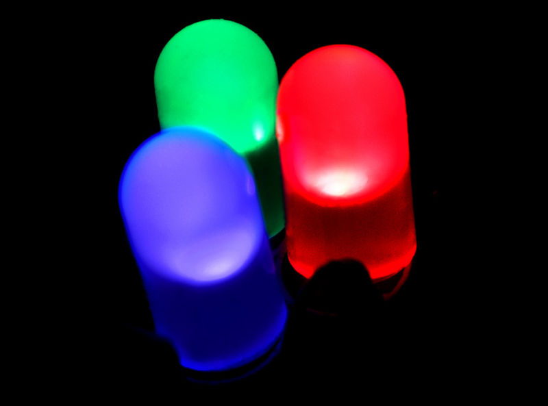
Figure 2 – Large size red, green, and blure LEDs the fundamental components of an LED display. From the Wikicommons by PiccoloNamek and in the public domain under creative common license.
The key thing about the light emitting diode (LED) is that when the electrons enter the p region they recombine with and neutralize holes. This represents as shown in the lower portion of the schematic a transition from the conductance band back to the valence band with the emission of light whose color depends on the transition energy. Hence, electrical energy is converted to light at the junction.
In Figure 2, I show diodes of the three primary colors: red, green, and blue. If you take a magnifying glass up to your LED display, you will see minute arrays of these red, green, and blue LEDs each of which is individually addressable, meaning the light intensity of each can be individually controlled so that whatever color you and intensity you desire is created by additive color. That is basically, how an LED display works.