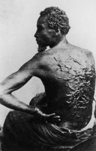
Peter, the whipped slave

Figure 1 – Peter, 1863, an African American slave from Baton Rouge shows the scars inflicted by his overseer. Photographer unknown. Image is in the public domain because of its age.

Those of you who have seen Steven Spielberg’s new movie: “Lincoln.” may recall the scene where little Tad Lincoln is lying by the fire looking at lantern slides.  He ponders for a moment, fixated by the horrible image of a beaten slave. This is an actual and infamous abolitionist image of an ex slave from Baton Rouge, named Peter, who bears the scars, brutally inflicted by his overseer.

The photographer is unknown.  The image is brilliant.  Written on that poor man’s back is the history of his life, indeed the history of his people.  In one still image the photographer speaks to us of the immeasurable cruelty of slavery, and of unspeakable toll that it takes on its victims.

Slavery was abolished in the British Empire in 1833.  As a result photography could play no role as its chronicler.  Of course, as we have seen through the brave work of Lisa Kristine and others, it continues to this day.  In the United States, the abolitionist movement and the American Civil War were contemporary with the invention of slavery.  As a result, we can today still see the effects, the reality, and the after effects of slavery and subsequent Jim Crow documented in vivid images.

As for Peter, he was freed and went on to fight in the Union Army against slavery.  That unequal justice is also documented in Spielberg’s “Lincoln,” in Ken Burns’ “The Civil War” and in Edward Zwick’s 1989 film “Glory.”

Signal-to-Noise, an intuitive view

We all have an intuitive understanding of what noise is; so let’s start with that.  You’re sitting in a restaurant, and your boyfriend is about to propose to you.  The problem is that you’re having trouble hearing him, because of all the noise around you – the self-impressed boorish lout at the next table gfawing loudly at his own jokes, the children screaming on the other side of the room, and the large table full of intoxicated people all talking at once. Your boyfriend is nervous and speaking unusually softly.  So we have it – first background noise and second a low signal.

Engineers describe this as the signal-to-noise ratio.  When this ratio becomes less than about one, the signal becomes very hard to discern above the noise.  And recognize, that it’s not just that there is a background that’s the problem, the problem is that it varies and is random.  Your ears and your brain just don’t know how to process the sound to separate the signal from the noise.  Note, that I’m trying to distinguish between background, which if it is constant, can be easily dealt with, and noise which is random.

Let’s return to the restaurant, somebody steps up to the front of the room and starts talking into a microphone.  Suddenly, there’s a signal that is way above the noise, has a high signal-to-noise ratio, and is easily discerned.  Wait a minute you say, what about my proposal.  I’llk leave that for you to figure out.

Have you ever heard someone speak or sing into a microphone that has a loose connection that causes the amplification to vary randomly?  Sometimes the sound is high above the background and sometimes it’s low and near the background.  Well, that’s another type of noise, called signal noise.  The total noise in a system is the combination of the background noise and the signal noise.  In fact, every component of a system, say a camera system, can introduce noise.

Optical systems, like cameras, have the same issues.  For instance, fog introduces noise into your image, making it hard to see things.  It reduces the contrast.  Now in my blog of October 20, 2012, we discussed the relationship between image resolution and contrast.  Contrast is the difference between white and black.  The finer detail you want to see, the more contrast you need.  We have defined resolution in terms of the finest line separation you can still discern.  If you make it harder to discern the lines by adding noise, both to the white signal and to the black background, your resolution decreases.

By the way, I do hope that the proposal worked out!

Returning to the question of image sharpness

I’d like to pick up on the issue of image sharpness.  So maybe, we should begin by reviewing where we are, with references to earlier blogs.

  1. We discussed the pinhole camera and described how larger f-numbers (the ratio of focal length to aperture) improve depth of field and sharpness.
  2. We discussed the pixel limit of a given camera’s resolution.
  3. We considered the diffraction limit of resolution in the context of pixels.
  4. We described the concept of measuring resolution in terms of line pairs and line width.
  5. We explored the relation ship between image contrast and resolution.
  6. We developed a simple method for measuring image sharpness or resolution that can easily be implemented and we showed the results of some real-life lens.
  7. We found that with a “good lens” you can achieve resolutions close to the pixel limit.
  8. We found that for real lenses matched with a given image sensor there is an ideal diffraction limited f-number, where you will achieve your sharpest image, provided you don’t need to worry about depth of field.

All of this was meant to enable you to declare war on useless statements that you see all over the place like: “tack sharp,” “excellent resolution, and “very,very sharp.” Care to try to put these in quantitative order – as in is a “tack sharp” lens better than a “very, very sharp lens” or the other way around?  They are really meaningless descriptions.  Yet, you see them in lens reviews all of the time.

Oh yes, and we found that the IPhone camera is pretty amazing!

So in the next technical blog, I’d like to set the stage, for considering how image noise affects resolution.  And of course, noise is an important element to understanding the dynamic range of cameras and images as well.

The magic of daguerreotypes

All of this talk about daguerreotypes may leave you wondering about what the big deal is.  So I just thought that I should pause for a few moments and reflect on the sheer magic of these little silvered copper plates.  They are truly magical, or at least as magical as things get in this age of science and high technology.  And, of course, part of their mystery resides in the way that they, as the original photographic medium, blend science, art, and seeming sorcery.

If you haven’t already done so, you really should experience them first hand.  They are still “affordable” at antique stores.  A lot of what are labeled to be daguerreotypes are, in fact, tin types.  There’s a simple way to recognize them.  The image seems to hang in space.  You cannot quite place it as being on the surface.  If you move your head slowly over a daguerreotype, you will see that just when you view it head on, it disappears, replaced by a shiny silver mirror like reflection.  Indeed, in the day of daguerreotypes special boxes were constructed for viewing them.

Many of the people who made daguerreotypes were truly artists.  As a result many of these images are beautifully and delicately hand-colored.  The cases are special in and of themselves.  These, often referred to as being made of gutta percha, a natural latex product, are in fact mislabeled.  While manufactured in the nineteenth century they are created of the world’s first true thermoplastic.

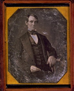
Figure 1 – Daguerreotype of Abraham Lincoln in 1846 attributed to Nicholas H. Shepherd.  In the LOC and in the  public domain.

As I have said before, part of the charm is that captured in that ethereal daguerreotype image is a person from the mid nineteenth century.  Often these are famous people, whom you never expected to see in a photograph.  But more often, they are just everyday people, now long gone.  There are even post mortem images, where the photographer was called upon to capture a last memory of a loved one.

I have categorized today’s blog both as “Reviews and Critiques”  and “Personal Photographic Wanderings.”  This is because viewing a daguerreotype is a highly intimate and personal experience.  You have to experience them for yourself.  They can affect you in so many different ways.

And finally, I know that many of you, including myself, have flocked or plan to flock to see Daniel Day-Lewis, as Lincoln, in Steven Spielberg’s new movie by that name.  So if you have wondered what Lincoln actually looked like, I offer you the image of Figure 1, a daguerreotype taken in 1846 by the great American daguerreotypist Nicholas H. Shepherd.

Photographic Firsts #3 – The first photograph of the moon

The question of the first photograph of the moon appears to be a bit of a fuddle.  Daguerre (1787 – 1851) himself is said to have photographed the moon.  Unfortunately, on March 8, 1839 Daguerre’s diorama, his laboratory, early experimental works, and his notes were all destroyed in a fire.  So his image of the moon was destroyed.  Indeed, there are currently less than twenty-five existent daguerreotypes that can be unambiguously attributed to Daguerre.

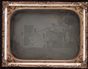
Next, the New York University Professor John Draper (1811 – 1882), who collaborated with Samuel F. B. Morse (1791-1872) actively produced daguerreotypes of the moon in March of 1839 at NYU’s observatory in Washington Square.  An image in the archives of NYU taken on March 26, 1839 appears to be the earliest moon photograph currently in existence.

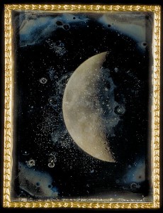
Figure 1 – John Adams Whipple “View of the Moon, 1852” in the public domain.

A very interesting exposure sequence daguerreotype of the moon was taken by Samuel D. Humphrey, author of “Handbook of the Daguerreotype,” on September 1, 1849 in Canandaigua, NY.  As a side note, because the moon is lit by the sun, photographing the moon is like photographing an earthly scene on a sunny day.  As a result, the exposure typically falls within the old rule of thumb, shoot at f/11 at one over the ISO.  This rule served Ansel Adams (1902 – 1984) well in determining the correct exposure for “Moonrise Hernandez, NM, 1941.”

Finally, a magnificent set of daguerreotypes of the moon were taken by Harvard Professor John Adams Whipple (1822-1891), in collaboration with astronomer William Cranch Bond (1789-1859), between 1847 and 1852.  These images won the prize for technical excellence in photography at the 1851 Crystal Palace Exhibition in London.  On the night of July 16–17, 1850, Whipple and Bond also made the first daguerreotype of a star (Vega).

I’ll leave you with that image to ponder.  By 1852 astrophotography was certainly born as a tool for science.

The Airy disk of an airplane

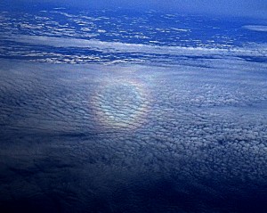
Figure 1 – Airy disk of an airplane projected on the distant clouds

In our discussion of camera resolution, we described how a point source appears, not as a point, but as an Airy disk in the camera.This phenomenon is, in fact, fairly ubiquitous.  An interesting variation is to see the Airy disk projected by the sun illuminating an airplane and projected onto the clouds below.  I am not sure that I fully understand the mechanism here.  But I thought

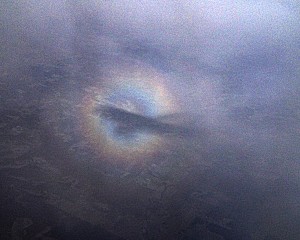
Figure 2 – Airy disk of an airplane with shadow of plane projected on closer clouds

that I would show some examples that we took while flying into Minneapolis/Saint Paul for a recent experimetal trip to the Mayo Clinic in Rochester, MN.  Figure 1 shows the disk itself, a bright central region and a ring progressively blue to red.  In some cases you can see a second ring.  Also note that the central peak is fairly weak, presumably because we are looking at a dark hole rather than a bright spot.  I have also noted that, when the clouds get close, you often see the shadow of the plane centered in the ring (see Figure 2).

So I put it out for readers’ comments on the exact physical mechanism at work here.  Judging by the angles involved and the order of the colors it is pretty clearly a diffraction phenomenon and not a water droplet or ice crystal phenomenon like rainbows and solar halos.

Whether or not you are interested in the physics, keep an eye out for this next time you fly.  The can be very dramatic and cool. In the meantime, I am going to do some furtehr research and see if I can come up with a more complete explanation.

Samuel F. Morse and the Birth of the Modern


Figure 1 – Early American daguerreotype by Samuel F.B. Morse and John Draper 1839/1840 showing the Unitarian Church on Washington Square from the roof of the old NYU building. Image is in the public domain.

I mentioned that William Brady studied photography under Samuel F. Morse (1791-1872), who introduced the Daguerreotype to America in 1839.  That may be a bit surprising.  Most of us remember Morse as the inventor of the Morse code and the telegraph. However, if you take a trip to a Museum like the Museum of Fine Arts in Boston, you will realize that Morse was a skilled portrait painter.  What was he an artist or a scientist-inventor?

The answer to that question takes us to a remarkable book by historian Paul Johnson, “The Birth of the Modern, World Society 1815 – 1830.”  Johnson targets the period between 1815 and 1830 as marking  the pivotal transition of world society into the modern world.  This marked the transition into a scientific society.  As Johnson shows, a key factor was the development during this period of both the McAdamized road and the steamboat.  Of course, the key here was the evolution of the shrinking world, the speedier and speedier communication of ideas.  We have in due course:

  • The postal service
  • The railroad
  • The telegraph
  • The telephone
  • Wireless communications
  • The automobile
  • Radio
  • The airplane
  • Television
  • The computer
  • The internet

They all stem from the revolution set in place by this critical fifteen year period in human history.

And there is something else that happened at that moment, something that answers the question of whether Samuel F. B. Morse was a scientist or an artist.  Up until that time, as the scientific revolution developed men and women of intellect could
consider themselves to be both.  In the footsteps of Leonardo, Daguerre and Morse could, and were, both.  Science was, as much, as any art, a humanity.

Allow me to quote Johnson directly (last page of chapter seven):

“So too, he (the artist Turner) felt an affinity with Faraday; they were both experimentalists, working skillfully with their hands as much as with their eyes and their brains, to explore the physical secrets of the world.”

“But as the 1820s progressed, it became harder to maintain that all men of genius could speak to one another.  There was a sad moment at Lowther Castle in 1827, when Sir Humphrey Davy and William Wordsworth met for the last time.  Wordsworth later complained to a correspondent that it had no longer   been a meeting of kindred spirits: ‘His scientific pursuits had hurried his mind into a course where I could not follow him, and had diverted it in proportion from objects with which I was best acquainted.’ The parting of the ways between art and science, the bifurcation into two – indeed into many cultures was only one aspect of modernity.”

This then is the key to understanding the invention of photography.  Men like Daguerre, Morse, and Talbot saw themselves, in the finest tradition of men of genius, in their times, as both scientists and artists.  There was no ambiguity or dichotomy in that view.

Photographic Firsts # 2 – The first photograph


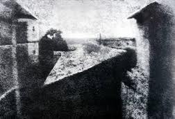
Figure 1 – The first photograph, “View from the Window at Le Gras, 1826”, in the public domain in the United States.

The first photograph, certainly the first photograph currently in existence, is usually credited to French amateur scientist, Joseph Nicéphore Niépce (1765-1833).  This image, “View from the Window at Le Gras”, produced on pewter is currently in the collection of the Henry Ransom Center at the University of Texas at Austin.

Niépce first experimented successfully with copying engravings onto lithographer’s’ stones, using a process he referred to as heliography as early as 1824.  (The term, photograph, was first used by astronomer, John Herschel, in 1839.)  Eventually he settled upon using pewter plates as a support medium.  In the summer of 1826, in the window of his upper-story workroom at Le Gras, Niépce set up a camera obscura using a polished pewter plate coated with bitumen of Judea (an asphalt derivative of petroleum) and exposed the plate for at least eight hours. The exposed regions of the plate became hardened by the light, much like dentist currently cure cements with UV light.  Niépce removed the plate and used a mixture of oil of lavender and white petroleum to dissolved away the the unhardened bitumen.  This produced a direct positive image on the pewter, which has now lasted close to two hundred years.

Niépce formed a partnership with the French artist Louis Jacques Mandé Daguerre (1787-1851), in 1829 and he died of a stroke in 1833. Daguerre, of course, went on to invent the daguerreotype in 1838.  The two are generally attributed, along with Englishman Henry Fox Talbot, with the invention of photography.  Readers are also referred, however, to the important work of Hércules Florence, who after Niépce but before Daguerre made important contributions to the invention.  Florence worked obscurely in Brazil and as a result was not recognized by his contemporaries.


A Thanksgiving hike in the Massachusetts wetlands

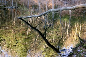
Figure 1 – Broken tree in Pond

The weather on Thanksgiving this year was “Picture Perfect” in Massachusetts – high forties, clear, and crisp.  We took the time to explore the late fall wetlands in Lincoln.  The Massachusetts landscape is dominated by glacial topography: drumlins and kettle ponds.

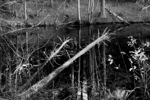
Figure 2 – Fallen trees in pond

The autumn has lingered, with the color persisting into late November.  Even now there are a few trees, mostly oaks, showing leaves.  This combines with jet black and highly reflective ponds, powder blue skies, and lichen coated bark to project delicate pastel shades wherever you look.  The after effects of hurricane Sandy are twisted, snapped, and fallen trees limbs.

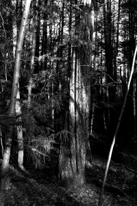
Figure 3 – Tree lit by November sun

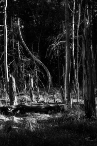
We emerged at one point into a massive sunlit meadow, now used for community farming, then followed a ridge line back into the woods only to find a marsh with strangely twisted trees lit gloriously by the late afternoon sunshine.  Such places always remind me of a famous, now known to be inaccurate, mural at the American Museum of Natural History, showing the then imagine Jurassic Swamp with giant brontosaurus grazing on lush vegetation.

It was a glorious afternoon and I took at least one photograph that I was happy with.

Figure 4 – Sunlit marsh