Monochrome Me

Figure 1 - Door and Step, Kennebunkport, ME. (c) DE Wolf 2014.

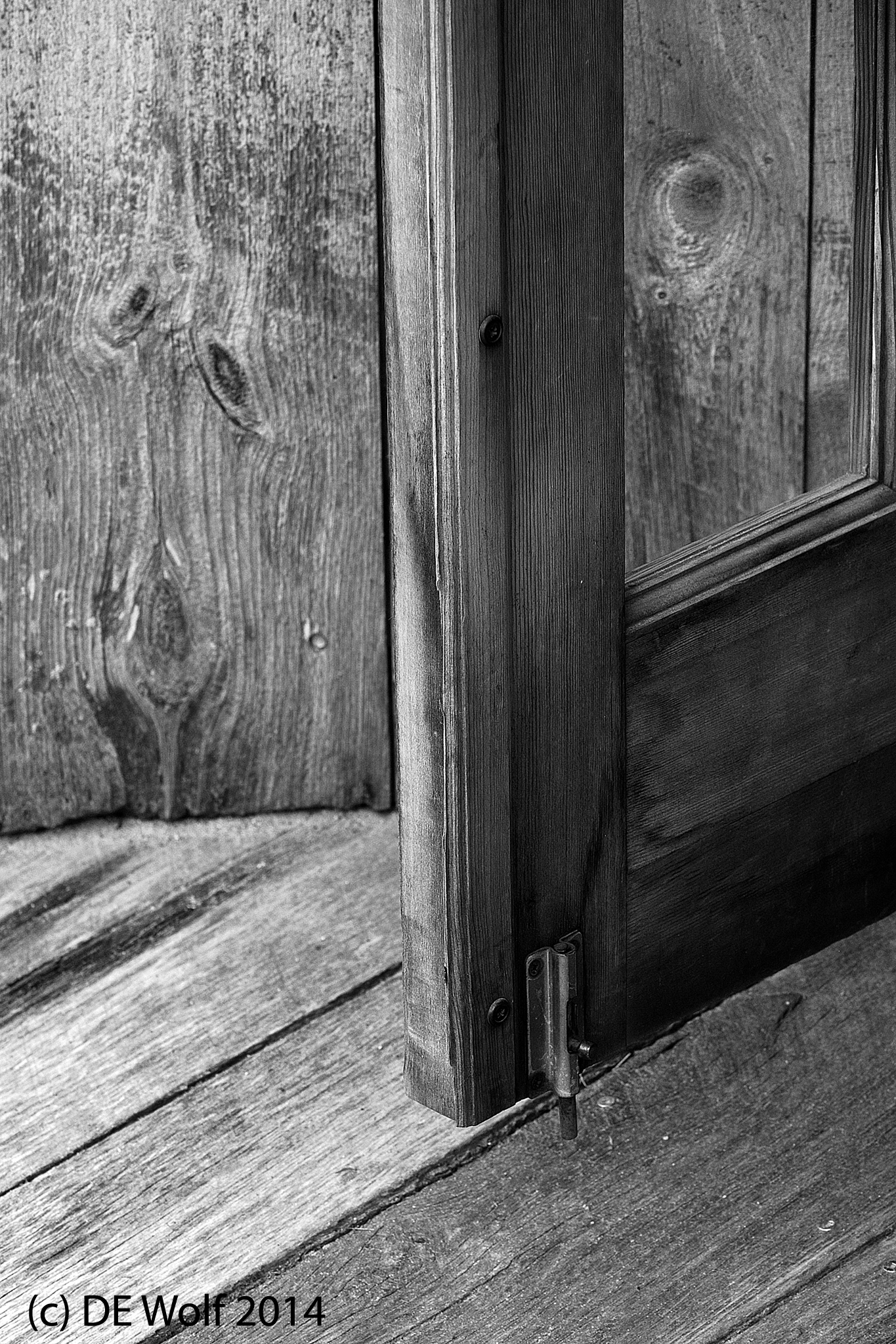
Figure 1 – Door and Step, Kennebunkport, ME. (c) DE Wolf 2014.

Needless-to-say “Monochrome Me” wants to have his say today.  As I said, it is the black and white image that I strive for, perhaps with  just a touch of sepia tone. In my book toning is the one activity of photograph production that was more enjoyable in the chemical days.  I mean, what could be better than exposing yourself to toxic selenium salts?

While a beautiful black and white photograph is an admirable object, neither the name “monochrome” nor the name “black and white” get us off on the right foot.  He has a “monochromatic personality – is one dimensional, flat, cardboard like.”  He sees everything as “black and white.”  You see what I am talking about?

Seriously though, there is tremendous tonal dimensionality to a beautiful black and white photograph.  It is not just about form, but also about the range of tones.  The goal is to have brilliant, but not overpowering, whites, deep blacks, and everything in between.  While limited ultimately by physics and physiology, the range should seem infinitesimally graded.  Look for the faint forms in shadow and highlight.  Therein, lies greatness.

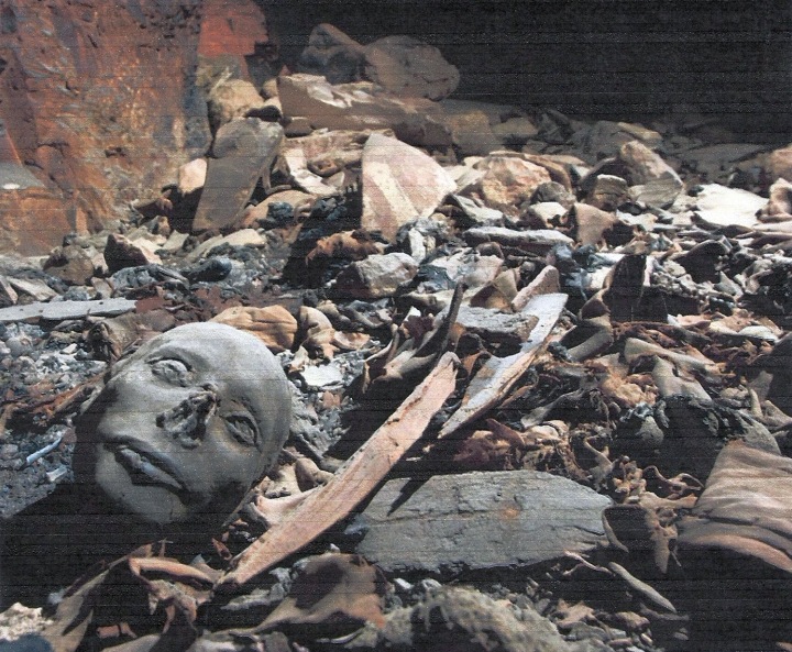
While in Kennebunkport’s Dock Square earlier this week, I came upon this wooden door with a glass window and a very eccentric sloping step.  I was immediately struck by the beauty of the weathered wood, the grains, and the knots.  I knew right away that this would “work” photographically.  And when I was working up the image I found myself drawn to the little face, the pareidolia, in the grain on the wall, by the wood knot behind the window, and by the simplicity of the door stop. People must have thought me a bit crazy standing there with my monopod mounted camera photographing a humble step and maybe I am.

EF70-200mm f/4L USM Canon lens at ISO 400, aperture-priority AE 1/200th sec at f/8.0, Exposure compensation -1, Lens at 84 mm.


Polychrome Me

Figure 1 - Flowers and glass in a shop window, Kennebunkport, ME. (c) DE Wolf 2014.

Figure 1 – Flowers and glass in a shop window, Kennebunkport, ME. (c) DE Wolf 2014.

The view that the photographer is one who observes, one who steps out of participation, has some intriguing consequences. You become a tourist in your own life. You are constantly in a quest for objects and events to photograph. The image becomes to the photographer: what game is to the hunter, coins to the numismatist, or antiques to the antique collector. Yes that is it; you become a collector of images, and each image holds its own memories.

OK, so accept it. Would it be better not to capture events and objects at all? Think of it as recording not collecting. You can think of it that way as long as you don’t become one of those people who record every meal on vacation.

So I am a hunter for images! And what I realize is that there are really two me’s. I truly love black and white images. That is what I strive to create. I am forever search for the forms and the light that will give me what I am looking for, that will translate beautifully with velvety blacks, creamy whites, and every marvelous grey level in between. And notice that I spell it “grey” not “gray.” This connotes a certain elegance and exoticism.  But I also find that dichotomously hiding just below the surface of my consciousness is a “Polychrome Me,” a me that loves to exalt in color.

One of the great aspects of modern digital photography is that you can truly split your photographic personality without needing to carry two cameras. It is the same feature that enables what is essentially zone black and white photography without the need to change cameras. Expose well, and all the zones are there. The “Levels” and “Curves” features of Photoshop simply replace choice of film, developer, and paper.

So today I’d like to offer up two images by “Polychrome Me.” The first was taken of glass and silk flowers in a shop window. I love the play of light in glass. And I was thinking of Henri Matisse when I took this picture. Perhaps it is “Cala Lillies, Irises, and Mimosas.” The point is that the feeling here is in the brilliant colors and to me they are Matisse’s colors. And shortly after taking that image I found this mannequin in a shop. The world was orange, and I delighted in the little helices of orange ribbon. Do I need to say that I added the catch light to her eyes, because unlike the ghostlike alien mannequin of a previous blog, this mannequin seemed soft and beautiful? She needed only a magic sparkle in her eyes to bring her to life.

Both images were taken with my EF 70-200mm f/4L USM Canon lens at ISO 400 in aperture AE priority mode – the mannequin at 1/60 sec, f/8.0 at 131 mm, the glass and flowers at 1/100th sec, f/11.0 at 70 mm.

Figure 2 - Shop mannequin and her orange world, Kennebunkport, ME. (c) DE Wolf 2014.

Figure 2 – Shop mannequin and her orange world, Kennebunkport, ME. (c) DE Wolf 2014.

Self portrait at the 1912 Cafe

Figure 1 - Self portrait at the 1912 Cafe, Freeport, ME. (c) DE Wolf 2014.

Figure 1 – Self portrait at the 1912 Cafe, Freeport, ME. (c) DE Wolf 2014.

Figure 1 is an experiment in self portraiture.  Selfies today are generally taken with the front facing camera.  A generation ago the common form was to take a picture of yourself in the mirror.  Vivian Maier offers some wonderful examples of this genre.

The in-the-mirror photograph in general betrays a problem or fault with photography.  The photographer ceases to participate. That is why photography often appeals to the shy among us.  You don’t have to be part of events.  You can abstract yourself from them.  This self portrait, I hope, takes this abstraction to a new level.  There I am reflected in the window of the 1912 Cafe.  Perhaps the name of the cafe creates a sense of irony, emphasizing further abstraction, as the cell phone is totally antithetical to the simpler life of the early twentieth century.

With a cell phone you needn’t really look into the camera.  You could as well be reading an email.  You become totally abstracted from the act of taking the picture, even though in secret you are quite actively involved in framing the image.

I am also trying here to create a sense of the commonplace, to mimic so many photorealistic paintings of diners and people in everyday activities.  Of course, nothing could be more photorealistic than a photograph.  And also, the abstraction of the photograph to events pales in comparison to the pose of people on cell phones.  It is the ultimate ambiguity that in connecting with others we disconnect with those immediately around us.

The photograph and collective conscience

Our discussion yesterday about photographs of the D-Day landings and how they enable us to experience what those individuals experienced got me thinking again about photographs as memes, but from a different perspective than we have considered in the past.  These photographs create and belong to a collective consciousness.  We know how to relate to the depicted because we are humans and share experience and the interpretation of experience with other human beings.  The photograph becomes a kind of glue that puts the events and understanding of events in a chronological context.  And it enables us to relate to our fellow beings.

In this context the role of the image is truly to bind people together and to create a collective consciousness.  This collective consciousness transcends individual consciousness, and that is an important element of what humans are, what we have evolved to. We are meant both to see collectively and to see individual.

While we can certainly perceive abstractions and have the plasticity of mind to accept a stylized painting as symbolic of reality.  The photograph, arguably, represent a maturation of image technology.  The photograph enables us to create images like humans see, to create memes that truly and directly map or relate to human vision.  There truly is a collective vision a fundamentally human world view.  We know how those people in the landing craft felt, because we have, through the photograph, become them.

War and peace

Figure 1 - Approaching Omaha Beach, June 6, 2014, From the US National Archives and in the public domain.

Figure 1 – Approaching Omaha Beach, June 6, 2014, From the US National Archives and in the public domain.


Today marks the seventieth anniversary of the D-Day invasion of Europe.  Photograph brings us back to those awful moments as if we had been there ourselves. And the new media abound with historic images of the landings.  I have chosen one from the Army Signal Corps Archive at the US National Archives.  I have often wondered about these powerful images that focus on the seconds before all hell broke loose.  The fear, apprehension, even the nausea of the men on board the amphibious landing craft is still palpable to us seven decades later. You need to focus on the little detail, like the “No Smoking” sign on the door of the landing craft.  In such details lie the essential humanity of the photograph.

There are a number of before and after, then and now series of D-Day photographs from the news services.  I am particularly fascinated by this one from the Canadian National Archives.  It so vividly shows the contrast between terrible war and carefree peace.  In a way it defines what that generation was fighting for on that day.  The photographs and movie strips do not allow us to forget these denizens of that black and white world, and in truth we owe them so much.  They are part of us, but in part by virtue of the monochrome, they are before us – from the age of Titans before the age of Gods and men.

“And all the clouds that lour’d upon our house
In the deep bosom of the ocean buried.
Now are our brows bound with victorious wreaths;
Our bruised arms hung up for monuments;
Our stern alarums changed to merry meetings,
Our dreadful marches to delightful measures.
Grim-visaged war hath smooth’d his wrinkled front…”

William Shakespeare, Richard III, act 1, scene 1.

Bob Collins – Observing the crowd

Street Photography holds a special magic for us.  It transports us to times and places that we might otherwise never see, or it forces us to pause and see the details that we might otherwise fail to notice.  And when time paints a patina of nostalgia and history on street images, they bring back to life people and emotions that would otherwise be lost to us.

A current exhibition at the Museum of London celebrates the life and opus of London street photographer Bob Collins (1924-2002).   His work spans important moments in British history, the post war years and the emergence of a new Britain.  Collins turned professional in 1956 and he covered the streets of London for nearly fifty years.  He was seeking people and the emotions of the moment.  We have for instance, a photographer covering the coronation of Queen Elizabeth.    Collins’ camera is trained on the other photographer, not on the events themselves.  The key point is the intensity of the moments, that is lived in a thousand lives.  A truly amazing photograph is Collins’ picture of the morning rush hour at Victoria Station.  Technically, this is a beautiful example of blurred motion, here accentuated by the seeming motionless ticket taker and a few of the riders.  I love this picture on a technical level, for sure.  I ponder as to how exactly it was taken.  For once, I want to know the lens and the f-setting and the exposure time.  But then I realize that there is something much more profound going on, something that truly defines street photography.  The world is abuzz with motion.  Time doesn’t stop for us, it rushes on like the riders in this picture.  Despite their hurry, they are mostly gone to us now, having rushed hell-bent into oblivion.  The camera, the street photographer, captures and freezes in time the visages of a few individuals.  The rest is a blur.

For those of you lucky enough to be in London this spring and early summer, “Observing the Crowd: Photographs by Bob Collins” can be seen at the Museum of London, 16 May to 13 July 2014.

Ist kaputski with moose and squirrel

Hmm, a couple of weeks back we had the snowmobilers chasing a moose in Maine and this week we have a man taking a selfie while just about cheek to cheek with a squirrel.  Well guess what? Neither episode ended so well.  What’s wrong with these people?  Are they candidates for this years Darwin Awards?

And it got me thinking, always a dangerous thing!  When people post photographs or video that go “viral” was that (going viral) their intent all along?  Or is it just caprice?  I would not strictly rule out purposeful intent.  I suppose that you could focus your raison d’etre to “viral” – all for a brief shining moment of fleeting fame and then a return to anonymous oblivion.  There are clearly folks who follow this Kafkaesque path – to join the ignominious pantheon of those gone viral before them, whom no one remembers now.  But for the most part, I believe that people just post because people just post.  We don’t feel complete unless our friends, superficial and real, witness our antics, and no antic or event is too trivial to record.

It all kind of goes with photographs of dinner.  About fifteen years ago my wife, son, and I were appalled by a couple who video recorded what they were having for dinner on vacation in Santa Fe.  What a moronic thing to do, or so we thought.  Now people do it all the time.

I suppose that as long as there are people who care, or fain to care, such pursuits are legitimate.  A hundred years from now logs of Facebook activity will offer up valuable historic records of everyday life and everyday concerns.  In that regard they are automatically placed in an annotated context.  And these images will speak to us, perhaps a bit more clearly, than the glimpses of nineteen century life that everyday photographs from that period do.

Photographs of subjects not meant to be seen

Figure 1 - Howard Carter opens the innermost shrine of King Tutankhamen's tomb near Luxor, Egypt which one of carter's water boy found the steps down to (1922). From the Wikimediacommons, original photograph from the NY Times archive and in the public domain because of the date of publication.

Figure 1 – Howard Carter opens the innermost shrine of King Tutankhamen’s tomb near Luxor, Egypt (1922). From the Wikimediacommons, original photograph from the NY Times archive and in the public domain because of the date of publication.

It was announced this past Monday,  by Egypt’s Minister of Antiquities Dr. Mohamed Ibrahim, that mummies of approximately fifty ancient Egyptians were discovered and uncovered in a massive tomb in Luxor’s Valley of the Kings.  Among these embalmed remains were princesses, princes, and well-preserved infants from the time of the Pharaohs and these were believed to be relatives of 18th dynasty Kings Thutmose lV and Amenhotep lll, who ruled in the 14th century BC.

As is usually the case, the Tomb had been raided both in ancient times and as recently as the 19th century by grave robbers in search of treasure.  As a result the scene is one of chaos, yet still extremely significant archaeologically. Images of this chaos are both thought provoking and reminiscent of images from almost a hundred years ago showing the excavation and unwrapping of Egyptian pharaoh Tutankhamen by by Howard Carter and George Herbert, 5th Earl of Carnarvon.

Back in 1922 the discovery of King Tut’s tomb caused quite a stir. It and the movie that followed spawned the bogus concept of the Curse of the Mummy, and of course, an endless litany of plays on the word “mummy.”  Today there is also the interesting connection between  Earl Carnavon, Highclere Castle, and the British television series “Downton Abbey.”  Carnavon was the real thing!

A striking theme in all of this is the fundamental ambiguity that archaeology creates.  These are the tombs, the final resting places, of actual people, who once lived.  From where comes the right to excavate their graves and put their bodies on display in some museum?  Is there some magic date at which these tombs cease to be private and suddenly become open to the public.  It is a strange dichotomy between the pursuit of knowledge of the sacred and overt violation and sacrilege.

At a further level, the photographs are truly fascinating and hold their own particular ambiguity.  These tombs were never meant to see the light of day or even of artificial light.  They were passed on to the realm of the dead, indeed they became of that realm, and their illumination was never meant to be, we were not meant to see them.  And yet here we do see them, here we do photograph them.  These are truly photographs that were not meant to be taken of subjects not meant to be seen.

Art vs. Science? Creating new visions

Figure 1 - Photomicrographs of the drug AZT were taken at magnifications of 30x and 50x. Used to illuminate the crystals were polarized and darkfield lighting techniques. AZT is thought to help prevent the replication of HIV, the AIDS virus, also known as HTLV-III.

Figure 1 – Photomicrographs of the drug AZT were taken at magnifications of 30x and 50x. Used to illuminate the crystals were polarized and darkfield lighting techniques. AZT is thought to help prevent the replication of HIV, the AIDS virus, also known as HTLV-III. Image from the US NCI by Larry Ostby, 1986. FRom the Wikimedia Commons and in the public domain.

A reader posted on Facebook yesterday this interesting set of images by Andy Ellison, who is an MRI technologist at Boston University Medical School’s Center for Biomedical Engineering.   These are three dimensional scans (a set of slices of produce, yes that’s right vegetables).  As is so often the case with natural structures these a stunningly beautiful. But a couple of critical questions came to mind.  Do they present a new vision? Do they present new botanical information?  And all of this got me thinking again about the relationship between science and art and the transitional spectrum between pure science and pure art.

We recently spoke about X-ray images by Arie van’t Riet, which are clearly more in the realm of art – particularly in the colorization.  You may, in a sense imagine what it would like to have X-ray vision, like Superman. And, of course, that is the very point isn’t it?  We used to see only our red, green, blue world. Now we get to see all over the electromagnetic spectrum and even other spectra like the MRI. All of this extends human vision, revealing new ways of seeing.

It strikes me as curious.  We see science and art as two different viewpoints.  But arguably the purpose of this kind of imagery, when it is scientific is to present a new and different vision of the world.  When it is artistic in nature, the purpose is to present a new and different, often an individualistic, vision of the world.  How can two supposedly diametrically opposed viewpoints share the same purpose?

I have made a big deal about the strictures of scientific art.  Science sets rules about image manipulation.  Fine, but this has nothing to do with whether the image is artistic.  It is just like writing a fugue.  There are rules that you must follow.  But this has nothing to do with the magnificence of the piece.

One is tempted to say something like: science can be art, but art cannot be science – as if it were a corollary to this rule concept.  This is meaningless and discipline chauvinistic. Science, in this context, does not possess a higher purpose than art.

I think that the important point to be made is that when science becomes art, it is typically the artistic expression of an individual artist.  This artist chooses the composition, chooses the colors, chooses the dynamic range.  The fact that it starts as science is only relevant in that the palette chosen, the expressive elements, are scientific in origin.  The creator transcends science and really becomes an artist.  Similarly, the artist may choose to adopt a scientific palette. A clear example of this is the photomicrographs of Roman Vishniac.  What I am saying is that all art is art.  All purpose is to present the artist’s vision.