Photographic numerology – what is the best ratio aspect for an image

Figure 1 - Early English Pence of Aethelred the Unready.  The reverse bears a cross which made it convenient to divide the coin in halfpence or quarther pence referred to as farthings.  Image from Arichis uploaded to the Wikipedia and placed in the public domain.

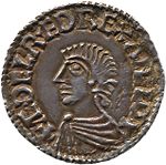
Figure 1 – Early English Pence of Aethelred the Unready*. The reverse bears a cross which made it convenient to divide the coin in halfpence or quarther pence referred to as farthings. Image from Arichis uploaded to the Wikipedia and placed in the public domain.

The other day I had gone out to take photographs in New York City and I found myself snapping away merrily – ’tis the season for merry!  When I got home, I was curious how many photos I had taken and found that the number was 36.  One roll, I thought to myself.  In the good old days(?) 35 mm roll film used to come in 24 exposure and 36 exposure rolls.  This is like a base twelve system of some sort and smacks of either a Babylonian (twelve sixty minute hours to the half day (sunrise to sunset) or old English (12 inches to the foot, 36 inches to the yard, twelve pence to the shilling, and twenty shillings or 240 pence to the pound) conspiracy.  By the way at 36 mm x 26mm, 35 mm film wasn’t even 35 mm, which is another mystery.

Hmm, it’s all very strange and, of course, the reason that film is the way it is results from some historical vagaries.  But it is not the only numerological oddity in photography.  Why is the favorite aspect ratio today 6 x 4? 6/4 = 1.67.  What about full frame 35 mm that’s 36/26 =  1.38.  Think about the common paper sizes from when 35 mm film ruled. 8 x 10 gives us 1.25 as does 16 x 20.  11 x 14 gives us 1.27.  All of these are very similar and almost compatible with 35 mm film, just a wee bit of cropping. But 5 x 7 gives us 1.4.

There is however, something really interesting about all of this.  I try to standardize my aspect ration and only rarely go to a random freehand aspect ratio.  But I typically find that 8 x 10 doesn’t feel quite right, nor does 5 x 7.  What’s magical about 6 x 4?

The answer is, perhaps obvious.  1.67 is very close to the golden proportion or 1.6180339887.   We have discussed this before.  This proportion, as sides of a rectangle, was discovered by the ancient Greeks to be the most aesthetically pleasing.  It often occurs in nature and the Greeks and later artists used and use it widely, for instance in defining the proportions of the Parthenon.   It is also manifest in the approximation referred to as the Golden Rule of Thirds, which we have also discussed.  All of this, is food for thought on a rather cold day.  If it gets colder, I might just look into the details of the roll film sizes.

*Æthelred the Unready was king of England (978–1013 and 1014–1016).  Unready” is a mistranslation of Old English unræd (meaning bad-counsel)—a twist on his name “Æthelred”, meaning noble-counsel. A better translation would be ill-advised.

Two everyday guys and a gorgeous blonde

A couple of months ago I posted about the world’s first Pope Selfie.  I thought at the time that it was important to not only link to the AP photo of the pope taking the selfie, but also to be sure to include the selfie itself.  Hmm, does this raise a grammatical question?  Is it selfie itself or selffie yourself? Well I guess that it doesn’t really matter.

Now we have the gone viral image of Denmark’s Prime Minister Helle Thorning-Schmidt taking a selfie of herself with British Prime Minister David Cameron and U.S. President Barack Obama at Mandela’s memorial service on Tuesday.  Before getting further into it let me point out the obvious – two dudes hanging out with and perhaps fawning over a beautiful woman. Nothing new there.

What strikes me about both the Pope’s selfie and Prime Minister Thorning-Schmidt’s selfie is that what we usually see is not the selfie itself but someone else’s photograph of the selfie being taken.  The act of taking the image becomes more important than the image.  It is as if the whole emphasis had morphed away from the selfie to the act of selfiing(?).  This is a curious phenomenon.  We all have seen pictures of photographers taking pictures.  I’ve even done some myself and, I think, that they can be significant in telling the story of photography, as part of the history of photography.  But this, I believe, is something more.  I suspect that at some level what is going on is that we have celebrities that we admire or worse worship, and catching them in the act of taking a selfie is the same as saying that they are just like us – which, of course, they are.  And better still, they are just as narcissistic as we are, which in turn makes it all right to be self possessed.

Anyway I remain a fan of the self portrait.  Although, I think that Chuck Close takes it all a little far.  The selfie remains something fun.  There is a certain spontaneity about it and, yes, a lack of self-consciousness.  This is part of the allure of the cell phone explosion.  The more prolific these devices become the less and less we are bothered or taken aback by people snapping pictures.  And that means that what we call “modern times” will be quite candidly captured for posterity.

Reading the soul of Abraham Lincoln – “his eyes are full of tears and that his lips are sad with a secret sorrow?”

Figure 1 - Andre Gardners February 5, 1865 photographic portrait of Abraham Lincoln.  Image from the Wikimedia Commons and in the public domain.

Figure 1 – Alexander Gardner’s February 5, 1865 photographic portrait of Abraham Lincoln. Image from the Wikimedia Commons and in the public domain.

The Opinionator Section of the New York Times has been carrying an intriguing four part commentary by Errol Morris on Lincoln and photography, “The Interminable, Everlasting Lincolns.” I was particularly struck by part three because it resonates with what we have talking about in regard to nineteenth century photographs.  Indeed, I think that it takes the subject a step further in recognizing the special quality of “the photograph” to reveal the human soul in a way that painting never will.  I know that’s a very strong statement.  But the point is that an artist can draw what (s)he wants, a photographer captures – and then Photoshops.  The last part is cynical David talking.

Morris relates a wonderful story.  It seems that in 1909 Count S. Stackelberg visited the estate of Leo Tolstory, Yasnaya Polyana, to try to convince him to write a piece about Abraham Lincoln for The New York World.  This was presumably for the centennial of Lincoln’s birth that year. (As an aside Lincoln was born on the same day as Charles Darwin – two men destined to change the world in very different ways). Tolstoy turned down the request but in doing so related a story to Stackelberg.

It seems that years before he (Tolstoy) had been traveling in the Caucasus and became the guest of a Caucasian Chief of the Circassians.  It seems the Chief wanted to hear stories of the great leaders and generals of the western world.  So Tolstoy, who just happened to be one of the world’s greatest story tellers, told him of the Czar, of Napoleon, and of  Frederick the Great. But it seems the Circassian Chief was dissatisfied. Something was missing. Count Tolstoy had failed to tell him of the greatest leader of all, a man called Lincoln.

So Tolstoy told the Chief all that he knew about Lincoln.  But still the Chief wasn’t satisfied.  Despite the Count’s great skills at story telling, he had failed to truly flesh out Lincoln.  The Chief wanted to see a photograph.  And so Tolstoy arranged for this to happen – remember late 19th century, you just don’t look that sort of thing up on your IPad.  Still Count Tolstoy knew someone in the next village whom he thought might have such a picture.  And now let me let Tolstoy tell the story in his own words (via Morris’ article):

“One of the riders agreed to accompany me to the town and get the promised picture, which I was now bound to secure at any price. I was successful in getting a large photograph from my friend, and I handed it to the man with my greetings to his associates. It was interesting to witness the gravity of his face and the trembling of his hands when he received my present. He gazed for several minutes silently, like one in a reverent prayer; his eyes filled with tears. He was deeply touched and I asked him why he became so sad. After pondering my question for a few moments he replied: ‘I am sad because I feel sorry that he had to die by the hand of a villain. Don’t you find, judging from his picture, that his eyes are full of tears and that his lips are sad with a secret sorrow?’”

Morris likes to imagine (hope) that the picture shown to the Chief was the so-called broken glass photograph that was one of the very last photographs of Abraham Lincoln.  And you can read more about this is Mr. Morris’ series.  It was taken at the studio of Alexander Gardner (1821-1882) on February 5,1865.  It is often referred to as the last photograph of Lincoln – and may, in fact, be.  The story of Lincoln’s life, his trials and tribulations, his sorrows are indeed written on his face and contained in his eyes.  Both Tolstoy’s story and Gardner’s photograph, are in a very real sense, truly privileges to hear and see.  They bring us back more than a century and they admit us to the private recesses of a man’s soul.  We are enriched by them, and such is the magic of photography.

From fuzzy to sharp – the dinosaur in the room

Figure 1 - Classic rabbit ear television antenna. By Bernd from the Wikimedia Commons and in the public domain.

Figure 1 – Classic rabbit ear television antenna. By Bernd from the Wikimedia Commons and in the public domain.

The evolution of broadcast television and its decline are closely related to the evolution and ascent of digital photography.  If you go back to the fifties and consider the images from these early televisions they were highly inferior to contemporary silver gelatin photography.  This is closely related to how they were made. Video cameras worked essentially on an image dissector principle.  Light was focused with a camera lens on a phosphor screen which emitted a beam of electrons out its back side.  These were tamed into reasonable focus with a magnetic field.  A small portion of this beam of electrons was allowed to pass through an aperture and onto a photocell.  This was accomplished either electronically or mechanically.  The entire stream was sequentially scanned.  The process was reversed on the tv monitor.  A beam of electrons was focused and scanned across a phosphor screen.

In the first demonstration of television in 1926 by John Logie Baird, the scanning was accomplished using a Nipkow disk, where the optical field is scanned using a spiral of points (see Figure 1). Aficionados will recognize the important role today played by Nipkow disks in confocal microscopy.

This whole process didn’t lend itself to either high resolution or high dynamic range images.  However it did lend itself very well to analogue image transmission first across wires and then wirelessly. Hence the images were fuzzy, and we preferred silver gelatin photographs.

So how did technology evolve to where it is today?  First the whole scanning process improved, which explains why television in the United States was inferior to television in Europe.  The US standardized before higher definition was technically possible.

And then something transitional happened.  In 1969 the CCD was invented by George Smith and Willard Boyle at Bell Labs.  Scanning was no longer necessary and resolution on the camera side was defined by how small and how many pixels you can pack into your sensor.  And of course, when the computer world moved away from cathode ray (scanning) tubes to solid-state pixel arrays of light emitting diodes (LEDs), the die was cast for high resolution digital television and digital.

I believe that the invention of the CCD and the LED diode array  were the key new species in the technological forest.  Home computers, video games, Facebook all owe their wide acceptance and technical dominance to these two inventions.  These in turn are rapidly consuming the broadcast television base.  Indeed, it seems likely that the only factor slowing down this process of technological evolution is the length of a human lifetime.  The older you get, generally the slower you are to adapt.  We, not the rabbit eared television, are the true, recalcitrant dinosaurs.


Did Comet ISON survive?

Figure 1 Set of images taken by NASA's Solar Dynamics Observatory satellite showing the remnants of Comet ISON surviving perihelion.  Image from NASA and in the public domain.

Figure 1 Set of images taken by NASA’s Solar Dynamics Observatory satellite showing the remnants of Comet ISON surviving perihelion. Image from NASA and in the public domain.

In followup to my post on the Wednesday before Thanksgiving, it now appears that “yes, Virginia” comet ISON did survive its perilous journey to within a million miles of the sun.  It remains unclear how much of it survived and what kind of a display it will put on for the inhabitants of planets Earth.

Figure 1 is a still image from NASA’s Solar Dynamics Observatory satellite showing the remnants of the comet as it comes around the sun.  This is unbelievably shown in the time lapse video from the observatory, which shows first the comet’s approach, then its disappearance behind the sun, and finally its reappearance on the other side.  Chalk this up to David’s fascination with “robotic eyes” giving us new ways to see and photograph.  The way these images were taken is by using a circular shield that attenuates the light from the sun allowing the surrounding stars and solar atmosphere to be see.  This only works well when you are above the Earth so that there is not a lot of light scattering by our own atmosphere.

So now we have to wait and see what happens next.  Will ISON be a weak fizzle or will it put on a great show as originally hoped.  December will tell.

A certain crispness of image

I was thinking a bit more this morning about the photograph from 1918 that I posted on Thanksgiving of a sailor and a soldier being feted in 1918 by the City of New York.  It strikes me that one of the reasons that we can relate so closely to an image like that is the crispness.  Despite the fact that it is in black and white, because it is so crisp, sharp, and vibrant, we can relate to it as if it were in color.  That could be any of us.  We can relate to the happy feeling of the image.  Therein, of course,  lies part of the magic of photography in knocking down the barriers not only of space, but of time.

I was similarly struck this week by a photograph by Dita Alangkara of the AP showing “A Mother’s Relief,” a Typhoon Haiyan survivor kissing her baby as she waits to board an evacuation flight at the airport in Tacloban, Philippines, on November 22.  The image evokes such empathy, conjuring up a complex set of emotions.  We relate to the desperation to save herself and her child.  We react to an overwhelming sense of relief.

I think that ultimately we have to also deal with the safe separation that photographs give us.  We are not standing with that woman.  There is an abstraction, which in itself is upsetting.  We might watch a news-clip on the evening news of some terrible event and then go about our business – because its seems to have noting to so with us.  This is more than the enuring effect of terrible pictures.  It has also to do with the rectangular image frame.  That is where these people are.  They do not surround us in a vivid three-D, complete with sounds and smells.  They disappear – or at best remain as a little scar on our brains – after we go back to eating.  In a real sense this abstracting aspect of the image has not enhanced, but rather diminished, our fundamental humanity.


A few odds and ends

It’s the day after Thanksgiving and I find myself with a few odds and ends that I’d like to share with you.

Figure 1 - Aeropostale Diffraction, (c) DE Wolf 2013.

Figure 1 – Aeropostale Diffraction, (c) DE Wolf 2013.

First is a little IPhone image that I took this past weekend of a window display at Aeropostale.  The sunlight shining in was warm and winter bright and they had these vertical blinds designed to catch and diffract the light – very physicist appealing!

Second, I did just a little bit of sleuthing in follow-up to my post “The Transcendence of the vampire,” and I have found that the entirety of the movie “Le Manoir du Diable” – all three minutes of it – can be found on You Tube.  This should not be a surprise.  What is perhaps a bit more of a surprise is that it is fun to watch in a retro 1896 sort of way.

Third, and finally there is a very interesting and amusing column in the NY Times by Daniel Menaker (November 23, 2013) entitled “Taking our selfies seriously.”  The term “selfie” is getting a lot of press this year.  Although as Mr. Menaker points ou,t like all such phrases, it is likely to have its day and then die from selfie-immolation.

Saturn’s rings and the ultimate selfie

Figure 1 - Cassini mosaic of the Saturn Ring System showing the Earth, moon, Venus, and Mars.  From NASA and in the public domain.

Figure 1 – Cassini mosaic of the Saturn Ring System showing the Earth, moon, Venus, and Mars. From NASA and in the public domain.

NASA has released the dramatic composite natural-color image of Figure 1  in which Saturn, its moons and rings, and Earth, Venus and Mars, all are visible.  The Cassini-Huygens mission is a cooperative project of NASA, the European Space Agency and the Italian Space Agency. To take this image Cassini plunged onto the dark side of the planet, which enables the delicate ring structure to become fully revealled. Cassini’s imaging team, at the Jet propulsion Laboratory, processed 141 wide-angle images to create the panorama. The image sweeps 404,880 miles (651,591 kilometers) across Saturn and its inner ring system, including all of Saturn’s rings out to the E ring, which is Saturn’s second outermost ring.  For and interactive version where you can, for instance, click on the Earth visit the Cassini Webpage.  It is the ultimate selfie.

We’ve spoken a lot in this blog about robotic eyes.  Yet it is always remarkable to think of these remarkable digital cameras.  They’re not that different than the digital cameras that we carry around.  Still they are millions of miles away in space. Snapping images under remote control and beaming these back to us ever so slowly to conserve battery power. And as I’ve pointed out before they are not quite totally robotic.  Someone decided that this would make a nice image and that the addition of ourselves in the picture would add to the appeal.  I love it!

The spectrum of cute and cuddly

Figure 1 - Harriet the Galapagos Tortoise at the Australia Zoo, sticking out her tongue.  Image by Cory Doctrow and from the Wikimedia Commons under creative commons license.

Figure 1 – Harriet the Galapagos Tortoise at the Australia Zoo, sticking out her tongue. Image by Cory Doctrow and from the Wikimedia Commons under creative commons license.

My wife remarked today that the major use of social media appears to be the exchange of pictures of cute and cuddly animals and of videos of flash mobs dancing.  It seems to me that there is a  lot of truth in this.  My posting about Mark Twain and the love of cats, or ailurophilia, has stirred up a bit of controversy among my more rabid dog loving readers,  or poochalikes.  This got me wondering about the relative universality of images designed to tug on our collective heart strings and evoke a big giant “Awwwww!”  I mean, and at the risk of insulting fidophiles further, one person’s cute is after all another person’s lunch.

I was amazed recently when I showed the famous video of Matty the Sloth giving a flower to his caregiver to a friend and reader from South America, that she smiled politely, shook her head, and informed me that I do not like these.  There must be something about tree sloths, where familiarity breeds contempt.  I mean dodge a few doggie dos on the lawn and you too could stop being a Sirius dog-lover.

In truth I actually do like dogs, albeit not as much as I like cats.  But I definitely have enough love to go around – and each for his own.  There are insect lovers and snake lovers, bird lovers and horse lovers.

A surprising number of the readers of this blog are turtle and tortoise lovers.  Figure 1 is for them.  I know it is not an especially artistic image.  It is an image of a Galapagos tortoise named Harriet, who until June 23, 2006 was resident of a zoo in Australia.  Harriet was a handsome tortoise – cute and cuddly to some.  In the picture she is perhaps sticking out her tongue at us.  Perhaps she recognizes her own importance to the world.

Harriet, you see, was born around 1830.  So she was around 175 when she passed away.  She is believed to have been collected in the Galapagos during the voyage of the Beagle in 1831-1836. There is some evidence that she was collected by by Sir Charles Darwin himself.

It is believed that Harriet and two other tortoises were brought to the Australian Botanic Garden in 1841 by John Clements Wickham, who was the First Lieutenant of the HMS Beagle during Darwin’s voyage and later Captain of the ship.  The names of the tortoises were: Tom, Dick, and Harry. Awwww!

So here’s the thing, Harriet and her kin were truly zoological celebrities.  They were much more than mere representatives of their species, Geochelone nigra porteri.  They played a very key role in our understanding of how life evolved on the Earth.  They paid a price for this celebrity by being exiled from their homes for nearly two centuries.

Turtles have lived on the planet Earth for in excess of 200 million years.  We may wonder how this is possible.  As Ogden Nash remarked:

The turtle lives ‘twixt plated decks
Which practically conceal its sex.
I think it clever of the turtle
In such a fix to be so fertile.