Sad, horrific, and hackneyed subject matter in photography

A couple of weeks back, I was admiring Italian photographer, Marina Rosso‘s  touching photoessay about her grandparents “Licia and Ryan,” who have been married for fifty-seven years.  Nice work, I thought (and still think), but then I made the mistake of reading some reader comments on PetaPixel.  Photographing one’s grandparents  “a little suspect.” And I gues, in a sense, that it is.  I mean you pretty much know how this story is going to play out.  And this got me thinking about choosing what might be termed “easy topics.”  By easy topics I mean, topics or subjects, where you pretty much know the story is going to turn out and where the emotions that you are likely to elicit in your audience are pretty much predictable and guaranteed.

Then I came upon “The Scar Project,” which I discussed yesterday.  I mean who is not going to feel for these people?  Right?  And yes indeed, I have seen other pictures like these before.  So is there anything wrong with photographing such “easy topics?”  There are two obvious answers.  First, these are not “easy topic.” The photographer, if (s)he is a living breathing human being, as interpreter has to be even more devastated by the subject matter than the viewer.  Second, commonality of theme does not make a theme off limits.  It just makes it harder to succeed, because your audience expects not only excellent images, but also something more – a new twist or perspective.  The ante is up.  And besides who has the right to tell an artist what (s)he can photograph?

We have to consider war and devastation images in this context.  The photojournalist needs to communicate.  The images of American Civil War dead rotting in a field have retained their significance and ability to move despite the reams of subsequent images from every war and genocide in the intervening years.  The fundamental statement about humanity, it resilience and endurance, remains.  And I keep coming back to two images that we have discussed before: Eddie Adams’ “Brigadier General Nguyen Ngoc Loan Executing the Viet Cong Guerilla, Bay Lop, 1968;” and Nick Ut’s “Children Fleeing South Vietnamese Air Force Napalm Attack on the Village of Trang Bang, 1972,”   Both of these images played significant roles in reversing American public opinion about the Vietnam War.  Such is the power of image.

Sterling B. Jensen, empathy, and “The Scar Project”

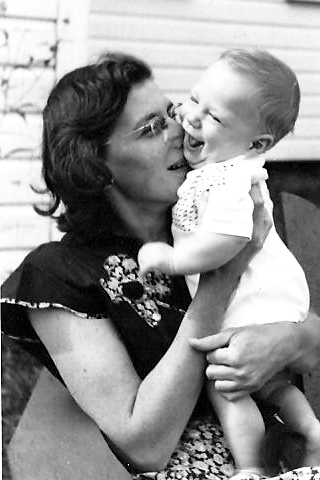
Figure 1 - "With my mother, 1951" (c) copyright DEWolf 2013.

Figure 1 – “With my mother, 1951” (c) copyright DEWolf 2013.

From 1964-68, I had the privilege of attending Stuyvesant High School.  I say privilege first because it was a very special place with very special teachers and second because at the time I probably didn’t fully recognize what a privilege it was.  I may have seen it as a necessary rite of passage for a “geek in training.”

As I write this my mind recalls some really great teachers: Jack Irgang (history), Ralph Ferrara (Biology), Ann Moehle (Biology), and Sterling B. Jensen (creative writing and drama).  We were truly blessed.  I’d like to write a bit today about Sterling Jensen.

Mr. Jensen was an actor and mime.  Notably he was a founder of the now legendary Roundabout Theatre in Manhattan.  I saw him as King Lear, and it was truly unforgettable.  Mr. Jensen taught me two interesting things.  First, never use the words “interesting” or “things,” oops!  If you truly have something worth saying, you can find better words.     Second, that the highest of human emotions is empathy.

To be clear about it, say there is a terrible accident, where a bicyclist is hit and killed by a car.  If you hear about it second hand, and say “OMG that’s terrible, that poor guy,” you are experiencing sympathy.  You feel sorry for the bicyclist and, perhaps, the driver who now has to live with the pain of having killed someone.  But if you see the accident and at the moment of horrendous impact wince painfully, you are empathizing, you are feeling or sharing that person’s pain.

Back in the land of geekdom, people with fine tuned empathic powers have been featured in several Star Trek episodes.  First, there is Gem from the Minarian system, who in 2268 is tested by the Vians to see if her people are worthy of being rescued from a supernova.  Kirk, spock, and McCoy are subject to torture and Gem must take on their pain to save them – pretty grim stuff.  And then, of course, there was Deanna Troi, extrasensory empath,who was a half-Betazoid, half-Human who served under Captain Jean-Luc Picard, as ship’s counselor aboard the USS Enterprise-D and the USS Enterprise-E. I am doubtful that most therapists would want to have extrasensory empathic powers, but there you are.

My point in all of this is that if empathy is the highest form of human emotion, and if the purpose of art and photography is to create emotion in the viewer, then art that evokes empathy has achieved this higher plane.  It is in that context that we may consider the very remarkable and truly moving portfolio by fashion photographer David Jay, “The Scar Project.”  And I think that we do need to include the rest of the project’s title “Breast Cancer is not a Pink Ribbon.”  When you view these images you do not feel sympathy, you do not feel “there but for the grace of God go I,” you feel empathy.  For a brief instant, it is ever fleeting, you feel the pain, and grace, and endurance of these women.

Jay’s project was born when a frequent model of his was diagnosed with breast cancer at age 32.  The project is documented in a film, “Baring it All,” which you can see at the projects website.  It is hard to say anymore without seeming trite or cliché.  Perhaps all is said by one of the young women in the documentary who declares, “The scar represents everything I’ve been through. I’m proud of what I’ve been through.”

Finally, and to go full circle, I remember very vividly that when I was taking Sterling Jensen’s class in creative writing in 1968, my mother Sylvia Wolf (1917-1988) was diagnosed with breast cancer and underwent her first radical mastectomy.  It was very hard to concentrate on Shakespeare.  My mother succumbed to the disease twenty-years later, but only after fighting it with tremendous strength and grace.  Having witnessed all of this, I can bear testimony, that it truly is not a pink ribbon.


Frank Hurley, photographer, explorer, adventurer

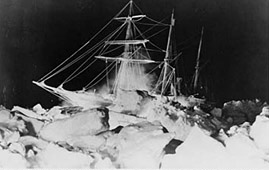
EnduranceintheIce

Figure 1 – Frank M. Hurley, Endurance in the Ice, 1915 from the Wikipedia and in the public domain

James Francis “Frank” Hurley (1885-1962) was an Australian photographer and adventurer(BTW also referred to as “Mad Frank Hurley”). His remarkable photographs document Sir Ernst Shackleton’s ill-fated Imperial Transantarctic Expedition (1914-1916).  I very highly recommend that you read Caroline Alexander’s “Endurance,which is adorned with Hurley’s wonderful photographs.  Frank Worsley, Captain of the Endurance, warned Shackleton, leader of the expedition:

She’s pretty near her end… The ship can’t live in this, Skipper.  You had better make up your mind that it’s only a matter of time…what the ice takes, the ice keeps.”

Figure 2 - Another of Hurley's images of the Endurance trapped in the Antarctic icepack, 1915 in the Wikimedia and in the public domain.

Figure 2 – Another of Hurley’s images of the Endurance trapped in the Antarctic icepack, 1915 in the Wikimedia and in the public domain.

And thus began the greatest sea voyage, 800 miles across furious seas in an open boat, in the history of the world.  It is truly the stuff of which legends are made.  And Hurley documented it all.  I think that you must agree that his photographs are excellent.  That he had a gift and an wonderfully artistic eye.  Following his Antarctic adventures, Hurley went on to a long and highly productive career in photography and cinema.  He was a combat photographer in both World Wars.

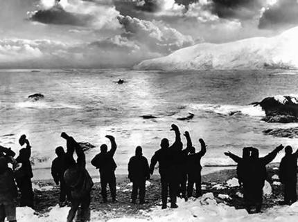
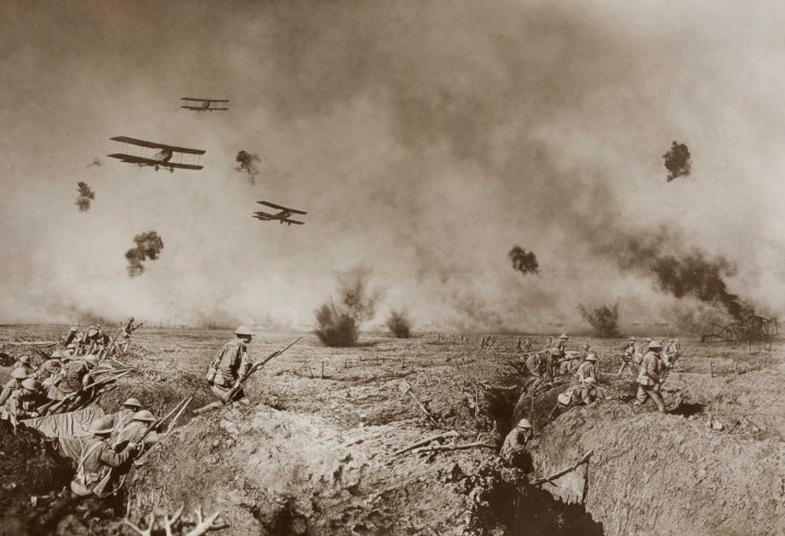
I’d like you to consider two more of Hurley’s spectacular images.  Shackleton’s return to rescue the sailors he left on Elephant Island (Figure 3) and a combat image “The Battle of Zoonekee” taken by Hurley during World War I (Figure 4).  These are both wonderfully executed images and I think really speak to the talent of the photographer..

Figure 3 - Shackleton's Return to Elephant Island from the Wikicommons and in the public domain.

Figure 3 – Shackleton’s Return to Elephant Island from the Wikicommons and in the public domain.

BattleofZonnebeeke

Figure 4 -Frank Hurley’s “The Battle of Zoonebeke.” Original image is in the collection of the Library of New South Wales and is in the public domain.

Hurley was troubled by the limitations of his media.  As we have discussed previously, emulsions of the day were highly sensitive to UV light and, as a result, skies tended to be a boring blur of whiteness.  The bulkiness and slowness of early twentieth century cameras made combat photography cumbersome.  Remember that earlier war photographers like Matthew Brady tended to photograph the aftermath of battles and camp scenes rather than combat itself.

Both figures 3 & 4 represent manipulations.  There is an excellent little video of how and why, in Hurley’s own words, they were done at the Australian Screen Organization’s website.  Figure 3 is ambiguous as to whether it truly shows: Shackleton’s return to Elephant Island, as Hurley published it, or his departure.  More significantly the dramatic moody sky was added in photo-montage.  Similarly, Figure 3 is a montage of three of Hurley’s photographs composited for dramatic effect.

None of this detracts from Hurley as a photographer.  However, Australia’s official wartime historian, Charles Bean, who was in charge of the photographic unit, was outraged and declared these images fakes. He  demanded Hurley stop making them.  I bring these to your attention because they inhabit the grey area between fraud and art.  As artistic works all of this manipulation is allowed and acceptable.  As photojournalistic images they may be considered to have crossed the ethical line into the realm of fakery.  It is a matter of perspective, and you will have to decide for yourselves.


More forms of image abuse

I had thought that I was through, at least for the moment, with our discussion of “image abuse.”  And I’ve concluded that “image abuse” is just the right term for it, since it includes much more than “Photoshopping” and image manipulation.  It really goes to the very core of people manipulation through photography.

Anyway, just as I was turning the chapter on this subject a controversy erupted on the internet about the History Channel miniseries “The Bible” and how the face of Satan on this series bears more than a coincidental likeness to President Obama.  I am really not one to look for conspiracies everywhere I go.  So I’m going to ask you to judge for yourselves.  And, by the way, before you weigh in with your opinion, also take a look at another image of the actor, Mohamen Mehdi Ouazanni, who plays Satan in the series without his makeup .

Also, and despite all this stuff about the face of darkness, I have to ask why Satan is portrayed as a black man, while God is portrayed as white?  The face of Evil does not need to be black as demonstrated beyond all doubt by the image of Prince Palpatine in the Return of the Jedi. And suggestions made in so depicting the devil is no different from images from the last US election of President Obama with a Hitler mustache.

This is all “image abuse.” It represents an attempt to manipulate people that we must, regardless of political leaning, all rail against.  There is no place for this kind of racism or this kind of disrespectful innuendo in a free society.

“Shopped” images and the modern day Herostratus

Site_of_Temple_of_Artemis

Figure 1 – What remains of the Temple of Artemis at Ephesus today. Photograph by Ronan Reinart from the Wikicommons under creative commons license.

On July 21, 356 BC, seeking notoriety, Herostratus (Ἡρόστρατος) burned down the Temple of Artemis at Ephesus (one of the seven wonders of the ancient world). The name, Herostratus has become a metonym (equivalent) for someone who commits a criminal act in order to become famous.  Herostratus proudly proclaimed his guilt in an attempt to immortalize his name. The Ephesian authorities had him executed and forbade the mention of his name under penalty of death. However, the ancient historian Theopompus recorded the event and the name Herostratus in his “Hellenics.”  In that sense, Herostratus was successful in achieving his goal.

Nice story – I know – but you ask, what does this have to do with the creation of fake “shopped” images?  Well let me ask this: why do people create “fake” images.  It’s all a matter of intention.  As I’ve said in science and press photography it’s strictly forbidden- but elsewhere? Is it fair for me to laud the artist as one who “shops” images to create what (s)he believes to be beautiful, but at the same time to criticize the fashion and advertising photographer as one who “shops” images to make money?  Both may make money from their labors and both are trying to create what they believe to be beautiful.

This part of it gets very complicated, and, I believe, that we are left with the issue of motive.  If the motive is to exploit, to manipulate, to hurt, then it is wrong.  We may defend someones right to self-expression, but at the same time we must condemn the morally repulsive, such as the overt exploitation of children in some fashion photography or racist undertones in manipulated political photo-images.  Recognize that what is at stake is the very fabric of our ethical and political compass.  And it is a very difficult and fine line to tread between our views of morality and civil liberties.

So, we appear to be after motive.  Let’s consider again gun tottin’, bikkini clad Sarah Palin.  It seems unlikely that the goal there was to deceive or even that it was truly political.  No one really believed that the image was of Governor Palin.  The political right looked at it, laughed, and saw their image of her as a kick-ass politician.  The political left looked at  it, laughed, and saw their image of her as a gun-crazed kick-ass politician.  No real harm done.  Someone made this image for amusement.

Now consider, the image of the Statue of Liberty and the tornado.  Someone made that image possibly for fun.  Was their intent really to deceive or just to have fun?  If the intent was deception and political, perhaps to warn of the wrath of God or the dangers of global warning, then we may question its intrinsic morality – maybe that’s a strong word – its intrinsic acceptability.  But it is just as likely that any ulterior motives came from others, who exploited the image.

A very important point is that we don’t really know, for sure, who made these images.  They don’t come with a credit line.  There are lots of people trying to go “viral” on the web, and we can perhaps, understand that in terms of people seeking a moment of fame and glory. It’s a curious and all pervasive social phenomenon.  Perhaps they are seeking to be modern Herostratus’ – perhaps they share his motive.  However, it is fascinating when all this is accompanied with namelessness, when the price of fame is anonymity.


Images from Saint Peters II

My second favorite image of last week from Saint Peters, actually Saint Petersburg, is this wonderful pictue by Alexander Demianchuk for Reuters called “Catching the Rays.”  It shows a young man preoccupied by the music of his IPod strolling in the snow past the wall of the Peter and Paul Fortress in St. Petersburg, Russia, on March 10.  He is modly dressed in boots, jeans, and snow jacket apprpriate to the season and he flaunts a classic Russian fur hat meant to deal with the a serious Saint Petersburg winter.  He is oblivious to the sunbathing, bikini-clad beauties gathered against the wall.  The image brings a smile and a chuckle, and I really love the boots of the snow maidens!

Images from the Saint Peters I

Well, it’s Sunday and that means that I find myself flipping through the various collections of “Photos of the Week.”  There are invariably a number of moving or amusing images.  And, of course, I find myself reflecting on how much under image rapid-fire we all are. I found two images to share this week and they are so different, one sacred, one profane, that I feel I have to put them up on separate days.

So first – last week, brought the election of the new Pope amidst a pagent of sacred, yet ancient, ceremony.  And we could not help but think how different our cellphone-based world usually is.  This wonderful picture by Michael Sohn of the Associated Press seems to unify, if momentarily these two worlds. An expectant crowd gathers to witness the appearence of the new pope in Saint Peters square.  We see a constellation of lights, candles(?) symbolic of the human soul.  They seem infinite and just out of focus, just beyond reach.  But then we realize that they are not candles but cell phones and IPads – all photographing the event.  Indeed, the one in focus IPad in the center of the foreground, creates the sense of picture within picture, which like two parallel mirrors heightens our sensation of infinity.

It is a magnificent juxtaposition and excellently executed! The depth of field was perfectly chosen to contrast sharpness and fuzziness in reflief and beyond that to create a true sense of mystery of the infinite.

Photoshop as a dirty word

I thought that it would be interesting to explore further this issue of photo-manipulation.  Is it art or is it always a bad thing?  Recently someone complained to me about the degree of manipulation being put it some digital images  It’s always expressed today as “that was Photoshopped” or even merely “shopped.”  This means that Photoshop has joined the elite pantheon of brands that have become catch-all verbs, like Xerox and Bing.  Indeed, and I love this, the process of so much recognition that a word becomes universal has been referred to as “genericide.”

It is all, obviously a matter of context.  In art anything goes (as long as it isn’t hateful, perverse, or exploitative).  And I stick with those exceptions.  But beyond these, in art image manipulation software is a tool that furthers the artist’s ability to express him- or herself.  It is like any new artistic medium.Beyond that, we move into the high fidelity zones of science and press photography.  In these two areas, the absolute truth is required – no image manipulation allowed.

In science, this gets really interesting.  In the analogue days, films and papers were intrinsically nonlinear.  Indeed, they were logarithmic in response.  As a result, while dodging and burning were strictly forbidden, the very act of choosing a paper contrast grade was inherently manipulation, even though it was considered acceptable then.    Today, you are expected to be linear.  You can histogram equalize as long as the settings are maintained for experimental and control images and as long as you do not clip detail into the blacks.  It’s a bit complicated and made even more so by imaging systems that automatically set all sorts of experimental parameters.

In press photography the big issue is that what you are photographing is real.  That is that you haven’t removed details or added any.  Photo-montage is a strictly forbidden.  However, aesthetically tweaking the image, as we would an image in fine art photography, is allowed.

The problem with press photography is that it’s a close kissin’ cousin of advertising photography – and those guys will alter everything.  The goal of advertising is to sell brand or politics, and they do it with a vengeance.  And since the goal of press photography is to sell newspaper or television or other media, things start to get seriously blurred.  However, it remains the responsibility of a free press to be truthful and to report.  This is more and more forgotten today – still it remains paramount.

I’d like in the next few blogs to consider some of the classic examples of manipulated photography.  At a superficial level it may appear that there is considerable grey involved in the deduction of whether a given example is good or bad in an ethical sense.  I believe, however, that on careful consideration the absolute criteria remain.  You don’t need Bertrand Russell, only your mother.  Is it meant to fool or deceive?  Is it meant to manipulate?  Is it hateful, perverse, or meant to exploit?  I think that the ultimate criteria remain.  In art almost every manipulation is acceptable.  In science and press photography almost no manipulation is acceptable.  And as for advertising, I guess that we have to recognize it for what it is.  But do remember, especially when politics is involved that the stakes are very high, and by dashing off a supposedly funny or telling political image on the web, however manipulated, we ourselves become manipulated pawns in the process.

New view from Cassini

Figure 1 - Venus glimmering brightly through the rings of Saturn taken by the Cassini-Huygens satellite on November 10, 2012 from NASA and in the public domain.

Figure 1 – Venus glimmering brightly through the rings of Saturn taken by the Cassini-Huygens satellite on November 10, 2012 from NASA and in the public domain.

As we have discussed before, the ultimate in robotic eyes are the cameras on our deep space probes. Among the most remarkable is Cassini-Huygens a Flagship-class NASA-ESA-ASI robotic spacecraft.  It was launched in 1997 and arrived at Saturn in 2004 having in the meanwhile observed Jupiter and the heliosphere as well as tested Einstein’s theory of relativity.  Good stuff for a “mere” robot.

Cassini today continues to send back very remarkable images of Saturn.  So a visit to her photogallery at NASA is worthwhile and fun.  NASA recently released a wonderful image taken on November 10, 2012, which shows Venus glimmering brightly through Saturn’s marvelous rings.  These amazing robots continue to provide us with images better than anything we could ever image.  The distinction between science and art dims and we have only begun to scratch the face of the universe.  If these images exceed our wildest imaginings then these robotic eyes may truly be said to have extended the limits of our imaginations.