Murad Osmann – being led around the world

We have discussed the immediacy of cell phone phototography.  It represents a profound sociological phenomenon.  In a sense it has created very new ways of communicating emotion, and since communicating emotion is a primary objective of art, it has created new modes of art.  So I was intrigued to read in Petapixel the leader “Photographer Captures Girlfriend Leading Him Around the World.”

Russian photographer Murad Osmann has taken a rare perspective, focusing on the back of his girlfriend Nataly Zakharova as she leads him all around the world. The work which you can follow on Instagram is entitled “Follow Me.”   Each picture is shot from the photographer, or observer’s viewpoint, and you see Nataly’s hand as she reaches back and leads Osmann onto adventure in some dramatic world . He takes these pictures either with his IPhone or with his DSLR and then uses Camera+ software for processing.

So what you wind up with is a photographic series or essay, moments of excitement and anticipation captured in time in a way that only digital photography can provide, and you feel as if you are the photographer.

I found it curious what aspects of the images, taken as a series, grabbed my attention and in what order,  First, in a vague sense was the location:London, Hong KongDisney Land … But then I was drawn to the hand with its distorted dominance in perspective that seemed to draw me into the adventure.  Then I found myself intrigued by the ever changing color of Nataly’s nail polish. And finally, there were her dresses, which I reflexively memorized so as to see which appeared again in subsequent photos.  It is all very magical.  And you conclude that she has a very extensive wardrobe.

But, I believe most profound is the gesture of hand-holding.  It carries an intimate and touching sense of the romantic.  Is there perhaps an ancient reminder of Michaelangelo’s “Creation?”  Is this question over-the-top and extreme?  I don’t think that we are necessarily always conscious of the mythical allusions of images.  They are so engrained in our culture as to appear almost innate.  What could be more “creative” than the relationship between man and woman?  And if you think that seeing biblical themes in a series of IPhone photographs exaggerated, then consider “Follow me to the snakes of Bali.”

And finally, consider what has to be viewed as the piece de resistance of the series: “Follow me to Venice.”  What exactly are we to make of this image?  What exactly does it mean or is it pure whimsey?  And, of course, since the series continues and may be followed on Instagram, we cannot even say that it is the crowning jewel of the work.


Rite of spring in the Yosemite Valley

We are three weeks from the official start of spring in the northern hemisphere, and, depending upon where you live, the signs are either just starting or well on their way.  Photographically speaking, one of the great pilgrimage sites to mark this special time is the Yosemite Valley and more specifically the horsetail falls.  Every February is marked by these falls becoming lit with fire by the setting sun, and crowds of photographers flock to the valley to witness and record the event. 

There are many wonderful examples of photographs of this event, but let me suggest Andrew Kee’s website, which not only has a wonderful picture taken by Andrew, but also provides best times and dates for devotees.  So next year you can check this site and will not have the excuse of “I didn’t know when.”

When is clear. The astronomical alignment peaked this year on February 20 and 21.  This is, of course, one week after St. Valentine’s Day, which was created by the early Christian church to supersede the great Roman fertility holiday, the Wolf holiday, known as the Festival of the Lupercal+.  It all seems fitting, as no place has engendered more beauty photographs than the Yosemite Valley.

+Some may recall Mark Antony’s eulogy to Julius Caesar in Shakespeare’s play by that name:

“You all did see that on the Lupercal
I thrice presented him a kingly crown,
Which he did thrice refuse: was this ambition?

Joseph Kayne – a multitude of glorious visions

I have mentioned many times before that I believe that LensWork is pretty much the finest of the artistic photography journals being published today.  So I scour each issue for featured artists and I am rarely disappointed.  In the latest issue (#104) I found three magical words: photography, architecture, and Chicago.  What could be better?  So with great expectations, I started my exploration of the wonderful work of Chicago-based photographer Joseph Kayne.

The portfolios in Lenswork: “Chicagoesque – Architecture” and “Chicagoesque – Murals,” lived up to my expectations.  Then I started to explore Mr. Kaynes website.  The beauty and diversity of his work is overwhelming, or maybe just plain amazing.  The Chicago photographs there are labeled merely “Chicagoesque.”  They are then divided into “black and white” and “color.”  Mr. Kayne has true depth in both media.

A few points should be made here.  Mr. Kayne uses medium format cameras.  One of the wonderful aspects of these cameras, the one that makes them ideal for architectural photography, is the ability of tilt the lens to correct for perspective issues.  The big perspective issue with architecture is that you tend to be on the ground and looking up.  Your parallel building lines are moving up and seem to be converging to some distant point, instead of remaining parallel.  Tilt lenses enable you to correct for this.  Yes, so does Photoshop, but that’s not the point.  Look at the beautiful parallel straight-on perspective of for instance, “Pride of Chicago.”  And if you want to see gorgeous perspective consider “Concerto No. 9.”  That’s amazing craftsmanship and beauty rolled into one.  At the same time Mr. Kayne is a master of daring perspective.  He looks almost straight up at a building facade with, for instance, “Gothika.”  How’s that for depth-of-field?  And where does “The Elegant Path’ lead us?

The murals are another thing altogether!  Look for instance at “Deception.”  These photographs of church windows, ancient tile floors, and street murals connect with Joseph Kayne’s images of petroglyphs in his “Ancient America” series.  There is a tremedous depth and spiritualism in Mr. Kaynes work.  I don’t think that I have yet fully absorbed his website’s galleries.  He has remarkably chronicled the American West, the Southwest, and  New England.   With his landscapes, he asks us to “Walk in Beauty. 

A key element in observing and reading photography is what you can learn from it, what you can take from it to extend your own vision and work.  There is truly a lot to be learned from Joseph Kayne.

Linda Butler and the right touch of sensitivity

Yesterday’s talk about exploitation of native peoples in photography, especially the Chinese raft poler, got me thinking about how this can be done right.  Right here means with a true touch of sensitivity towards the intrinsic nobility of the subject.  So immediately comes to mind, one of my favorite photographers, Linda Butler.

In 2005 I went to see an exhibit of Ms. Butler’s work at the Peabody and Essex Museum in Salem, Massachusetts.  This focused on her work Yangtze Remembered: The River Beneath the Lake.  The exhibit, and its companion book, documents village life in the Three Gorges region of China, before it was completely inundated to provide hydroelectric power for modern China.  As such it is a tale of two China’s: the old and timeless China and the new modern China.

So consider, and contrast to the picture discussed yesterday, Ms. Butler’s “River Fisherman, Shennong Stream, 2000,” which shows a proud fisherman, with his metculously folded net and the basket in which he stores fish,  at the end of a day’s work.  Then look at “Carpenter’s House, Beishi 2001,” showing a carpenter sitting in front of the house that he built by hand for himself.  He built all the furniture himself as well.  The same carpenter is shown two years later in front of the ruins of his house, cleared to make way for the dam.  There is a sign on the hill above the house, top right, that reads 175 m, which is the eventual water level of the man-made lake.  Six months after Linda Butler took this picture the land was under fifteen feet of water, and the indefatigable carpenter had moved a half mile away and was constructing a new home for his family.  Those two photographs taken together define the meaning of  human pride and perseverance.

I cannot talk about Linda Butler’s work without showing my personal favorite of her photographs.  This is “Pig on a Motorcycle, Niehe, 2001.”  A farmer is taking his pig to market and has stopped at a local restaurant.  The pig sleeps “happily” on the back of the motorcycle.  He is in a stupor because he has been fed fermented mash.

Yangtze Remembered: The River Beneath the Lake is just part of Ms. Butler wonderful opus.  She is, perhaps, best known for her work “Inner Light, The Shaker Legacy.”  I highly recommend exploring her website and, in particular, her extraordinary photographs of the aftermath of hurricane Katrina, “Meditations on an Altered World, 2005-6,” and “Death of a Farm, Georgetown, KY, 1986.”  These series are haunting in their lack of people, but just the same the human presence is so palpable.

I love portfolios like those of Linda Butler.  There is so much to be learned from them.  There is the technical, of course, but most significantly there is the lesson of how to tell an intensely compelling story through the power of the image,


More controversy from the fashion industry

Well, the 2013 Sports Illustrated Swimsuit issue is out and, stirred up by a posting by Dodai Stewart on Jezebel, there is new controversy flying about the web and news media concerning the fashion industry .  Well there’s a mighty surprise.  The goal of Sports Illustrated is to tillilate its clientele and to stir up controversy.  Controversy equals kaching, kaching.

Men being titillated by sexy women is nothing new, nor is the saprophytic exploitation of the models.  The question that Stewart raises is one of culture.  SI is taking you to the seven continents, profiling its models against what it sees as characteristic of the cultural location.  Stewart objects to the use of “natives” as “props.”  She tells us that “people are not props.”  To be accurate I looked up the meaning of “prop” on the Free Online Dictionary.  This is definition 2: “a theatrical property.”  The word property applied to people is problematic, but I would argue that props are inanimate and that while people cannot be props they can certainly be background.  It is done all of the time and quite innocuously.

Let’s take a look at some of the pictures that Ms. Stewart is objecting to.  First we have Emily Didonato in the Namibian desert with a spear carrying tribesman, whose rear end is even more exposed than Ms. Didonato’s.  The photograph  by Kayt Jones is truly wonderfully constructed in terms of composition.  The background is out of focus so as not to steal emphasis.  The balance between sand and sky is perfect.  The tribesman is just sufficiently out of focus that there’s no question about what is foreground and what is background.  The juxtaposition of the spears is beautifully done.  And, of course,  Ms. Didonato is is gorgeous and exotic herself.  I see all of that and then I get a kind of lump in my stomach that says to me: “Ooh, how embarrassing!”  What is the man thinking about this strange creature in his world.  He is scantily clad because he’s hot, she because someone’s selling sex (not really bathing suits).  And as Ms. Stewart points out, no matter how much he was paid, does he really understand that his near naked behind is now in glossy print worldwide?

Second let’s consider Derek Kettela’s photograph taken in Guilin, Guangxi Province, China of model Emily V reposing on a raft as she is poled about by a “native” with serious dental issues and complete with “coolie hat.”  Yikes!  I mean somebody please help me.  Why don’t we just bring back the “black-face minstrel shows?”  A white women relaxing as a “native” poles her along or across the river is such a throwback to an imperial age.  I know a lot of modern Chinese, who would go ballistic over this photograph.  It is not the image that they have of their country – even with all its problems.  Yet SI has chosen this image as representative of China.

The issue here is not the right of an industry to take the photographs that they want, exploit whom they want, and to make as much money as they want.  The issue here is the subliminal messages that come across, that the photographs convey.  I am not a supporter of the concept that one must always speak or photograph politically correctly.  To me the question of what you are thinking, what’s in your heart, is much more important than what comes out of your mouth.  However, when your pictures are going out to 3.5 million subscribers, 23 million readers (of whom over 18 million are men BTW) there is a very serious issue of social responsibility.

Meteor over Chelyabinsk

My colleague and I were oohing and ahing over the videos of a meteor crashing to Earth in the Chelyabinsk region of the Russian Urals last Friday.  We are told that this is a once in a century event; so certainly worthy of being the “iconic image of the week.”  People will likely still be watching it a hundred years from now..

It got me thinking of meteors and photographs of meteors and meteorites.  Of course, my first thought was a blog on “The first photograph of a meteor.”   I was able to learn that the first meteor photograph was taken on a glass plate negative by Ladislaus Weinek director of the Klementinum observatory in Prague on Nov. 27, 1885However, I was unable to find a copy of this image on the web.

Figure 1 - Tunkuska tree fall, 1908, from the Wikicommons and in the public domain.

Figure 1 – Tunkuska tree fall, 1908, from the Wikicommons and in the public domain.

So I combed the cobwebs of my memory for thoughts and visions of meteors.  The first is obvious.  On June 30, 1908 near the  Podkamennaya Tunguska River in what is now Krasnoyarsk Krai, Russia there was a great meteor fall and blast generally referred to as the “Tunguska event.”  It is now believed that the meteoroid actually exploded in the air rather than striking the ground.  It probably had the force of a ten to fifteen megatons of TNT and  knocked down an estimated 80 million trees over an area covering 2,150 square kilometers (830 sq mi).  That is a circular diameter of 52km.  While there were no “robotic eyes” or surveillance cameras to photograph the event, there are many amazing post blast photographs of the tree fall made by subsequent expeditions.

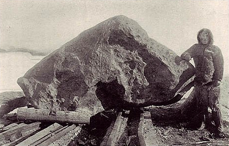
Figure 2 - Robert Peary and tthe Ahnighito Meteorite, 1897, from the Wikicommons and in the public domain.

Figure 2 – Robert Peary and tthe Ahnighito Meteorite, 1897, from the Wikicommons and in the public domain.

My strongest memory association with meteorites is as a child being taken by my father to see the great meteorite collection at the Hayden Planetarium in New York City.  In 1818, British arctic explorer Sir John Ross was astonished to find that a tribe of Eskimos along Greenland’s western coast possessed spear heads of iron.  The Eskimos smartly refused to reveal the source saying only that they came from a mountain of iron, in their language saviksoah.  A number of subsequent explorers tried, but failed to find the saviksoah.

By the the turn of the twentieth century Eskimos were actively trading for iron and no longer had the same need for their magic source.  An Eskimo named Tallakoteah told explorer Robert Peary that there were three irons: “the woman,” “the dog,” and “the tent. The legend was that there once had been a sewing woman and her dog, who lived together in a tent in the sky.  An evil spirit hurled them to the Earth and they landed as great lumps of iron.  Tallakoteah led Peary to these stones and, true to imperialist form, he decided to cart them away to New York. This was a Herculean task which ultimately took him several attempts and years.  As a child I remember looking with amazement at the tent, or Ahnighito, (also referred to as the Cape York meteorite) where Peary brought it for permanent exhibit at the Hayden Planetarium at the American Museum of Natural History in New York City.

There are many classic images of Peary collecting this colossal stone in Greenland, transporting it to New York, and then carting it up from the peer to the American Museum.  Figure 2 is a example of these images.  For a complete telling of the saga of meteorite collection and Peary’s efforts see Douglas Preston’s book, “Dinosaurs in the Attic.”

All forms of photography are equal

I am an avid reader of “View Camera, The Journal of Large Format Photography.”  Practitioners of this form of photography are the keepers of many of the wonderful time-tested forms – from wet colloidon to large format Polaroid –  of the art that might otherwise be lost.  Indeed, they keep these forms new and vibrant, since their goal is not merely to copy but to create.  I was despaired, however, to read in one article recently, the comment that digital printing was merely poster printing, not truly a photographic process.  That is not true and misses a very fundamental point.

I used to believe that if you painted squares or lines and dots on a canvas, but couldn’t paint like Rembrandt, if required to do so, then you weren’t really an artist.  Somehow I believed that being an artist required achieving technical prowess beyond that required for your own art.  It seems silly now and rather convoluted.  It is not true and misses a very fundamental point.

Art is vision and the ability to express that vision.  It encompasses everything from a detail fifteenth century tempura or fresco that might have taken years to complete to minimalist art – a string glued to paper or a paint-laden sponged dabbed selectively on a white board.  You can like it or not, but it expresses vision and is art.

And the marvel in all of this is the individuality of vision.  I have a coworker who showed me marvelous pastel photographs that she had taken in Greece.  They were wonderful, and I remember thinking that if I had been standing right beside her and taken the same pictures they would look completely different.  It’s all about vision.  And it’s all art.

Modern digital cameras, even cell phone cameras, have become progressively easier to use.  They have made the technical part easy and allowed us to concentrate on vision.  Or said differently, they have opened up for us previously unheard of technical capability.   One may argue that the endless droning litany of drunken partiers posted on Facebook, represents a new low in photography.  But I would argue that the real mediocritization of photography came with a vengeance with the introduction of the Kodak Brownie.  Dull meaningless black and whites, or was it gray and grays, and colors automatically set by processing machines to muddy indifference.   They have given more artists a voice.

Let’s embrace photography in all of its forms from the most ancient to the most modern.  They all contribute an important vision or voice to the diversity of the art.


The number of photographs ever taken

I found myself wondering recently how many photographs have ever been taken.  I recognize that this is a little weird.  However, it is what geeks do.  I knew that there would be an answer on the web, that someone besides me had wondered about it before.  So with a little searching I found that everything that I could find written about the subject dates back to a 2011 blog posting by 1000memories.com,  which estimated the number in 2011 to be about 3.4 trillion (3.5 x 10 ^12 for us geeks).  I’ve come up with a slightly different number, but close enough for government work and it’s interesting in that it really demonstrates Kurweil’s concept of the “Singularity.”  The Singularity is the view that technology is growing so rapidly that it’s becoming essentially infinite and  going off the scale.  So let’s have some fun and look at this.

To begin with 100memories.com uses as the number of cameras in the world an estimate by media expert Tomi Ahonen at 2.2 billion in 2011.  In 2012 Ahonen revised this estimate to be 4.2 billion cell-phone base cameras and about a quarter of that, say 1.0 billion non cell-phone based cameras.  So let’s take this number to be a total of 5.2 billion cameras.  The next thing that we have to ask is how many pictures are taken each year per camera.  1000memories.com estimated this in 2011 to be 150 photographs per camera.  As I’ll show you in a bit there is reason to believe that the rate of growth is on the order of 16% a year; so lets go with 175.  So we have something like 910 billion photographs being taken each year at the start of 2013.  Wow!

Alright, so where do we go from here?  So let’s remember that the first photograph was taken by Joseph Nicéphore Niépce in 1827.  That’s 186 years ago.

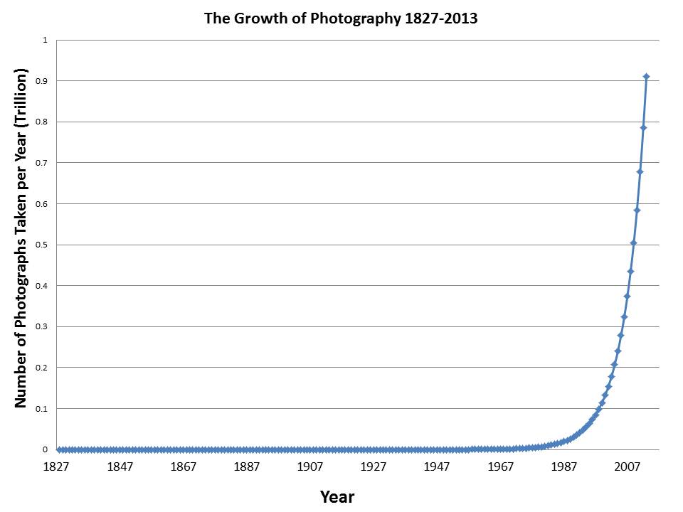
Figure 1 - The growth of photography 1827-2013

Figure 1 – The growth of photography 1827-2013

The problem is a lot like compound interest.  Suppose that your great-great grandfather had gone into a bank in 1827 and offered to deposit a dollar with the proviso that the money would not be taken out of the account until January 1, 2013 but that he wanted 16% interest.  How much would you have today?  Yes, you guessed it $910 billion. The growth is shown in Figure 1, years 1827 to 2013.  I’ve taken it back to photographs per year.

The Figure doesn’t show the early years very well.  I’d have to expand the scale or make it logarithmic.  But notice how it explodes as we get close to 2013.  That explosion in math is known as a singularity.  Hence “The Singularity.”  Kurzweil generally places the singularity at around 2025, for various reasons.  All sorts of technologies follow this pattern towards blinding almost  inconceivable growth.  Take our calculation out to 2025 and we’ll be talking 5.4 trillion photographs per year!

Getting back to our original question of how many photographs have ever been taken, to calculate this you need to add up the number for each year since 1827.  That is you have to calculate the area under the curve in Figure 1.  This number is 6.62 trillion.* Pretty impressive!


*Last year Facebook estimated that people were uploading 250 million photographs a day.  This is about 91 billion photographs a year or about 10 % of the photographs taken in the world last year.  Facebook current has 220 billion images stored.  That’s 3.5 % of all the pictures ever taken.


Early color movies – and the story of Technicolor

Figure 1 - Lon Chaney, Sr. from The Phantom of the Opera, 1925. Image from the Wikicommons and in the public domain.

Figure 1 – Lon Chaney, Sr. from The Phantom of the Opera, 1925. Image from the Wikicommons and in the public domain.

Some time around 1925, my mother who was a young girl then, went with her friend Becky to the Loew’s Delancy in New York City to see Lon Chaney, Sr. (1883-1930), Mary Philbin (1902-1993), and Norman Kerry (1894-1956) in the silent film classic, “The Phantom of the Opera.”  They screamed so loudly that they were almost thrown out of the theater.  Watch the famous unmasking scene or even the entire movie and judge the terror for yourself.  It is, of course, pretty thin by modern standards.  Also take a look at Figure 1, a still shot from this movie, showing the horrific phantom.  So the question I have to ask is this the movie that terrified my mother and her friend?

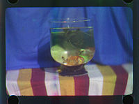
But first, let’s talk about the history of color in movies.  In 2012 the National Media Museum in the UK announced an exciting discovery.  The first color film was created by british inventor Edward Raymond Turner in 1902.  Figure 2 is a still from the movie.  This film was made with a special camera that took three successive black and white images through a red, green, and blue filters and then projected them back through the same filters.  So fifty years after Maxwell’s tartan ribbon, we have the same technique applied to moving pictures.  It is plain and simple pure additive color.
Turner Still 1902

Figure 2 – A still from Edward R. Turner’s first color movie, 1902. From the British Media Museum and graciously in the public domain.

The first feature film taken and shown with an additive red green additive two color process called Kinemacolor was “A Visit to the Seaside,1908.”  Of course, the use of just two colors was a bit limiting.  In 1917 an additive technique that used four filters on a rotating filter wheel (red, yellow, green, and blue) was used to produce a film called “Our Navy.”

The dominant early color process was Technicolor.  And it is with Technicolor that the subjects gets complicated and interesting.  Technicolor came in three chronological stages.

Process 1 (1917) – the first Technicolor Process was additive and involved first taking the red an green images simultaneously onto sequential film frames using a beam splitter arrangement.  The projector had two projection lenses.  As anyone familiar with optics will recognize, this kind of projection will lead to a subtle parallax shift and the colors will not be in perfect registration.  To overcome this, a wedgeprism was added to enable registration of the two color planes.  There is an excellent photograph of one of these early Technicolor cameras and schematics of both the beam splitter camera system and the two lens projection system at the Wide Screen website.   The first film produced by this process was “The Gulf Between, 1917.”  Additive color was effective, but, as noted, required special cameras and projectors.  The process  also necessitated projection at double speed.

.
Phantomtechnicolor

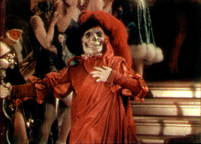
Figure 3 – A still from the masqued ball scene from the Technicolor Process 2 film, “The Phantom of the Opera, 1925.” From Wikicommons and in the public domain.

Process 2 (1922) –  As a result, it soon became clear, necessity being the mother of invention, that subtractive color was the way to go.  This led to adoption of the second Technicolor process.  Again, as in Technicolor Process 1, images were taken red and green simultaneously on film.  The red and green sets were then photographed onto two separate strips and dyed in the complementary color.  They were then cemented together.  The first film produced by this method was “The Toll of the Sea, 1922.”  “Phantom of the Opera was made by the Technicolor Process 2 in 1925.  Wait a minute!  Phantom of the Opera was a color movie.  Yes indeed it was.  Only a small segment of this remains of the masqued ball scene (see Figure 3) .  So why is it now only seen in black and white?  We’ll get to that part of the story later.

Some of you are old enough to remember films melting from the heat of the projector, or even worse, for nitrocellulose based films, exploding or bursting into flames.  Projector heat was a real problem for films produced by the Technicolor 2 process.  They warped and buckled and the two layers would separate.

Process 3 (1928) – To overcome this heat problem the third Technicolor process was developed.  Once again red and green planes were recorded simultaneously but sequentially on the film.  However, in the developing laboratory the reds were copied to one strip of film and the greens to another, just like in the Technicolor 2.  However, the film contained a special gelatin.  The gelatin required exposure to UV light to copy the films.  The UV hardened the emulsions.  Unhardened emulsion, that is unexposed emulsion, was removed chemically.  This is very reminiscent of Nicéphore Niépce’s (1765 – 1833) method of creating the world’s first photograph, which we have discussed previously.  The emulsions were then dyed with complementary colors and chemically transferred to a “blank” strip of film.  A so-called “mordant” was then applied to prevent further migration of the emulsion.  The first film produced by the Technicolor 3 process was “The Viking, 1928” (video of the entire film).”  This was also the first feature-length Technicolor film to also feature a soundtrack.

Wikipedia has a list of early color movies and the processes used to make them.  The list covers the period from 1903 to 1935.  Take a look at this list.  It is astounding how many there were and how strong audience demand for the latest technology must have been.  We have Autochromes and Three Color stills.  We have brilliant and magnificent color movies by a variety of additive and subtractive processes, most dominantly Technicolor.  These all are a tribute to the inventiveness and color of the age.   I for one can never think of this period as being a black and white one.

OK.  So why do most of these films now exist only in black and white?  First, of all in the 1940’s the company Technicolor destroyed many film originals, when they were unclaimed by the studios during a space clearing act.  Most of those that survived were made into black and white for television copies in the 1950’s and the colored masters were subsequently destroyed.  So the real black and white era was not the 1900’s to 1920’s but the 1950’s to 1960’s – the era of black and white television.

For further reading on Technicolor see the Wikipedia and the Wide Screen website.  Both of these were consulted extensive in researching this blog.