Repairing Manfrotto tripods

I’m pretty big on the added stability, and therefore sharpness, that a monopod or tripod provides.  So, shortly after I bought my first Canon DSLR, I bought myself a Manfrotto 724B tripod.  And shortly after that, one of the leg locks snapped – snapped because like everything else these days it’s made of plastic, but that’s a whole other story.  So I rigged up a not so perfect solution involving a plumber’s ring clamp and went my merry way for several years, periodically dreaming of sending a nasty, or at least, a beseeching note to Manfrotto.

Well the time for well-meaning notes has long since past.  So last month I went online to see what was involved in getting this baby repaired, and here’s a surprise.  I’m not the only one with this problem.  There are so many people with this problem, in fact, that you can buy spare parts.

My purpose in writing this is to inform people that not only can this be done, but it’s actually quite easy to do. I got my part from the Spartan Photo Center in just a couple of days.  I’ll give them an endorsement for that.  I was going to supply you with detailed instructions and photographs of the repair process, but there is a little video you can watch that shows it all.  It proved not to be quite as easy as shown on the video.  But, the whole process took me about ten minutes, and there was no frustrated screaming or muttering under my breath.  Do pay attention to the fact that you need a punch and have to work bottom to top.  My tripod is as good (?) as new.

Physical media and the need to touch

Figure 1 - The world's first digital computer. Image from the Wikimediacommons and in the public domain. Uploaded by  Anasalialmalla (own work) and put in the public domain by creative commons license.

Figure 1 – The world’s first digital computer. Image from the Wikimediacommons and in the public domain. Uploaded by Anasalialmalla (own work) and put in the public domain by creative commons license.

In my blog yesterday, I intentionally illustrated it with a historic picture from the Kelmscott Press.  Productions by William Morris at Kelmscott are some of the most beautiful and prized books ever created.  There is something wonderfully tactile about a beautiful book or a beautiful photographic print that defies the fact that we can do better in purely electronic medium: better linearity, greater dynamic range, and even comparable resolution.

There seems to be a true human need to touch and feel an object, and an even greater one to own it.  Owning a CD or other recording defies merely downloading it.  And I suspect that this somehow relates to the need of some people to collect, to amass great collections.  Rarity is desired.  Tactility is sensual.  These are the intrinsic human needs that any electron medium must ultimately overcome if it is to effectively compete with more substantive media.

I know this from my own personal experience.  I take a photograph and process it to my liking.  However, it is always aimed at an ultimate physical print, and I am not truly satisfied until I hold that print in my hand.

And there is another curious aspect of this to consider.  We seem to believe that the purely physical is somehow more enduring than the electronic image.  If you keep a diary or journal, for instance, you tend to believe that the physical journal will have a greater longevity than one keep electronically.  Computer memory can be erased in a flash.  The nature of storage media has historically changed at lightning speed.  Try to find a way to read an 8“ floppy (1980’s technology) or even a zip drive (1990’s technology) and you will understand the persistent problem that the conservators at the Smithsonian Institution continuously face.  Of course, understanding visual media like photography printed out is pretty straight forward.  On the other hand, can you guarantee that your journal gloriously scripted can still be read a hundred years from now? Will people still know how to read cursive?  It’s a lot like trying (for most of us) to read old German printing.

On the other hand printed words and photographs are getting costly to produce.  They are costly to distribute.  They are costly to store.  And they are costly to conserve against the elements.

We come then to the purpose of libraries and galleries.  No doubt there is something really special about seeing or reading an original.  But the other purpose of these institutions is to store and disseminate information.  Therein, lies the other way in which the internet specifically and the digital age in general become democratizing.  Great works of art were originally prepared for kings and emperors.  With the exception of public art and church art, nobody got to see these originals. Now anyone can see them electronically.

Control of information and its flow is power.  Making information publically available electronically is empowering.  So the internet and electronic digital media democratize at both ends.  Firstly, the artist has essential control over his or her own dissemination.  And secondly, the viewer has essential control over what he or she chooses to view.

Where is all of this going?  Where is it taking us?  In some regards the answer is unclear.  Broadly however, we are moving more and more into a digital and electronic world.  We are not given a choice really, the world and its media are evolving before our eyes.

A note on MTFs for Nikon Users – and a note about dying bookstores

Figure 1 - The தமிழ்: Books Shop from the Wikimedia Commons under creative commons license.  Image by Superbmust, 2012.

Figure 1 – The தமிழ்: Books Shop from the Wikimedia Commons under creative commons license. Image by Superbmust, 2012.

After finishing my last two blogs, I took a more serious look at the MTFs that Nikon provides for its users and realized that a short note was necessary.  The charts that Nikon provides are essentially the same as those provided by Canon except that they only provide the MTF for the lens fully open.  They do not provide curves for the near “sweet spot” or “best performance” setting of f/8.  And if you look at my blog about measuring lens sharpness, you’ll realize that fully open is certainly far from the best performance setting.  There is a sound engineering logic for this choice that we don’t really need to consider.   The most important point to make is that these curves are meant to enable you to critically compare lens within a family or brand.  You also have to remember that there are many other factors to consider, and I will try to discuss some of these in the future.

Most photographers, and certainly most amateur photographers, tend to make a brand decision early on and then are essentially captive within a brand, if for purely financial reasons alone.  That’s why within brand comparisons become important.  My choice of Canon is because when I bought my first DSLR it was the only game in town.  So I have stuck with it and slowly built up my accessories.  I am quite happy with this choice.  I am however, very impressed with the Nikon line and am looking forward to having the opportunity to explore it hands-on.

I should also add that I am much more interested in taking good pictures than I am in the “feature mentality” of photography.  This is why I tend not to read the equipment oriented photomags.  Of course, they serve their purpose, especially when you’re shopping for new equipment.  I am just grateful that book stores have coffee shops; so I do not have to buy these magazines.

Book stores?  For the last several years I have been watching the Nook Section slowly metastasize and consume my local Barnes and Nobles from within.  Now with the news that they are abandoning the Nook Tablet after suffering massive losses in competition against Amazon’s Kindle, one has to wonder whether those of you who like to take photographs of modern social dinosaurs before the go extinct should rush to your large book changes and snap away nostalgic images.

I must apologize to my high school English teacher Mr. Jensen for violating a golden rule of good writing.  I have turned today’s blog on a dime from MTFs to the off-topic of bookstores.  Saturday mornings are meditative stream of consciousness moments.

Selecting a new lens

Figure 1 - Fallen Tree, Sudbury, MA, (c) DE Wolf 2013

Figure 1 – Fallen Tree, Sudbury, MA, (c) DE Wolf 2013

Now that we have discussed the ins and outs of MTF charts, we can consider how to use them to select a lens.  In the previous blog I laid out the dilemma that I was faced with.  As a starting point I went to the Canon site and considered the MTFs of two lens that I knew from personal experience perform excellently: the EF-S 18-55mm f/3.5-5.6 IS II (This is the IS version of then lens that I discussed at length in a previous blog) and the EF 70-200mm f/4L USM, which is a lens that I am in love with.  The 70-200mm is a bargain among the Canon L Lens series at ~$700 and performs fabulously, as long as you are willing to forgo image stabilization.  I use a monopod almost all the time with that lens and results are amazing.  If you click on the two hyperlinks for these lenses you can see their MTFs.  This gives you a perspective of what good is, and all of the other lenses that I was considered did not have as good MTF performance.

So I thought that I had the issue settled.  Buy the EF-S 18-55mm for the great price of ~$199.  But then I took a look at the MTF for the EF-S 18-55mm f/3.5-5.6 IS STM.  The STM feature enables continuous focusing when you are doing video.  Actually, I have no interest in video but the superior performance of this lens in terms of sharpness really makes it, at ~ $249,  worth the extra $50.  As I’ve tried to emphasize, sharpness is not everything, and a review in PC Magazine, while rating the lens very highly, does describe some of its flaws: small amounts of barrel distortion at wide angle and edge darkening.

All this said the proof is ultimately in the forest!  There is nothing like a good tree in the forest picture, with its myriad spatial frequencies to put a lens through its sharpness paces.  In Figure 1, I show a picture of a fallen tree in the woods near my house.  Note how well the pine needles in the background are resolved. (Note that I like to use a very small amount of Adobe Photoshop’s “Smart Sharpen” feature to crisp things up, although this is not really necessary.  I have done so here).  Also I took this image handheld to test out the IS feature  As a result of all of this, I am declaring the EF-S 18-55mm f/3.5-5.6 IS STM a best buy Canon lens in my book.

How to select a new lens – the modulation transfer function (MTF)

Figure 1 - A typical MTF Chart for a Canon Lens

Figure 1 – A typical MTF Chart for a Canon Lens

During my recent trip to Vermont, I discovered that my ten year old Canon 18 – 55 mm zoom lens, the one that came with the original 300D Rebel had given up the ghost.  If you try to get such a lens repaired its going to cost you about $150.  In contrast if you buy a new one from a store like B&H Photovideo, it sells for about $199 and has the added advantage of being image stabilized.  So no contest right?  Well maybe not so much.  I immediately started down the path of whether another lens would better serve my purposes, maybe a different moderate zoom range?

So setting $500 limit for myself, I entered the world of what lens to buy.  You can start to read the customer reviews.  This approach comes with the problem that these people don’t know what they are talking about, more often than not.  So then you have to look at the technical specs of the lenses.  There are a lot of parameters that define lens quality.  But given my obsession for image sharpness a good starting point is the Mosulation Transfer Function or MTF.

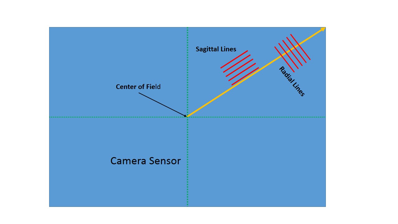
Figure 2 - Schematic defining terms in an MTF (c) DE Wolf 2013

Figure 2 – Schematic defining terms in an MTF (c) DE Wolf 2013

In today’s blog I’d like to talk technical about how to read an MTF curve and then, in my next technical blog, I’ll discuss the choice that I made and how I made it.  We have previously discussed resolution in terms of how a lens handles a set of parallel line or line pairs.  Simply put if you have a set of white lines and black lines, where the line thickness equals the line spacing, and unless the lines are very wide and far apart the lens is going to distort the lines.  It does this in two ways: it smooths or unsharpens the line edges and it modulates the lines. Huh?  Modulates mean that black becomes gray and white becomes gray until when the line spacing is so fine you can no longer distinguish the two shades of gray.  Suppose black is 0 and white is 255, then a 10 % demodulation takes the contrast down to 90 % of what it was to begin with.  The difference between black and white is now only 230.  That’s what the MTF does.  It tells you how much the  lens( or lens/camera system) modulates the contrast, expressed as a fraction, where 1.00 or 100% is maximum.

Figure 1 shows a typical MTF Chart from Canon.  Obviously, it requires a bit of explanation.  First, you will recall that the sensor on a digital camera is typically rectangular.  For a full frame 35 mm camera this rectangle is 25 mm X 36 mm.  The corner to corner diagonal distance is approximately 44 mm; so the center to corner distance is approximately 22 mm.  In Figure 2 the blue rectangle is mean to be the camera sensor.  The arrow goes from the center to the corner; so it is 22 mm long.  The x axis of Figure 2 is meant to be distance from the center along this arrow.  Next imagine that we had a set of lines parallel to the radius (referred to as meridional lines), and at each point along the radius we measured the modulation of these lines.  We can refer to this as the meridional modulation transfer function.  The key point is that the camera’s ability to resolve lines falls off from the center of the sensor to the edges; so the MTF decreases.

If you think about it, you will realize that the lines could alternatively be parallel to the radius instead of perpendicular to it.  So you could alternatively measure the MTF for parallel lines.  Parallel lines are referred to as sagittal lines.  I’ve always liked the word sagittal.  Sagittal comes from the Latin word sagittalis, meaning arrow.  You may be familiar with the constellation, or Zodiac sign, Sagittarius, the archer.  So the MTF measured with lines parallel to the arrow is referred to as the sagittal MTF.  This gets a bit confusing and you might ask why the resolution of the two types would different.  With a perfect lens they would be the same.  However, if they are different the lens is said to have astigmatism.  So comparison between the  two MTFs is a good measures of the lens astigmatism.

So here’s how it all works.  The two MTFs are usually measured at two line spacings, 10 line pairs/mm and 30 line pairs/mm.  10 lp/mm is meant to be a measure of the lens response to low spatial frequencies and the 30 lp/mm to high spatial frequencies.  That would give you four curves.  However, it is usually measured both with the lens wide open and with an f-number of 8.0 (near the sweet spot for lens resolution); so worst and best resolution.  This is why there are eight curves in Figure 1.  So here we go.  The thick lines are measurements taken at 10 LP/mm  and the thin lines are at 30 LP/mm.  The black lines are measurements taken with the lens wide open, and the blue lines are with the lens at f/8. The solid lines are meridonial measurements while the dotted show the sagittal measurements.

Now the key point, a value of 0.8 or greater represents superior lens performance.  A value of 0.6 represents only satisfactory performance.  So you know what you’re looking for 0.8 or better everywhere and at a cheap price.  Finally, one saving grace if you are using a Canon camera with an APS-C sensor with dimensions 14.8mm x 22.2mm.  Then the radius is only  about 13 mm, so you only have to worry about lens performance out to 13 mm.

As I said at the outset, totally defining lens specifications is a complex issue.  But the MTF is represents a good starting point and at least gives you a peg on which to hang your comparative performance.  Do remember caveat emptor that individual lenses can vary and a lemon is sour no matter how you slice it.  So you’ve ultimately got to field test your lenses, while you can still return them.

I will return to the question of which lens I bought and why in my next technical blog.  Wait a minute, David.  Aren’t you going to tell us where to find the MTF data.  For Canon lenses go to the Canon DSLR site and click on the picture of your lens.  The MTF’s are on the bottom of the page.  The situation with Nikon lenses is similar.  Go the the Nikon Lens Site, click on the lens you’re interested in and you’ll then see a link to the MTF Chart.


Are full frame DSLRs superior to APS-C cameras?

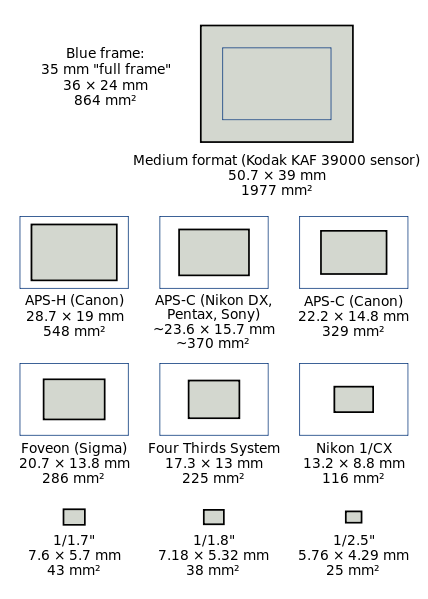
Figure 1 - DSLR camera sensor formats compared.  Image from the Wikimediacommons and in the public domain.

Figure 1 – DSLR camera sensor formats compared. Image from the Wikimediacommons and in the public domain.

I have been dealing with a lens problem over the last few weeks, and as a result, I have been sorting out in my mind the relative advantages between the APS-C and full frame sensor cameras.  At the risk of becoming soporific, the story begins with where does that pesky multiplication factor come from.  But a first question: what am I talking about?  If your DSLR  camera (refer to Figure 1)has a full frame sensor it is a 26 mm X 36 mm or 864 mm2, which means that it is the same size as 35 mm film.  However, if your DSLR has an APS-C sensor it is smaller, 15.7mm x 23.6 mm or 370 mm2 for Nikon and 14.8mm x 22.2mm for Canon or 329 mm2.  Now suppose you put a standard lens (one designed for the full frame format) on the camera.  Your APS-C sensor will only image the center of the field.  Your image will appear magnified relative to the full frame format by a factor of 36/23.6 = 1.53 for Nikon and 36/22.2 = 1.62 for Canon.  There is your magic multiplication factor.

Image magnification is determined by focal length.  For example, a 100 mm lens magnifies two-fold compared to a 50 mm lens.  As a result whatever the true focal length of the lens is, you need to multiply by this multiplication factor to get the equivalent focal length for an APS-C camera.  For instance, if you are using a Canon 18mm to 55 mm zoom lens, it is equivalent on a APS-C camera, such as the Canon T2i, to a 29 mm to 89 mm zoom.

It is logical to ask which is better?  And if you are a regular reader of this blog then you know that I am going to obsess about two factors: image sharpness and image dynamic range.  Given that, and before we can discuss relative advantages, we have to consider one more technical point.  Suppose that you start with the APS-C sensor and you want to make it bigger, indeed you want to make it full frame, then you can do this in one of two ways: you can make the pixels bigger and keep the same number of pixels or you can keep the size of the pixels the same and just add more of them.  This is not a minor point, as we shall see.

Canon’s full frame cameras, for example the EOS 5D and the EOS 6D have approximately 22 Mp “resolution.”  Compare this to their APS-C cameras at 18 Mp “resolution.”  This means that there are about 22 % more pixels or about  10 % more on a side.  Basically, this means that the pixels are bigger, but that the number doesn’t change by much. Nikon kind of goes both ways.  Their APS-C cameras have around 24.1 Mp.  Their full frame cameras come in two flavors.  The D800 has 36.3 Mp, meaning 50 % more pixels or 23 % more on a side,  while their D600 series has a full frame sensor with 24.3 Mp, meaning no change in the number of pixels.

Advantage APS-C – Price

The big advantage of the APS-C sensor is that it is cheaper to manufacture.  The reason for this is that the larger a sensor you try to manufacture there more likely you are to have a flaw.  Flaws were acceptable back in the Jurassic, when I was a lad, and we were first using cooled-CCD cameras for scientific measurements.  In the consumer market, this is totally unacceptable.  There can be as much as a 20 fold increased cost associated with making a full frame, as opposed to APS-C, sensor.  This is reflected in the increased cost of full frame DSLR cameras, approximately five to six fold.

Advantage full frame dynamic range and signal to noise

If you have a larger sensor then its well depth, the number of photoelectrons that it can hold increases as the area.  So roughly speaking, if you hold the number of pixels constant and increase the area of the pixel by (1.5)2 or 2.25, you gain over a two-fold increase in your camera’s dynamic range.  Also the  more electrons the better the signal to noise.  This is going to help you out in low light images, but only by about a factor of about two or one f-stop.

What about image sharpness

The story with sharpness is a tricky one.  First, of all most lenses perform best, from a sharpness or modulation transfer function point (MTF) of view, at or near their centers.  It is the edges that are hard to get sharp.  I am in love with my Canon  EF 70-200mm f/4L USM LensThis lens has an outstanding MTF.  Couple that with my APS-C sensor and the performance is just amazing!  In addition, it is easier for lens manufacturers to design high quality lenses for a smaller sensors, and again easier translates to price.

Last October we spoke extensively about photographic image resolution and I showed you that the resolution of a camera lens is 1.22 x wavelength of the light x f-number.  For green light this is about four microns.  We also showed that for good DSLRs this is about equal to the interpixel distance (for a 18 Mp APS-C sensor).   Recognize that the focal length of the lens comes in because the f-number is the focal length divided by the aperture and that this refers to the true focal length.  So if you keep the number of pixels the same going to full frame you will lose a bit in resolution or sharpness.  But say that you increase the number of pixels enough to keep the interpixel distance the same (that was 2.25 fold in the previous example), then your resolution or sharpness will be the same.  However, if the resolution is the same then when you print or project your image on a computer screen you will have more pixels.

Last fall we discussed in detail how many pixels you need as a function of print size.  What we found there is that 300 pixels per inch is more than sufficient and this means that today’s APS-C sensors certainly provide sufficient sharpness for a crisp 12” x 18” image.

My bottom line

When I started writing today’s blog I was afraid of being boring (I have no doubt succeeded in that), but at least I thought the subject pretty straight-forward – 1100 words later, no so much!  You can see that there are advantages both ways, which makes the choice ambiguous.  My bottom line is that for the kinds of photography that I do and the print sizes that I am aiming for there is no real value to going full frame.  Affordability is very key, since everyone has limits on how much they can spend on equipment.  The ability to add another lens to my photographic arsenal, outweighs the minor disadvantages of the APS-C.

Analogue vs. digital

First Telegraph Message sent between Washington, DC and Baltimore, MD in 1844 by Samuel Morse.  From the Wikimediacommons and in the public domain.

First Telegraph Message sent between Washington, DC and Baltimore, MD on May 24, 1844 by Samuel Morse. “What hath God wrought?” From the Wikimediacommons and in the public domain.

If you have a picture that you want to transmit to another place, computer, or person you’ve got to decide whether you want to do that in an analogue or a digital mode.  More accurately the nature of the communication system tends to dictate the mode.  So it is useful to consider what we mean by these two terms.

Suppose that you have a signal like a voltage.  Let’s say it’s between 0 and 1 Volt.  if analogue, this voltage can take on any value between 0 and 1.  A digital voltage is broken down into a set of discrete values.  This might be in steps of 0.01 V or some other division, like some power of two.  For instance, when we talk about the intensity level of a pixel for a digital camera, this is a discrete digital number.

Most electronic devices today move back and forth between the analogue and digital world.  If you remember our discussion of how a CCD camera works, we spoke about the fact that each pixel adds up light induced electrons to create a voltage.  When the chip is read that voltage passes through an analogue to digital converter, that converts the voltage to a discrete digitized signal.  Today once you’re digital, you tend to stay digital.  The numbers are handled digitally in your computer, by your image processing software, and then displayed digitally.  In the age of say television with so called cathode ray tubes, everything stayed analogue.

This is the basics of the analogue vs. digital world,  But if you really think about the case of our CCD pixel, it never was really analogue.  The voltage was really a discrete number of electrons.  It was really digital to begin with. In fact most physical signals are based upon inherently discrete processes.

The simplest digital system is the two state or binary system.  The state is on or off zero or one.  That’s how our modern computers work, ultimately in binary.  Multiple zero or one bits are required to express a given number.  For instance, the number 13 is 1 times 8 (or 2^3) plus 1 times four (or 2^2) plus 0 times two (or 2^1) plus 1 times one (or 2^0).  This is usually written as 1101 in so-called binary. This binary number has a eights column, a fours column, a twos column, and a ones column.  This is just like our usual tens power counting system has a hundreds, a tens, and a ones column. So the number 13 in a base ten system is 1 times ten plus 3 times one, or 13.

There are other digital systems.  If you think about our English alphabet, there are 26 letters.  So any word can be expressed by a string of these 26 values.  If you’ve heard about quantum computing that intrinsically is a base four system where any number can be expressed as a series of numbers or columns, where each value is 0,1,2 or 3.

Morse code is very interesting.  Remember telegraphy was the first data transmission system; so you would have thought that it would be analogue.  But, when Morse developed his code.  He expressed everything as dots and dashes.  He used time or duration as a second dimension.  So at any point the signal is either off, on for a short while, or on for a long while.  In a sense this is equivalent to a three state system, where everything is a string of 0’s, 1’s, and 2’s.  All of this can be very clearly seen in the world’s first telegram send by Samuel F. B. Morse between Washington, DC and Baltimore, MD on May 24, 1844, “What hath God wrought?”  If you blow the image up you can clearly see the dots, dashes, and empty spaces recorded on the paper strip as well as Morse’s translation of it below.  The world’s first internet, the telegraphy network, was a digital one.

Blue snow – another color correction problem

Figure 1 - Bicycle Patrol, 1968 digitized image from a Ektachrome transparency, uncorrected for blue show effect. (c) DE Wolf 2013.

Figure 1 – Bicycle Patrol, 1968 digitized image from a Ektachrome transparency, uncorrected for blue snow effect. (c) DE Wolf 2013.

The photograph in Figure 1 was taken at the boat house in Central Park, NYC after a major snow storm in 1968.  The color is as the Ektachrome transparency recorded it.  Blue snow?  Snow isn’t blue; it’s white.  Or is it?

Why is the snow blue?  It’s actually not a problem with the film but rather with the snow itself.  We’re illuminating with daylight, that is beautiful white light.  The color of things comes from three phenomena:  light absorption, light scattering, and interference.  Let’s leave interference, the root cause of color in oil slicks and butterfly wings, for another day and concentrate on absorption and light scattering.  Remember that white light is a mixture of colors or wavelengths that our eye/brain interpret as white.   If you have a surface say a piece of white paper that scatters all wavelengths of light it  appears white.  However, if you have a leaf that reflects or scatters green light but absorbs other colors it will appear green.  So the dominant factor in the color of leaves, and flowers, and other pretty things is what wavelengths it absorbs or removes from white.  Sounds like subtractive color to me!

Now why is the sky blue?  The atmosphere is made of air.  The molecules of the air, the oxygen, nitrogen, etc. scatter the light.  Physicists call this particular flavor of scattering Rayleigh scattering.  Rayleigh scattering goes inversely as the fourth power of the wavelength.  So if you have blue light say 450 nm it will scatter (700/450)^4 or   5.9 times more by air than red light at 700 nm.   Basically the red light shines down on us while the blue light scatters all over the place, making the sky blue.

The same is true of snow.  White light strikes the snow.  The blue light reflects back, while the red light penetrates further, eventually becoming absorbed.  So the snow appears blue. Snow flakes and thin snow don’t absorb much; so they appear white.  Thicker snow and glacial crevices appear blue, as does the snow on my rowboat.

Your eye/brain tends to correct for this and still see white.  In digital photography you can use image processing software, like Adobe Photoshop, to “correct” for the blue snow and make it appear as you expect it to be, namely white.  I’ve done this in Figure 2, using adjust color balance in Photoshop.  Again, you can decide which coloration you prefer.


Figure 2 - Bicycle Patrol, 1968 digitized image from a Ektachrome transparency, corrected for blue show effect. (c) DE Wolf 2013.

Figure 2 – Bicycle Patrol, 1968 digitized image from a Ektachrome transparency, corrected for blue snow effect. (c) DE Wolf 2013.

White balance and color temperature

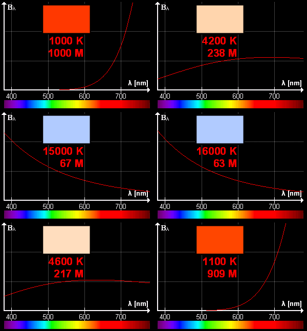
Figure 1 - Black body spectrum illustrating the concept of color temperature.  From the Wikimediacommons by Dariusz Kowalczyk and in the public domain under creative commons license.

Figure 1 – Black body spectrum illustrating the concept of color temperature. From the Wikimediacommons by Dariusz Kowalczyk and in the public domain under creative commons license.

An obvious question is whether reciprocity failure is related to white balance and color temperature.  the answer is yes and no.  The yes part comes from the common point to both reciprocity failure and white balance that films are designed for a certain mixture of colors in the light.  The no part is that reciprocity failure relates to low and very high light levels, while color balance really applies to the central portion of the sensitivity curve.

Let’s use the terms white balance and color temperature synonymously.  They’re actually kissin’ cousins, but not quite the same thing – but we don’t need to worry about semantic differences here.  When the sun rises in the morning it is reddish, becomes whiter until noon, and then starts to go back to red.  This has to do with atmospheric absorption and scattering of light.  The sun is an incandescent light source, which means that it emits light over a broad region of the electromagnetic spectrum, which our eyes call white because we are programmed to do so.  If you took a piece of iron or tungsten and heated it up to 5900 degrees Kelvin (the Celsius or centigrade temperature plus 273 degrees), it would glow with a spectrum nearly identical to that of the sun.  Hence, the sun is rated as having a color temperature  If you heated it to a lower temperature it would appear red, to a higher temperature blue.  The applet of Figure 1 shows this pretty graphically.  The temperature is given as is the spectrum in red and the rectangle shows you the color that your eye would perceive.

Your eye does a pretty good job of correcting for all of this.  Unless you really concentrate on the tonality, your eye-brain will interpret a sheet of paper to be white regardless of whether you look at it under daylight, indoor color lighting, or fluorescent hotter lighting. Your eye does a wonderful job of adapting.  In contrast films do what they are designed to do.  If you are using daylight film it will give you a warm yellowish tone if you take a picture with incandescent light bulbs or a greenish blue tone if you use fluorescent lighting.  To correct for this you either had to use indoor film or rebalance  the color with color correction filters.

Today’s digital cameras do this correction electronically by adjusting the relative contribution of the red, green, and blue pixels.  They do this very well, in my experience, and even can sense the nature of the lighting.  If you are shooting raw images you can turn off white balance and then manipulate it later with your image processing software.