Image Stitching

A reader(ABW) has asked me to comment on a recent posting on the PetaPixel website concerning the creation by photographer “Michael “Nick” Nichols”, under the auspices of the National Geographic Society, of a giant image of the second largest Sequoia in the Sequoia National Forest, “The President.”.  I was all set to do so, when another reader (CJHinsch) responded so elegantly to my New Year’s Resolution post, expressing my desire to learn to photograph trees, and further pointed me to the work of James  Balog.  Mr. Hinsch really hits the nail on the head.  The real issue is not the marvel of how this is done technically, but the marvel of the tree itself, and that’s a very personal thing.  So more discussion on all of this needs to happen.

As far as the tree mosaics are concerned, the technical need for this type of image is the recognition of two points:  First, if you try to photograph a tree from its base, or suspended in another tree, or even from the air you are going to wind up with a pretty distorted image or a very tiny one from far away.  Second, that’s not how the eye works.  We see the tree in its entirety, then focus in on a few leaves, see them in fine detail, perhaps even notice a caterpillar.  Finally, we focus back and in our minds eye imagine that we have seen the whole tree at the caterpillar level of detail.  So if your desire is to reproduce the human experience “tree” in it’s full scale entirety, this is what you need to do.

Recognize that trees are not the only subjects that call out for this type of treatment. This happens whenever we are confronted by a subject that is physically larger than our lens can handle, unless, of course, we step way way back and lose all detail.  It should also be said removal of distortion is not always the artistic intent.  In the case of the tree images the goal is presenting a sharp and highly resolved undistorted image.  But there are other cases, making a 360 degree image of a landscape, where the distortion is intentional as a means of adding drama.  Moving frame by frame perpendicular to an image removes distortion.  Rotating around the axis of your tripod actually introduces a so called “spherical distortion.”
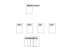
StitchingDoing a mosaic is conceptually pretty straight forward and is illustrated in Figure 1.  Imagine that I want to photograph something that is way too large to fit in my field of view, here the letters ABCDEFGHIJKLM.  In fact, my camera can only photograph five letters at a time.  What I do is take four overlapping images.  Then I reconstruct them by overlapping the images.

Now in the age of digital photography, this is an automated process.  Your Iphone or IPad will do it for you (have apps.) as will Photoshop.  When photography was a purely analog, this was a laborious and painstaking process.  But could be very effectively done, as witnessed by Ansel Adams’ giant landscapes for the Wells Fargo Bank.  It still is pretty laborious as the Sequoia project illustrates.  The desire is to keep things perfectly flat so as to minimize distortion and the need for corrected algorithms. In the case of the tree image the camera is moved up down and sidewards snapping multiple images on a hoist and framework.  The advantages of creating an image this way is that it is flat and undistorted and it has a much higher level of detail than could be accomplished with a single image.  In fact the major limitation in practice tends to be how big and at what resolution can you print.

That’s it technically, but like I said there’s a whole lot more to consider from a aesthetic and emotional viewpoint.

The golden proportion – perfection in art and nature

SimilarGoldenRectangles.svg

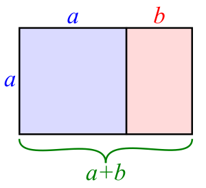
Figure 1 – the “Golden Rectangle,” from the Wikicommons and in the public domain

As I indicated the “golden rule of thirds” is an approximation of the “golden proportion” aka the “golden ratio.”  The “golden proportion” comes from the ancient Greeks, so it must be cool and mystical.  But what exactly is it?

It is a special rectangle as shown in Figure 1.  The rectangle has a height, which we will call a and a width, which we will call a+b.  Now honestly that is true of all rectangles.  Since as long as the rectangle isn’t a square, the width is always a bit larger than the height.  So we might as well call that amount b.  But the “golden rectangle” has the special property that

(a+b)/a = a/b =ϕ

I know that a lot of you don’t like equations, but forget the equation.  All that I am saying is that for this particular rectangle, when I divide it as shown, I create a second rectangle only on its side, and that the width divided by the height is the same for both rectangles.  This ratio is so important that we’ve given it a name, really a symbol, the Greek letter ϕ, which happens to equal 1.6180339887, approximately.  “Approximately?”  Mr. Spock.”  “I try to be precise, Captain.”

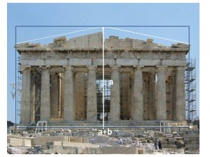
Parthenon

Figure 2 – The ratio of the width to the height of the Parthenon is the golden ratio phi. Original image from the Wikicommons and is by Eusebius (Guillaume Piolle)(own work).

Now before we go off on any tangents, take a look at Figure 1 again.  You see that the line b is almost a third of a+b.  Remember the “golden rule of thirds.”  If you do a little calculation you realize that instead of being 1/3 which is approximately 0.33, the fraction is actually approximately 0.38.  And it is this division of the image that we are really supposed according to the Greeks, or the imagined Greeks, to be striving for n order to attain both geometric and aesthetic perfection.

So now take a look a Figure 2, which shows the Parthenon in Athens, what did the architects Temple of the Goddess Athena choose the ratio of the width to the height to be.  Yes, you guessed it ϕ!  Perfection in the Goddess is here symbolized by perfection in the geometry of the building.

Fibonacci_spiral_34

Figure 3 – The Fibonnaci spiral from the Wikicommons by Dicklyon and in the public domain.

Finally, recognize that one of the key points of the construction in Figure 1, is that the placement of a line a distance a from the start of the width create a second and rotated “golden rectangle.  This construction can be done on paper with a simple drawing compass.  This process can be repeated over and over an infinite number of times each step creating a smaller and smaller “golden rectangle.”  If you look at Figure 3, you can see how this process defines a spiral, called the Fibonnaci spiral (for the mathematicians I apologize for not going into the subtle differences between the Fibonnacci spiral and the Golden spiral.”).  This is very cool!  And cooler still is the fact that this spiral is the basis for a large numbers of forms in the animal world including the ram’s horn and the spiral of ancient ammonites as well as the modern chambered Nautilus.  We find all of these to be objects of great beauty.  So therein lies the basis of the concept that this ratio is fundamental to the concept of beauty and to be emulated in the division of an image.

The golden rule of thirds

So let’s talk about one of these important “mind tricks,” “the golden rule of thirds.”  As we shall see in a subsequent blog the “the golden rule of thirds.” is actually an approximation of the “golden proportion,” which is where our true aesthetic hard-wiring (whatever that means) lies.  But the “the golden rule of thirds.” is a very useful and practical compositional tool to use when taking and creating photographs.

The basic concept is that a photograph will be aesthetically pleasing if its elements are laid out on a basic grid that equally divides the image in thirds.  According to Wikipedia, “the golden rule of thirds” was first articulated and by John Thomas Smith in his book Remarks on Rural Scenery (1797).

Presentation1

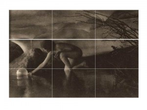
Figure 1 – Ann Brigman’s “The Bubble, 1909,” overlaid with a three by three grid to demonstrate the “Golden Rule of Thirds.” Original photograph from Wikicommons and in the public domain.

Let’s consider an image,  that we’ve seen before, Anne Brigman’s “The Bubble, 1909” to see how it’s done.  I’ve divided the horizontal and vertical axes in thirds and overlaid the grid on the image.  Vertically, you can see that the image is divided into: the ceiling, the middle ground where the figure is, and the pool.  Horizontally, the division is: the lit area to the left, the middle ground, and the dark background area to the right.  Indeed, the body of the figure is

Presentation2

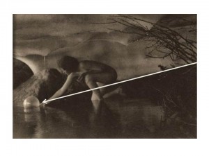
Figure 2 – Ann Brigman’s “The Bubble, 1909,” overlaid with the arrow of directionality.  Original photograph from Wikicommons and in the public domain.almost completely confined to the middle zone.

As an aside there are some additional “mind tricks” or suppositions going on in “The Bubble, 1909” as shown in Figure 2.  An additional, and very well defined, diagonal line divides the subject again into roughly 1/3 and a 2/3 portions.  I’ve drawn it as an arrow to indicate the direction of the motion.  Why do I assume that the woman is launching rather than retrieving the bubble?  Why does my mind tell me that?  Well first of all the arrow goes from darkness to light.  Second, the woman expresses an outward gesture with palm up as if she were releasing the orb, not palm down as if she were stretching her fingertips out to retrieve it.  The final cue is most interesting of all.  In countries where one reads left to right, the eye/mind interprets the left-right motion as inwards.  If, in so moving our eye, we encounter an animate object, here the woman, we interpret that she is passing us in the opposite direction, that is moving outward.*

Returning to the issue of the “golden rule of thirds, let’s consider another old friend, Edward Weston’s, ” Nude in the Dunes, 1930.”  The picture is vertically divided into thirds and the nude is in the lower third.  As I’ve said, this placement and the sand dune above it gives the image a dynamic sense of motion.  You feel that the nude is slowly slipping out of the picture.  A very different and much more stable effect would be accomplished if the nude were at the center of the image. In fact the effect can be seen in Weston’s, “Nude in the Sand, 1936

Finally, let’s consider again Ansel Adams, “Moonrise, Hernandez, NM, 1941”  Adams made a very conscious decision here to emphasize sky over Earth.  The pictures is very neatly divided vertically in thirds (top to bottom): darkness, bright sky, and Earth.  The moon in the center region and very near the dead center of the image is clearly a very important focal point, and we need to move our eye outward from there to encounter the town going down or the dark sky going up..

It has to be said, that “rules are made to be broken,” and violating the “golden rule of thirds” can have dramatic effect.  It remains, however, a very easy compositional tool that can be readily implemented on the fly while taking pictures and then fine tuned in the light room.

*For a further discussion of this directionality issue see Lootens on Photographic Enlarging and Print Quality, The Camera, Baltimore, MD 1945.


Physiological vs. physical optics

In my last blog I talked about the resolution of the human eye.  That is all fine and dandy, but it is very important to remember that the eye does not function like a CCD or CMOS-based digital camera.  It does not snap pictures that it then stores intact in the brain.  The eye is part, an important extension, of the brain, and the brain is an image processing device that stores images in its own peculiar way, connects and combines them with other images, and connects them all with emotions.  When looking at a scene or photograph the eye doesn’t even stand still.  Rather it scans the scene picking out important recognition points.

Now I’m not an expert on this topic.  So I’m not going to dig myself in more deeply for risk of being inaccurate.  I just want to emphasize a few significant points.

  • First, when talking about the eye and brain, it’s important to recognize that you’re dealing with physiological and ultimately psychological optics, not just plain vanilla physical optics.  There’s even different set of units to describe physical and physiological optics.
  • Second, the brain connects an images and ultimately evokes emotion.  In a very real sense we feel an image.
  • Third, all of the aesthetic tricks of photography, the golden rule of thirds, the dynamicsm within an image, foreground/background flip, etc. are the result of what’s going on in the brain during image perception.

Of course, the eye, the brain, and all of the rules of physiological and psychological optics are ultimately determined by the physics and chemistry of the eye and brain.  But, and perhaps most importantly, without the brain and the way it processes there could be no photography, since it is the brain that accepts a flat image of a three dimensional world, even  images devoid of color, and enables it to evoke the same emotions as the original scene.*  It is the eye/brain that enables us to look at a photograph and say: “How beautiful!” – not just to say but to feel it.

*At the recommendation of a reader, I have been reading Timothy Egan’s biography of Edward Curtis, “Short Nights of the Shadow Catcher.  Egan records that in “December of 1904 Curtis rented out a large hall in Seattle and mesmerized the audience with hand-colored lantern slides and moving pictures of Indians of the Southwest.  The film prompted members of the audience to jump from their seats in fear.”


The resolution of the human eye

In our discussion of camera resolution we never asked what the resolution of the human eye is?  This is an important question, since ultimately, when we look at a photograph, regardless of how it is presented to us, we are looking at it with the human eye.

Doing the same kind of analysis that we have done to determine the diffraction limit of a camera lens, it can be shown. The human eye has an angular resolution for green visible light of about 1.2 arc minutes.  An arc minute is 1/60th of a degree.  Those pesky Babylonians, with their base 60. are at it again! Physicists prefer a different unit of measure, called the radian.  There are 2 π radians in 360 degrees; so 1.2 arc minutes is about 2.1 milliradians.  The value of using radians is that the spatial resolution is just the distance away from what you are looking at times the angular resolution in radians.

So say you are reading a book or looking at a photograph 12 inches in front of your face, then you resolution is going to be 12 inches X 2.1/1000 = 0.0252 inches.  Remember that this is in line pairs.  There are about 40 line pairs per inch – or 80 lines (or dots) per inch.  This is kissing close to the 72 dots per inch standard that Adobe Photoshop and historically topography use.

Similarly, as I write this, I’m looking from about 18 inches at a 15 inch laptop screen.  So in that case my eye’s resolution is going to be 18 inches X 2.1/1000 = 0.0378 inches or 26.5 line pairs per inch which is 53 dots per inch.  Across my 15 inch screen that’s 794 dots.  If I decide that I’m going to peer in, putting my nose to the screen at about nine inches, I’m going to need twice as many dots per inch or 1,588.  That’s pretty close to the 1366 that my screen is set at.

We’ve seen these numbers before.  But now we realize that the requirements in dots per inch for computer displays and digital prints of various sizes ultimately are defined by the resolution of the human eye.  And hidden in all of this is another important point that the print or display resolution required is defined by how far away you are viewing it.

Infrared photography on digital cameras

solarspec

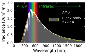
Figure 1 – The solar spectrum, By Danmichaelo (Own work) [Public domain], via Wikimedia Commons

In researching my last blog on the Infrared Photography of Davide D’Angelo, I discovered that there was a bit of a controversy about whether infrared photography should be possible with digital cameras that are “infrared filtered.”  So I thought that I would explore  that here, for those of you who want to try it for youselves.

OK, so for starters, let’s look at the spectrum of sunlight (see Figure1). The bottom line from this is that there is a lot of light in the near infrared (700 – 950 nm).

Next, the bar is set by classical, i.e. film-based, infrared photography.  What is, or was the response of such films?  Let’s look at the spectral response of Kodak High-speed HIE Infrared Film.  This pretty clearly tells us that we are, or were, looking at the spectral region between 700 and 950 nm.

So what we need to do is filter out the visible, maybe allowing a little deep red, using what’s referred to as a long-pass filter.  Let’s look at the spectra of some of these filters.  We see that a Wratten number 87 or 88 will do the job for us.  Note the Wratten number 89B, which is the Hoya 72 filter.  It allows a bit more red to pass, but as we shall see may be the compromise you need to get this to work on your digital camera.

standard_camera

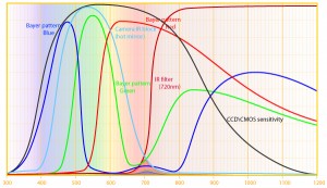
Figure 2 – Spectral response of a standard digital camera CCD/CMOS by  http://www,ir-photo.net under creative commons license.

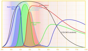
Finally, we need to consider the spectral response of digital cameras.  What we call a pixel on the sensor of digital cameras is actually a small pattern or array of pixels divided into three groups: those with a micro-blue filter over them, those with a micro-green filter over them, and those with a micro-red filter over them.  The sensor is then filtered in two more ways.  There is a filter to remove UV light and there is a filter to remove infrared light.

unmodifiedcamera_plus720filter

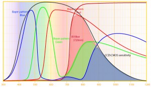
Figure 3 – Spectral response of a standard CCD/CMOS digital camera with a a Hoya 72, Wratten 89B, filter by http”//www.ir-photo.net under creative commons license.

The net effect of all of this is shown in Figure 2.  The shaded blue, green, and red areas, referred to as Bayer patterns, are the individual color sensor elements.  The blue, green, and red solid lines show how the responses of these elements would be in the absence of the “extra” filtration.

moddedcamera_720filter

Figure 4 – Spectral sensitivity of IR converted digital camera (CCD/CMOS) camera used in conjunction with a Hoya 72, Wratten 89B, filter by http://www.ir-photo.net under creative commons license.

Next (Figure 3) let’s add a Hoya 72 filter.  Note the little shaded area that ranges from about 650 to 775 nm. That is the IR sensitivity of such a camera.  It looks pathetic, but it will give you images provided you put your camera on a tripod and accept the necessary long exposures that you will need.

You can, however, have your camera modified (typical cost $200 to $300 depending on camera, in 2012), which entails removal of the IR cut-off filter.   Some examples of these services are LifePixel, and  Digital Silver Imaging, and This is shown in Figure 4 and gives you back all of the beautiful infrared sensitivity that is intrinsic to the CCD and CMOS detectors.  Indeed, this sensitivity extend well beyond 1200 nm, greatly exceeding that of Kodak HIE film.

One important word of additional caution is that the focus changes.  Some lens have specially marked lines on the lens barrel to indicate where the IR will be in focus.  In the absence of this, you are going to have to experiment to locate this line.


Bokeh, what it is

I have been reading a lot about different digital camera lenses in my research on image sharpness.  There are words that you hear so often that it can get a bit annoying – meaningless words like “tack sharp.”  Another term that keeps cropping up is “bokeh.” If you read a lot about photography you’ll keep running into it as well.  So I thought that it might be worth defining it.

Bokeh is the aesthetic use of out-of-focus regions of an image to create pleasing effects.  It is caused by the depth-of-focus, or lack there of, of the lens.  Take a look, for instance, at my picture “Lady Slipper,” in my “Cabinet of Nature Gallery.”  I could have photographed against a dark black uniform background; but instead the out-of-focus Windsor chair and other elements of the background add aesthetically to the image.

The word “bokeh” comes from the Japanese word “boke,” which means “blur.”  The (h) is added so that we remember to pronounce the (e).  Usually it is pronounced as “boh – kay” but sometimes as “boh-keh” – but never as boke (rhyming with broke or bloke).  Remember this the next time you are in a genuine pizza shop and ordering a calzone.  Italians have never met a silent (e).  Calzone is not like school zone.  The (e) is pronounced like “cal-zo-nay.”  Mangia!

Sources of noise in digital photography

Perhaps, it is worth saying a bit more about noise in digital photography, because I don’t want to leave you with the impression that the only type of noise is the counting noise that we have been discussing.  Every element of an electronic device, like a digital camera, can generate noise.

For the kinds of detectors used in digital cameras, CCDs and CMOS detectors, there are, generally speaking, three types of noise:

  1. Dark or thermal noise, which reflects that fact that above absolute zero (and we are far above absolute zero) random thermal motion of electrons can cause the electrons to act as if they we caused by photons.  Or said differently heat rather than light causes the electron to appear in the pixel well.
  2. The kind of counting noise that we have been discussing.
  3. Read-out noise – noise that results from the transfer of electrons between adjacent pixels as they are read out of the detector.  This transfer is often described as a bucket brigade, where water can spill between buckets as it is moved along.

There are two other forms of detector noise to consider. I think these might be better considered as kinds of background in your image, but never-the-less.  Both of these are randomly distributed on your detector, but always occur in the same positions. These are:

  1. Random but permanent variations in pixel sensitivity including hot (bright) pixels or dead (black) pixels.
  2. Random fuzzy areas on your detector due to dust.

Finally, noise in the amplifier or other camera electronics can add noise to your image or even add systematic patterns such as banding, seen at low intensity.  If the amplifier has a temporal oscillation to it, for instance, and because the image is always read out the same way, these will appear as spatial bands in the image.

We will have the opportunity to discuss noise more in the future.  For now, the important point is that there is noise.  Some noise gets amplified along with the signal as you change the ISO setting.  Finally, noise ultimately limits image sgarpness and resolution.

Counting noise, ISO, graininess, and image sharpness

Now that we’ve introduced the concept of counting or signal noise, we are in a position to also discuss graininess and its relationship to image sharpness.  The important point to remember from our discussion of counting noise is that because of the random nature of the incoming photons of light, the intensity of even a uniform intensity surface will show pixel-to-pixel variation.

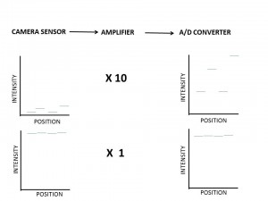
Now your digital camera may be thought of as having three components as illustrated in the schematic shown at the top of Figure 1. These three elements are:

  1. A sensor that builds up electrons in response to the light (subject to the laws of randomness that the lower the number the more the variation).  The individual pixel elements are miniature capacitors, which means that they produce a voltage directly proportional to the number of electrons and therefore the intensity of light,
  2. An electronic amplifier that can multiply your voltage and increase its size
  3. An analog to digital (A/D) converter that converts the voltage to a digital number that can then be stored either on your camera or on your computer.

Now, below this schematic on the left hand side I’ve drawn a little graph that shows intensity from four pixels in your image, presumed to be of the same light intensity.  However, because the intensity is low there is lots of variability, due to counting noise.  Also because the intensity is low it’s going to appear black or near black in your image.  So, we have to amplify it, say by a factor of 10 X.  This brightens things up.  However, as shown on the right hand side, the variability  gets amplified as well.  This is what we call graininess in an image.  Also, as we have previously discussed, this kind of noise limits our ability to distinguish things in our image.  So the resolution isn’t so good.

To overcome this problem, we can instead lengthen the exposure, which fills the pixels with more electrons and jacks up our overall intensity.  That is we need to use no, or less amplification.  This is shown at the bottom of Figure 1.  Less variability means less variability or graininess and better resolution.

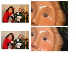
Figure 2 – Increasing electronic amplification or ISO causes image graininess and reduces image sharpness

So you need two camera controls here.  To control how much you fill the pixels with electrons you need to be able to either expose for longer time or decrease the f-number.  When you cannot do this, because you need a high f-number for depth of field or faster exposure to stop action or hand motion, you need to be able to control the amplification.  That’s your ISO setting.  The higher your ISO the higher your magnification.  In the old film days, an ISO of 100 was considered to be normal, high ISO films were fast, high grain films; low ISO films were slow, fine grain films.

Let’s take a look now at the images of Figure 2.  Don’t worry about the slight color differences between top and bottom.  The top image was taken at ISO 100 (low electronic amplification).  When you blow up the caroler’s face there’s very little variation or grain, the sharpness is quite good.  The bottom image was taken at ISO 6400 (high electronic amplification).  When you blow up the caroler’s face There’s a significant amount of variation or graininess, and, as a result, there is a loss of sharpness or resolution.