ImageJ, a gift from gov

As we have developed topics in this blog, we are slowly moving into a very quantitative realm.  So for all of the serious techno-geeks reading this I’d like to give you a gift, or rather pass on a gift.  The National Institutes of Health has developed a very quantitative, very complete, and very open programing platgform called ImageJ that is available for download.  Did I mention that it is free?

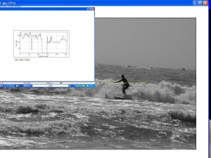
ImageJ is not going to substitute for you artistic image processing software.  It isn’t meant to so .  But it does enable you to do some pretty sophisticated, quantitative image processing tasks.  Just as a simple example.  Consider the image of our Maine Surfer again (see Figure 1).  Using ImageJ, we draw a yellow line through the surface and that ask it to display the intensity values along this line.  This kind of thing will become very handy as we examine issues like image resolution further.

Figure 1 – Some simple image analysis performed woth freeware ImageJ

Making a solarization image

Figure 1 – Black and white image of a surfer in Maine

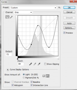
Figure 2 – Solarizing response curve or LUT for Figure 1

Recognize, that if we are prepared to play loosie goosie with the definition, the last image of yesterday’s post is indeed a solarization by virtue of the reversal in the tones at higher intensity.  The effect, is subtle, however.

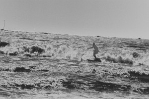
Today I’d like to have a little fun and make a more dramatic solarization.  The steps are identical to what we did yesterday.  Let’s start with another high contrast image.  This is a silhouette that I took of a surfer last month in Kennebunport, ME.  Figure 1 shows this as a black and white image.  We again go to curves, see Figure 2 and apply a very non-linear, non-monotonic response curve or LUT.  The effect is a very surreal and solarized image.  It looks almost like a negative!

Figure 3 – Solarized variant of Figure 1 obtained by applying response curve or LUT of Figure 2

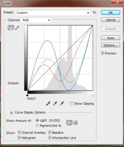
Figure 4 – Solarizing RGB response curves or LUTs

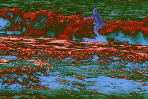
Now we can have some real fun by doing this in color.  We return to the colored version of Figure 1.  Then we apply a non-linear, non-monotonic response curve to each of the three color planes, Red, Green, and Blue.  This is shown in Figure 3.

I then cropped a bit and adjusted the brightness and contrast to make the image more pleasing and voila, we have a solarized color image.  Finally, note the way that the surfer is outlined brightly.  This effect is classic solarization.

Figure 5 – Final version – solarized color image of Maine surfer

Curves and the Look Up Table

Let’s continue our discussion of the Look Up Table or LUT. As the pixels of your digital camera’s sensor are hit by light, they emit and store electric charge – the more light, the more charge.  After the exposure, this charge is sequentially read out.  The charge is read as a voltage and the camera’s circuitry applies this voltage to what is referred to as an “analog to digital converter” or A/D.  The important point is that if you have an 8-bit camera, it converts the voltage to 2^8 or 256 grey levels for each color and for a 14-bit camera to 2^14 or 16384 grey levels for each color.  That’s your basic image.

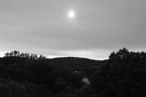
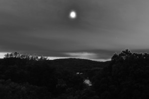
Figure 1 – Valley with Sun, B&W image

Your image processor, e.g. Photoshop, can alter this fundamental image by applying a Look Up Table to it.  To see what this means, let’s consider the image in Figure 1.  You can guess what I was trying to accomplish with this image.  There was the valley of trees, a very overcast sky, and the sun burning through.  The problem is that there was too much dynamic range in the scene for the camera’s sensor to handle.  Probably the picture should have been shot with a graded neutral density filter or taken at a set of bracketed exposures and then reassembled as a high dynamic range image. But nevertheless, errors can be educational.

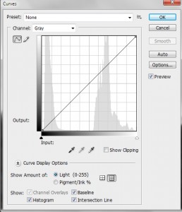
Figure 2 – Initial Photoshop CS3 histogram and response curve for Figure 1

In Figure 2, I display the Photoshop Curves screen.  Look first at the histogram.  A histogram is a display of the frequency or number of times a particular grey level appears in the image.  You can see that there are really two distinct regions: the dark tones of the valley and the high tones of the sky.

Next look at the curve, which is here a straight line.  The curve is a display of the LUT.  For a perfectly one-to-one linear LUT, like this, it says: a grey level of 0 should be displayed as 0, a grey level of 1 as 1, of 2 as 2, etc. So you can think of a two column table.  The first column is input value.  The second column is output value.  That’s your LUT.

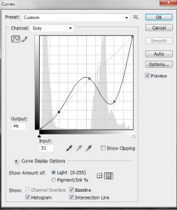
Figure 3 – Modified response curve for Figure 1

Now this picture calls for a different curve or LUT.  I set an anchor point at the end of the first subregion of the histogram and at the beginning of the second.  The lower values I don’t change by very much – just a bit of a concavity to the curve.  But the high values I seriously distort.  In fact, as seen in Figure 3, I drive the grey levels of clouds from very bright to very dark.  This is a very nonlinear and nonmonotonic (output grey level does not always increase with increasing input grey level) curve or LUT.

The final effect is illustrated in Figure 4.  It is certainly improved in comparison to the original, but there is still a lot of work remaining to achieve my concept of the image, when I first took it.  Indeed, it may not be salvageable.  However, it does serve to illustrate the concept of the LUT and response curve.

Figure 4 – The final result of applying the response curve of Figure 3 to the image of Figure 1

Solarization, Minor White, and the Look Up Table

I am not personally a great fan of extreme “Photoshopping.”  For my generation the rock star we emulated was Ansel Adams.  So the goal has been to achieve the ideal of his “range of light.”  This translates to a few basic techniques:

  1. Spread the dynamic range from black to white – a process referred to as, in image processing parlance, as histogram equalization,
  2. Adjust the gamma to get the tonal range you want,
  3. Dodge and burn judiciously to accentuate the wanted and suppress the unwanted,
  4. And in some cases to tone subtlety.

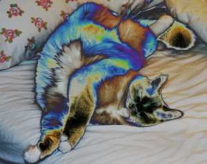
Radiant Tiddles, copyright 2005

But all this talk about “faking it” brought to mind a photograph that I took and played with in October of 2005.  I called this, in honor, sorry honour, of an English friend “Radiant Tiddles.”  This image is an example of a phenomenon known as “solarization.”  The first thought that you often have about solarization is that it is a form of photographic magic.  You will recall how the magic of photography is a theme of this blog.  And let me tell you that in the “good old days,” when creating a solarization involved flashing a print with light half way through development, it certainly felt like witchcraft.

Arguably, the most famous solarization is Minor White‘s “The Black Sun, 1955.”  This is a wonderful example, because you realize immediately what is going on.  Somehow the extreme white of the sun stopped being white and turned black – somehow the tone reversed. You’ll hear this referred to as “reciprocity failure.” If we look up solarization in Wikipedia, we learn that it “is due to halogen ions released within the halide grain by exposure diffusing to the grain surface in amounts sufficient to destroy the latent image.”  Let me say two things about that.  First, the latent image was the ultimate magic inherent in film photography, the fact that light created a memory in the film that could wait for years* to be brought out by chemistry.  Second, it’s a lot easier to understand as a digital phenomenon.

This understanding requires first an understanding of the concept of a “Look Up Table,” or “LUT.”  The LUT is very central and key to understanding much of what we do to create an image in digital media; so well worth the effort of understanding.

*And I do mean years later.  Film recovered in the Arctic in 1930 from an ill-fated balloon expedition in 1897 was successfully developed.


Transforming reality with the camera

Engineers would describe the camera as a “black box.”  You put a signal, in this case the object you are photographing, into the black box.  The black box transforms the input signal into an output signal, in this case the image.   The black box is a combination of the lens, the sensor, the electronics, as well as any intentional image processing that the camera does.  In general, we refer to this as “the system,” a fancy word for “the camera.”  There are many ways that the camera transforms the object.  Let’s consider some of them.”  The camera:

  • takes a three dimensional object and flattens it to form the image
  • typically makes the object smaller in the image
  • pixelates the object
  • distorts the object via its point spread function
  • distorts the object due to various lens aberrations, such as fish-eye distortion
  • if set to do so, may
    • sharpen the image
    • set the brightness and contrast
    • set the white balance
    • set the color or convert to monochrome

There is a lot going on, and we’ve already discussed some of it.  This engineer’s description can be a very useful one, as it enables the basis for a systematic language to describe what the camera does.

We have, in fact, without knowing it been using the engineer’ signal-processing by a black box” perspective in our discussion of image sharpness.  In creating this uniform language, engineers typically look at how a “black box” modifies one of three types of signal; each of which totally describes how the system transforms an object and forms an image.

  • The first is to input an impulse.  This is our point of light
  • The second is to input a so-called square wave.  This is our set of black and white lines
  • The third is to input sine waves.   These are the spatial frequencies shown in Figure 2 of the last blog.

Each of these definitions are essentially equivalent.  Each will be useful as we further consider resolution and other camera properties.

Camera resolution and image contrast

In our exploration of digital camera resolution, we started off with the pixel view and recognized that in order to distinguish two white points or lines there had to be a black point or line in between.  This leads to the concept of dots per inch or line pairs per inch.  Then we discussed the lens’ point spread function and described Rayleigh’s criterion that two points of light become distinguishable when there is an approximately 20 % dip in between them.  This 20 % value was based on the properties of the human eye, and we can argue, in a digital age where the eye is not the primary detector, whether this should still be 20 % or whether a smaller percentage could be detected by our cameras, or more accurately since we know the camera can do better, should the definition of resolution be changed.

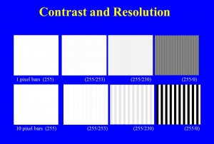
Figure – The relationship between contrast, or modulation, and resolution

Rather than worry about these semantic issues, let’s accept the view that the dip needs to have some value and see where this concept leads us.  In Figure 1, I have computer-generated some images.  In the top row of images, I have created a set of alternating one pixel wide vertical lines.  In the upper left hand image all of the lines have the same intensity of 255, and, big surprise, they’re not distinguishable, because they’re not different.  Moving to the right, in the next image the alternating lines have intensities of 255 and 253.  This is only about a 2 % difference.  This difference is referred to as: the contrast or the modulation.  I’m pretty sure that you won’t be able to see the individual lines.  In the next set the lines have a greater contrast or modulation, about 10 %.   The values are 255 and 230.  Maybe you can just make out the lines or maybe you see this as a uniform grey of average intensity about 242.  We’re pushing the resolution limit here!  Finally, look what happens if we go to 100% modulation, that is set the alternating intensity values to 255 and 0.  The individual lines should be pretty clear now.

Now here’s where things get interesting.  In the bottom set I’ve done the same thing, only the vertical lines  are ten pixels wide.  I think that you will see that even at the 2 % contrast or modulation the individual lines are visible.  In general, we see that the larger the separation the less contrast is needed to see the object.

There are two practical aspects of this.  First, if you take an image on a cloudy day, objects will be softer.  There will be less contrast and sharpness.  If you take the same image on a sunny day, objects will be harder or harsher.  There will be more contrast and sharpness.  Second, if you increase contrast in an image, it appears sharper, often to the point of exaggeration.

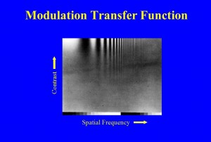
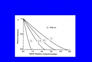
Figure 2 – the modulation transfer function 1

The number of lines per inch or mm is referred to as the spatial frequency.  There are other definitions , or more accurately other units, of spatial frequency, such as mm-1 or cycles/mm.  But, we don’t need to worry about that now.  Spatial frequency enables us to define the fundamental resolution properties of a lens or camera system.  This is very vividly shown in Figure 2.  Here we have done a similar thing to what we did in Figure 1, with the exception that instead of using lines we use a sine wave that oscillates from some minimum to some maximum, still called the modulation.  Spatial frequency increases to the right and contrast increases vertically.  Very clearly, we see that to resolve higher and higher spatial frequencies, we need more and more contrast.

Figure 3 – The modulation transfer function 2

In Figure 3, we see how this data is most usually shown for a lens.  This is the so-called modulation transfer function, which defines a lens’ resolution.  We suppose perfect modulation a modulation of 100 % or as a fraction 1.0 and consider what modulation the lens or camera delivers.  The numbers in the grey boxes are the lens’ f-number.  For a given lens, we see how the modulation is reduced more and more, by the lens, as the spatial frequency increases.  We also see how the smaller the f-number the better the modulation you get at a given higher spatial frequency.  In conclusion, the more modulation, or contrast, you have, the better your resolution.

Camera Resolution and the Airy Disk

Suppose that you look at a point of light with your camera, what do you see?  This is a trick question; so the answer isn’t a point of light.  If you expand the image enough the point of light appears fuzzy.  This is a property of all lenses.  No lens can focus a point to a point.  Instead the point gets fuzzed out.  In fact it gets fuzzed out in all three dimensions.  The shape of the fuzzy light is called the “point spread function” or PSF.
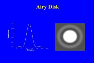
Figure 1 – How a point of light appears in a camera – The Airy Disk

In Figure 1, I show what this point should look like on the right and an intensity scan through it on the left.  You will, of course, see that it isn’t quite just a fuzzy point.  Rather, there is a ring (of about 2% peak intensity) around the fuzzy center.  In fact if we had enough dynamic range to display it, we would see that there are an infinite number of concentric rings, each progressively fainter than the last.  This pattern is referred to as the Airy disk after the nineteenth century physicist-astronomer, Sir George Biddell Airy (see Figure 2).  Those of you familiar with optics will immediate recognize that the Airy disk, because of the concentric rings, must be some kind of interference phenomenon.  For now, let’s just accept it as an experimental fact.  This is what we see in an optical imaging system from a point of light.  For those of you interested in a complete explanation, I refer you to Arnold Sommerfeld’s excellent work on Optics and my own, more modest, paper in Digital Microscopy.

Figure 2 – Sir George Biddell Airy (1801-1892)

Now, you might ask, why blow things up so much?  Why not confine the Airy disk to a single pixel.  Then it would appear effectively as a point in the image.  If you do this you allow the image to be pixel limited in its resolution and you do not get as much resolution as you possible can out of your optics.

Another important question, why do we care how a point behaves in an image.  The answer to that takes us back to the question of a pixelated world.  Every scene or image consists of a set or array of points.  Therefore, if we know how the camera alters a point we will then know how it alters every scene that we can look at.  I like to say that the image is the transform, by the camera, via its point spread function, of reality or the scene.  This is not just a philosophical point.  If we know the point spread function there are mathematical methods of reversing the fuzzing, of making the image more accurately descriptive of the true scene.  This is what the various image sharpening methods used in your camera or image processing software attempt to do.
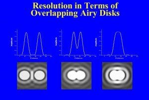
Figure 3 – Resolution in terms of overlapping Airy disks

You will remember that we described how in order to see a bright spot located at a pixel and distinguish it from a second bright spot at another pixel, there had to be a darker pixel in between.  The question of resolution can be described in very similar terms.  If we have two points, each converted by the camera to an Airy disk, how close can they get before we cannot figure out if we are looking at one or two spots?  Take a look at Figure 3.  You can see that the closer the points get to one another the smaller the dip in intensity in between them.  Any detector, your eye or the camera’s sensor, has some limit in its ability to see that dip.  This is what defines resolution.  In the nineteenth century, Lord Rayleigh defined resolution, somewhat arbitrarily, as being when the center of the second Airy disk falls on the first ring of the first Airy disk.  This corresponds to approximately a 20% dip in between, and this was found to be just about what the eye could do in a telescope.

For a camera, Rayleigh’s criterion can be written as:

(separation on the image sensor)=1.22 X (wavelength of light)X(f-number).

So let’s see , if we have light of 0.5 microns (green) light and are using a f-number of 8, the resolution will be about 4 microns.  We have already seen in our discussion about lenses and magnification, how to translate this to resolution size for an object at some distance.

(separation at the object) =(separation on the image sensor) / Magnification,

where,

Magnification = (focal length)/(distance to the object).

I’m trying very hard to limit the number of equations in this blog.  However, the equation adds one very important point, namely that resolution is inversely related to f-number.  The higher the f-number, the larger the separation distance, which means that we have less resolution. How’s that for counter-intuitive!  F-number improves your depth of focus at the price of weakening image sharpness.

Photographic image sharpness – where we are and where we need to go

Since we are working step by step through the question of camera image sharpness and resolution. I thought that it would be useful to review what we have already learned and where we have to go next.

  1.  We considered the pinhole camera and showed how  we can form an image by isolating single rays from each point of an object.  We also defined f-number and found that the bigger the aperture the worse the depth of field.
  2. The problem with the pinhole camera is that it collects very little light and therefore requires a very long exposure.  This limitation can be overcome by using a lens to collect many rays from the same point and bring them to a focus at a corresponding point of the image.
  3. We then considered what would happen if we had a “perfect lens.”  That is if the resolution was limited by the separation between and number of pixels, what would the resolution be?
  4. This enabled us to determine what the number of pixel requirement is for displaying images on a computer monitor.
  5. Similarly we determined the number of pixels requirement for high resolution printing.

So now we have to consider the other factors which govern image sharpness the quality and properties of the lens and stability of lens positioning.  This will lead us into some very fundamental concepts including:

  1. The point spread function.
  2. The Rayleigh criterion for image resolution.
  3. The relationship between contrast and resolution – the so called modulation transfer function.

Ultimately our goal needs to be a very practical one, how do you cut beyond the qualitative hype of manufacturer’s ads and really assess a lens?  How do you find and understand real quantitative lens specifications?  And beyond that is there a way to critically assess and compare your own lenses?

Pixels per inch vs. dots per inch

The next question in our quest to understand image resolution is the difference between pixels per inch (PPI) and dots per inch (DPI).  PPI is generally used to describe camera sensors, while DPI is generally used to describe digital printers.  We discussed in the previous blog how a pixel that is 1/200th of an inch on a side is just about the smallest object that your eye can resolve.  So if you fill that little pixel with even smaller dots of color your eye will blend them together.  Early printers used only three colors, however modern printers can use as many as seven colors.  .  This is what enables them to achieve a more subtle range of color.  So if you are looking at 200 PPI you are going to need 7 X 200 = 1400 DPI out of your printer.  For my 200 PPI that would be 7 X 300 =2100 DPI. So basically, the number of DPI required is the number of colors) X (the number of pixels per inch).